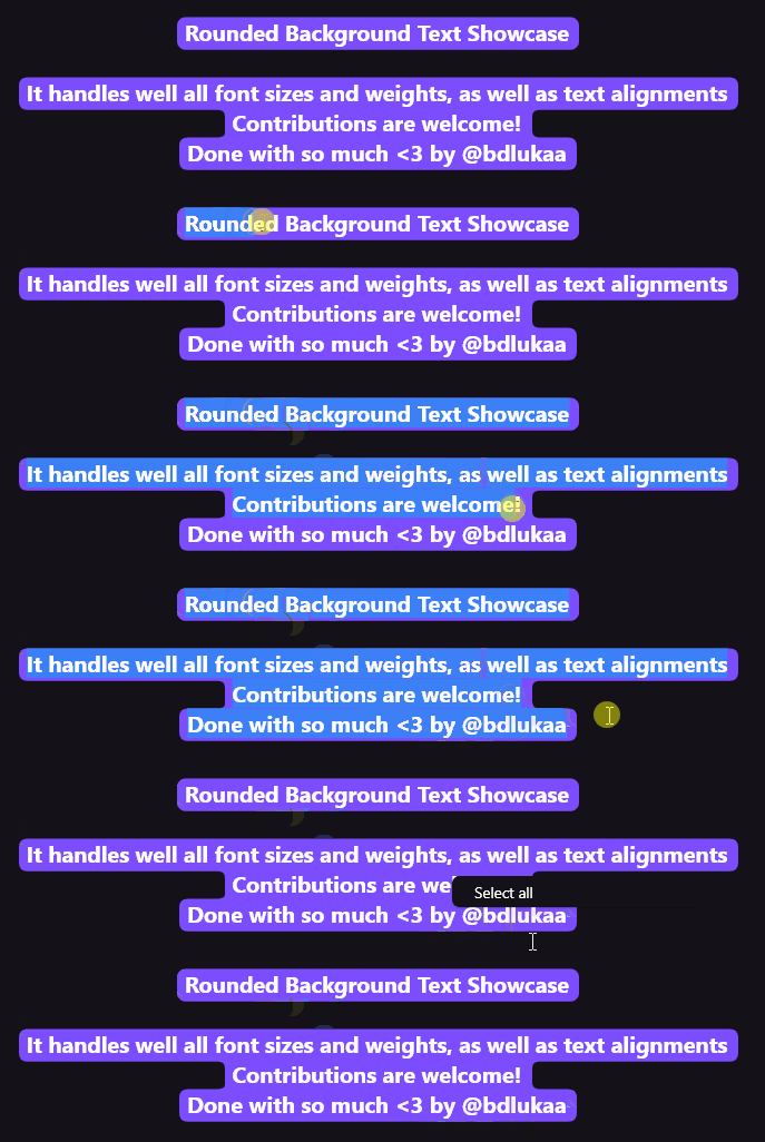
Aus öffentlichen Paketdaten erstellte Orientierung.
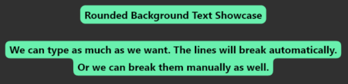
Ein Flutter-Paket, das Textelementen wie Text, TextField und TextSpan abgerundete Hintergründe hinzufügt. Es ermöglicht visuell ansprechende Textmarkierungen mit anpassbaren Farben, Randradien und Abständen. Ideal für moderne Benutzeroberflächen mit Fokus auf Lesbarkeit und Design-Ausdruck. Das Paket unterstützt alle wichtigen Plattformen – Android, iOS, Web, macOS, Windows und Linux – und sorgt für konsistente Stilierung über Geräte hinweg. Einfache Integration über einen einzigen pub add-Befehl macht es für Entwickler zugänglich, die elegante Texteffekte ohne komplexe benutzerdefinierte Zeichnungen suchen.
Anwendungsfälle
Wichtigen Text in Apps hervorheben
Stilisierte Eingabefelder erstellen
Visuelle Hervorhebung von Beschriftungen hinzufügen
Modernes UI-Design
Verbesserung der Zugänglichkeit durch Kontrast
Interaktive Textelemente erstellen
Hauptmerkmale
Rundumrahmung für Text
Unterstützung für TextField mit abgerundeter Hintergrundfläche
Anpassbarer Randradius und Abstand
Kompatibel mit TextSpan
Plattformübergreifende Unterstützung
Einfache Integration über pub.dev
Geeignet für
UI-Designer, die auf visuelle Perfektion abzielen
Entwickler, die moderne Flutter-Anwendungen erstellen
Apps, die hervorgehobene Textelemente erfordern
Projekte, die auf Barrierefreiheit und Lesbarkeit fokussiert sind
Teams, die eine schnelle Umsetzung von Effekten wünschen
Hinweise
Kann die Leistung bei vielen Instanzen beeinträchtigen
Für Zugänglichkeit ist ein sorgfältiger Farbkontrast erforderlich
Beschränkt auf Textdekoration-Anwendungsfälle
Nicht geeignet für komplexe Layouts
Abhängig von der Konsistenz der Plattformrenderung
Am besten sparsam verwenden, um visuelle Überlastung zu vermeiden
Original-README
Originaler README-Schnappschuss aus dem verknüpften Quell-Repository. Aktuelle Inhalte finden Sie im Repository.
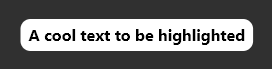
RoundedBackgroundText(
'A cool text to be highlighted',
style: constTextStyle(fontWeight: FontWeight.bold),
backgroundColor: Colors.white,
),
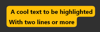
Multiline text is also supported
RoundedBackgroundText(
'A cool text to be highlighted\nWith two lines or more',
style: constTextStyle(fontWeight: FontWeight.bold),
backgroundColor: Colors.amber,
),
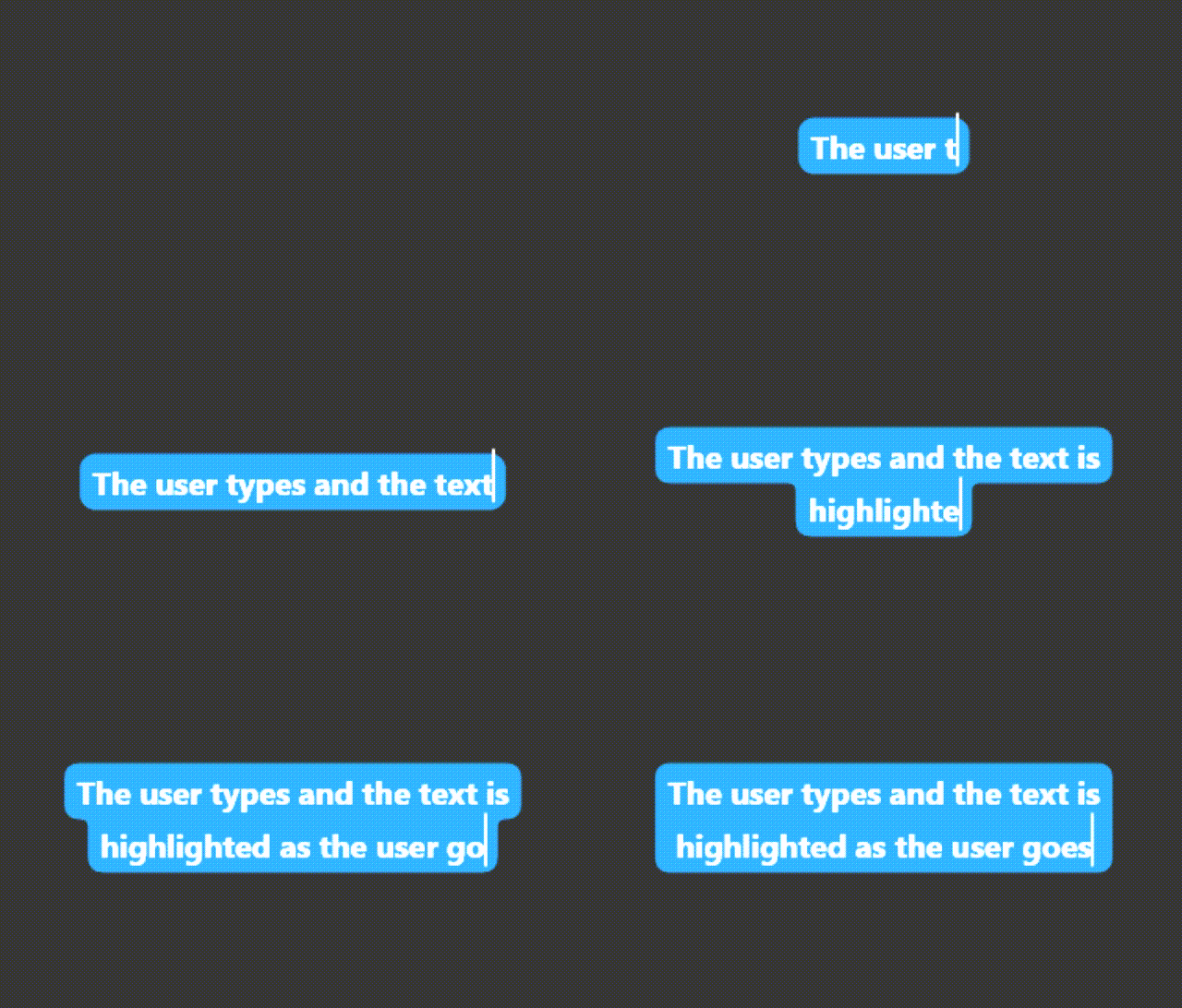
The text highlight will follow the text field scroll position.
Highlight a text span:
Highlight a small part of a text
RichText(
text: TextSpan(
text: 'Start your text and ',
children: [
RoundedBackgroundTextSpan(
text: 'highlight something',
backgroundColor: Colors.blue,
),
constTextSpan(text: ' when necessary'),
],
),
),
Select a highlighted text:
Use RoundedBackgroundText.selectable to make the text selectable:
RoundedBackgroundText.selectable(
'A cool highlighted text to be selected',
style: constTextStyle(fontWeight: FontWeight.bold),
backgroundColor: Colors.white,
),
You may like to know:
Change the corner radius
You can change the radius of the corners by setting innerRadius and outerRadius:
RoundedBackgroundText(
'A cool text to be highlighted',
style: constTextStyle(fontWeight: FontWeight.bold),
backgroundColor: Colors.white,
innerRadius: 15.0,
outerRadius: 10.0,
),
The max allowed value is 20.0. The min is 0.0
Deep dive
This section explains, with details, how the background painting works.
RoundedBackgroundText doesn't use a Text widget under the hood. Instead, it uses a custom text painter to paint the text above the background. As soon as the RoundedBackgroundText widget is initialized, the line metrics for the text is calculated (See computeLineMetrics), and is recalculated when the text changes or when the parent width changes. This is done at built time, resulting in a smooth experience for the user.
To paint the background, the line metrics generated before is used. Each line has 4 properties:
x - where the line starts horizontally within the size
y - where the line starts vertically within the size
width - the horizontal size of the line
height - the vertical size of the line
With these values, we can generate the background for each line. The background is generated around the whole text: from top-left to bottom-left to bottom-right to top-right to top-left. This makes it easy to calculate when there is a corner, either outer or inner.
The inner and outer radius are dynamically calculated based on the line height, provided by the line metrics, and the given innerRadius and outerRadius, respectively. By default, innerRadius is 10.0 and outerRadius is 10.0. For safety, in order to keep the roundnesses correct, these values must be in the bounds of 0.0 (min) and 20.0 max, otherwise the painting would be out the line.