Pakete, Repositories und App-Kategorien suchen

Cover von rounded_expansion_tile
Paketdetailsv0.0.13

rounded_expansion_tile

Eine einfache ExpansionTile für Flutter-Anwendungen mit Eckradius.

AndroidiOSWebmacOSWindowsLinux
30-Tage-Downloads
705
Likes
28
Pub-Punkte
135

Paket installieren

flutter pub add rounded_expansion_tile

Paketübersicht

Aus öffentlichen Paketdaten erstellte Orientierung.

Ein Flutter-Paket, das einen erweiterten ExpansionTile mit anpassbarem Randradius bietet und für zusammenklappbare Inhaltsbereiche ein modernes und visuell ansprechendes Design ermöglicht. Für Einfachheit und Integration entwickelt, erweitert es den Standard-ExpansionTile mit abgerundeten Ecken auf allen Plattformen. Ideal zur Erstellung sauberer, benutzerfreundlicher Oberflächen in mobilen und Web-Anwendungen. Das Paket ist leichtgewichtig und bleibt mit den Kern-Widgets von Flutter kompatibel.

Anwendungsfälle

  • Stilisierte einklappbare Abschnitte in Formularen erstellen
  • Responsive Akkordeons in Dashboards gestalten
  • Verbesserung der UI-Konsistenz durch abgerundete interaktive Elemente
  • Zugängliche Navigationspaneele erstellen
  • Erweiterbare Produktinformationen in E-Commerce-Apps implementieren

Hauptmerkmale

  • Anpassbarer Randradius
  • Plattformübergreifende Unterstützung (Android, iOS, Web, macOS, Windows, Linux)
  • Einfache Integration in bestehende Flutter-Projekte
  • Erweitert den Standard-ExpansionTile
  • Leichtgewichtig und minimale Abhängigkeiten

Geeignet für

  • Entwickler, die anspruchsvolle UI-Komponenten suchen
  • UI-Designer, die sich auf visuelle Kohärenz konzentrieren
  • Projekte, die konsistente, abgerundete Karten-ähnliche Erweiterungen erfordern
  • Anwendungen für mehrere Plattformen
  • Flutter-Anfänger erkunden die Anpassung von Widgets

Hinweise

  • Nur auf die Rahmenradius-Stilisierung beschränkt
  • Enthält keine zusätzlichen Animationen außer den standardmäßigen ExpansionTile-Animationen
  • Bei Bedarf manuelle Behandlung des Inhaltsabstands erforderlich
  • Keine integrierte Anpassung von Symbol oder Titel über das Standardangebot hinaus
  • Am besten geeignet für einfache Erweiterungsanwendungsfälle ohne komplexe Layouts
Original-README

Originaler README-Schnappschuss aus dem verknüpften Quell-Repository. Aktuelle Inhalte finden Sie im Repository.

Rounded Expansiontile

A simple combination of widgets to provide an Expansiontile with rounded corners. This widget uses default Flutter widgets only and is available for each platform.

Getting Started

This Widget returns a column with a ListTile and a ListView. It has all properties of the ListTile width a few custom inputfield. Simply load the widget in your pubspec yaml and start using it.

Inputfields

Default ListTile and ExpansionTile inputfields
  • autofocus

  • contentPadding

  • dense

  • enabled

  • enableFeedback

  • focusColor

  • focusNode

  • horizontalTitleGap

  • hoverColor

  • isThreeLine

  • key

  • leading

  • minLeadingWidth

  • minVerticalPadding

  • mouseCursor

  • onLongPress

  • selected

  • selectedTileColor

  • shape

  • subtitle

  • title

  • tileColor

  • trailing

  • visualDensity

  • onTap

  • initiallyExpanded

Extra inputfields and tips
  • shape Shape()

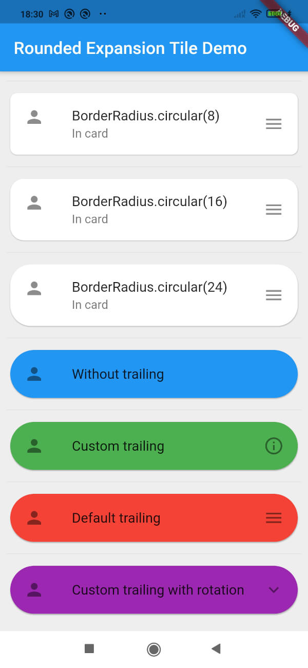
    The shape will be used for the shape of the ListTile, not for the children. This is visible when pressed and will be shown in the ink splash.

    Use the RoundedExpansionTile in a Card-widget with the same shape for the best result.

    Card(
        shape: RoundedRectangleBorder(borderRadius: BorderRadius.circular(16)),
        child: RoundedExpansionTile(
            shape: RoundedRectangleBorder(borderRadius: BorderRadius.circular(16)),
            title: Text('Some title'),
            children: [
                child1,
                child2,
                child3,
                ...
            ],
        ),
    ),
    
  • duration Duration()

    This will be used to show the expansion animation. It is used for the Expansion it self and the rotation / animation of the Icon. By default the duration is 500 milliseconds.

  • children List<Widget>[]

    The children that will be displayd when the ListTile is expanded.

  • childrenPadding EdgeInsets()

    The padding around the children. This is not the same as the contentpadding.

  • curve Curve()

    The curve used for the children animation. By default it uses Curves.fastLinearToSlowEaseIn

  • trailing Widget()

    When provided this will override the default hamburger menu icon (AnimatedIcon). This icon will rotate by default but can be set to false see rotateTrailing.

  • rotateTrailing bool

    Rotate the custom trailing icon when provided. By default this is true. When set to false the icon stays the same. Provide the trailing with an arrow down to make the widget look like the default ExpansionTile.

  • noTrailing bool

    When set to true there will be no trailing at all. Even when provided custom trailing this bool will prevent it from being shown.

Example

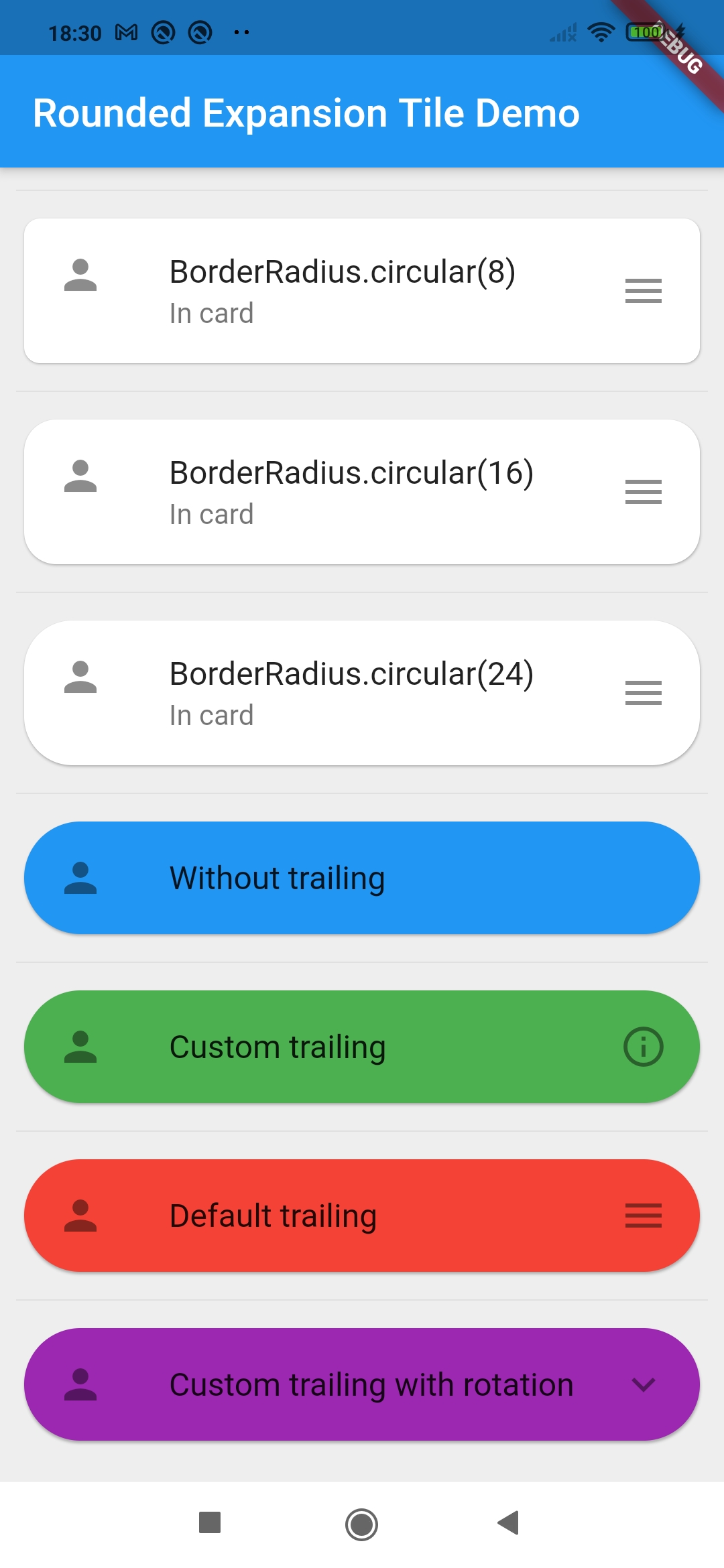
Screenshot of example app

Kategorien

Quell-Repository

Projekte, die dieses Paket verwenden

Noch keine Daten verfügbar.