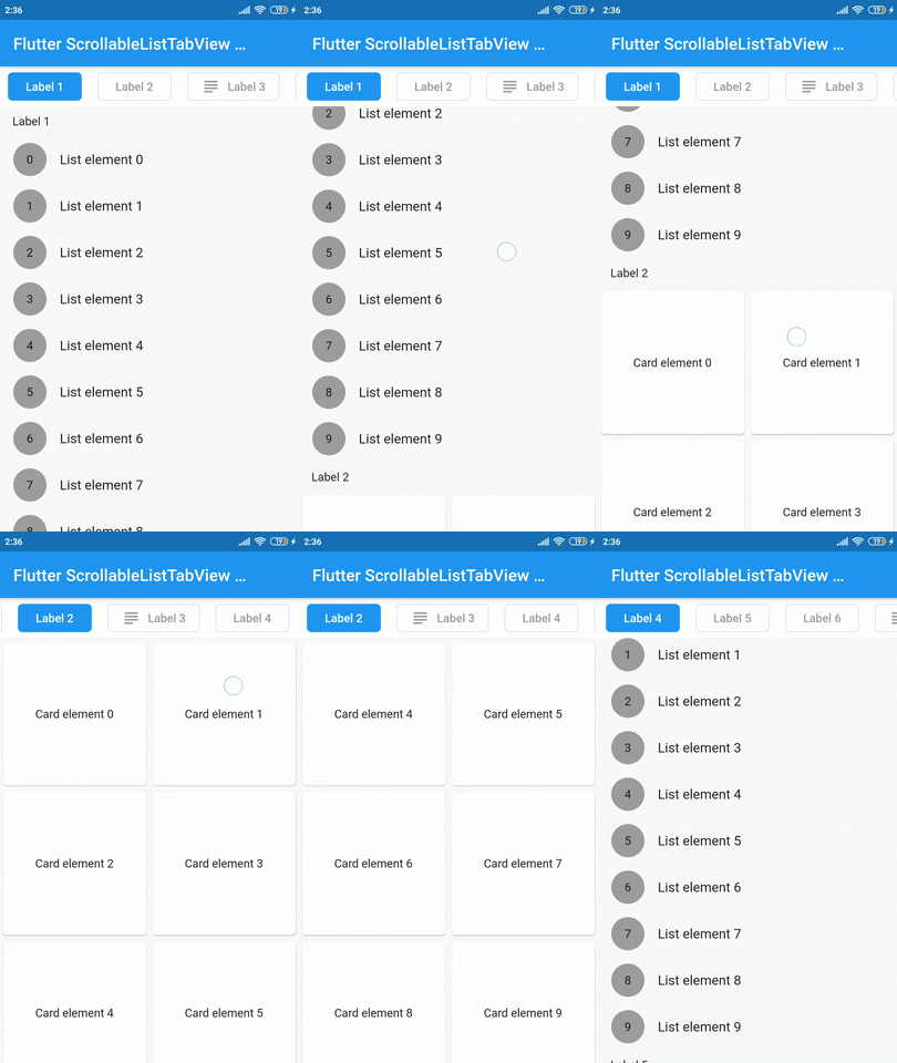
Aus öffentlichen Paketdaten erstellte Orientierung.
Ein Flutter-Widget, das eine scrollbare Liste mit einer benutzerdefinierten Tab-Ansicht synchronisiert und eine reibungslose Ausrichtung zwischen den beiden Komponenten gewährleistet. Es ermöglicht Benutzern, über das Scrollen durch Inhalte zu navigieren, während gleichzeitig die ausgewählte Registerkarte aktualisiert wird, und umgekehrt. Ideal für kohärente, interaktive Schnittstellen, bei denen Listenitems und Registerkarten eng miteinander verbunden sind. Das Paket ist leichtgewichtig und für nahtlose Integration in bestehende Flutter-Projekte konzipiert.
Anwendungsfälle
Synchronisierte Listen- und Tab-Navigation
Inhaltsreiche Dashboards erstellen
Geführte Onboarding-Flows erstellen
Implementierung von scrollbaren Registerkarten-Schnittstellen
Hauptmerkmale
Echtzeit-Synchronisierung zwischen Scrollen und Registerkarten
Anpassbare Tab-Stilisierung
Unterstützt dynamischen Inhalt
Einfache Integration mit bestehenden Widgets
Reaktionsfähiges Verhalten über Geräte hinweg
Geeignet für
Entwickler, die Tab-basierte Inhaltslayouts erstellen
Apps, die synchronisiertes Scrollen und Tab-Auswahl erfordern
UI-Designer, die interaktive Navigationsmuster suchen
Hinweise
Erfordert manuelle Handhabung der Tab-Element-Daten
Eingeschränkte plattformspezifische Optimierungen
Keine eingebauten Animationen
Nicht geeignet für hochkomplexe verschachtelte Navigationen
Original-README
Originaler README-Schnappschuss aus dem verknüpften Quell-Repository. Aktuelle Inhalte finden Sie im Repository.
scrollable_list_tabview
A Flutter widget which synchronize a ScrollView and a custom tab view.
The main idea is to create a custom tab view synchronizing with inner ScrollView. The scroll activity will trigger custom tab view at the top to follow the index of the inner scroll view widget.
Installation
Add dependency for package on your pubspec.yaml:
dependencies:
    scrollable_list_tabview: <latest>
Usage
To use this widget we must first define how our tabs will look like.
ListTab
Parameter
Definition
Widget icon
Trailing widget for a tab, typically an Icon.
Widget label
Label to be shown in the tab, must be non-null.
BorderRadiusGeometry borderRadius
BorderRadius value for a single tab.
Color activeBackgroundColor
Color to be used when the tab is selected.
Color inactiveBackgroundColor
Color to be used when the tab isn't selected.
bool showIconInList
Decide whether show icon widget in the scrollable view.
Color borderColor
Color of the border of tab when its not selected
Then we can use LisTab in ScrollableListTab.
ScrollableListTab
Parameter
Definition
ListTab tab
Data model used for rendering tab widgets.
ScrollView body
An individual inner scrollable widget.
Then ScrollableListTabView will take a list of ScrollableListTab as an argument.
ScrollableListTabView
Parameter
Definition
List<ScrollableListTab> tabs
List of tabs to be built.
double height
Height of the tab at the top of the view.
Duration tabAnimationDuration
Duration of tab change animation.
Duration bodyAnimationDuration
Duration of inner scroll view animation.
Curve tabAnimationCurve
Animation curve used when animating tab change.
Curve bodyAnimationCurve
Animation curve used when changing index of inner ScrollView(s).
There are some limitations on this package. For example we only support ScrollView to be the body. Also, we could have used builder pattern to build the widgets.
I would like to thank Google developers for creating awesome package called ScrollablePositionedList.
Contribution
Contributions are accepted via pull requests. For more information about how to contribute to this package, please check the contribution guide.
License
This project is licensed under the MIT license, additional knowledge about the license can be found here.