Aus öffentlichen Paketdaten erstellte Orientierung.
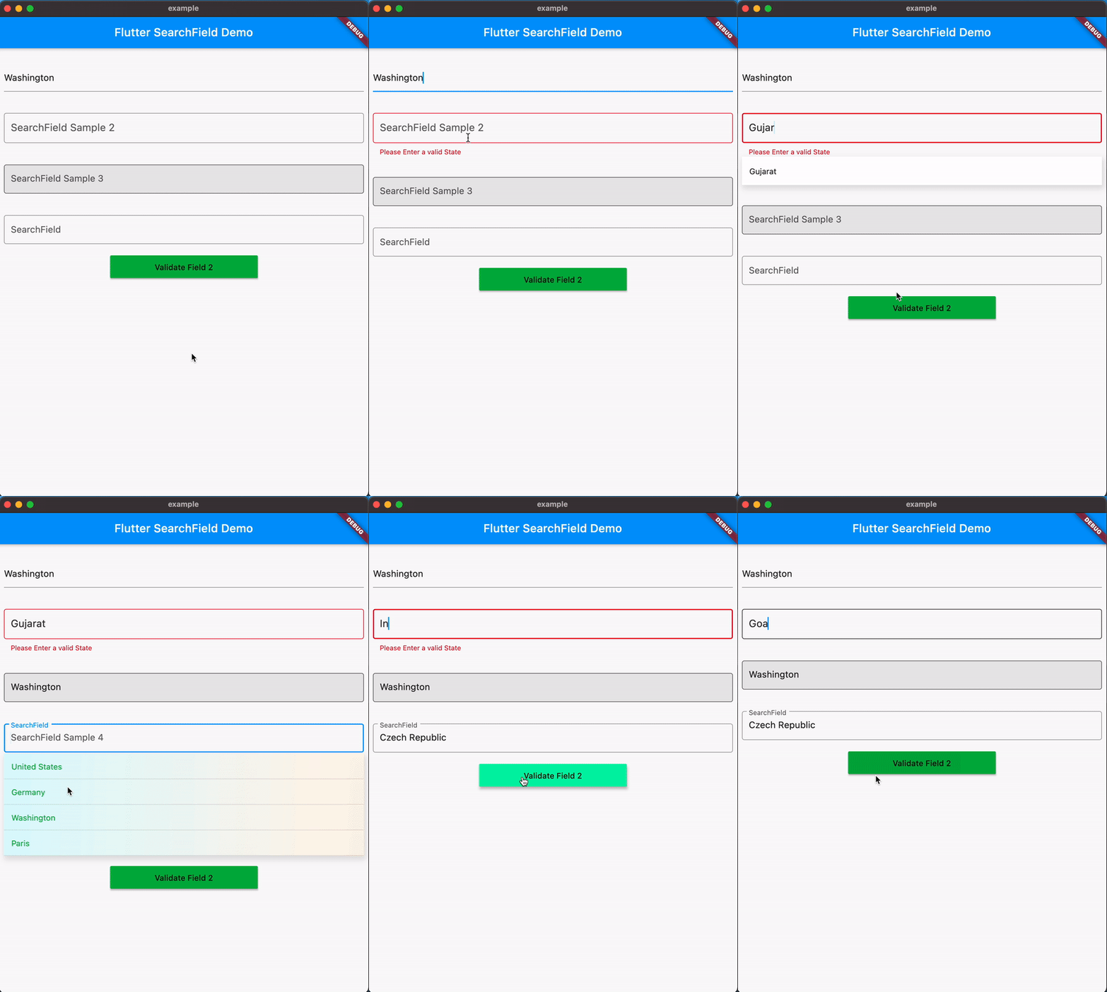
SearchField ist ein anpassbarer und intuitiver AutoComplete-Widget für Flutter, der entwickelt wurde, um die Suchfunktion in Apps zu vereinfachen. Er bietet eine saubere, einfach integrierbare Lösung zum Filtern und Anzeigen von Vorschlägen während der Eingabe. Dank Unterstützung auf allen wichtigen Plattformen – einschließlich Android, iOS, Web, macOS, Windows und Linux – sorgt er überall für konsistentes Verhalten. Das Paket betont Einfachheit, ohne Flexibilität einzubüßen, sodass Entwickler die Benutzeroberfläche und das Verhalten an ihre Bedürfnisse anpassen können.
Anwendungsfälle
Echtzeit-Suche in Listen
Formularingabe mit Vorschlagsdropdowns
Verbesserte Benutzererfahrung in datenintensiven Anwendungen
Dynamisches Filtern großer Datensätze
Anpassbarer Autocomplete für Formulare
Plattformübergreifende Suchkomponenten
Hauptmerkmale
Hochgradig anpassbare Erscheinung
Echtzeit-Filterung
Unterstützung für mehrere Plattformen
Einfache API mit minimalem Setup
Erweiterbar für benutzerdefinierte Logik
Eingebauter Tastatur- und Fokus-Manager
Geeignet für
Entwickler, die suchintensive Apps erstellen
Teams, die der plattformübergreifenden Konsistenz Priorität einräumen
Projekte, die leichtgewichtige Autovervollständigungslösungen benötigen
Benutzeroberflächenorientierte Anwendungen mit dynamischen Eingaben
Schnellprototypen mit interaktiver Suche
Hinweise
Kann zusätzliche Stilisierung für komplexe Designs erfordern
Die Leistung bei sehr großen Datensätzen hängt von der Implementierung ab
Begrenzte integrierte Validierungsfunktionen
Nicht ideal für erweiterte Filterung über die Textübereinstimmung hinaus
Benutzerdefinierte Rendering erfordert Verständnis von Flutter-Widgets
Original-README
Originaler README-Schnappschuss aus dem verknüpften Quell-Repository. Aktuelle Inhalte finden Sie im Repository.
@overridevoidinitState() {
cities = [
City('New York', '10001'),
City('Los Angeles', '90001'),
...
].map(
(City ct) {
returnSearchFieldListItem<City>(
// search will be performed on this value
ct.name,
// value to set in input on click, defaults to searchKey (optional)
value: ct.zip.toString(),
// custom object to pass in the suggestion list (optional)
item: ct,
// custom widget to show in the suggestion list (optional)
child: searchChild(ct, isSelected: false),
);
},
).toList();
super.initState();
}
Step 3: Add SearchField to your widget tree
SearchField(
hint: 'Search for a city or zip code',
maxSuggestionBoxHeight: 300,
onSuggestionTap: (SearchFieldListItem<City> item) {
setState(() {
selectedValue = item;
});
},
onSearchTextChanged: (searchText) {
if (searchText.isEmpty) {
return cities
}
// filter the list with your custom search logicfinal filter = List<SearchFieldListItem<City>>.from(cities)
.where((city) {
return city.item!.name
.toLowerCase()
.contains(searchText.toLowerCase()) ||
city.item!.zip.toString().contains(searchText);
}).toList();
return filter;
},
selectedValue: selectedValue,
suggestions: cities,
suggestionState: Suggestion.expand,
),
Customizing the Search Input
SearchField(
hint: 'Search for a city or zip code',
maxSuggestionBoxHeight: 300,
onSuggestionTap: (SearchFieldListItem<City> item) {
setState(() {
selectedValue = item;
});
},
selectedValue: selectedValue,
...
/// customize the search input with wide range of properties/// through SearchInputDecoration
searchInputDecoration: SearchInputDecoration(
prefixIcon: Icon(Icons.search),
suffix: Icon(Icons.expand_more),
border: OutlineInputBorder(
borderRadius: BorderRadius.all(Radius.circular(8)),
),
...
),
),
Customizing the Suggestions List
 SearchField(
    hint: 'Search for a city or zip code',
    maxSuggestionBoxHeight: 300,
    onSuggestionTap: (SearchFieldListItem<City> item) {
      setState(() {
        selectedValue = item;
      });
    },
    selectedValue: selectedValue,
    ...
    /// customize the decoration of the suggestions list
    suggestionsDecoration: SuggestionDecoration(
      border: Border.all(color: Colors.grey),
      hoverColor: Colors.grey.shade200,
      borderRadius: BorderRadius.all(Radius.circular(2)),
    ),
  ),
Customizing the Suggestions Item
 SearchField(
    hint: 'Search for a city or zip code',
    maxSuggestionBoxHeight: 300,
    onSuggestionTap: (SearchFieldListItem<City> item) {
      setState(() {
        selectedValue = item;
      });
    },
    selectedValue: selectedValue,
    ...
    /// customizes the decoration of each suggestion item
    suggestionItemDecoration: SuggestionDecoration(
      padding: EdgeInsets.all(8),
      borderRadius: BorderRadius.all(Radius.circular(2)),
      color: Colors.grey.shade200,
    ),
  ),
With v0.9.5 Searchfield now adds support for Keyboard navigation, you can now navigate through the suggestions using the keyboard.
Shortcuts:
Up/Down Arrow keys are circular, i.e. if you reach the last item and press down, it will take you to the first item. Similarly, if you reach the first item and press up, it will take you to the last item.
ctr/option + down to scroll to last item in the list
ctr/option + up to scroll to first item in the list
Support for Dynamic positioning of suggestions
The position of suggestions is dynamic based on the space available for the suggestions to expand within the viewport.
SearchFieldListItem
SearchFieldListItem is a generic class that is used to create the suggestions list. It takes a searchKey and an optional value and item which can be used to pass a custom object to the suggestion list.
searchKey required: This value is used to search the list, and will be shown in the suggestions list and also shown in input field when a suggestion is selected.
value optional: The value to set in the input on suggestion click,if not specified searchKey will be used
item optional: The custom object to pass in the suggestion list, this can be used to show a value different from the searchKey in the suggestion list.
child optional: The custom widget to show in the suggestion list, this can be used to pass a custom widget to the suggestion list.
Properties
animationDuration: Duration for the animation of the suggestions list.
autoCorrect: Defines whether to enable autoCorrect defaults to true
autofocus: Defines whether to enable autofocus defaults to false
autoValidateMode: Used to enable/disable this form field auto validation and update its error text.defaults to AutoValidateMode.disabled
contextmenubuilder: Creates a [FormField] that contains a [TextField]. When a [controller] is specified, [initialValue] must be null (the default). If [controller] is null, then a [TextEditingController] will be constructed automatically and its text will be initialized to [initialValue] or the empty string.
For documentation about the various parameters, see the [TextField] class and [TextField.new], the constructor.
controller: TextEditing Controller to interact with the searchfield.
comparator property to filter out the suggestions with a custom logic (Comparator is deprecated Use onSearchTextChanged instead).
dynamicHeight: Set to true to opt-in to dynamic height, defaults to false (itemHeight : 51)
emptyWidget: Custom Widget to show when search returns empty Results or when showEmpty is true. (defaults to SizedBox.shrink)
enabled: Defines whether to enable the searchfield defaults to true
focusNode : FocusNode to interact with the searchfield.
hint : hint for the search Input.
readOnly : Defines whether to enable the searchfield defaults to false
selectedValue : The initial value to be set in searchfield when its rendered, if not specified it will be empty.
inputType: Keyboard Type for SearchField
inputFormatters: Input Formatter for SearchField
itemHeight : height of each suggestion Item, (defaults to 51.0).
keepSearchOnSelection: Boolean to keep the search text in the searchfield when a suggestion is selected. Defaults to false.
marginColor : Color for the margin between the suggestions.
maxSuggestionBoxHeight: Specifies a maximum height for the suggestion box when dynamicHeight is set to true.
maxSuggestionsInViewPort : The max number of suggestions that can be shown in a viewport.
offset : suggestion List offset from the searchfield, The top left corner of the searchfield is the origin (0,0).
onOutSideTap : callback when the user taps outside the searchfield.
onSaved : An optional method to call with the final value when the form is saved via FormState.save.
onScroll : callback when the suggestion list is scrolled. It returns the current scroll position in pixels and the max scroll position.
onSearchTextChanged: callback when the searchfield text changes, it returns the current text in the searchfield.
onSuggestionTap : callback when a sugestion is tapped, it returns the tapped value which can be used to set the selectedValue.
onSubmit : callback when the searchfield is submitted, it returns the current text in the searchfield.
onTap: callback when the searchfield is tapped or brought into focus.
scrollbarDecoration: decoration for the scrollbar.
scrollController: ScrollController to interact with the suggestions list.
showEmpty: Boolean to show/hide the emptyWidget.
suggestions(required) : List of SearchFieldListItem to search from.
each SearchFieldListItem in the list requires a unique searchKey, which is used to search the list and an optional Widget, Custom Object to display custom widget and to associate a object with the suggestion list.
suggestionState: enum to hide/show the suggestion on focusing the searchfield defaults to SuggestionState.expand.
searchStyle : textStyle for the search Input.
searchInputDecoration : decoration for the search Input (e.g to update HintStyle) similar to built in textfield widget.
suggestionsDecoration : decoration for suggestions List with ability to add box shadow background color and much more.
suggestionDirection : direction of the suggestions list, defaults to SuggestionDirection.down.
suggestionItemDecoration : decoration for suggestionItem with ability to add color and gradient in the background.
SuggestionAction : enum to control focus of the searchfield on suggestion tap.
suggestionStyle:Specifies TextStyle for suggestions when no child is provided.
textInputAction : An action the user has requested the text input control to perform throgh the submit button on keyboard.
textCapitalization : Configures how the platform keyboard will select an uppercase or lowercase keyboard on IOS and Android.
textAlign: specifies the alignment of the text in the searchfield. Defaults to TextAlign.start.