Aus öffentlichen Paketdaten erstellte Orientierung.
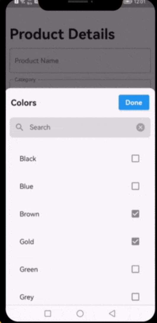
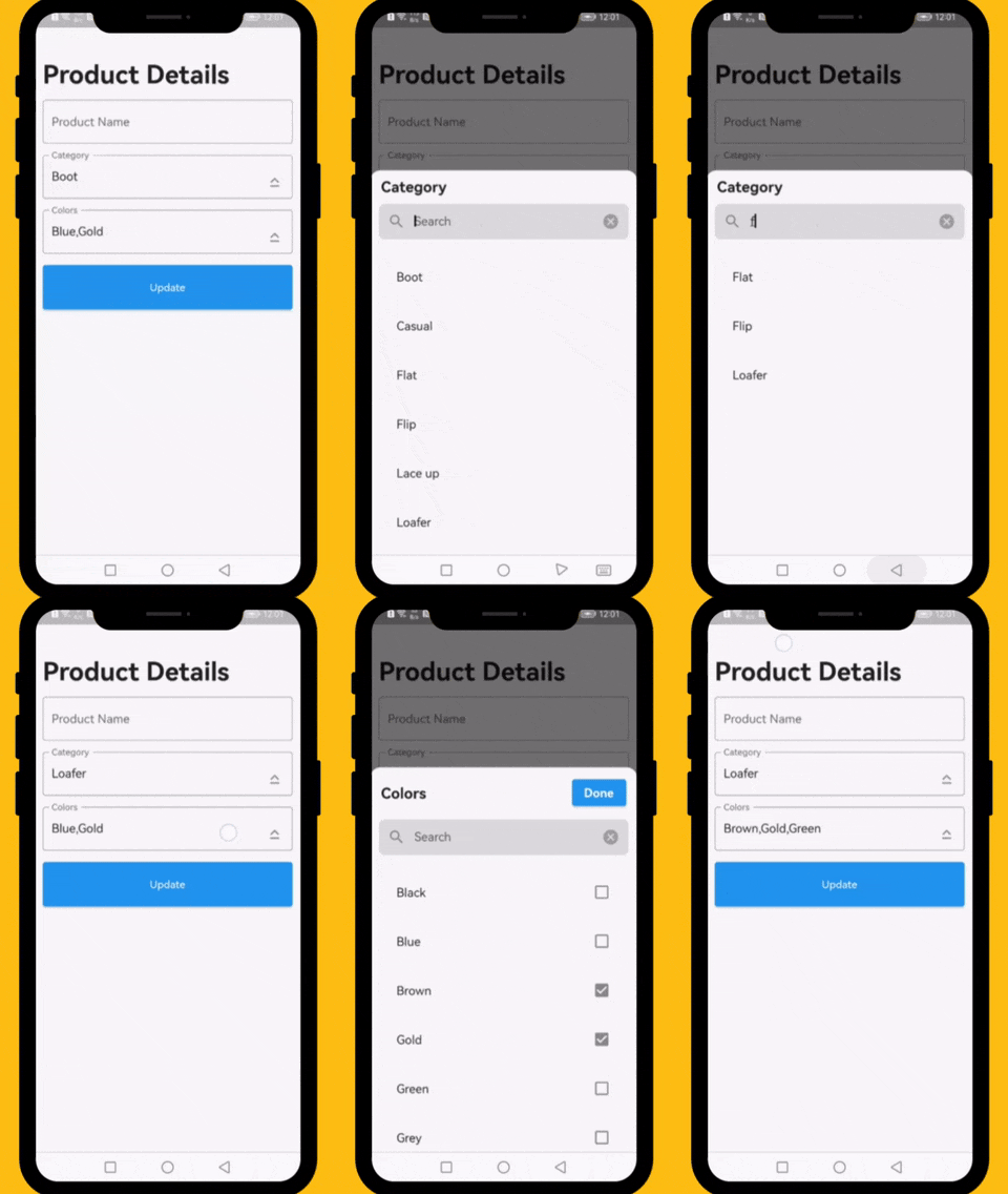
Ein Flutter-Widget, das den Prozess des Suchens in einer Dropdown-Liste mit einzelnen oder mehreren Optionen vereinfacht. Es bietet eine intuitive, durchsuchbare Oberfläche, die die Benutzererfahrung beim Auswählen aus großen Datensätzen verbessert. Das Widget ist hochgradig anpassbar und unterstützt verschiedene Plattformen wie Android, iOS, Web, macOS, Windows und Linux. Ideal für Formulare und Daten-Eingabeschnittstellen, die eine effiziente Filterung und Auswahl erfordern.
Anwendungsfälle
Formularingaben mit großen Optionslisten
Dynamische Filterung in Admin-Dashboards
Benutzerprofil-Einrichtung mit Kategorieauswahl
suchbare Mehrfachauswahl-Menüs
Daten-Eingabe-Anwendungen mit umfangreichen Auswahlmöglichkeiten
Hauptmerkmale
Echtzeit-Suchfilterung
Unterstützung für einzelne und mehrfache Auswahl
Plattformübergreifende Kompatibilität
Anpassbare Benutzeroberfläche und Gestaltung
Einfache Integration in bestehende Formulare
Leicht und leistungsstark
Geeignet für
Entwickler, die datenintensive Anwendungen erstellen
Teams, die responsive Suchoberflächen benötigen
Projekte, die mehrfachauswahl-Menüs erfordern
UI/UX-fokussierte Flutter-Anwendungen
Anwendungen für mehrere Betriebssysteme
Hinweise
Kann zusätzliche Stilisierung für komplexe Themen erfordern
Eingeschränkte integrierte Überprüfungsfeatures
Die Leistung hängt von der Größe des Datensatzes ab
Nicht für extrem große Datensätze ohne Paginierung optimiert
Benötigt manuelle Behandlung von Auswahlrückrufen
Original-README
Originaler README-Schnappschuss aus dem verknüpften Quell-Repository. Aktuelle Inhalte finden Sie im Repository.
Dropdown Searchable List Choices
A very useful widget for searching through single or multiple options from a drop-down list.
Platforms
This plugin has been successfully tested on iOS, Android & web.
Examples
The following examples are extracted from the example project available in the repository. More examples are available in this project.
This property takes List as a parameter and it is useful to display items in drop down list.
Optional parameters
listBuilder:
This property takes int value as a parameter. This is use to set the initial segment from [segmentNames].
enableMultipleSelection:
This property takes Color value as a parameter. You can change the background color of animated segment.
bottomSheetTitle:
This gives the bottom sheet title.
submitButtonChild:
You can set your custom submit button when the multiple selection is enabled.
selectedItems:
This will give the call back to the selected items from list.
dropDownBackgroundColor:
This will set the background color to the Dropdown Searchable.
searchWidget:
This property takes TextFormField value as a parameter. [searchWidget] is use to show the text box for the searching. If you are passing your own widget then you must have to add [TextEditingController] for the [TextFormField].
isSearchVisible:
This property takes bool value as a parameter. [isSearchVisible] is use to manage the search widget visibility. by default it is [True] so widget will be visible.
I would be happy if you send us feedback on your projects where you use our component. Just email amir.email@gmail.com and let me know if you have any questions or suggestions about my work.