Pakete, Repositories und App-Kategorien suchen

Cover von selector_wheel
Paketdetailsv1.1.2

selector_wheel

Ein Flutter-Paket zum Erstellen eines anpassbaren Wertauswahlrads.

AndroidiOSWebmacOSWindowsLinux
30-Tage-Downloads
174
Likes
30
Pub-Punkte
130

Paket installieren

flutter pub add selector_wheel

Paketübersicht

Aus öffentlichen Paketdaten erstellte Orientierung.

Ein Flutter-Paket, das die Erstellung anpassbarer, interaktiver Wertewählerräder für die Benutzereingabe ermöglicht. Es bietet eine visuell ansprechende Möglichkeit, Werte aus einem drehbaren Rad auszuwählen, ideal für Einstellungen, Timer oder jede Situation, die eine intuitive numerische oder kategorische Auswahl erfordert. Das Rad unterstützt reibungslose Animationen, benutzerdefinierte Gestaltung und reaktionsschnelles Verhalten über Plattformen hinweg. Es ist für Entwickler konzipiert, die eine Alternative zu herkömmlichen Textfeldern oder Dropdowns mit verbesserter Benutzererfahrung suchen.

Anwendungsfälle

  • Formulareingaben mit visueller Rückmeldung
  • Zeit- oder Mengenauswahl
  • Gamifizierte Benutzeroberflächen
  • Einstellungen mit einstellbaren Parametern
  • Interaktive Lernwerkzeuge

Hauptmerkmale

  • Anpassbare Radaussehen
  • Glatte Rotationsanimationen
  • Reaktionsfähige Touch- und Drag-Unterstützung
  • Unterstützung für diskrete und kontinuierliche Werte
  • Plattformübergreifende Kompatibilität

Geeignet für

  • Entwickler, die interaktive Benutzeroberflächen erstellen
  • Apps, die eine intuitive Wertauswahl benötigen
  • Designer, die einzigartige Formularelemente wünschen
  • Projekte für mehrere Plattformen

Hinweise

  • Kann eine Leistungsoptimierung auf Geräten mit geringer Leistung erfordern
  • Eingeschränkte eingebaute Validierung
  • Nicht für sehr große Wertebereiche optimiert
  • Erfordert sorgfältige Gestaltung für Barrierefreiheit

Original-README

Originaler README-Schnappschuss aus dem verknüpften Quell-Repository. Aktuelle Inhalte finden Sie im Repository.

Selector Wheel

pub package codecov

A Flutter package for creating customizable selector wheel widgets.

Table of Contents

Features

  • Customizable selector wheel widget
  • Supports variable wheel size, item width, item height, and more
  • Built with Flutter's best practices for optimal performance
  • Supports haptic feedback, fade-out effect, and more
  • Can be used with any data type

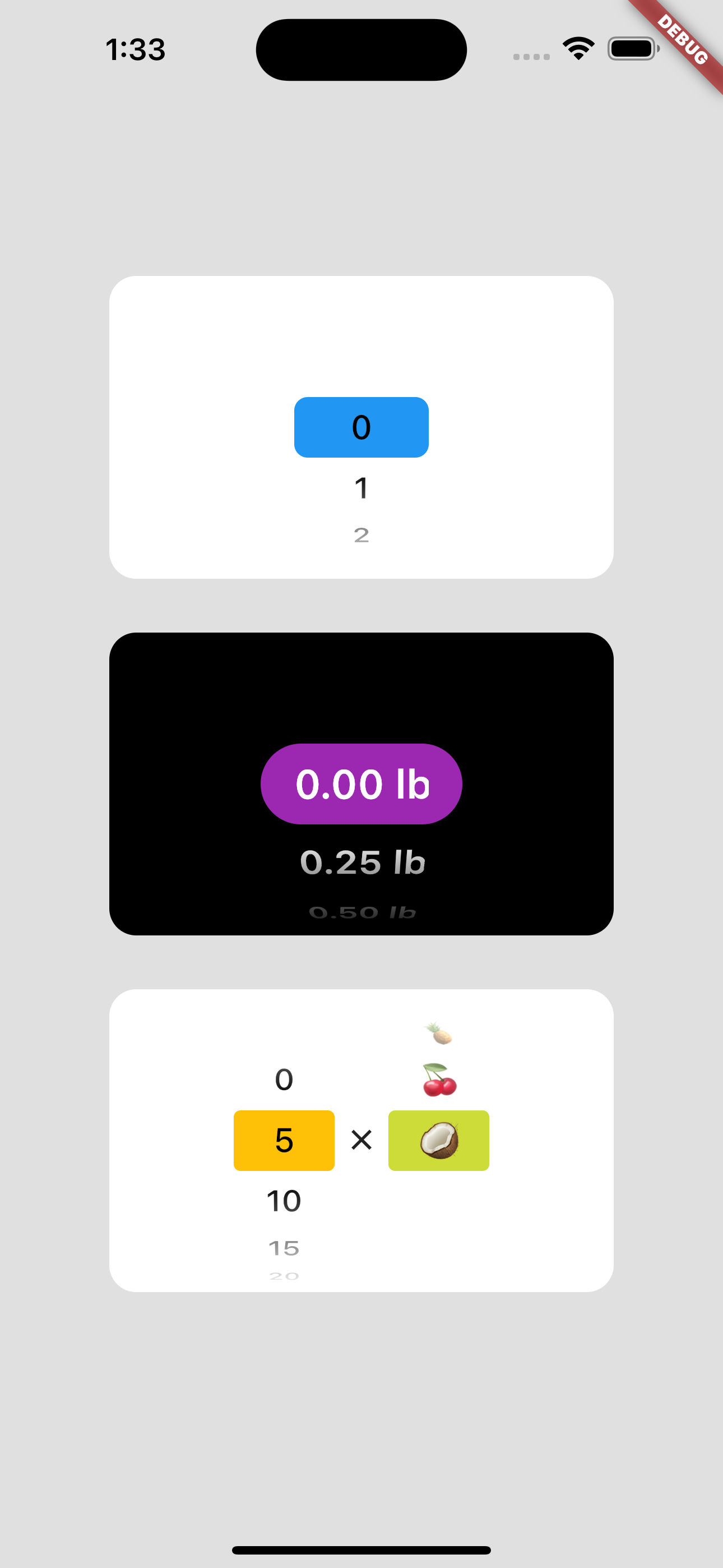
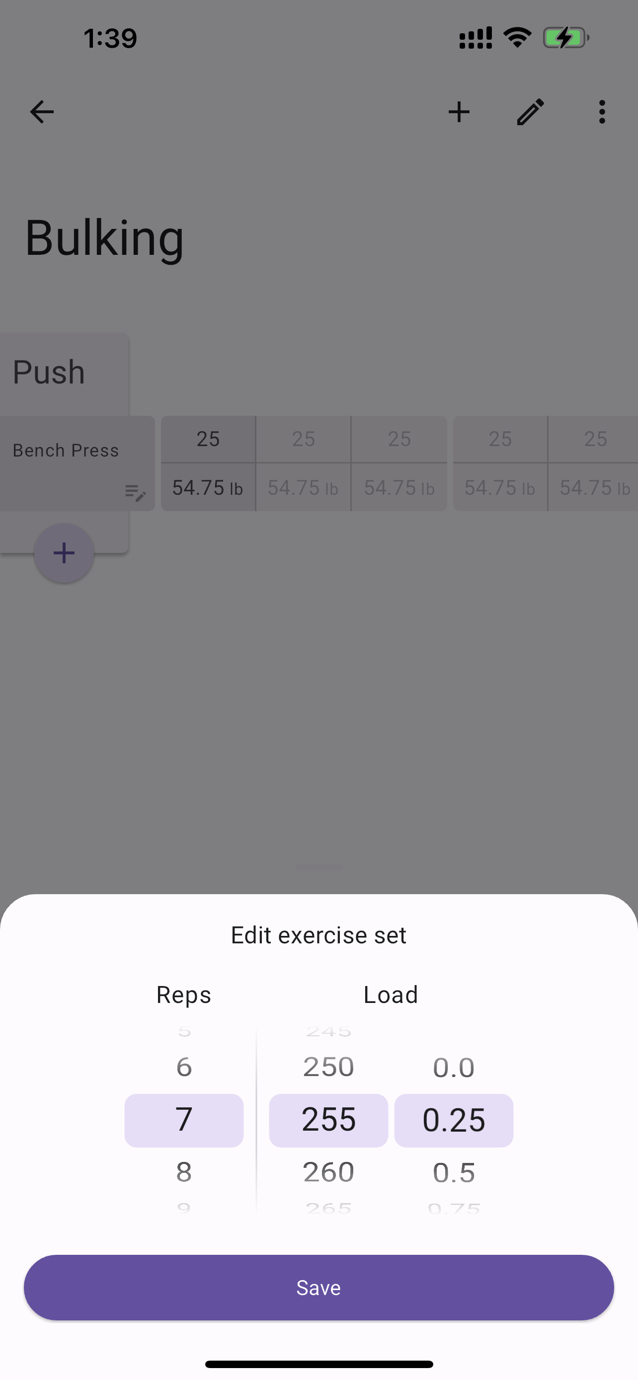
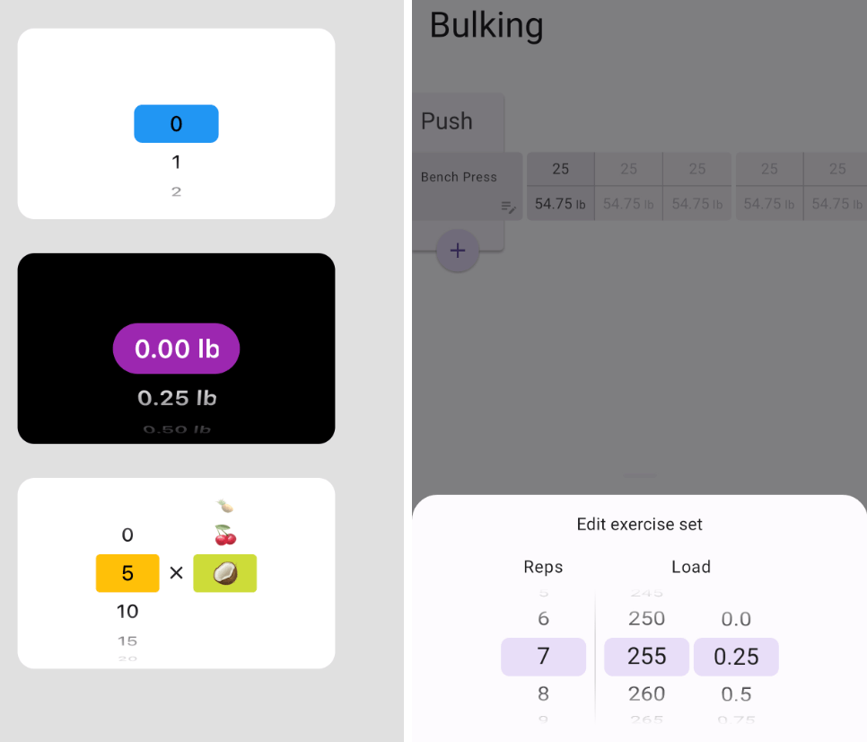
Usage example regular Usage example with bottom sheet

Getting started

Add selector_wheel to your pubspec.yaml by running the following command:

flutter pub add selector_wheel

Usage

Import the package:

import 'package:selector_wheel/selector_wheel.dart';
Basic usage

Use the SelectorWheel widget in your app:

SizedBox(
  width: 200,
  height: 200,
  child: SelectorWheel(
    childCount: 10,
    // convertIndexToValue is a function that converts the index of the
    // child to a value that is displayed on the selector wheel. In this
    // case, we are converting the index to a string. I.e we'll have
    // 0, 1, 2, 3, 4, 5, 6, 7, 8, 9 on the selector wheel.
    convertIndexToValue: (int index) {
      return SelectorWheelValue(
        label: index.toString(),
        value: index,
        index: index,
      );
    },
    onValueChanged: (SelectorWheelValue<int> value) {
      // print the value that was selected
      print(value);
    },
  ),
)
Customizing the selector wheel

Keep in mind, that the convertIndexToValue function can be used to convert the index to any value. In the example below, we are converting the index to a double value to represent quarter lbs.

SizedBox(
  width: 200,
  height: 200,
  child: SelectorWheel(
    childCount: 10,
    convertIndexToValue: (int index) {
      // This is just to illustrate, that the index can be converted
      // to any value. In this case, we are converting the index to
      // a quarter of a pound.
      final quarter = index / 4;

      return SelectorWheelValue(
        // The label is what is displayed on the selector wheel
        label: '${quarter.toString()} lb',
        value: quarter,
        index: index,
      );
    },
    onValueChanged: (SelectorWheelValue<double> value) {
      // print the value that was selected
      print(value);
    },
  ),
)

The colors of the selector wheel can be customized by overriding the ThemeData in the following way:

// Overriding the colors of the selector wheel
Theme(
  data: ThemeData(
    textTheme: Theme.of(context).textTheme.copyWith(
      titleLarge: Theme.of(context).textTheme.titleLarge?.copyWith(
        fontSize: 24.0,
        fontWeight: FontWeight.w600,
      ),
    ),
    colorScheme: Theme.of(context).colorScheme.copyWith(
      surface: Colors.black,
      onSurface: Colors.white,
      secondaryContainer: Colors.amber,
    ),
  ),
  child: SizedBox(
    width: 200,
    height: 200,
    child: SelectorWheel(
      childCount: 10,
      highlightBorderRadius: 16.0,
      highlightHeight: 40.0,
      highlightWidth: 100.0,
      convertIndexToValue: (int index) {
        return SelectorWheelValue(
          label: index.toString(),
          value: index,
          index: index,
        );
      },
      onValueChanged: (value) {
        // print the value that was selected
        print(value);
      },
    ),
  ),
)

Notice, that we're also customizing the "highlighted" item's border radius, height, and width. To see all the customizable properties, check out the SelectorWheel class.

Contributing

Contributions are welcome! If you find a bug or have a feature request, please open an issue on the GitHub repository.

License

This package is licensed under the MIT License. For more details, please refer to the LICENSE file included in the repository.

Kategorien

Abhängigkeiten

Abhängigkeiten 3 Einträge

Quell-Repository

Projekte, die dieses Paket verwenden

Noch keine Daten verfügbar.