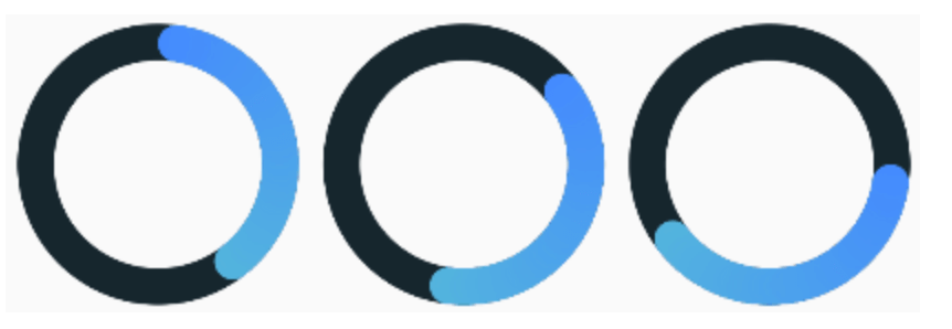
Aus öffentlichen Paketdaten erstellte Orientierung.
Ein leichtgewichtiger, Open-Source-Flutter-Paket zur Erstellung einfacher kreisförmiger Fortschrittsindikatoren. Es bietet eine saubere und anpassbare Möglichkeit, Ladezustände oder Fortschritte mit minimalem Aufwand anzuzeigen. Das Paket unterstützt alle wichtigen Plattformen wie Android, iOS, Web, macOS, Windows und Linux. Für Entwickler, die eine einfach zu verwendende Alternative zu komplexen Fortschritts-UIs suchen, bietet es reibungslose Animationen und einfache Konfigurationsoptionen. Ideal für Formulare, Datenladebildschirme oder jede Situation, die visuelle Rückmeldung über laufende Prozesse erfordert.
Anwendungsfälle
Ladezustandsanzeiger
Formular-Einreichungsfortschritt
Datenabruf-Visualisierung
Spiel- oder App-Level-Fortschritt
Anpassbare Benutzeroberflächenelemente
Hauptmerkmale
Einfache API
Plattformübergreifende Unterstützung
Glatte Animationen
Anpassbare Farben und Größen
Minimale Abhängigkeiten
Einfache Integration
Geeignet für
Anfänger-Flutter-Entwickler
Einfache Lade-UIs
leistungsensitive Anwendungen
Schnellprototypen
Apps, die leichte Fortschrittsanzeigen benötigen
Hinweise
Eingeschränkte Anpassungsmöglichkeiten im Vergleich zu erweiterten Paketen
Keine integrierten Textbeschriftungen
Nicht geeignet für komplexe Fortschrittsverfolgung
Erfordert manuelle Behandlung dynamischer Werte
Am besten geeignet für grundlegende Anforderungen an Kreisfortschritt
Original-README
Originaler README-Schnappschuss aus dem verknüpften Quell-Repository. Aktuelle Inhalte finden Sie im Repository.
Simple circular progress bar
Open source Flutter package, simple circular progress bar.
The maximum value of the progress bar. The values will vary from 0 to [maxValue].
startAngle double
0
The angle from which the countdown of progress begins.
progressStrokeWidth double
15
Thickness of the progress line.
backStrokeWidth double
15
Line thickness of the background circle. If you don't need a background circle, set this parameter to 0.
progressColors List
Progress bar can be either with or without a gradient. For a gradient, specify more than one color in the [progressColors] field and if a gradient is not needed specify only one color.
fullProgressColor Color
The color of the circle at 100% value. It only works when [mergeMode] equal to true.
backColor Color
The color of the background circle.
animationDuration int
Duration(seconds: 6)
Animation duration. If you don't need animation, set this parameter to zero Duration.
mergeMode bool
false
When this mode is enabled the progress bar with a 100% value forms a full circle with [fullProgressColor]. If no [fullProgressColor] is specified, the last color from [progressColors] is taken.
valueNotifier ValueNotifier
The object designed to update the value of the progress bar. By default, creates a ValueNotifier with the maximum value.
onGetText Text Function(double)
Callback to generate a new Text widget located in the center of the progress bar. The callback input is the current value of the progress bar.
YouTube video
You can see how the application works from the example in this video.