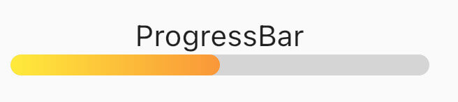
Einfaches Paket für Fortschrittsindikatoren mit festen Farben und Verläufen. Kann zur Anzeige von Fortschritt oder für einfache Animationen verwendet werden.
Aus öffentlichen Paketdaten erstellte Orientierung.
Ein leichtgewichtiges Flutter-Paket mit einfachen Fortschrittsindikatoren in festen Farben und Gradientenunterstützung. Ideal zum Anzeigen von Ladezuständen oder zur Erstellung subtiler Animationen in Apps. Das Paket ist einfach zu integrieren und bietet saubere, anpassbare visuelle Rückmeldungen auf mehreren Plattformen. Es unterstützt Android, iOS, Web, macOS, Windows und Linux und ist somit vielseitig für die plattformübergreifende Entwicklung. Entwickelt für Entwickler, die minimalistische, aber effektive Fortschrittsvisualisierungen ohne komplexe Konfigurationen suchen.
Anwendungsfälle
Ladezustandsanzeiger
Animierte Fortschrittsanzeige
Einfache Benutzeroberflächenrückmeldung
Plattformübergreifende Fortschrittsbalken
Anpassbare Ladeanimationen
App-Startbildschirme
Hauptmerkmale
Feste Farbverlaufsbalken
Gradientenunterstützung
Minimale Konfiguration
Plattformübergreifende Kompatibilität
Einfache Integration
Leichtes Format
Geeignet für
Anfänger-Flutter-Entwickler
Einfache App-Oberflächen
Verbesserungen der Ladebenutzererfahrung
Schnellprototypen
Apps, die leichtgewichtige Indikatoren benötigen
Visuelle Rückmeldung in Formularen oder Downloads
Hinweise
Begrenzte Anpassungsmöglichkeiten
Keine erweiterten Stilmerkmale
Nicht geeignet für komplexe Animationen
Am besten geeignet für grundlegende Fortschrittsanforderungen
Keine integrierten Pausen-/Fortsetzungssteuerungen
Abhängig von der externen Abhängigkeitsverwaltung
Original-README
Originaler README-Schnappschuss aus dem verknüpften Quell-Repository. Aktuelle Inhalte finden Sie im Repository.
Simple progress indicators package with solid colors and gradients. Can be used to show progress or for simple progress bar animation.
ProgressBar is a basic linear indicator widget. It's a Stateless Widget that produces basic horizontal rounded rectangle with optional background rounded rectangle underneath.
Include it in your build method like:
backgroundColor - solid indicator background color, defaults to transparent
Minimum working widget requires only a value and color OR gradient property. NOTE: Specifying both properties is not accepted.
ProgressBarAnimation
ProgressBarAnimation is a simple animating progress bar widget.
It animates ProgressBar widget for a given duration.
Animation starts at the time the widget is built.
AnimatedProgressBar is a ImplicitlyAnimatedWidget. It behaves like other flutter AnimatedFoo widgets. This animates value parameter changes for a given duration. Animation starts only when one (initial) value changes to other (final) value. See the example below.
It has several configurable parameters:
value - value widget animates to, need to be changed
duration - initial value to final value animation duration