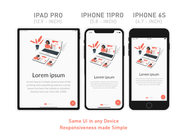
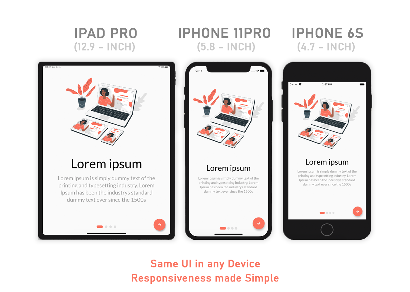
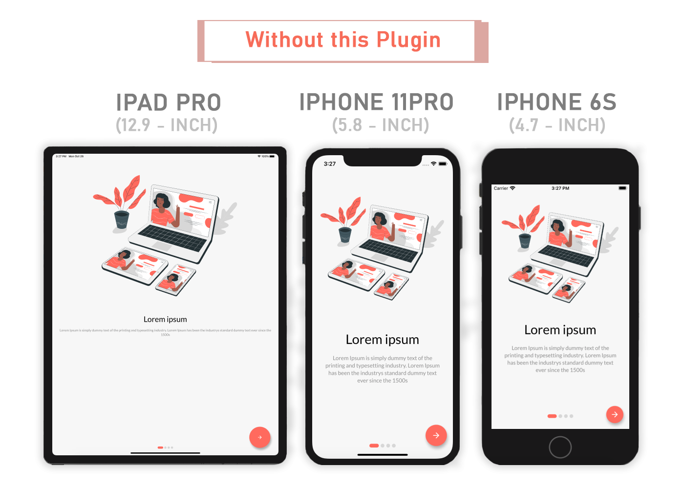
Aus öffentlichen Paketdaten erstellte Orientierung.
Sizer ist ein Flutter-Paket, das die Gestaltung von responsive Benutzeroberflächen auf mobilen, Web- und Desktop-Plattformen vereinfacht. Es bietet eine einfache Möglichkeit, Layouts zu erstellen, die sich nahtlos an verschiedene Bildschirmgrößen und -ausrichtungen anpassen, indem logische Einheiten basierend auf den Bildschirmabmessungen des Geräts verwendet werden. Mit Sizer können Entwickler Größen relativ zur Bildschirmbreite und -höhe definieren, wodurch eine konsistente Darstellung unabhängig vom Gerätetyp oder der Auflösung gewährleistet wird. Das Paket lässt sich problemlos in bestehende Projekte integrieren und erfordert nur minimale Einstellungen, was es ideal für skalierbare und wartbare Benutzeroberflächen macht.
Anwendungsfälle
Plattformübergreifende responsive Apps erstellen
Anpassbare Layouts für mehrere Bildschirmgrößen erstellen
Konsistente UI-Skalierung auf Mobilgeräten und Desktop sicherstellen
Einfachere responsive Gestaltung ohne komplexe Medienabfragen
Layouts gestalten, die sowohl auf kleinen Smartphones als auch auf großen Desktop-Bildschirmen funktionieren
Hauptmerkmale
Automatische Bildschirmgrößenanpassung
Unterstützung für alle wichtigen Plattformen (Android, iOS, Web, macOS, Windows, Linux)
Einfach zu verwendende skalenbasierte Größenanpassung
Eingebaute Ausrichtungsverwaltung
Minimale Boilerplate-Anforderung
Geeignet für
Entwickler, die mehrere Plattformen ansprechen
Teams, die UI-Konsistenz priorisieren
Projekte, die eine schnelle Implementierung von responsive Layouts erfordern
Anfänger lernen responsive Flutter-Design
Apps, die eine dynamische Skalierung über verschiedene Geräte erfordern
Hinweise
Kann eine anfängliche Anpassung bereits vorhandener hartcodierter Werte erfordern
Am besten mit einem konsistenten Design-System verwenden
Nicht ideal für hochgradig angepasste oder nicht einheitliche Skalierungsanforderungen
Beschränkt auf größenbasierte Reaktionsfähigkeit, nicht auf Layoutstrukturänderungen
Erfordert Verständnis der Prinzipien der logischen Pixelskalierung
Original-README
Originaler README-Schnappschuss aus dem verknüpften Quell-Repository. Aktuelle Inhalte finden Sie im Repository.
Sizer (Responsive UI solution for Mobile App,Web and Desktop)
Looking for Flutter development support? Let’s connect — available on WhatsApp and Email.
A Flutter package that simplifies responsive design by automatically adapting your app’s UI to any screen size — making responsiveness seamless and intuitive.
Same layout to look different in tablet and mobile, use the Device.screenType method:
Device.screenType == ScreenType.tablet
  ? Container(   // Widget for Tablet
      width: 100.w,
      height: 20.5.h,
   )
  : Container(   // Widget for Mobile
      width: 100.w,
      height: 12.5.h,
   )
*Device.ScreenTypecan not be Desktop unless maxTabletWidth is set
Guideline
Sizer
maxMobileWidth - Maximum width of a mobile device
(If the device's width is larger than this, it will be categorized as a tablet) - Default value: 599
maxTabletWidth - Maximum width of a tablet device
(If the device's width is larger than this, it will be categorized as a desktop) - Optional: enables DesktopScreenType if enabled
Extensions
Adaptive.h() or .h - Calculated percentage of the device's height (40.h -> 40% of device's height)
Adaptive.w() or .w - Calculated percentage of the device's width (40.w -> 40% of device's width)
Adaptive.sp() or .sp - Calculated sp based on the device's pixel density and aspect ratio (See FAQ)
Adaptive.dp() or .dp - Calculated dp based on the device's pixel density (See FAQ)
*Note: Only use .sh and .sw if you want height and width to depend on the device's available height and width after applying SafeArea. Use .h and .w by default.
Adaptive.sh() or .sh - Calculated percentage of the remaining device's height after applying SafeArea
Adaptive.sw() or .sw - Calculated percentage of the remaining device's width after applying SafeArea
Device.boxConstraints - BoxConstraints of the device
Device.orientation - Screen Orientation of the device (portrait or landscape)
Device.screenType - Screen type of the device (mobile or tablet)
Device.aspectRatio - Aspect ratio of the device
Device.pixelRatio - Pixel density ratio of the device
Adaptive.cm() or .cm - The respective value in value in centimeters
Adaptive.mm() or .mm - The respective value in value in millimeters
Adaptive.Q() or .Q - The respective value in quarter-millimeters
Adaptive.inches() or .inches - The respective value in inches
Adaptive.pc() or .pc - The respective value in picas (1/6th of 1 inch)
Adaptive.pt() or .pt - The respective value in points (1/72th of 1 inch)
Adaptive.px() or .px - The respective value in pixels
Note
You need to import sizer package in order to access number.h, number.w, number.dp, and number.sp
Auto import in VSCode and Android Studio doesn't work for dart extension methods. Typing 10.h would not bring up auto import suggestion for this package
One workaround is to type Device so that the auto import suggestion would show up:
Why is dp not calculated using the device's screen density?
Since there is no way to obtain a device's physical width in inches, we could not calculate for screen density. Material Design's screen density calculation involves a device's physical width in inches. As an alternative, dp is calculated using the device's pixel ratio.
Community Support
If you have any suggestions or issues, feel free to open an issue
If you would like to contribute, feel free to create a PR