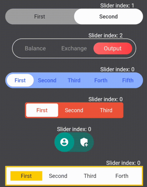
Aus öffentlichen Paketdaten erstellte Orientierung.
Ein Flutter-Paket zum Erstellen anpassbarer Schiebeschalter, das umfassende Kontrolle über Aussehen und Verhalten bietet. Es ermöglicht Entwicklern, interaktive Umschaltknöpfe mit sanften Animationen, benutzerdefinierten Farben, Formen und Größen zu erstellen. Ideal für Einstellungsbereiche, Themenumschalter oder jede Benutzeroberfläche, die eine visuelle Ein-/Ausschaltänderung erfordert. Das Paket unterstützt alle wichtigen Plattformen, einschließlich Mobilgeräte, Web und Desktop, und sorgt für konsistente Erfahrungen über Plattformen hinweg. Mit intuitiven Konfigurationsoptionen vereinfacht es die Umsetzung moderner, reaktiver Schaltflächen-Interfaces.
Anwendungsfälle
Themenwechsler
Einstellungspanels
Ein/Aus-Steuerung
Formulareingaben
Benutzereinstellungsauswahl
Hauptmerkmale
Anpassbare Farben
Glatte Animationen
Mehrere Größenoptionen
Plattformübergreifende Unterstützung
Konfigurierbare Spur und Daumen
Zustandspersistenz
Geeignet für
Entwickler, die Einstellungs-UIs erstellen
Designer, die interaktive Schalter benötigen
Apps mit Dunkel-/Hellmodus
Plattformübergreifende Anwendungen
Benutzerdefinierte Formularkomponenten
Hinweise
Erfordert Verständnis des Flutter-Widgetbaums
Möglicherweise sind zusätzliche Stile für komplexe Layouts erforderlich
Nicht für hohe Häufigkeit von Zustandsänderungen optimiert
Original-README
Originaler README-Schnappschuss aus dem verknüpften Quell-Repository. Aktuelle Inhalte finden Sie im Repository.
Library for creating and customizing sliders
Widget customization variations
Here are some examples of the library's features:
First I suggest you get familiar with what container and sliders are in the library
The library lets you change the style of containers and sliders using the fields in the table below
List and description of the functionality:
Fields
Description
children
Widgets that placed inside sliders / required
onSelect
The function takes an index variable that changes depending on the index of the current slider / required
containerHeight
Container height / required
containerWight
Container width / required
slidersColors
The color of each slider. A single color in the array will fill all sliders / white by default
slidersGradients
The gradient of each slider. A single gradient in the array will fill all sliders
containerBorder
Container border widget
slidersBorder
Slider border widget
containerBorderRadius
Container corner rounding radius
containerColor
Container fill color / grey by default
indents
Indents between the container and sliders (the same on all sides) / 0 by default
direction
Defining the direction of the slider swipe / horizontal by default
isAllContainerTap
A shadow cast by a box
containerBoxShadow
Ability to tap on the current slider and change its index to the opposite (available only for 2 children) / false by default
initialIndex
Initial index of the slider, which is rendering for the first time
Creating your own SlideSwitcher
SlideSwitcher is an ordinary widget. In order to create it you have to specify the obligatory parameters:
"children" - texts, icons, pictures and any other widgets that will be stored in the sliders;
"onSelect" - the function which will be executed during the change of the focused slider;
"containerHeight" - container height; "containerWight" - container width. To customize the widget
you should use the optional parameters from the table above.
To change the state of the screen it is recommended to create a variable storing the index of the current slider and call its setState
in the "onSelect" function
List of exceptions for cases that are not supported by the library:
List of exceptions
All widgets from the list of "children" do not fit into the given container size
The "isAllContainerTap" parameter can be "true" only when "children" length is 2
The first error from the table occurs when the smallest side of the container(determined by the direction of the swipe)multiplied by the length of the "children" by half is greater than the largest side of the container.Only occurs when the borders of the container are maximum rounded
NEW
Vertical Switchers.
The direction parameter of this library is responsible for the direction of the switch's movement.
Just add direction: Axis.vertical to your widget:
If you need a switch with two children to determine whether to turn something on or off, then
add empty containers to children parameters and parameter isAllContainerTap: true: