Aus öffentlichen Paketdaten erstellte Orientierung.
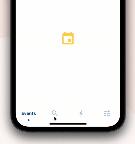
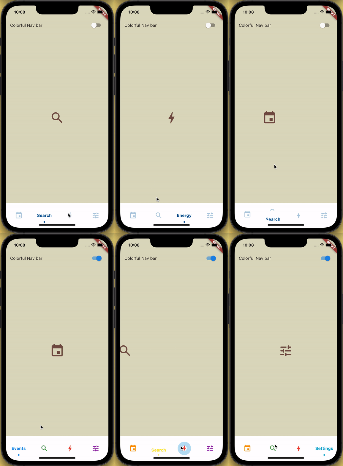
Eine anpassbare Bottom-Navigation-Bar mit einer Schiebeanimation für Symbole und Beschriftungen, verbessert durch einen Ausschnitt-Effekt und Wellenfeedback beim Tippen. Für moderne, interaktive Benutzeroberflächen entwickelt, unterstützt sie mehrere Plattformen wie Android, iOS, Web, macOS, Windows und Linux. Das Paket bietet reibungslose Übergänge und visuelle Feinheiten, ideal für Apps, die eine intuitive Navigation mit dynamischer Rückmeldung erfordern. Es lässt sich nahtlos über pub.dev in Flutter-Projekte integrieren.
Anwendungsfälle
Mobile App-Navigation
Webanwendungs-Schnittstellen
Plattformübergreifendes UI-Design
Interaktive untere Leisten
Moderne App-Asthetik
Hauptmerkmale
Schiebe-Ikon- und Textanimation
Clipping-Effekt für visuelle Tiefe
Ripple-Effekt beim Tippen
Plattformübergreifende Kompatibilität
Anpassbare Erscheinung
Glatte Übergangsanimationen
Geeignet für
Flutter-Entwickler, die animierte Bottom-Navigation suchen
designorientierte Anwendungen
Apps mit hoher Benutzerinteraktion
Entwickler, die mehrere Plattformen ansprechen
UI/UX-Verbesserungsprojekte
Hinweise
Kann eine Leistungsoptimierung auf älteren Geräten erfordern
Eingeschränkte Anpassung über die Kernfunktionen hinaus
Mögliche Layout-Konflikte in komplexen Widgets
Nicht für sehr große Navigationsmengen optimiert
Abhängig von Flutter's Rendering-Pipeline
Original-README
Originaler README-Schnappschuss aus dem verknüpften Quell-Repository. Aktuelle Inhalte finden Sie im Repository.
How to use?
Add sliding_clipped_nav_bar: to your pubspec.yaml dependencies then run flutter pub get
Add SlidingClippedNavBar() to bottomNavigationBar property of Scaffold() and add PageView() to body with NeverScrollableScrollPhysics() don't try to upate the seleted index from onPageChanged or will see some weird behaviour. You can use Stack() or AnimatedSwitcher() for custom page transition animation.
API reference
barItems → List<BarItem>
List of bar items that shows horizontally, Minimum 2 and maximum 4 items. required
selectedIndex → int
Selected index of the bar items. required
iconSize → double
Size of all icons (inactive items), don't make it too big or will be clipped. optional [30]
fontSize → double
FontSize of the text. optional [16]
fontWeight → FontWeight
FontWeight of the text. optional [FontWeight.bold]
fontStyle → FontStyle
FontStyle of the text. optional [null]
activeColor → Color
Color of the selected item which indicate selected. required
inactiveColor → Color?
Inactive color of item, which actually color icons. nullable
onButtonPressed → OnButtonPressCallback
Callback when item is pressed. required
backgroundColor → Color
background color of the bar. optional [Colors.white]
The height must be constant because the animation is in vertical direction. According to me 60 is perfect. But if you think needs to be reduced then please create an issue with a screenshot. I will see if I can do something.
How do I add drop shadow?
Wrap SlidingClippedNavBar with DecoratedBox or Container and pass BoxDecoration to decoration property. BoxDecoration takes list of boxShadow there you can pass your drop shadow.