Pakete, Repositories und App-Kategorien suchen

Cover von sliver_sticky_collapsable_panel
Paketdetailsv5.0.1

sliver_sticky_collapsable_panel

Eine Sliver-Implementierung eines haftenden, zusammenfaltbaren Panels mit einem Box-Header, der bei Statusänderungen neu erstellt wird, und einem Sliver-Kind als Panel-Inhalt.

AndroidiOSWebmacOSWindowsLinux
30-Tage-Downloads
2480
Likes
121
Pub-Punkte
160

Paket installieren

flutter pub add sliver_sticky_collapsable_panel

Paketübersicht

Aus öffentlichen Paketdaten erstellte Orientierung.

Ein auf Sliver basierendes Widget, das ein haftendes, zusammenfaltbares Panel mit dynamischer Neubildung des Headers basierend auf dem Scrollzustand implementiert. Es verfügt über einen anpassbaren Box-Header, der sich beim Ausklappen oder Zusammenfalten des Panels aktualisiert, und akzeptiert ein Sliver-Kind für den Panelinhalt. Für effizientes Scrollen in komplexen Listen konzipiert, integriert es sich nahtlos in CustomScrollView-Layouts über mehrere Plattformen hinweg.

Anwendungsfälle

  • Scrollbare Listen mit interaktiven Kopfzeilen
  • Dynamische Kopfzeilenzustände während des Scrollens
  • Komplexe Benutzeroberflächen mit feststehenden Paneelen
  • Inhaltsbereiche, die sich erweitern/verkleinern lassen
  • Anpassbare scrollgetriebene Interaktionen

Hauptmerkmale

  • Verhalten des haftenden Panels
  • Kopfzeile bei Scrollen neu erstellen
  • Sliver-kompatible Layout
  • einklappbarer Inhaltsteil
  • Plattformunabhängige Implementierung

Geeignet für

  • Entwickler, die scrollbare Schnittstellen erstellen
  • Apps mit responsive Headern
  • CustomScrollView-Integrationen
  • Plattformübergreifende mobile und Web-Anwendungen
  • UIs mit geschichteten scrollbaren Inhalten

Hinweise

  • Erfordert Integration innerhalb von CustomScrollView
  • Beschränkt auf silberbasierte Layouts
  • Die Kopfzeilenlogik erfordert möglicherweise eine individuelle Anpassung
  • Die Leistung hängt von der Komplexität des Kindes ab
  • Nicht geeignet für nicht scrollende Kontexte

Original-README

Originaler README-Schnappschuss aus dem verknüpften Quell-Repository. Aktuelle Inhalte finden Sie im Repository.

sliver_sticky_collapsable_panel

pub license build status flutter compatibility dart compatibility

A Sliver implementation of sticky collapsable panel, with a box header rebuild on status and a sliver child as panel content.

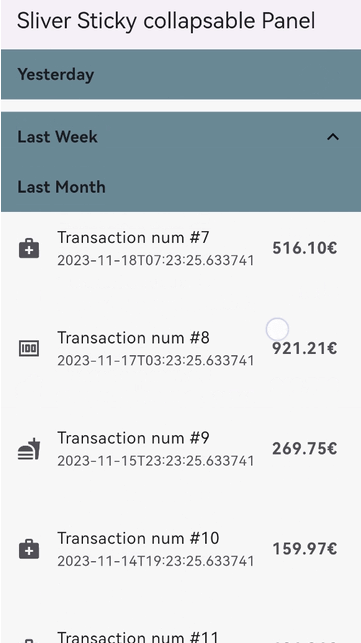
Snap Shot

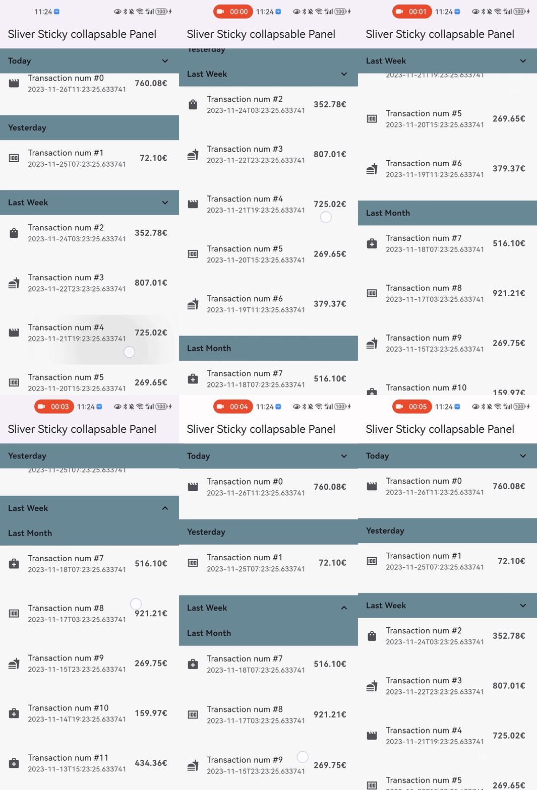
simple Shot

Features

  • Relying solely on the Flutter framework itself, no any other dependencies.
  • Pure Dart implementation, running on any platform who supports Flutter.
  • Command style support for expand/collpase the panel.(it's still compatible with declarative style)
  • Accept one box child as header and one sliver child as panel content.
  • Header can overlap panel content (useful for sticky side header for example).
  • Notify and rebuild the header when status changed (scroll outside the viewport for example).
  • Support not sticky headers (with sticky: false parameter).
  • Support a controller which notifies the scroll offset of the current sticky header.
  • Support click the header to collapse the panel, or disable collapse (with disableCollapsable = true parameter in panelController).
  • Support iOS style sticky header, just like iOS's system contact app (with iOSStyleSticky = true parameter).
  • Support add padding for sliver child (with paddingBeforeCollapse parameter).
  • Support add padding after the header even the panel collapsed (with paddingAfterCollapse parameter).

Getting started

  • In the pubspec.yaml of your flutter project, add the following dependency:

    dependencies:
      sliver_sticky_collapsable_panel: ^5.0.1
    
  • In your library add the following import:

    import 'package:sliver_sticky_collapsable_panel/sliver_sticky_collapsable_panel.dart';
    
  • In your code, use the sliver like this:

    CustomScrollView(
      controller: _scrollController,
      slivers: [
        SliverStickyCollapsablePanel(
          scrollController: _scrollController,
          panelController: StickyCollapsablePanelController(key:'key_1'),
          headerBuilder: (context, status) => SizedBox.fromSize(size: Size.fromHeight(48)),
          sliverPanel: SliverList.list(children: [...]),
        ),
        SliverStickyCollapsablePanel(
          scrollController: _scrollController,
          panelController: StickyCollapsablePanelController(key:'key_2'),
          headerBuilder: (context, status) => SizedBox.fromSize(size: Size.fromHeight(48)),
          sliverPanel: SliverList.list(children: [...]),
        ),
        ...,
      ],
    );
    
  • For simple right side header arrow hint ^, you can build with widget in flutter framework like AnimatedRotation:

    SliverStickyCollapsablePanel(
      scrollController: _scrollController,
      panelController: StickyCollapsablePanelController(key:'key_1'),
      headerBuilder: (context, status) => Container(
        width: double.infinity,
        height: 48,
        child: Stack(
          children: [
            Text("your title, or any other box widget you like"),
            Align(
              alignment: Alignment.centerRight,
              child: AnimatedRotation(
                duration: const Duration(milliseconds: 0),
                turns: status.isExpanded ? 0 : 0.5,
                child: const Icon(Icons.expand_more),
              ),
            ), 
          ],
        ),
      ),
      sliverPanel: SliverList.list(children: [...]),
    ),
    

More Advanced Feature:

  • You can disable collapse for any sliver you wanted, just add disableCollapsable = true.
    CustomScrollView(
      controller: _scrollController,
      slivers: [
        SliverStickyCollapsablePanel(
          scrollController: _scrollController,
          panelController: StickyCollapsablePanelController(key:'key_1',disableCollapsable: true),
          headerBuilder: (context, status) => SizedBox.fromSize(size: Size.fromHeight(48)),
          sliverPanel: SliverList.list(children: [...]),
        ),
        ...,
      ],
    );
    

  • You can enable iOS style sticky header, just like the system's contact app with just one parameter iOSStyleSticky = true.
    CustomScrollView(
      controller: _scrollController,
      slivers: [
        SliverStickyCollapsablePanel(
          scrollController: _scrollController,
          panelController: StickyCollapsablePanelController(key:'key_1'),
          iOSStyleSticky: true,
          headerBuilder: (context, status) => SizedBox.fromSize(size: Size.fromHeight(48)),
          sliverPanel: SliverList.list(children: [...]),
        ),
        ...,
      ],
    );
    
    simple Shot

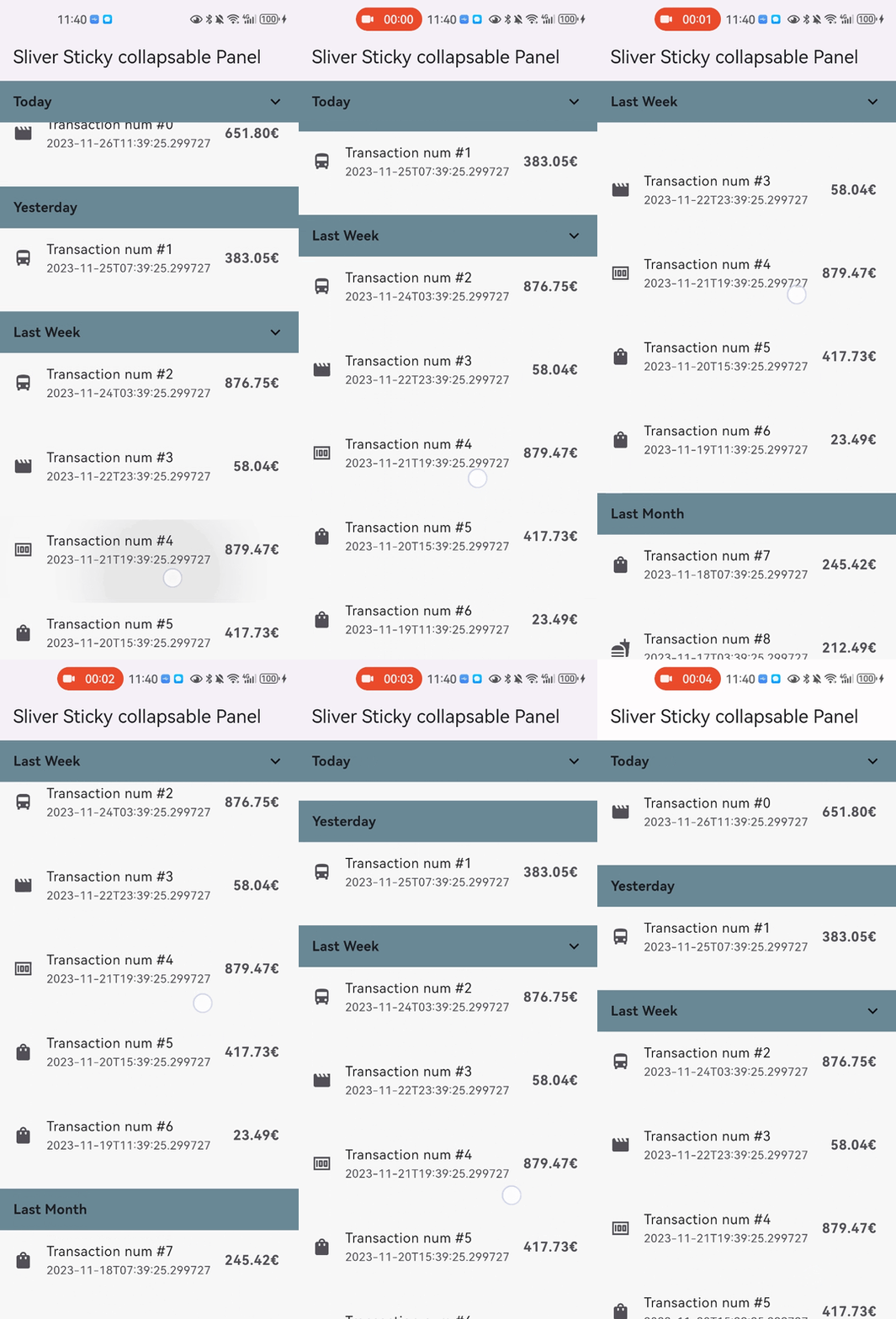
  • You can add padding for sliver child (with paddingBeforeCollapse), even if the panel is collapsed, the padding still work between headers with paddingAfterCollapse.
    CustomScrollView(
      controller: _scrollController,
      slivers: [
        SliverStickyCollapsablePanel(
          scrollController: _scrollController,
          panelController: StickyCollapsablePanelController(key:'key_1'),
          paddingBeforeCollapse: const EdgeInsets.all(16),
          paddingAfterCollapse: const EdgeInsets.only(bottom: 10),
          headerBuilder: (context, status) => SizedBox.fromSize(size: Size.fromHeight(48)),
          sliverPanel: SliverList.list(children: [...]),
        ),
        ...,
      ],
    );
    
    simple Shot

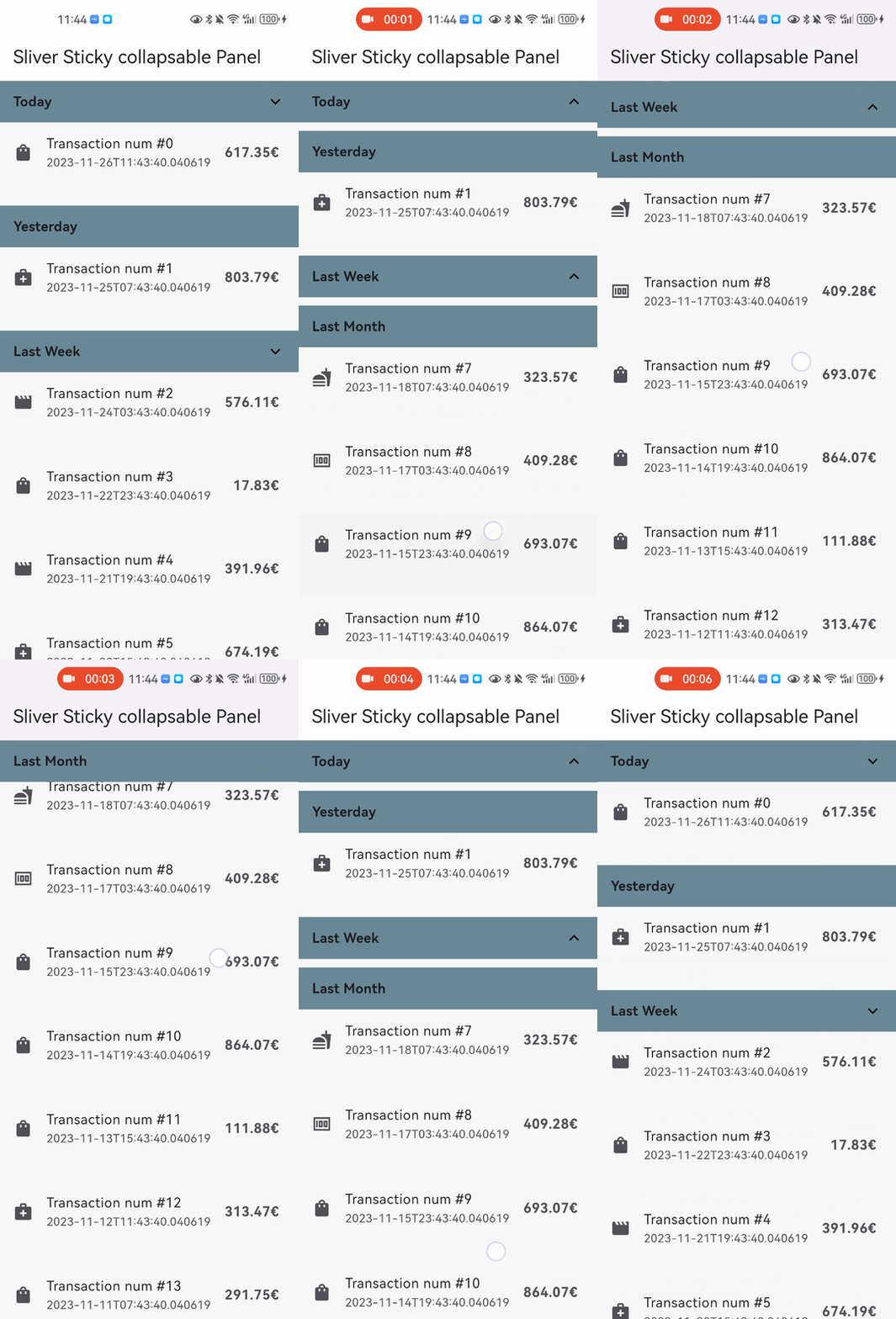
  • You can animate collapse/expand with only one parameter: panelAnimationDuration
    CustomScrollView(
      controller: _scrollController,
      slivers: [
        SliverStickyCollapsablePanel(
          scrollController: _scrollController,
          panelController: StickyCollapsablePanelController(key:'key_1'),
          panelAnimationDuration: Duration(milliseconds: 300),
          paddingBeforeCollapse: const EdgeInsets.all(16),
          paddingAfterCollapse: const EdgeInsets.only(bottom: 10),
          headerBuilder: (context, status) => SizedBox.fromSize(size: Size.fromHeight(48)),
          sliverPanel: SliverList.list(children: [...]),
        ),
        ...,
      ],
    );
    

Performance configuration

  • You can use optional parameter headerSize to speed up the layout process when the size not change
    • if your header size maybe change, just keep this parameter null (which is the default)
      CustomScrollView(
        controller: _scrollController,
        slivers: [
          SliverStickyCollapsablePanel(
            scrollController: _scrollController,
            panelController: StickyCollapsablePanelController(key:'key_1'),
            iOSStyleSticky: true,
            headerBuilder: (context, status) => SizedBox.fromSize(size: Size.fromHeight(48)),
            headerSize: Size(MediaQuery.of(context).size.width, 48),
            sliverPanel: SliverList.list(children: [...]),
          ),
          ...,
        ],
      );
      

Thanks

Kategorien

Quell-Repository

Projekte, die dieses Paket verwenden

Noch keine Daten verfügbar.