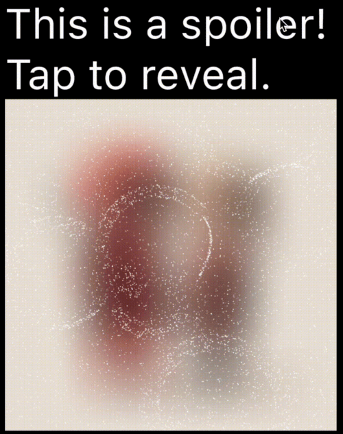
Ein Flutter-Paket zum Erstellen von Spoiler-Animationen, die denen im Telegramm ähneln, wodurch sensible oder spoilerbeladene Inhalte bis zu einem Tippen oder Klicken versteckt bleiben können.
Aus öffentlichen Paketdaten erstellte Orientierung.
Das spoiler_widget-Paket ermöglicht Entwicklern die Erstellung interaktiver Spoiler-Animationen in Flutter, die den beliebten Telegram-Stil der Aufdeckung nachahmen. Es erlaubt es, sensible oder überraschende Inhalte zunächst zu verbergen und bei Benutzerinteraktion – beispielsweise durch Tippen oder Klicken – sichtbar zu machen. Ideal zum Verbergen von Spoilern in Nachrichten, Bildern oder Texten, verbessert es die Benutzererfahrung mit fließenden Übergängen über mehrere Plattformen hinweg. Das Paket ist leichtgewichtig und lässt sich nahtlos in bestehende Flutter-Anwendungen integrieren.
Anwendungsfälle
Spoiler in Chat-Apps verbergen
Bildinhalte beim Tippen anzeigen
Interaktive Geschichtselemente erstellen
Schutz sensibler Informationen in Benutzeroberflächen
Spielerische Enthüllungen in Spielen hinzufügen
Hauptmerkmale
Telegram-artige Animation
Berührung zum Aufdecken-Interaktion
glatte Übergangseffekte
Plattformübergreifende Unterstützung
Einfache Integration mit bestehenden Widgets
Anpassbare Aufdeckdauer
Geeignet für
Chat- und Messaging-Apps
Interaktive Erzählung
Gamifizierte Schnittstellen
Inhalt mit kontrollierter Sichtbarkeit
Entwickler, die einfache aber effektive Animationen suchen
Hinweise
Kann die Leistung bei vielen Instanzen beeinträchtigen
Eingeschränkte Anpassung über grundlegende Animation hinaus
Benutzerinteraktion zur Aufdeckung erforderlich
Nicht geeignet für statischen Inhalt
Am besten sparsam verwenden, um den Überraschungseffekt zu bewahren
Original-README
Originaler README-Schnappschuss aus dem verknüpften Quell-Repository. Aktuelle Inhalte finden Sie im Repository.
Spoiler Animation for Flutter
A Flutter package to create spoiler animations similar to the one used in Telegram, allowing you to hide sensitive or spoiler-filled content until it's tapped or clicked.
Demo
Mask Operation
Demo
Mask Operation
Demo
PathOperation.intersect
PathOperation.difference
PathOperation.union
PathOperation.xor
Features
Spoiler Animation: Blur effect to hide content until tapped or hidden
Wave Effects: Optional wave/ripple expansions with SpoilerSpotsController
Particle System: Configure particle density (0–1 coverage), size, speed, color, and shape paths/presets.
You can apply a custom-shaped mask using maskConfig in both TextSpoilerConfig and WidgetSpoilerConfig.
This allows the spoiler effect to only appear inside specific areas defined by a Path.
You can find a complete, runnable example in the example/lib/main.dart file. It demonstrates various configuration options and both text and widget-based spoilers.
Configuration
Common Fields
Table showing common config parameters for both TextSpoilerConfig and WidgetSpoilerConfig.
Field
Type
Description
isEnabled
bool
Whether the spoiler starts enabled (hidden).
enableGestureReveal
bool
Whether tap should toggle visibility.
particleConfig
ParticleConfig
Particle system parameters (density, speed, color, size, shape).
fadeConfig
FadeConfig?
Fade parameters (padding, edgeThickness).
shaderConfig
ShaderConfig?
Custom fragment shader configuration for particles.
maskConfig
SpoilerMask?
Optional mask to apply using a Path.
onSpoilerVisibilityChanged
ValueChanged?
Callback fired when spoiler becomes visible/hidden.
Legacy fields (deprecated)
These fields are kept for backward compatibility; prefer particleConfig and fadeConfig.
enableFadeAnimation
fadeRadius (maps to FadeConfig.padding)
fadeEdgeThickness
particleDensity
particleSpeed
particleColor
maxParticleSize
ParticleConfig
Field
Type
Description
density
double
Area coverage percentage in the range 0..1 (0 = 0%, 1 = 100%). Values are clamped.
speed
double
Particle speed (px/frame).
color
Color
Base particle color.
maxParticleSize
double
Particle diameter in pixels.
shapePreset
ParticlePathPreset?
Built-in shapes or ParticlePathPreset.custom(...) for your own path.
enableWaves
bool
Enables ripple waves that push particles.
maxWaveRadius
double
Wave radius limit in pixels.
maxWaveCount
int
Maximum number of simultaneous waves.
TextSpoilerConfig
Field
Type
Description
textStyle
TextStyle?
The text style applied to the spoiler text.
textSelection
TextSelection?
Range of text to apply the spoiler.
textAlign
TextAlign?
Text alignment inside the widget.
maxLines
int?
An optional maximum number of lines for the text to span, wrapping if necessary.
isEllipsis
bool?
Determines whether overflowing text should display an ellipsis ("…") at the end.
WidgetSpoilerConfig
Field
Type
Description
imageFilter
ImageFilter?
Blur filter used to hide the child.
maxActiveWaves
int
Max concurrent waves for wave-based effects.
FAQ
How can I animate the blur or wave concurrency?
Adjust the properties in your configuration object at runtime. For instance, set a new imageFilter or call methods on the wave controller to dynamically tune the effect.
Can I skip the wave logic?
Yes—by default, you get a basic spoiler with fade. Use SpoilerSpotsController only if you want wave animations.
Does this work on the web?
Yes! It’s entirely in Flutter/Dart. Just ensure you handle any platform quirks with gesture input.
Dual Rendering Modes
spoiler_widget now supports two modes of rendering particles:
Atlas Rendering (Default): Uses Flutter's drawRawAtlas. This is a CPU-driven approach that is highly efficient for most standard spoiler effects.
Shader Rendering (GPU): Uses custom fragment shaders to render particles. This is ideal for complex visual effects and leverages GPU power for smoother performance on high-end devices.
To enable Shader Rendering, simply provide a ShaderConfig to your spoiler configuration.
Particle Shapes
Pick a shape once in ParticleConfig, and it works for both atlas and shader modes. Leave shapePreset null for the default circle (fastest path).