Pakete, Repositories und App-Kategorien suchen

Cover von square_progress_indicator
Paketdetailsv0.0.8

square_progress_indicator

Sie können anpassbare quadratische Fortschrittsindikatoren erstellen, wie das native Flutter CircularProgressIndicator-Widget.

AndroidiOSWebmacOSWindowsLinux
30-Tage-Downloads
5280
Likes
30
Pub-Punkte
160

Paket installieren

flutter pub add square_progress_indicator

Paketübersicht

Aus öffentlichen Paketdaten erstellte Orientierung.

Ein anpassbarer quadratischer Fortschrittsanzeiger für Flutter, inspiriert vom nativen CircularProgressIndicator. Er bietet eine moderne, kompakte Alternative zu kreisförmigen Fortschrittsanzeigen mit Unterstützung für benutzerdefinierte Farben, Strichbreite und Animation. Ideal für Ladezustände in Apps, bei denen ein quadratisches Design besser zur Benutzeroberfläche passt. Das Paket ist leichtgewichtig und kompatibel mit allen wichtigen Plattformen, einschließlich Android, iOS, Web, macOS, Windows und Linux.

Anwendungsfälle

  • Ladeanzeiger in Formularen
  • Fortschritt in Dashboards anzeigen
  • Benutzerdefinierte Ladeanimationen in mobilen Apps
  • Kreisförmige Fortschrittsbalken durch quadratische ersetzen
  • Verbesserung der Benutzeroberflächenkonsistenz in Material Design-Apps

Hauptmerkmale

  • quadratische Gestaltung
  • Anpassbare Farbe und Strichbreite
  • Glatte Animation
  • Plattformübergreifende Kompatibilität
  • Einfache Integration mit Flutter
  • Erweiterbare Stiloptionen

Geeignet für

  • Entwickler, die alternative Fortschrittsindikatoren suchen
  • UI-Designer, die sich auf quadratische Themen-Interfaces konzentrieren
  • Apps, die konsistente Ladevisualisierungen erfordern
  • Flutter-Projekte für mehrere Plattformen
  • Projekte mit Material Design und modernem Ästhetik

Hinweise

  • Beschränkt auf quadratische Geometrie
  • Kann zusätzliche Stilisierung für komplexe Animationen erfordern
  • Nicht geeignet für kreisförmige Fortschrittsanforderungen
  • Abhängig von der Rendering-Leistung von Flutter
  • Am besten in Kontexten verwenden, in denen quadratische Formen mit der Designsprache übereinstimmen
Original-README

Originaler README-Schnappschuss aus dem verknüpften Quell-Repository. Aktuelle Inhalte finden Sie im Repository.

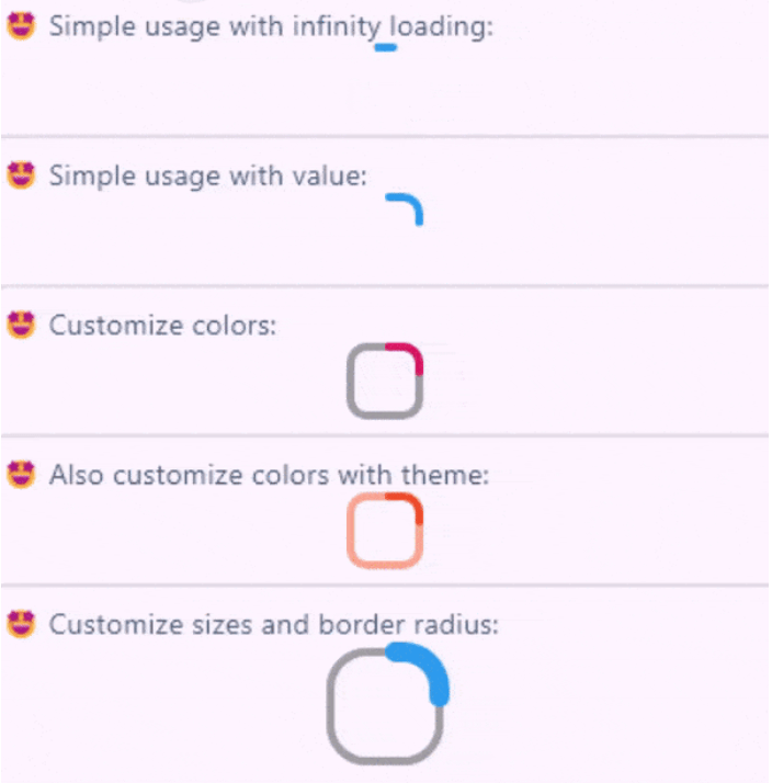
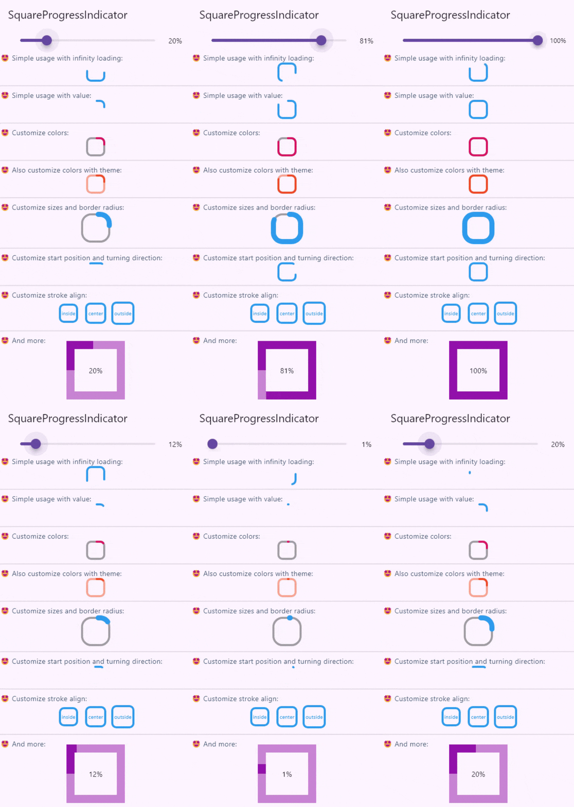
Create fully customizable square or rectangle progress indicators like native flutter CircularProgressIndicator widget!

Features

Full example of SquareProgressIndicator

Live demo

You can check the example project web export on this link: https://amir14a.github.io/square_progress_indicator/ Thanks to Github!❤️

Usage

Simple usage:

const SquareProgressIndicator(),

Customize usage:

SquareProgressIndicator(
    value: _value,
    width: 100,
    height: 100,
    borderRadius: 0,
    startPosition: StartPosition.leftCenter,
    strokeCap: StrokeCap.square,
    clockwise: true,
    color: Colors.purple,
    emptyStrokeColor: Colors.purple.withOpacity(.5),
    strokeWidth: 16,
    emptyStrokeWidth: 16,
    strokeAlign: SquareStrokeAlign.center,
    child: Text("${(_value * 100).toStringAsFixed(0)}%"),
),

Additional information

Parameter Type Default Info
value double? null The value of the progress, it should be between 0 and 1. don't pass it to use Indeterminate mode
width double 38 The width of rectangle that the progress line is drawn around it.
height double 38 The height of rectangle that the progress line is drawn around it.
borderRadius double 8 The border radius of the rectangle, it is applied to all four corners.
color Color? progressIndicatorTheme.color The color of the progress line.
emptyStrokeColor Color? progressIndicatorTheme.circularTrackColor The color of the line behind the progress line which show for reminding progress.
strokeWidth double 4 The width of the progress line.
emptyStrokeWidth double 4 The width of the line behind the progress line which show for reminding progress.
clockwise boolean true The direction of turn of progress line, if you pass false, the progress line will be reversed, default value is true.
startPosition double 0 (StartPosition.topCenter) Start position of progress line relative to the topCenter, you can pass a value from [StartPosition] class or custom double value you need.
strokeAlign SquareStrokeAlign SquareStrokeAlign.inside The stroke align of the progress line, pass a value from [SquareStrokeAlign] and read it's documents. see: https://api.flutter.dev/flutter/painting/BorderSide/strokeAlign.html
strokeCap StrokeCap? StrokeCap.round The stroke cap of the progress line and empty line, see: https://api.flutter.dev/flutter/dart-ui/StrokeCap.html
child Widget? null The child widget, it can be a text or everything you need.

Feel free to create issue or pull requests in github repository!

Kategorien

Quell-Repository

Projekte, die dieses Paket verwenden