Pakete, Repositories und App-Kategorien suchen

Cover von stage_navigation_bar
Paketdetailsv0.1.0

stage_navigation_bar

Ein Flutter-Paket für eine schöne Navigationsleiste mit Animation beim Auswählen eines Elements.

AndroidiOSWebmacOSWindowsLinux
30-Tage-Downloads
10
Likes
9
Pub-Punkte
150

Paket installieren

flutter pub add stage_navigation_bar

Paketübersicht

Aus öffentlichen Paketdaten erstellte Orientierung.

Ein Flutter-Paket, das eine ästhetisch ansprechende Bottom-Navigation-Bar mit fließenden Animationen beim Wechsel zwischen Elementen bietet. Es verbessert die Benutzererfahrung durch dynamische visuelle Rückmeldungen während der Navigation und ist daher ideal für Apps, die ansprechende und moderne Schnittstellenelemente erfordern. Das Paket unterstützt mehrere Plattformen wie Android, iOS, Web, macOS, Windows und Linux und sorgt für konsistentes Verhalten über Geräte hinweg. Mit minimalem Setup über pub add können Entwickler schnell eine visuell reichhaltige Navigationslösung in ihre Projekte integrieren.

Anwendungsfälle

  • Mobile App-Navigation
  • Webanwendungs-Schnittstellen
  • Plattformübergreifende Desktop-Anwendungen
  • Interaktive UI-Prototypen
  • Moderne Implementierungen des App-Designs

Hauptmerkmale

  • Animiertes Elementauswahl
  • Glatte Übergangseffekte
  • Multiplattform-Unterstützung
  • Einfache Integration mit pub
  • Anpassbare Erscheinung
  • Reaktives Design

Geeignet für

  • Entwickler, die animierte Navigationsleisten suchen
  • designorientierte Flutter-Anwendungen
  • Apps für mehrere Plattformen
  • UI/UX-Verbesserungsprojekte
  • Anfänger bis mittlere Flutter-Nutzer

Hinweise

  • Kann eine Leistungstestung auf älteren Geräten erfordern
  • Eingeschränkte Anpassung über die grundlegende Gestaltung hinaus
  • Abhängig von externen Animationsbibliotheken
  • Nicht geeignet für einfache statische Navigationsanforderungen
  • Mögliche Konflikte mit anderen Navigationspaketen

Original-README

Originaler README-Schnappschuss aus dem verknüpften Quell-Repository. Aktuelle Inhalte finden Sie im Repository.

Static Badge Static Badge Static Badge

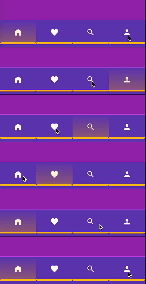
A beautiful navigation bar with animation when select item.

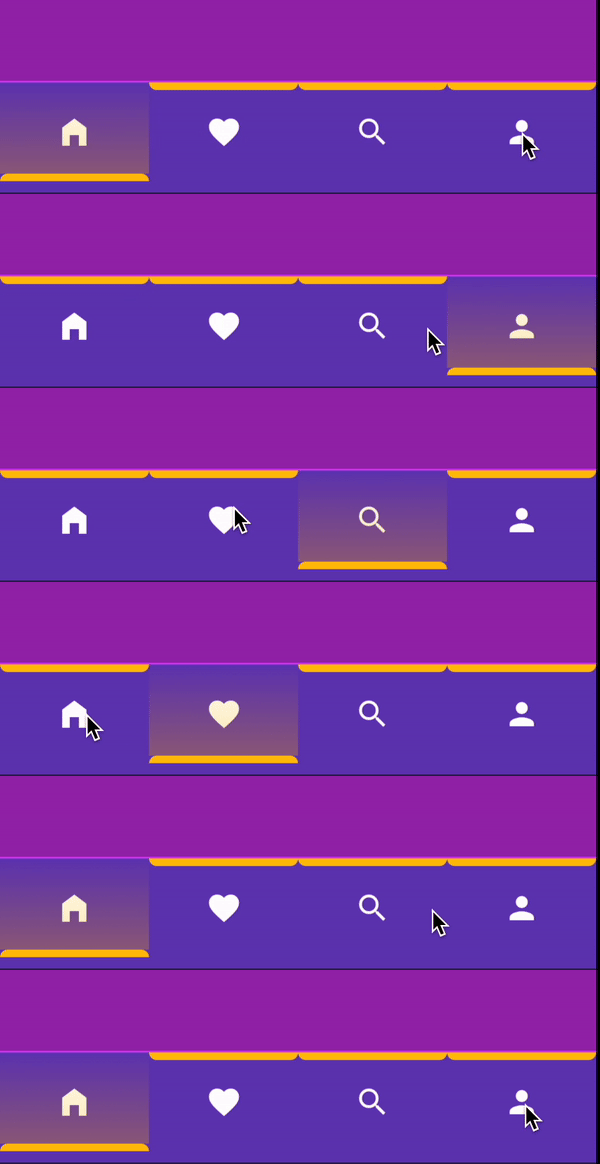
Top To Bottom

Table of contents

  1. Installing
  2. How To Use
  3. Showcase
  4. Example Project
  5. Contributors

🖥 Installing

Add Dependency
dependencies:
  stage_navigation_bar: ^0.1.0 #latest version
Import Package
import 'package:stage_navigation_bar/stage_navigation_bar.dart';

ℹ️ How To Use

Place your StageNavigationBar to the bottomNavigationBar slot of a Scaffold. Or in the bottom of your main page view.

Code
class StageNavigationBarExample extends StatefulWidget {
  const StageNavigationBarExample({super.key});

  @override
  State<StageNavigationBarExample> createState() =>
      _StageNavigationBarExampleState();
}

class _StageNavigationBarExampleState extends State<StageNavigationBarExample> {
  /// Your initial page
  int _selectedIndex = 0;

  @override
  Widget build(BuildContext context) {
    return Scaffold(
      bottomNavigationBar: StageNavigationBar(
        items: const [
          Icon(Icons.home_filled, color: Colors.white),
          Icon(Icons.favorite, color: Colors.white),
          Icon(Icons.search, color: Colors.white),
          Icon(Icons.person, color: Colors.white),
        ],
        selectedIndex: _selectedIndex,
        indicatorColor: Colors.amber,
        onTap: (int index) {
          setState(() {
            _selectedIndex = index;
          });
        },
      ),
    );
  }
}
Properties
  • animationDirection: Define the animation move shape when tap.
  • alignment: Alignment of the items.
  • barHeight: StageNavigationBar height.
  • barWidth: StageNavigationBar width.
  • indicatorHeight: Indicator line height.
  • itemPadding: Each item padding.
  • duration: Indicator animation Transition duration.
  • selectedIndex*: Current selected index.
  • indicatorColor*: Color of the indicator and the gradient.
  • onTap*: On item tap.
  • barPadding?: StageNavigationBar internal padding.
  • barMargin?: StageNavigationBar external padding.
  • decoration?: StageNavigationBar box decoration.
  • selectedIndicatorBorderRadius?: Selected item indicator border radius.
  • unselectedIndicatorBorderRadius?: Unselected item indicator border radius.
  • items!: StageNavigationBar items, List of widget.
  • itemsCount!: Items count for itemBuilder callback.
  • itemBuilder!: Callback will be called with indices greater than or equal to zero and less than itemsCount.
Default values
  • animationDirection = IndicatorAnimationDirection.topToBottom,
  • alignment = Alignment.center,
  • barHeight = 60,
  • barWidth = double.infinity
  • indicatorHeight = 5,
  • itemPadding = const EdgeInsets.all(0),
  • duration = const Duration(milliseconds: 200),
  • selectedIndicatorBorderRadius: default value depends on 'animationDirection' value,
  • unselectedIndicatorBorderRadius: default value depends on 'animationDirection' value,
IndicatorAnimationDirection Values
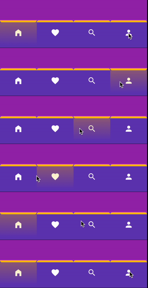
IndicatorAnimationDirection.top
IndicatorAnimationDirection.topToBottom
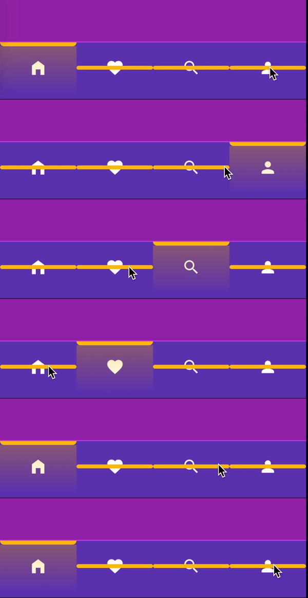
IndicatorAnimationDirection.centerToTop
IndicatorAnimationDirection.centerToBottom
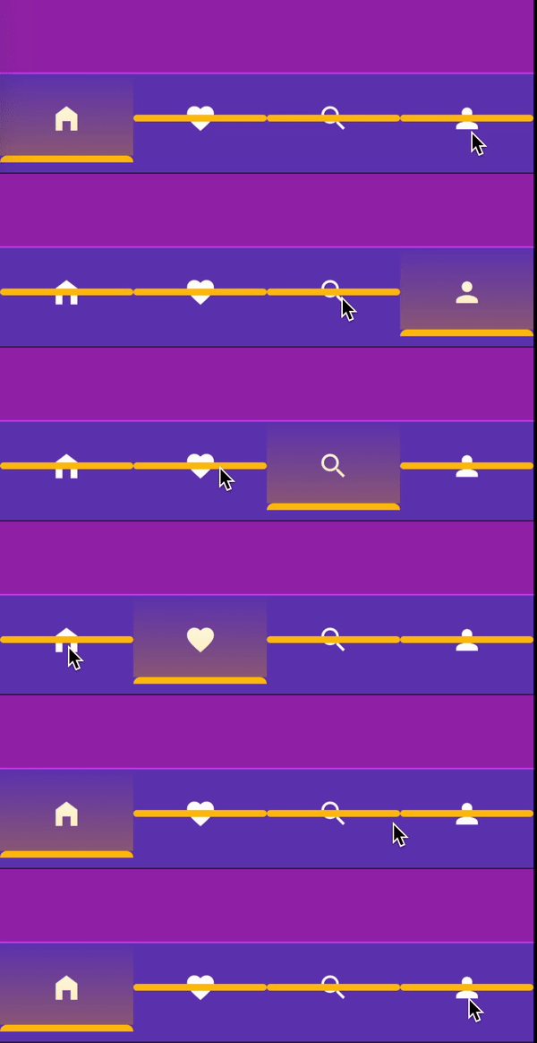
IndicatorAnimationDirection.bottom
IndicatorAnimationDirection.bottomToTop
Event
onTap: (index){

}

🕹 Showcase

IndicatorAnimationDirection
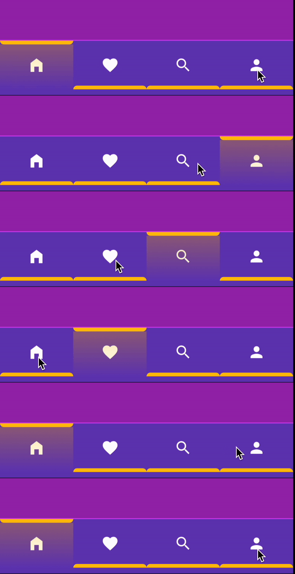
animationDirection: IndicatorAnimationDirection.top

Top


animationDirection: IndicatorAnimationDirection.topToBottom

Top To Bottom


animationDirection: IndicatorAnimationDirection.centerToTop

Center To Top


animationDirection: IndicatorAnimationDirection.centerToBottom

Center To Bottom


animationDirection: IndicatorAnimationDirection.bottom

Bottom


animationDirection: IndicatorAnimationDirection.bottomToTop

Bottom To Top

📱 Example Project

Pub Example

Github Example Project

👨🏻‍💻 Contributors

Mohammad Alamoudi @mu7mmd

Kategorien

Quell-Repository

Projekte, die dieses Paket verwenden

Noch keine Daten verfügbar.