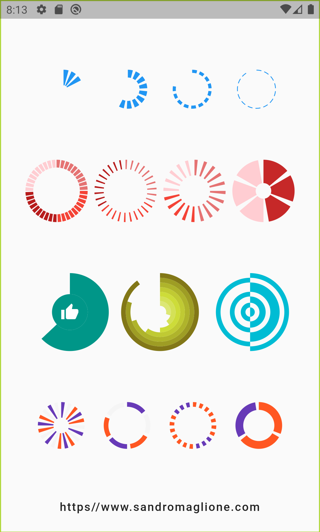
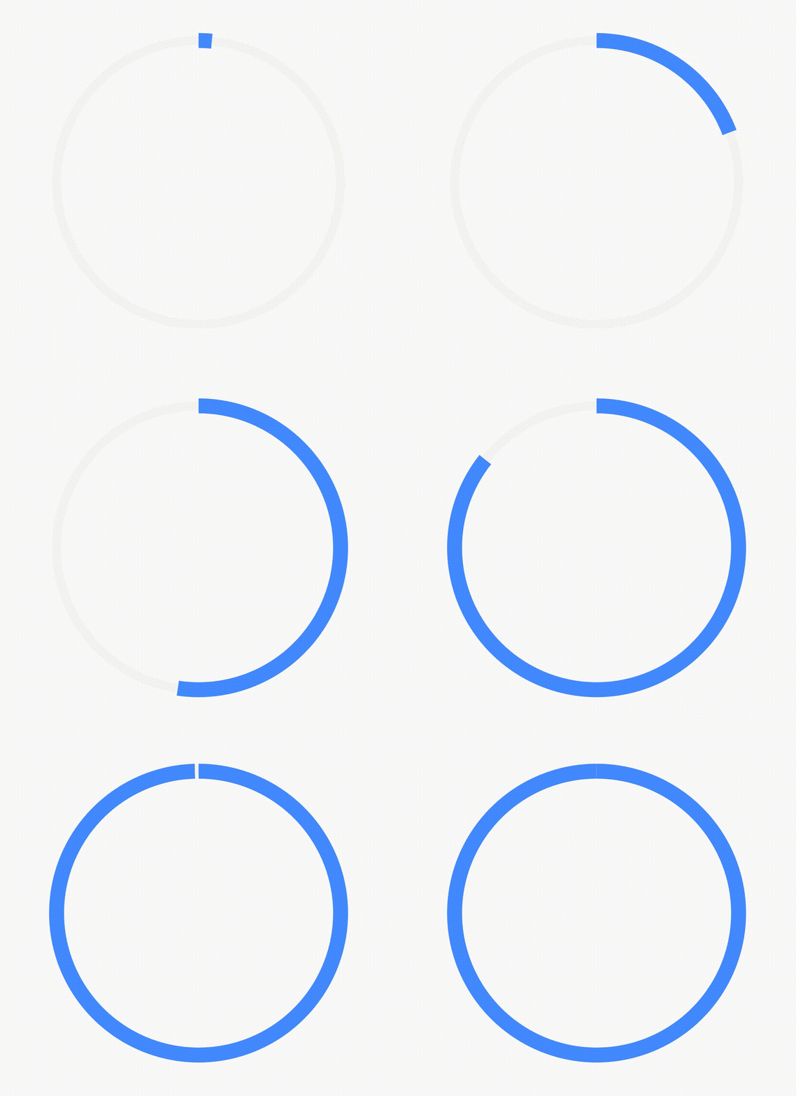
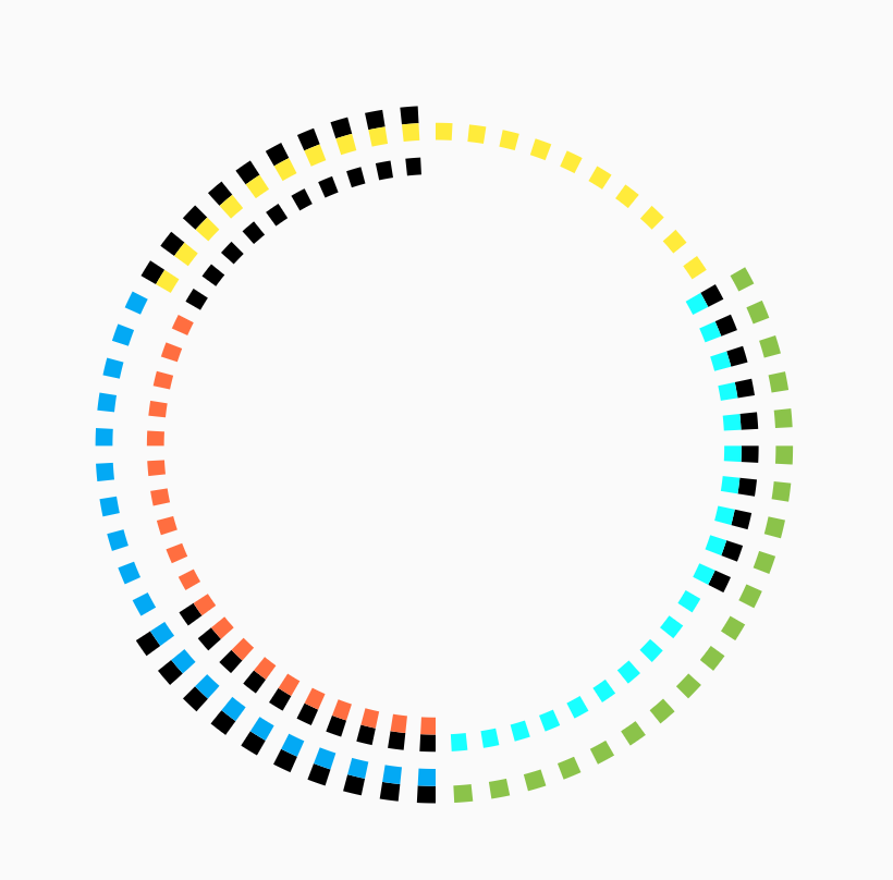
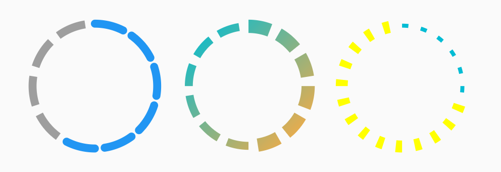
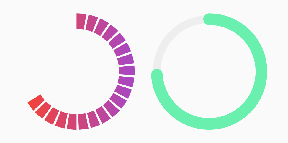
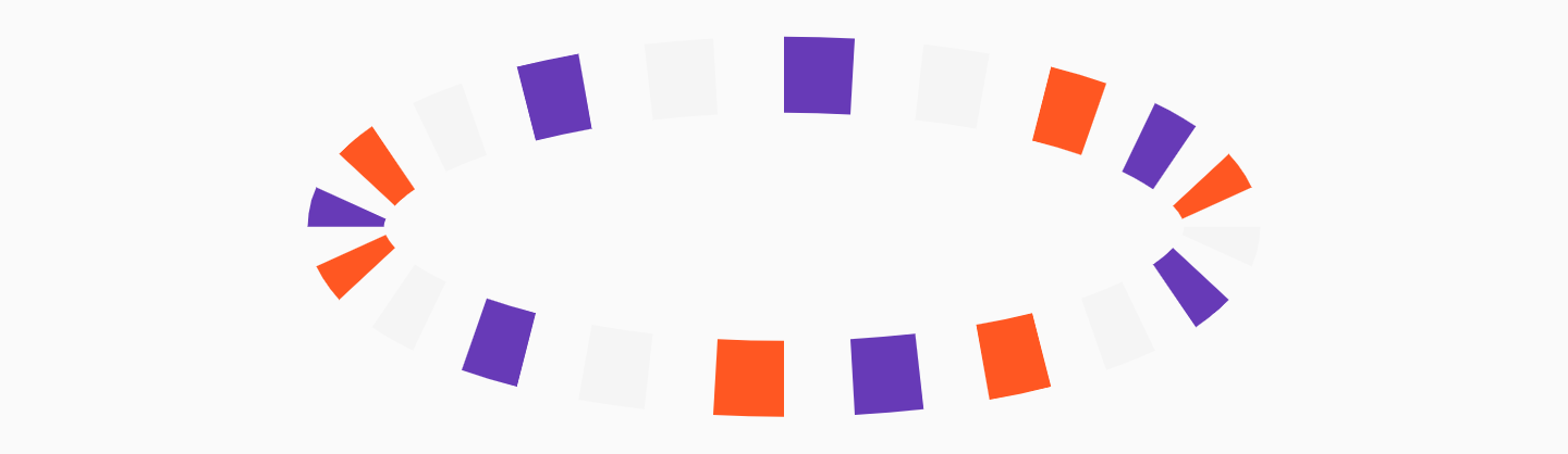
Aus öffentlichen Paketdaten erstellte Orientierung.
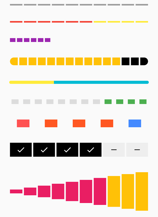
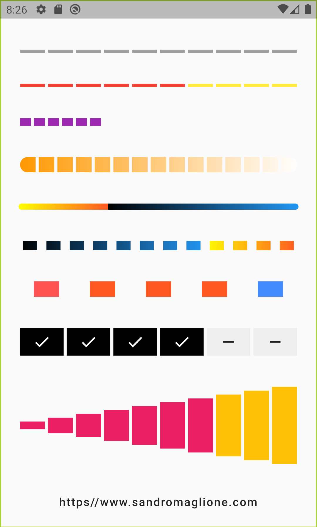
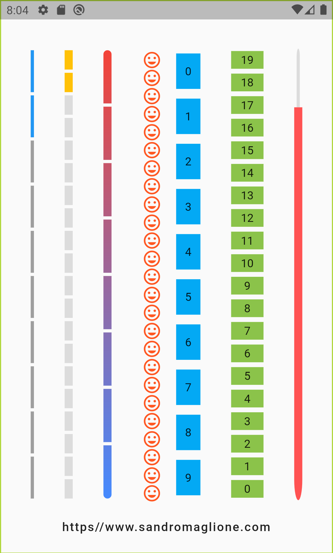
Ein Flutter-Paket, das eine anpassbare Schrittfortschrittsleiste bereitstellt, die den Fortschritt durch eine Reihe von Schritten visuell darstellt. Jeder Schritt kann als ausgewählt oder nicht ausgewählt markiert werden, was es ideal für die Führung von Benutzern durch mehrstufige Prozesse wie Formulare, Onboarding-Flows oder Kassenprozesse macht. Der Indikator unterstützt reibungslose Animationen und ist hochgradig konfigurierbar mit Optionen für Farben, Größen und Schrittabstände. Er funktioniert auf allen wichtigen Plattformen einschließlich Android, iOS, Web, macOS, Windows und Linux.
Anwendungsfälle
Onboarding-Wizard
Mehrschrittformulare
Verfolgung des Zahlungsvorgangs
Aufgabenabschluss-Workflows
Tutorial-Fortschrittsanzeiger
Hauptmerkmale
Anpassbare Schrittdarstellung
Animierte Übergänge zwischen Schritten
Unterstützung für mehrere Plattformen
Konfigurierbare Farben und Größen
Reaktionsfähiges Design
Einfache Integration mit bestehender Benutzeroberfläche
Geeignet für
App-Entwickler, die geführte Nutzerreisen erstellen
Designer, die visuelle Fortschrittsrückmeldung benötigen
Projekte, die eine plattformübergreifende Konsistenz erfordern
UX-orientierte Anwendungen mit sequenziellen Aufgaben
Einfach aber elegant Visualisierung des Fortschritts
Hinweise
Beschränkt auf lineare Schrittfortschritte
Keine integrierte Unterstützung für dynamische Hinzufügung/Entfernung von Schritten
Benötigt manuelle Zustandsverwaltung für Schrittaktualisierungen
Nicht geeignet für nicht-lineare Workflows
Möglicherweise sind zusätzliche Stile für komplexe Themen erforderlich
Original-README
Originaler README-Schnappschuss aus dem verknüpften Quell-Repository. Aktuelle Inhalte finden Sie im Repository.
Step Progress Indicator
Open source Flutter package, bar indicator made of a series of selected and unselected steps.
Made by Sandro Maglione, check out his personal official website sandromaglione.com
Number of steps to underline, all the steps with index <= currentStep will have Color equal to selectedColor.
0
customStep(int, Color, double)
Widget
Defines a custom Widget to display at each step, given the current step index, the Color, which could be defined with selectedColor and unselectedColor or using customColor, and its size, which could be defined using size, selectedSize, unselectedSize, or customSize.
-
onTap(int)
void Function()
Defines onTap function given index of the pressed step.
-
customColor(int)
Color
Assign a custom Color for each step.
-
customSize(int)
double
Assign a custom size for each step.
-
selectedColor
Color
Color of the selected steps.
Colors.blue
unselectedColor
Color
Color of the unselected steps.
Colors.grey
gradientColor
Gradient
Apply gradient color to the indicator.
-
selectedGradientColor
Gradient
Apply gradient color to the selected steps of the indicator.
-
unselectedGradientColor
Gradient
Apply gradient color to the unselected steps of the indicator.
-
blendMode
BlendMode
Apply BlendMode to ShaderMask when gradientColor, selectedGradientColor, or unselectedGradientColor defined.
-
direction
Axis
Defines if indicator is horizontal or vertical.
Axis.horizontal
progressDirection
TextDirection
Defines if steps grow from left-to-right / top-to-bottom TextDirection.ltr or right-to-left / bottom-to-top TextDirection.rtl.
TextDirection.ltr
size
double
Size of the indicator (height if direction is Axis.horizontal, width if Axis.vertical).
4.0
padding
double
Spacing, left-right if horizontal, top-bottom if vertical, of each step.
2.0
fallbackLength
double
Length of the progress indicator in case the main axis (based on direction attribute) has no size limit i.e. double.infinity.
100.0
selectedSize
double
Specify a custom size for selected steps.
-
unselectedSize
double
Specify a custom size for unselected steps.
-
roundedEdges
Radius
Add rounded edge corners to first and last step.
-
mainAxisAlignment
MainAxisAlignment
Assign alignment MainAxisAlignment for indicator's container.
MainAxisAlignment.center
crossAxisAlignment
CrossAxisAlignment
Assign alignment CrossAxisAlignment for indicator's container.
CrossAxisAlignment.center
stepMainAxisAlignment
MainAxisAlignment
Assign alignment MainAxisAlignment for a single step.
MainAxisAlignment.center
stepCrossAxisAlignment
CrossAxisAlignment
Assign alignment CrossAxisAlignment for a single step.
CrossAxisAlignment.center
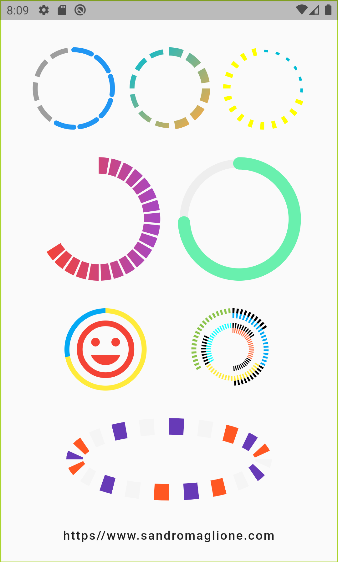
CircularStepProgressIndicator Parameters
Parameter
Type
Description
Default
totalSteps
int
Total number of step of the complete indicator.
@required
currentStep
int
Number of steps to underline, all the steps with index <= currentStep will have Color equal to selectedColor.
0
child
Widget
Widget child contained inside the indicator.
-
selectedColor
Color
Color of the selected steps.
Colors.blue
unselectedColor
Color
Color of the unselected steps.
Colors.grey
customColor(int)
Color
Assign a custom Color for each step.
-
gradientColor
Gradient
Apply a gradient color to the indicator.
-
customStepSize(int, bool)
double
Assign a custom size for each step.
-
selectedStepSize
double
Specify a custom size for selected steps.
-
unselectedStepSize
double
Specify a custom size for unselected steps.
-
circularDirection
CircularDirection
Defines if steps grow clockwise (CircularDirection.clockwise) or counterclockwise (CircularDirection.counterclockwise)
CircularDirection.clockwise
stepSize
double
Size of the each step of the indicator.
6.0
height
double
Height of the indicator's container.
-
width
double
Width of the indicator's container.
-
padding
double
Spacing between each step.
math.pi / 20
startingAngle
double
Angle in which is placed the starting point of the indicator.
0
roundedCap(int, bool)
bool
Adds rounded edges at the beginning and at the end of the circular indicator given int index of each step and a bool telling if the step is selected.
(_, __) => false
removeRoundedCapExtraAngle
bool
Removes extra angle caused by StrokeCap.butt when roundedCap is applied #20.
false
arcSize
double
Angle in radiants which represents the size of the arc used to display the indicator.
math.pi * 2
fallbackHeight
double
Height of the indicator's container in case the parent height has no size limit i.e. double.infinity.
100.0
fallbackWidth
double
Width of the indicator's container in case the parent width has no size limit i.e. double.infinity.
100.0
Roadmap
I am always open for suggestions and ideas for possible improvements or fixes.
Feel free to open a Pull Request if you would like to contribute to the project.
If you would like to have a new feature implemented, just write a new issue.
Versioning
v1.0.2 - 2 January 2022
v1.0.1 - 16 June 2021
v1.0.0 - 10 May 2021
v0.2.5+8 - 01 December 2020
v0.2.4+7 - 25 August 2020
v0.2.3+6 - 20 May 2020
v0.2.2+5 - 26 April 2020
v0.2.1+4 - 25 February 2020
v0.2.0+3 - 24 February 2020
v0.1.1+2 - 24 January 2020
v0.1.0+1 - 23 January 2020
Support
If you would like to support my work, why don't you buy me a coffee?