Pakete, Repositories und App-Kategorien suchen

Cover von super_profile_picture
Paketdetailsv1.0.0

super_profile_picture

Ein anpassbarer Flutter-Widget zur Anzeige von Profilbildern mit Unterstützung für Bild- und Textoptionen.

AndroidiOSWebmacOSWindowsLinux
30-Tage-Downloads
33
Likes
11
Pub-Punkte
150

Paket installieren

flutter pub add super_profile_picture

Paketübersicht

Aus öffentlichen Paketdaten erstellte Orientierung.

Super Profile Picture ist ein anpassbarer Flutter-Widget, der zum Anzeigen von Profilbildern mit Unterstützung für Bilder und Text-Avatare entwickelt wurde. Er bietet flexible Gestaltungsmöglichkeiten, Formoptionen und dynamische Fallbacks, wenn Bilder nicht verfügbar sind. Ideal für Benutzeroberflächen in sozialen Apps, Chat-Plattformen oder Dashboards, da er eine konsistente visuelle Darstellung über alle Geräte hinweg gewährleistet. Der Widget lässt sich nahtlos in Flutter-Projekte integrieren und unterstützt alle wichtigen Plattformen wie Android, iOS, Web, macOS, Windows und Linux.

Anwendungsfälle

  • Benutzerprofil wird angezeigt
  • Chat-Schnittstellen
  • Dashboard-Widgets
  • Soziale Medien-Apps
  • Teammitgliederliste

Hauptmerkmale

  • Bild- und Textavatar-Unterstützung
  • Anpassbare Formen und Größen
  • Fallsicherungstext für fehlende Bilder
  • Plattformunabhängiger Entwurf
  • Einfache Integration mit Flutter
  • Reaktionssicheres Layout-Handling

Geeignet für

  • Entwickler, die soziale Apps erstellen
  • UI-Designer, die konsistente Avatare benötigen
  • Projekte, die plattformübergreifende Kompatibilität erfordern
  • Apps mit Benutzerprofilen oder Messaging-Funktionen
  • Teams, die wiederverwendbare Avatar-Komponenten wollen

Hinweise

  • Bildladungseinstellung für Remote-URLs erforderlich
  • Beschränkt auf grundlegende Avatar-Funktionen
  • Keine integrierte Avatar-Erzeugung aus Namen
  • Möglicherweise sind zusätzliche Stile für komplexe Benutzeroberflächen erforderlich
  • Abhängig von externen Bildladebibliotheken

Original-README

Originaler README-Schnappschuss aus dem verknüpften Quell-Repository. Aktuelle Inhalte finden Sie im Repository.

logo

License: MIT pub package GitHub popularity version

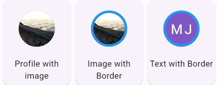
A customizable Flutter widget for displaying profile pictures, supporting both image and text options. It will show label text in case the image is not provided or fails to load. You can use any image provider, such as NetworkImage, AssetImage, and more, to display the image.

Live Demo & Experiment Page

Live demo: Demo & Experiment site

Installation

i. Add the latest version of this package to your pubspec.yaml file, and run: 'dart pub get':

dependancies:
  super_profile_picture: ^1.0.0

ii. Import the package in your Flutter App and use it.

import 'package:super_profile_picture/super_profile_picture.dart';

Note

The background color will be set according to the first letter of the label. Customization of the background color is not currently supported but may be added in the future.

Code Sample

Default

Screenshot_161 Screenshot_160

SuperProfilePicture(
    label: "Super Profile Picture",
    radius: 30,
);
SuperProfilePicture(
    label: "Super Profile Picture",
    radius: 30,
    image: NetworkImage("https://picsum.photos/200/300.jpg"),

);
Max Label Length

Screenshot_162


SuperProfilePicture(
    label: "Super Profile Picture",
    radius: 30,
    textDecorationProperties: TextDecorationProperties(
         maxLabelLength: 3,  
    ),
);
Empty Name / Blank

Screenshot_163

SuperProfilePicture(
    label: "",
    radius: 30,
);
With Border

Screenshot_164 Screenshot_165

SuperProfilePicture(
    label: "Super Profile Picture",
    radius: 30,
    border: Border.all(width: 6, color: Colors.blue),
);
SuperProfilePicture(
    label: "Super Profile Picture",
    radius: 30,
    image: NetworkImage("https://picsum.photos/200/300.jpg"),
    border: Border.all(width: 6, color: Colors.blue),

);

Properties

  • label
  • radius
  • textDecorationProperties
    • fontSize;
    • maxLabelLength;
    • useFittedBox;
    • fontColor;
    • fontWeight;
    • letterSpacing;
    • padding;
    • fontStyle;
  • imageDecorationProperties
    • frameBuilder;
    • loadingBuilder;
    • errorBuilder;
    • semanticLabel;
    • excludeFromSemantics;
    • width;
    • height;
    • color;
    • opacity;
    • colorBlendMode;
    • fit;
    • alignment;
    • repeat;
    • centerSlice;
    • matchTextDirection;
    • gaplessPlayback;
    • isAntiAlias;
    • filterQuality;
  • border
  • borderRadius
  • image
  • clipBehavior

Future Tasks

  • Add customizable background color function.

Kategorien

Quell-Repository

Projekte, die dieses Paket verwenden

Noch keine Daten verfügbar.