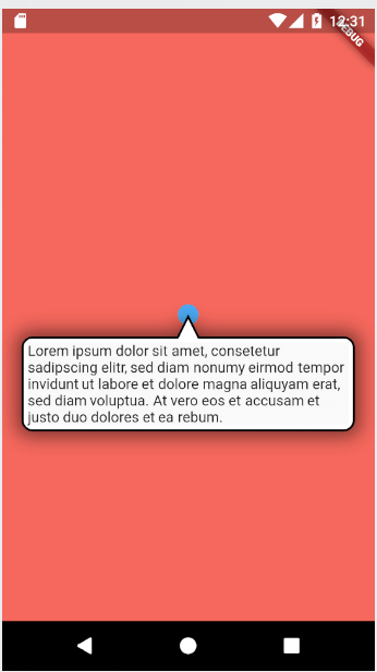
Originaler README-Schnappschuss aus dem verknüpften Quell-Repository. Aktuelle Inhalte finden Sie im Repository.
super_tooltip
SuperTooltip is a powerful and highly customizable tooltip widget for Flutter that provides extensive control over tooltip appearance, positioning, and behavior. It offers significant advantages over Flutter's standard Tooltip widget, including flexible positioning, rich styling options, backdrop effects, and advanced interaction patterns.
✨ Features
🎯 Flexible Positioning - Auto-positioning, manual directions (up, down, left, right)
🎨 Rich Styling - Customizable colors, borders, shadows, and arrow shapes
🌟 Backdrop Effects - Optional barriers and blur effects
🖱️ Interactive Behaviors - Hover support, tap-to-toggle, auto-dismiss
📦 Clean API - Organized configuration objects for better developer experience
⚡ Performance - Efficient rendering with minimal rebuilds
🎭 Animations - Smooth fade-in/fade-out with customizable durations
Installing
Run this command:
With Flutter:
flutter pub add super_tooltip
This will add a line like this to your package's pubspec.yaml (and run an implicit flutter pub get):
dependencies:
  super_tooltip: latest
Alternatively, your editor might support flutter pub get. Check the docs for your editor to learn more.
Now in your Dart code, you can use:
import 'package:super_tooltip/super_tooltip.dart' ;
🚀 Quick Start
Basic Usage
You need to make your Widget a StatefulWidget and create a SuperTooltipController to manage the tooltip's state:
class MyWidget extends StatefulWidget @override
State <MyWidget > createState () => _MyWidgetState ();
}
class _MyWidgetState extends State <MyWidget > final _controller = SuperTooltipController ();
@override
Widget build (BuildContext context) {
return SuperTooltip (
controller: _controller,
content: const Text (
"This is a simple tooltip!" ,
style: TextStyle (color: Colors .white),
),
child: IconButton (
icon: const Icon (Icons .info),
onPressed: () => _controller.showTooltip (),
),
);
}
}
With GestureDetector
Wrap SuperTooltip with a GestureDetector, MouseRegion, or InkWell for explicit control:
GestureDetector (
onTap: () => _controller.showTooltip (),
child: SuperTooltip (
controller: _controller,
content: const Text (
"Lorem ipsum dolor sit amet, consetetur sadipscing elitr" ,
softWrap: true ,
style: TextStyle (color: Colors .white),
),
child: Container (
width: 40.0 ,
height: 40.0 ,
decoration: const BoxDecoration (
shape: BoxShape .circle,
color: Colors .blue,
),
child: const Icon (Icons .add, color: Colors .white),
),
),
)
📚 Configuration Objects
The refactored API uses configuration objects to group related parameters, making it easier to understand and use:
TooltipStyle - Visual Appearance
Control the tooltip's visual appearance:
SuperTooltip (
style: TooltipStyle (
backgroundColor: Colors .deepPurple,
borderColor: Colors .purpleAccent,
borderWidth: 2.0 ,
borderRadius: 15.0 ,
hasShadow: true ,
shadowColor: Colors .black26,
shadowBlurRadius: 20.0 ,
bubbleDimensions: EdgeInsets .all (12 ),
),
)
PositionConfiguration - Positioning
Control where the tooltip appears:
SuperTooltip (
positionConfig: PositionConfiguration (
preferredDirection: TooltipDirection .auto,
minimumOutsideMargin: 20.0 ,
top: 10.0 ,
left: 10.0 ,
snapsFarAwayVertically: false ,
),
)
Directions:
TooltipDirection.auto - Automatically chooses the best directionTooltipDirection.up - Above the targetTooltipDirection.down - Below the targetTooltipDirection.left - To the left of targetTooltipDirection.right - To the right of target
ArrowConfiguration - Arrow Customization
Customize the tooltip arrow:
SuperTooltip (
arrowConfig: ArrowConfiguration (
length: 20.0 ,
baseWidth: 25.0 ,
tipRadius: 5.0 ,
tipDistance: 3.0 ,
),
)
CloseButtonConfiguration - Close Button
Add a close button to your tooltip:
SuperTooltip (
closeButtonConfig: CloseButtonConfiguration (
show : true ,
type: CloseButtonType .inside,
color: Colors .white,
size: 24.0 ,
),
)
BarrierConfiguration - Backdrop Effects
Control the backdrop behind the tooltip:
SuperTooltip (
barrierConfig: BarrierConfiguration (
show : true ,
color: Colors .black54,
showBlur: true ,
sigmaX: 10.0 ,
sigmaY: 10.0 ,
),
)
InteractionConfiguration - User Interaction
Control how users interact with the tooltip:
SuperTooltip (
interactionConfig: InteractionConfiguration (
showOnHover: true ,
hideOnHoverExit: true ,
toggleOnTap: true ,
hideOnTap: false ,
hideOnBarrierTap: true ,
hideOnScroll: false ,
clickThrough: false ,
),
)
AnimationConfiguration - Animation Timing
Control animation behavior:
SuperTooltip (
animationConfig: AnimationConfiguration (
fadeInDuration: Duration (milliseconds: 300 ),
fadeOutDuration: Duration (milliseconds: 200 ),
waitDuration: Duration (milliseconds: 500 ),
showDuration: Duration (seconds: 3 ),
exitDuration: Duration (milliseconds: 100 ),
),
)
🎯 Common Use Cases
Auto-Positioning Tooltip
Let the tooltip automatically choose the best position:
SuperTooltip (
controller: _controller,
positionConfig: const PositionConfiguration (
preferredDirection: TooltipDirection .auto,
),
content: const Text (
"I automatically position myself!" ,
style: TextStyle (color: Colors .white),
),
child: const Icon (Icons .help),
)
Hover Tooltip (Web/Desktop)
Show tooltip on hover with automatic dismissal:
SuperTooltip (
controller: _controller,
interactionConfig: const InteractionConfiguration (
showOnHover: true ,
hideOnHoverExit: true ,
),
animationConfig: const AnimationConfiguration (
waitDuration: Duration (milliseconds: 500 ),
),
content: const Text (
"Hover tooltip!" ,
style: TextStyle (color: Colors .white),
),
child: const Icon (Icons .info),
)
Custom Styled Tooltip
Create a visually distinct tooltip:
SuperTooltip (
controller: _controller,
style: TooltipStyle (
backgroundColor: Colors .red,
borderColor: Colors .redAccent,
borderWidth: 3.0 ,
borderRadius: 15.0 ,
hasShadow: true ,
shadowColor: Colors .red.withOpacity (0.3 ),
shadowBlurRadius: 20.0 ,
),
arrowConfig: const ArrowConfiguration (
length: 15.0 ,
baseWidth: 25.0 ,
),
content: const Padding (
padding: EdgeInsets .all (12.0 ),
child: Text (
"Error: Something went wrong!" ,
style: TextStyle (color: Colors .white),
),
),
child: const Icon (Icons .error, color: Colors .red),
)
Tooltip with Complex Content
Add rich content with buttons and interactions:
SuperTooltip (
controller: _controller,
style: TooltipStyle (
backgroundColor: Colors .white,
borderColor: Colors .grey.shade300,
borderWidth: 1 ,
),
closeButtonConfig: const CloseButtonConfiguration (
show : true ,
color: Colors .grey,
),
constraints: const BoxConstraints (maxWidth: 300 ),
content: Padding (
padding: const EdgeInsets .all (16.0 ),
child: Column (
mainAxisSize: MainAxisSize .min,
children: [
const Text (
'Confirm Action' ,
style: TextStyle (fontWeight: FontWeight .bold, fontSize: 16 ),
),
const SizedBox (height: 12 ),
const Text ('Are you sure you want to continue?' ),
const SizedBox (height: 16 ),
Row (
mainAxisAlignment: MainAxisAlignment .spaceEvenly,
children: [
ElevatedButton (
onPressed: () => _controller.hideTooltip (),
child: const Text ('Cancel' ),
),
ElevatedButton (
onPressed: () {
_controller.hideTooltip ();
},
child: const Text ('Confirm' ),
),
],
),
],
),
),
child: ElevatedButton (
onPressed: () => _controller.showTooltip (),
child: const Text ('Delete' ),
),
)
Toggle Tooltip
Create a tooltip that toggles on/off with taps:
SuperTooltip (
controller: _controller,
interactionConfig: const InteractionConfiguration (
toggleOnTap: true ,
hideOnBarrierTap: false ,
),
content: const Text (
"Tap the icon again to close" ,
style: TextStyle (color: Colors .white),
),
child: const Icon (Icons .info),
)
Auto-Dismiss Tooltip
Show tooltip that automatically dismisses after a duration:
SuperTooltip (
controller: _controller,
animationConfig: const AnimationConfiguration (
showDuration: Duration (seconds: 3 ),
),
content: const Text (
"I'll close automatically!" ,
style: TextStyle (color: Colors .white),
),
child: const Icon (Icons .notifications),
)
🎨 Advanced Customization
Custom Decoration with DecorationBuilder
For complete control over the tooltip's appearance, use decorationBuilder:
SuperTooltip (
decorationBuilder: (target) {
return ShapeDecoration (
color: Colors .blue,
shadows: [
BoxShadow (
color: Colors .black26,
blurRadius: 10 ,
offset: Offset (0 , 4 ),
),
],
shape: CustomShape (
target: target,
),
);
},
)
Callbacks and Events
React to tooltip state changes:
SuperTooltip (
controller: _controller,
onShow: () {
print ('Tooltip shown!' );
},
onHide: () {
print ('Tooltip hidden!' );
},
content: const Text ("Hello!" ),
child: const Icon (Icons .info),
)
Touch-Through Areas
Allow touches to pass through specific areas:
SuperTooltip (
controller: _controller,
touchThroughArea: Rect .fromLTWH (100 , 100 , 200 , 100 ),
touchThroughAreaShape: ClipAreaShape .rectangle,
touchThroughAreaCornerRadius: 10.0 ,
barrierConfig: const BarrierConfiguration (show : true ),
content: const Text ("Tutorial step 1" ),
child: const Icon (Icons .lightbulb),
)
📱 Mobile-Specific Features
Handle Back Button (Android)
Dismiss tooltip when the back button is pressed:
class MyWidget extends StatefulWidget @override
State <MyWidget > createState () => _MyWidgetState ();
}
class _MyWidgetState extends State <MyWidget > final _controller = SuperTooltipController ();
Future <bool > _willPopCallback () async {
if (_controller.isVisible) {
await _controller.hideTooltip ();
return false ;
}
return true ;
}
@override
Widget build (BuildContext context) {
return PopScope (
onPopInvokedWithResult: (didPop, result) => _willPopCallback (),
child: GestureDetector (
onTap: () => _controller.showTooltip (),
child: SuperTooltip (
controller: _controller,
content: const Text ("Tooltip content" ),
child: const Icon (Icons .info),
),
),
);
}
}
🖥️ Desktop & Web Features
Mouse Hover Support
SuperTooltip automatically handles mouse hover events on Web and Desktop platforms:
SuperTooltip (
controller: _controller,
interactionConfig: const InteractionConfiguration (
showOnHover: true ,
hideOnHoverExit: true ,
),
animationConfig: const AnimationConfiguration (
waitDuration: Duration (milliseconds: 500 ),
exitDuration: Duration (milliseconds: 100 ),
),
mouseCursor: SystemMouseCursors .help,
content: const Text ("Hover tooltip" ),
child: const Icon (Icons .help),
)
Note: On native mobile platforms (iOS/Android), hover events are not supported, and the tooltip reverts to standard tap-to-show behavior.
Thanks @akhil-ge0rge for the mouse hover implementation!
🎓 Migration Guide
If you're upgrading from the old API, here's how to migrate:
Old API (Flat Parameters)
SuperTooltip (
popupDirection: TooltipDirection .up,
backgroundColor: Colors .blue,
borderColor: Colors .black,
borderWidth: 2.0 ,
showCloseButton: true ,
closeButtonColor: Colors .white,
showBarrier: true ,
barrierColor: Colors .black54,
showOnHover: true ,
)
New API (Configuration Objects)
SuperTooltip (
positionConfig: PositionConfiguration (
preferredDirection: TooltipDirection .up,
),
style: TooltipStyle (
backgroundColor: Colors .blue,
borderColor: Colors .black,
borderWidth: 2.0 ,
),
closeButtonConfig: CloseButtonConfiguration (
show : true ,
color: Colors .white,
),
barrierConfig: BarrierConfiguration (
show : true ,
color: Colors .black54,
),
interactionConfig: InteractionConfiguration (
showOnHover: true ,
),
)
Benefits of the new API:
✅ Better organization and discoverability
✅ Fewer top-level parameters (42 → 13)
✅ Easier to create reusable tooltip configurations
✅ Better IDE autocomplete support
✅ More maintainable and extensible
🎯 Best Practices
Use Configuration Objects : Group related settings together
final myTooltipStyle = TooltipStyle (
backgroundColor: Colors .blue,
borderRadius: 10.0 ,
);
SuperTooltip (style: myTooltipStyle, ...)
Reuse Configurations : Create app-wide tooltip styles
class AppTooltipStyles static const primary = TooltipStyle (
backgroundColor: Colors .blue,
borderRadius: 8.0 ,
);
static const error = TooltipStyle (
backgroundColor: Colors .red,
borderRadius: 8.0 ,
);
}
Handle Controller Lifecycle : Always dispose controllers
@override
void dispose () {
_controller.dispose ();
super .dispose ();
}
Use Auto Direction : Let the tooltip position itself
positionConfig: PositionConfiguration (
preferredDirection: TooltipDirection .auto,
)
📖 Example App
Find comprehensive examples in the example directory .
Examples include:
Basic tooltips
Auto-positioning
Custom styling
Close buttons
Directional tooltips
Backdrop effects
Interactive behaviors
Complex content
Multiple tooltips
🤝 Contributing
Contributions are welcome! Here's how you can help:
Report Issues : Check existing issues or create a new oneSubmit Pull Requests :
For non-trivial fixes, create an issue first
For trivial fixes, open a PR directly
Improve Documentation : Help us make the docs betterShare Examples : Show us your creative uses of SuperTooltip
👥 Contributors
Made with contrib.rocks .
📄 License
This project is licensed under the MIT License - see the LICENSE file for details.
🙏 Acknowledgments
Special thanks to all contributors who have helped make SuperTooltip better!