Pakete, Repositories und App-Kategorien suchen

Cover von timeline_list
Paketdetailsv0.1.1

timeline_list

Flutter-Widget zur Erstellung hochgradig anpassbarer Zeitachsen. Perfekt für Onboarding-Flows, Fortschrittsverfolgung und interaktive Historienanzeigen.

AndroidiOSWebmacOSWindowsLinux
30-Tage-Downloads
4070
Likes
222
Pub-Punkte
160

Paket installieren

flutter pub add timeline_list

Paketübersicht

Aus öffentlichen Paketdaten erstellte Orientierung.

Ein hochgradig anpassbarer Flutter-Widget zur Erstellung interaktiver Zeitleisten, ideal für die Visualisierung von Abläufen wie Onboarding-Prozesse, Fortschrittsverfolgung und Darstellung historischer Ereignisse. Unterstützt verschiedene Layout-Optionen und Gestaltungsmöglichkeiten, sodass Entwickler ansprechende Benutzererfahrungen auf mehreren Plattformen erstellen können. Das Paket ist flexibel gestaltet und ermöglicht die Anpassung von Zeitlinien-Elementen, Verbindern und Markern. Es lässt sich nahtlos in Flutter-Anwendungen integrieren mit minimaler Einrichtung.

Anwendungsfälle

  • Onboarding-Flows
  • Fortschrittsverfolgung
  • History displays
  • Ereignissequenz
  • Benutzerreise-Visualisierung
  • Interaktive Tutorials

Hauptmerkmale

  • Hochgradig anpassbarer Design
  • Unterstützung für mehrere Plattformen
  • Flexible Element- und Verbindungsstil
  • Glatte Animationen
  • Einfache Integration mit Flutter
  • Responsive-Layout-Optionen

Geeignet für

  • App-Willkommensbildschirme
  • Aufgabenabschluss-Tracker
  • Chronologische Datenpräsentation
  • Bildungsanwendungen
  • Benutzeraktivitätsprotokolle

Hinweise

  • Benötigt manuelle Konfiguration für komplexe Layouts
  • Eingeschränkte integrierte Themen
  • Kann zusätzliche Stilisierung für Barrierefreiheit erforderlich sein
  • Leistungseinfluss bei großen Datensätzen
  • Nicht für vertikales Scrollen in dichten Zeitachsen optimiert

Original-README

Originaler README-Schnappschuss aus dem verknüpften Quell-Repository. Aktuelle Inhalte finden Sie im Repository.

Flutter Timeline Widget

pub package Flutter Timeline List Web Demo

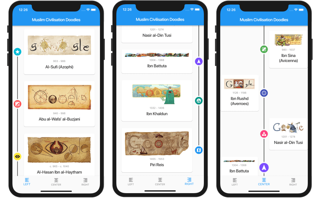
A highly customizable Flutter widget for displaying vertical timelines with custom markers, icons, and flexible positioning options.

Flutter Timeline List Screenshot

[!WARNING] 🦚 The documentation was created using LLMs. If you notice any errors or typos, please submit a Pull Request or create an issue.

Features

  • 🎯 Three timeline positions: start (left), center, or end (right)
  • 🎨 Fully customizable markers with any widget as content or icon
  • 📍 Flexible icon alignment: top, center, or bottom of markers
  • 🎯 Individual marker positioning for centered timelines
  • 🔄 Support for reversed timeline order
  • 📱 Custom scroll physics and controller support

Installation

Add this to your package's pubspec.yaml file:

dependencies:
  timeline_list: ^0.1.0

Usage

Simple Timeline

Flutter Simple Timeline List Screenshot

import 'package:timeline_list/timeline_list.dart';

Timeline(
  children: [
    Marker(child: Text("Step 1")),
    Marker(child: Text("Step 2")),
    Marker(child: Text("Step 3"))
  ],
)
Onboarding Example

Here's a more advanced example showing an onboarding timeline with custom icons:

Flutter Onboarding Timeline List Screenshot

var checkIcon = Container(
    width: 16,
    height: 16,
    decoration: BoxDecoration(shape: BoxShape.circle, color: Colors.green),
    child: Icon(Icons.check, color: Colors.white, size: 12));
var emptyIcon = Container(
    width: 16,
    height: 16,
    decoration: BoxDecoration(shape: BoxShape.circle, color: Colors.grey));
return Scaffold(
    appBar: AppBar(title: const Text("Onboarding example")),
    body: Column(children: [
      Timeline.builder(
        context: context,
        markerCount: 10,
        properties: TimelineProperties(
            iconAlignment: MarkerIconAlignment.center,
            iconSize: 16,
            timelinePosition: TimelinePosition.start),
        markerBuilder: (context, index) => Marker(
          child: Padding(
            padding: const EdgeInsets.all(8.0),
            child: Text("Step ${index + 1}"),
          ),
          icon: index >= 8 ? emptyIcon : checkIcon,
          position: MarkerPosition.left,
        ),
      ),
    ]));

Customization

Timeline Properties
  • timelinePosition: Controls the overall timeline position (start, center, end)
  • iconAlignment: Sets icon alignment relative to marker content
  • iconSize: Defines the size of marker icons
  • lineWidth: Sets the width of connecting lines
  • lineColor: Customizes the color of connecting lines
  • itemGap: Controls spacing between markers
  • iconGap: Sets gap between icon and marker content
Marker Properties
  • child: The main content widget of the marker
  • icon: Optional custom icon widget
  • position: Marker position for centered timelines (left, right)
  • onTap: Optional callback for marker tap events
  • maxWidth: Maximum width constraint for marker content

Examples

Check out the example/ folder for complete sample applications, including:

  • Fully featured timeline with custom icons and widgets
  • Simple onboarding flow

Contributing

This repo is looking for maintainers. Contributions are welcome! Please feel free to submit a Pull Request.

Thank you for all the contributors!


Sponsored by:

Kategorien

Quell-Repository

Projekte, die dieses Paket verwenden