Pakete, Repositories und App-Kategorien suchen

Cover von timelines_plus
Paketdetailsv2.0.1

timelines_plus

Aktualisierte Version des Timelines-Pakets. Hinweis: Dies ist nur eine aktualisierte Version dieses Pakets: https://pub.dev/packages/timelines

AndroidiOSWebmacOSWindowsLinux
30-Tage-Downloads
54.100
Likes
281
Pub-Punkte
160

Paket installieren

flutter pub add timelines_plus

Paketübersicht

Aus öffentlichen Paketdaten erstellte Orientierung.

timelines_plus ist eine aktualisierte Version des beliebten Timelines-Pakets und bietet erweiterte Funktionen zum Erstellen von Zeitachsen-UIs in Flutter-Anwendungen. Es stellt anpassbare Zeitachsen-Komponenten bereit, um Ereignisse chronologisch auf Android, iOS, Web, macOS, Windows und Linux darzustellen. Das Paket unterstützt sowohl vertikale als auch horizontale Layouts mit flexiblen Gestaltungsmöglichkeiten für Markierungen, Verbindungsstücke und Beschriftungen. Für Entwickler, die eine zuverlässige und leistungsstarke Möglichkeit suchen, Ereignisabläufe visuell darzustellen, wurde es entwickelt und bleibt mit dem ursprünglichen Paket kompatibel, während Verbesserungen für moderne Flutter-Entwicklung eingeführt werden.

Anwendungsfälle

  • Anzeigen von Ereignisverläufen
  • Projektmeilensteine visualisieren
  • Schritt-für-Schritt-Prozesse anzeigen
  • Onboarding-Flows erstellen
  • Verfolgung von Benutzeraktivitätszeitleisten

Hauptmerkmale

  • Unterstützung für vertikale und horizontale Zeitachsen
  • Anpassbare Marker und Verbindungen
  • Plattformübergreifende Kompatibilität
  • Verbesserte Leistung im Vergleich zum ursprünglichen Paket
  • Einfache Integration in bestehende Flutter-Projekte

Geeignet für

  • Entwickler, die Aufgabenverfolgungs-Apps erstellen
  • Teams, die Projektmanagement-Tools erstellen
  • Designer, die chronologische Benutzeroberflächen umsetzen
  • Lernapps mit Lernfortschritten
  • Anwendungen, die eine Ereignissequenzvisualisierung erfordern

Hinweise

  • Erfordert Flutter SDK 3.0 oder höher
  • Beschränkt auf grundlegende Zeitachsen-Designs ohne fortgeschrittene Animationen
  • Keine integrierte Unterstützung für dynamische Datenaktualisierungen
  • Am besten geeignet für statische oder einfache interaktive Zeitleisten
  • Abhängig von der Stabilität des übergeordneten Pakets

Original-README

Originaler README-Schnappschuss aus dem verknüpften Quell-Repository. Aktuelle Inhalte finden Sie im Repository.

Pub Awesome Flutter License: MIT

A powerful & easy to use timeline package for Flutter! 🚀

Caveat: This package is an early stage. Not enough testing has been done to guarantee stability. Some APIs may change.

Examples

Check it out on the web or look at the source code.

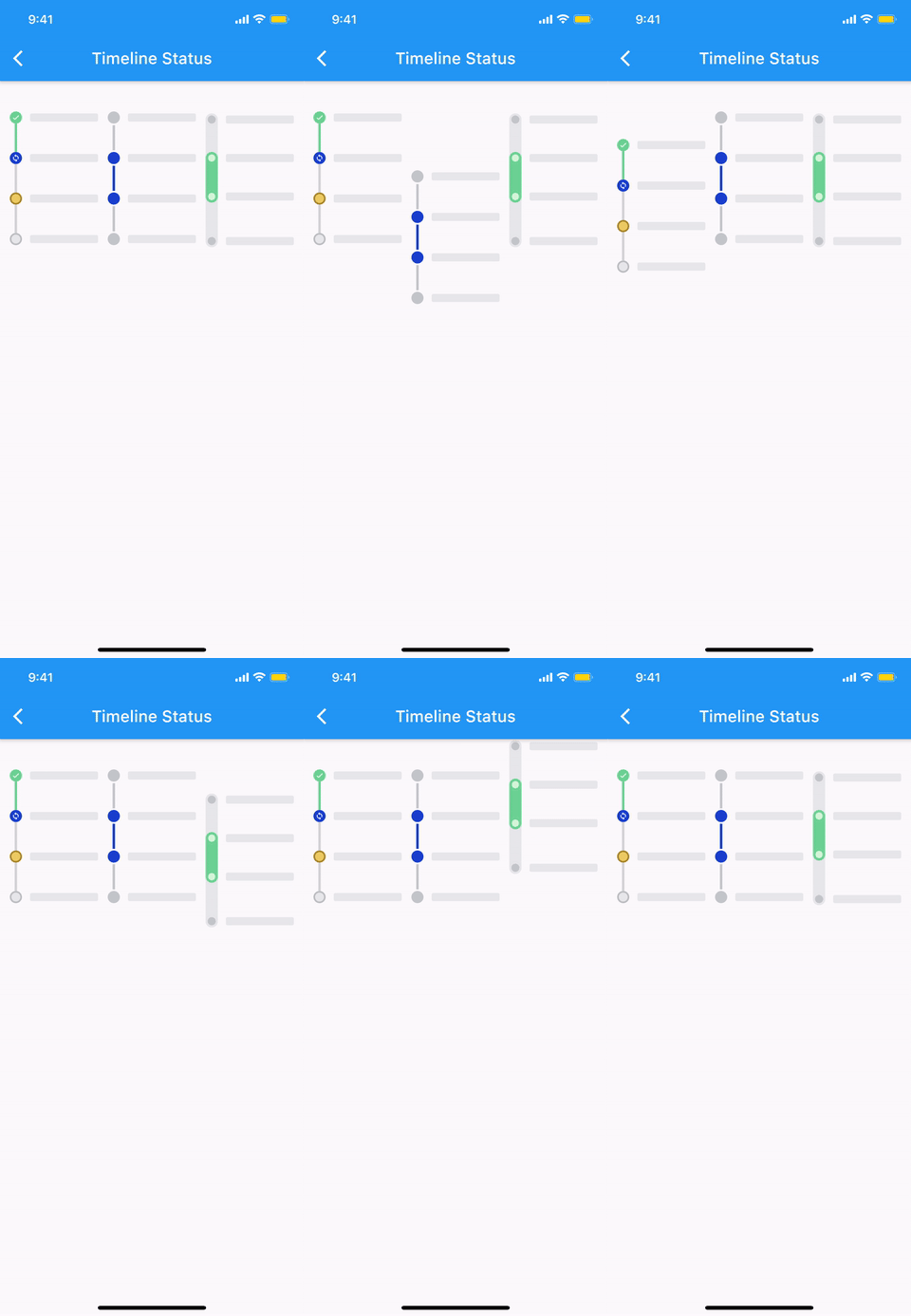
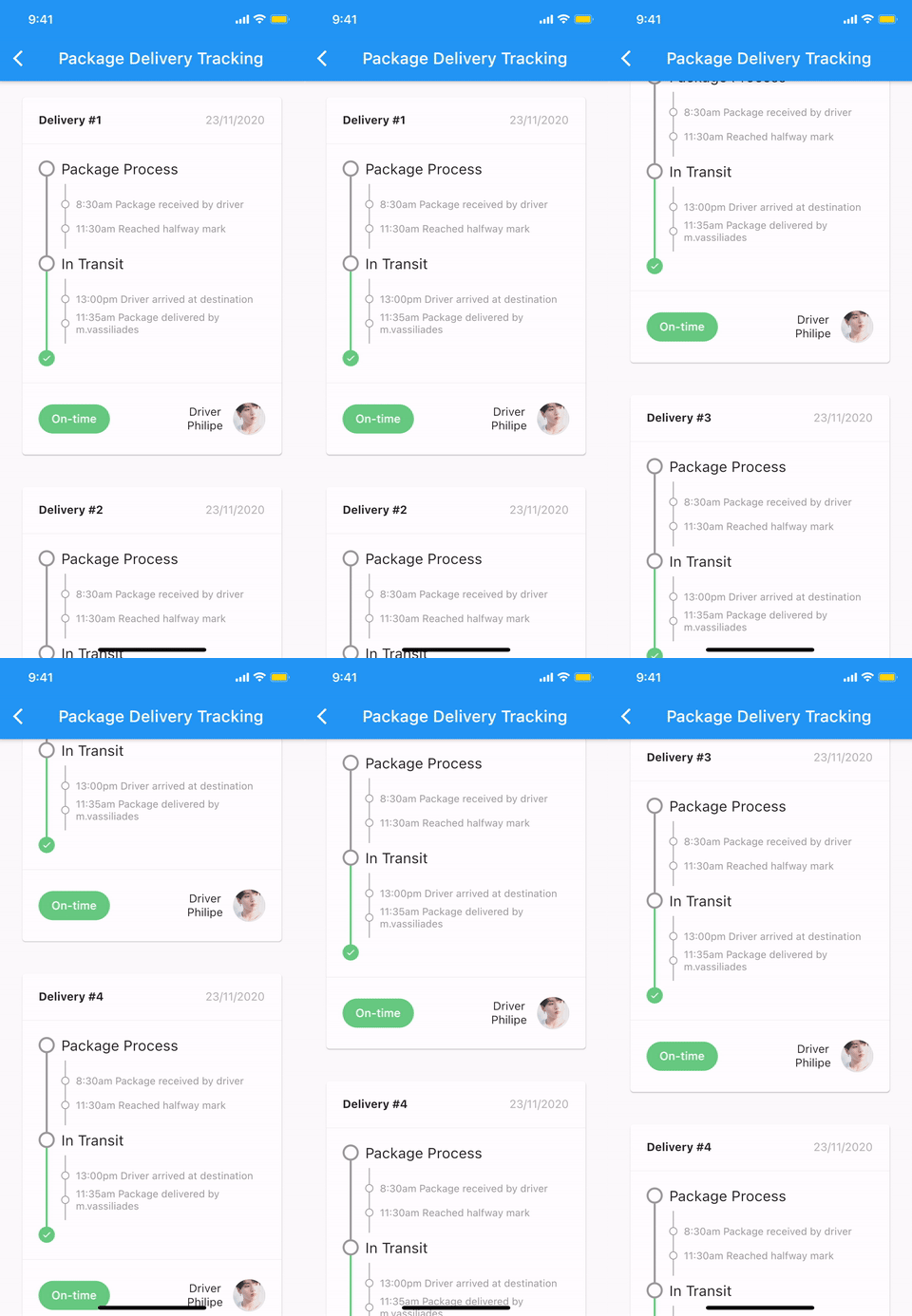
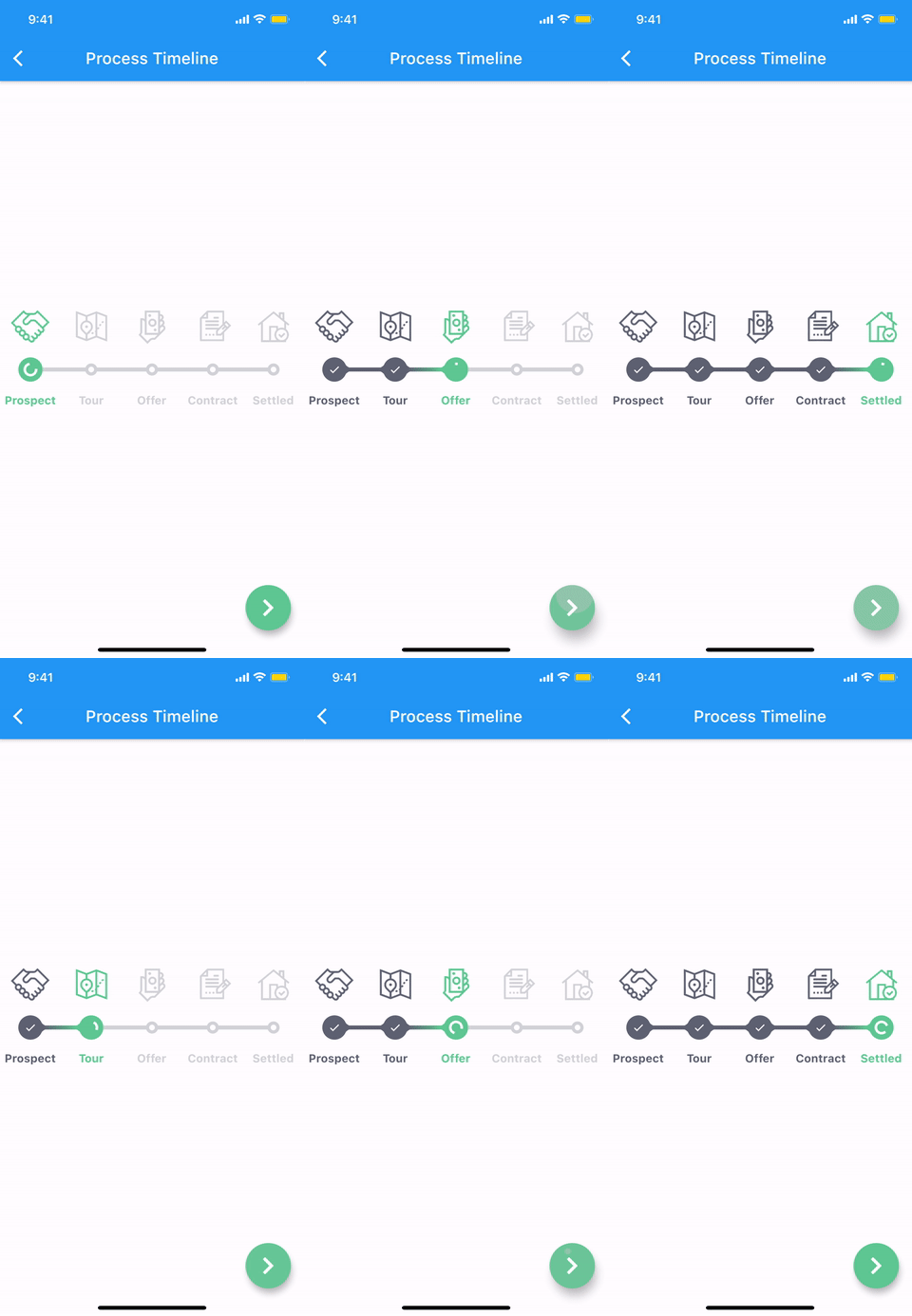
Timeline status Package delivery tracking Process timeline
timeline_status package_delivery_tracking.gif process_timeline.gif

More examples
🚧 WIP 🚧

Features

The timeline and each components are all WIDGET.
  • Common styles can be easily implemented with predefined components.
  • Vertical, horizontal direction.
  • Alternating contents.
  • Combination with Flutter widgets(Row, Column, CustomScrollView, etc).
  • Customize each range with themes.

Getting started

Installation

1. Depend on it

Add this to your package's pubspec.yaml file:

dependencies:
  timelines_plus: ^[latest_version]
2. Install it

You can install packages from the command line:

with Flutter:

$ flutter pub get

Alternatively, your editor might support flutter pub get. Check the docs for your editor to learn more.

3. Import it

Now in your Dart code, you can use:

import 'package:timelines_plus/timelines_plus.dart';

Basic Usage

@override
Widget build(BuildContext context) {
  return Timeline.tileBuilder(
    builder: TimelineTileBuilder.fromStyle(
      contentsAlign: ContentsAlign.alternating,
      contentsBuilder: (context, index) => Padding(
        padding: const EdgeInsets.all(24.0),
        child: Text('Timeline Event $index'),
      ),
      itemCount: 10,
    ),
  );
}

Check the Example or the API reference for more details.

Components

Theme

Check out Theme Demo to see how the values inside TimelineTile work with the theme.

To customize the timeline component with a theme, do the following:

TimelineTheme(
  data: TimelineThemeData(...),
  child: DotIndicator(...),
);

If you only want to change part of the parent theme, use TimelineTheme.of(context):

TimelineTheme(
  data: TimelineThemeData.of(context).copyWith(...),
  child: DotIndicator(...),
);

If the component you want to customize is Timeline or FixedTimeline, this is also possible:

FixedTimeline(
  theme: TimelineThemeData(...),
  children: [...],
);
Indicator
ContainerIndicator
ContainerIndicator
ContainerIndicator(
  child: Container(
    width: 15.0,
    height: 15.0,
    color: Colors.blue,
  ),
)
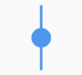
DotIndicator
DotIndicator
DotIndicator()
OutlinedDotIndicator
OutlinedDotIndicator()
Connector
SolidLineConnector
SolidLineConnector
SizedBox(
  height: 20.0,
  child: SolidLineConnector(),
)
DashedLineConnector
DashedLineConnector
SizedBox(
  height: 20.0,
  child: DashedLineConnector(),
)
DecoratedLineConnector
SizedBox(
  height: 20.0,
  child: DecoratedLineConnector(
    decoration: BoxDecoration(
      gradient: LinearGradient(
        begin: Alignment.topCenter,
        end: Alignment.bottomCenter,
        colors: [Colors.blue, Colors.lightBlueAccent[100]],
      ),
    ),
  ),
)
TimelineNode

Pure timeline UI component with no content.

The TimelineNode contains an indicator and two connectors on both sides of the indicator:

Simple TimelineNode
Simple TimelineNode
SizedBox(
  height: 50.0,
  child: TimelineNode.simple(),
)
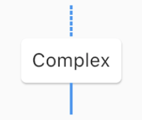
Complex TimelineNode
SizedBox(
  height: 80.0,
  child: TimelineNode(
    indicator: Card(
      margin: EdgeInsets.zero,
      child: Padding(
        padding: EdgeInsets.all(8.0),
        child: Text('Complex'),
      ),
    ),
    startConnector: DashedLineConnector(),
    endConnector: SolidLineConnector(),
  ),
)
TimelineTile

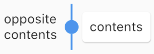
Displays content on both sides of the node:

TimelineTile
TimelineTile
TimelineTile(
  oppositeContents: Padding(
    padding: const EdgeInsets.all(8.0),
    child: Text('opposite\ncontents'),
  ),
  contents: Card(
    child: Container(
      padding: EdgeInsets.all(8.0),
      child: Text('contents'),
    ),
  ),
  node: TimelineNode(
    indicator: DotIndicator(),
    startConnector: SolidLineConnector(),
    endConnector: SolidLineConnector(),
  ),
)
TimelineTileBuilder

TimelineTileBuilder provides powerful build features.

Connection

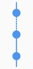
Each tile draws only half of the line connecting the neighboring tiles. Using the connected constructor, lines connecting adjacent tiles can build as one index.

ConnectionDirection.before
Connection direction before
FixedTimeline.tileBuilder(
  builder: TimelineTileBuilder.connectedFromStyle(
    connectionDirection: ConnectionDirection.before,
    connectorStyleBuilder: (context, index) {
      return (index == 1) ? ConnectorStyle.dashedLine : ConnectorStyle.solidLine;
    },
    indicatorStyleBuilder: (context, index) => IndicatorStyle.dot,
    itemExtent: 40.0,
    itemCount: 3,
  ),
)
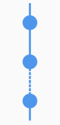
ConnectionDirection.after
Connection direction after
FixedTimeline.tileBuilder(
  builder: TimelineTileBuilder.connectedFromStyle(
    connectionDirection: ConnectionDirection.after,
    connectorStyleBuilder: (context, index) {
      return (index == 1) ? ConnectorStyle.dashedLine : ConnectorStyle.solidLine;
    },
    indicatorStyleBuilder: (context, index) => IndicatorStyle.dot,
    itemExtent: 40.0,
    itemCount: 3,
  ),
)
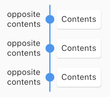
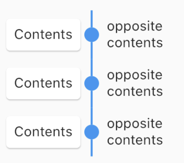
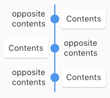
ContentsAlign

This value determines how the contents of the timeline will be built:

ContentsAlign.basic
Basic contents align
FixedTimeline.tileBuilder(
  builder: TimelineTileBuilder.connectedFromStyle(
    contentsAlign: ContentsAlign.basic,
    oppositeContentsBuilder: (context, index) => Padding(
      padding: const EdgeInsets.all(8.0),
      child: Text('opposite\ncontents'),
    ),
    contentsBuilder: (context, index) => Card(
      child: Padding(
        padding: const EdgeInsets.all(8.0),
        child: Text('Contents'),
      ),
    ),
    connectorStyleBuilder: (context, index) => ConnectorStyle.solidLine,
    indicatorStyleBuilder: (context, index) => IndicatorStyle.dot,
    itemCount: 3,
  ),
)
ContentsAlign.reverse
Reverse contents align
FixedTimeline.tileBuilder(
  builder: TimelineTileBuilder.connectedFromStyle(
    contentsAlign: ContentsAlign.reverse,
    oppositeContentsBuilder: (context, index) => Padding(
      padding: const EdgeInsets.all(8.0),
      child: Text('opposite\ncontents'),
    ),
    contentsBuilder: (context, index) => Card(
      child: Padding(
        padding: const EdgeInsets.all(8.0),
        child: Text('Contents'),
      ),
    ),
    connectorStyleBuilder: (context, index) => ConnectorStyle.solidLine,
    indicatorStyleBuilder: (context, index) => IndicatorStyle.dot,
    itemCount: 3,
  ),
)
ContentsAlign.alternating
Alternating contents align
FixedTimeline.tileBuilder(
  builder: TimelineTileBuilder.connectedFromStyle(
    contentsAlign: ContentsAlign.alternating,
    oppositeContentsBuilder: (context, index) => Padding(
      padding: const EdgeInsets.all(8.0),
      child: Text('opposite\ncontents'),
    ),
    contentsBuilder: (context, index) => Card(
      child: Padding(
        padding: const EdgeInsets.all(8.0),
        child: Text('Contents'),
      ),
    ),
    connectorStyleBuilder: (context, index) => ConnectorStyle.solidLine,
    indicatorStyleBuilder: (context, index) => IndicatorStyle.dot,
    itemCount: 3,
  ),
)
Timeline

The timeline component has two widgets, Timeline similar to ScrollView and FixedTimeline similar to Flex.

Also their constructors are similar to ScrollView and Flex.

The main difference is that they has TimelineTheme as an ancestor.

The tileBuilder constructor provides more powerful features using TimelineTileBuilder.

If you don't need TimelineTileBuilder, you can use other flutter widgets like ListView, Column, Row, etc.

Even if you use the flutter widget, you can use TimelineTheme.

Documentation

See full documentation

Changelog

See CHANGELOG.md.

License

MIT

Kategorien

Quell-Repository

Projekte, die dieses Paket verwenden