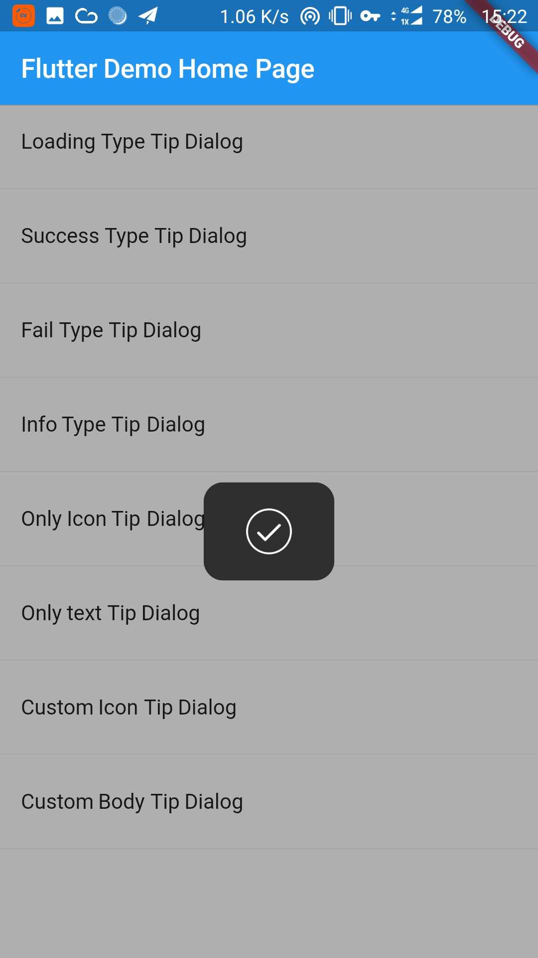
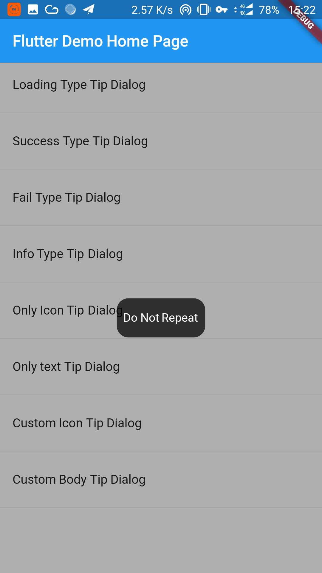
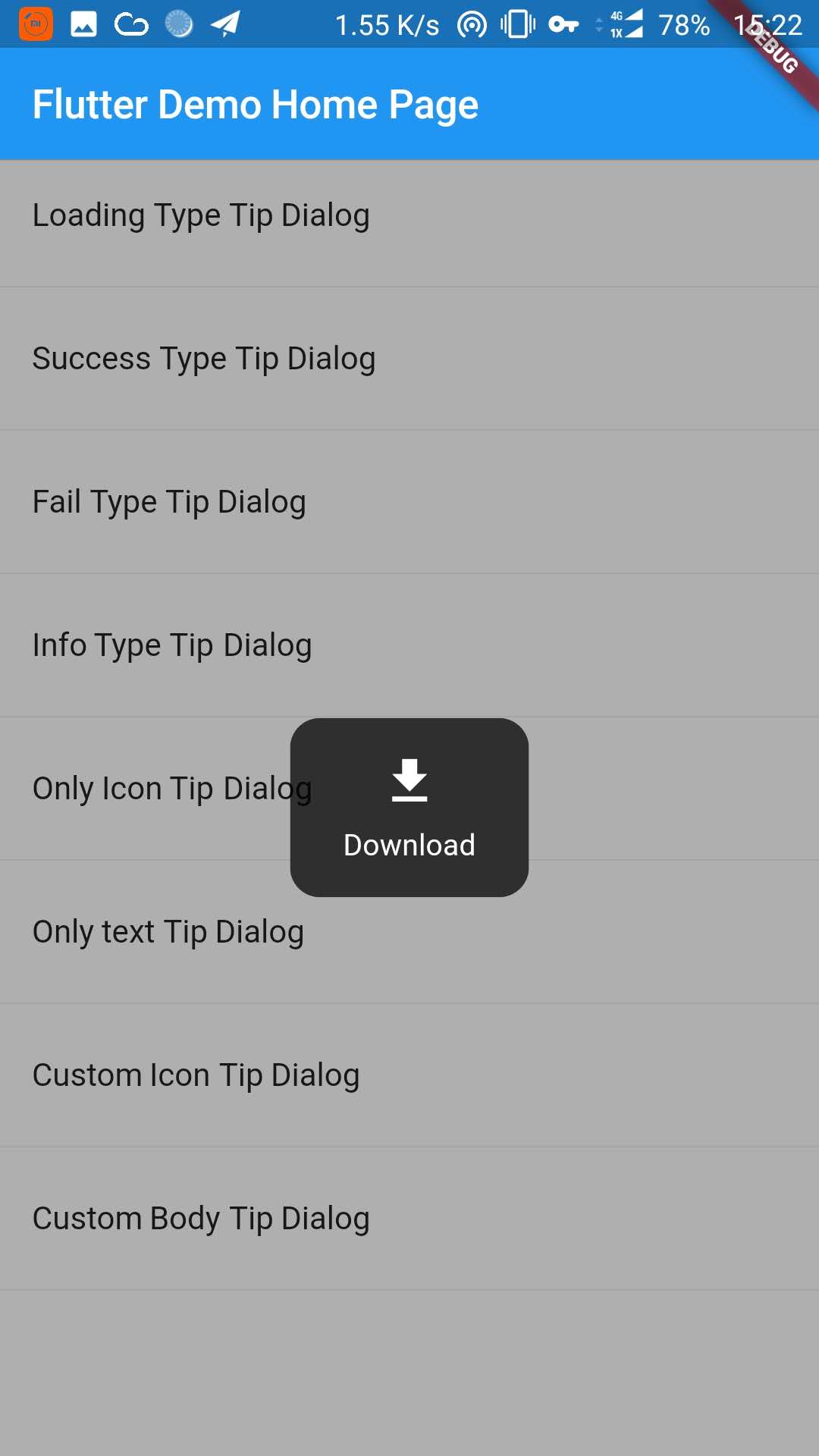
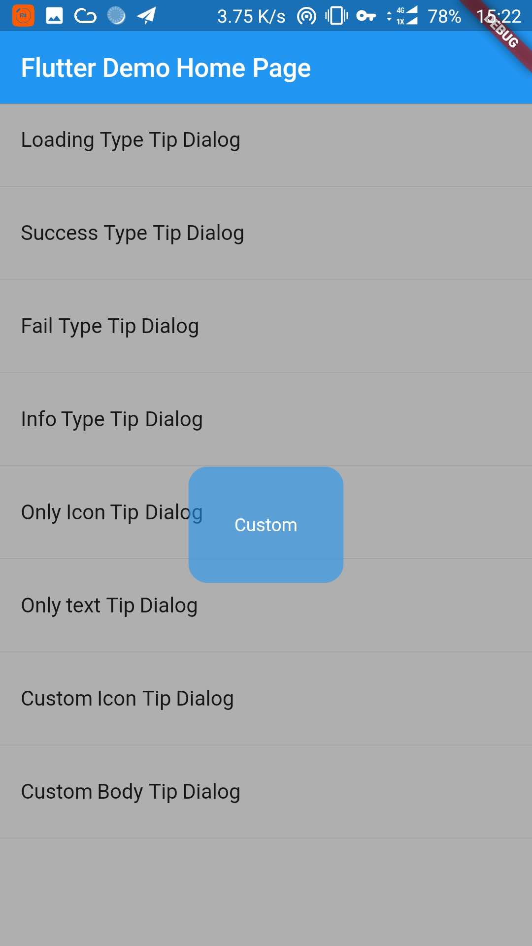
Aus öffentlichen Paketdaten erstellte Orientierung.
Ein Flutter-Paket, das einen anpassbaren Tipp-Dialog zur Anzeige kurzer Nachrichten oder Benachrichtigungen für Benutzer bereitstellt. Entwickelt für Einfachheit und einfache Integration, unterstützt es mehrere Plattformen wie Android, iOS, Web, macOS, Windows und Linux. Der Dialog kann verwendet werden, um hilfreiche Hinweise, Status-Updates oder Warnungen in einem sauberen, modernen Stil anzuzeigen. Es ist leichtgewichtig und ideal für Anwendungen, die minimale, nicht störende Feedback-Mechanismen erfordern. Das Paket wird von inrush.cn gepflegt und über pub.dev verfügbar.
Anwendungsfälle
Anzeigen von Benutzeranleitungs-Tipps
Anzeigen von temporären Statusmeldungen
Anleitungshinweise zur Onboarding-Bereitstellung
Benachrichtigung von Benutzern über Aktionen
Verbesserung der Benutzeroberflächenrückmeldung
Hauptmerkmale
Plattformübergreifende Unterstützung
Anpassbare Erscheinung
Einfache API
Leichtbauweise
Einfache Integration in Flutter-Apps
Konfigurierbare Dauer und Animation
Geeignet für
Mobile- und Web-Anwendungen
Onboarding-Flows
Benutzerbildungsfeatures
Minimalistische UI-Designs
Schnelle Feedback-Systeme
Hinweise
Beschränkt auf grundlegende Dialogfunktionen
Keine integrierte Lokalisierung
Benötigt manuelle Handhabung der Schließlogik
Nicht geeignet für komplexe Formulare oder Modals
Am besten geeignet für kurzlebige, nicht kritische Nachrichten
Original-README
Originaler README-Schnappschuss aus dem verknüpften Quell-Repository. Aktuelle Inhalte finden Sie im Repository.
TipDialog
Please use 3.0.0 or above version, because earlier versions have serious performance issues
You can install packages from the command line:
with Flutter:
$ flutter packages get
3. Import it
Now in your Dart code, you can use:
import'package:tip_dialog/tip_dialog.dart';
4. Use
Available attributes
/// [TipDialogContainer]@requiredthis.child,
/// automatically disappear timethis.duration: constDuration(seconds: 3),
/// mask layer alphathis.maskAlpha: 0.3// outside touchable, default false// if true and onOutsideTouch not set, when use TipDialogHelper.loading(), you can touch mask layer to dismiss// if true and onOutsideTouch set, when touching the mask layer, onOutsideTouch will be called.this.outsideTouchable: false// outside touch callback {@link OutsideTouchCallback}this.onOutsideTouch
Global Use
/// Use [TipDialogContainer] globally/// This widget can be globally supportedvoidmain() => runApp(newMyApp());
classMyAppextendsStatelessWidget{
@overrideWidgetbuild(BuildContext context) {
returnnewMaterialApp(
title: 'TipDialog Demo',
theme: newThemeData(),
home: Stack(
children: <Widget>[
MyHomePage(title: 'TipDialog Demo Home Page'),
// add [TipDialogContainer] widget hereTipDialogContainer(duration: constDuration(seconds: 2))
],
),
);
}
}
/// use TipDialogHelper to show or dismiss tipWidgetbuild(BuildContext context) {
returnnewScaffold(
appBar: newAppBar(
title: newText(widget.title),
elevation: 0.5,
),
body: newListView(children: <Widget>[
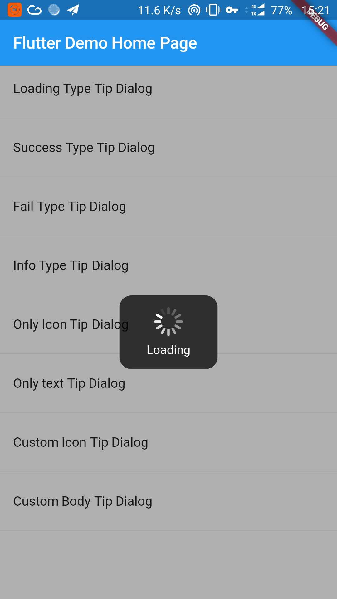
_buildItem("Loading Type Tip Dialog", () async {
TipDialogHelper.loading("Loading");
awaitnewFuture.delayed(newDuration(seconds: 5));
TipDialogHelper.dismiss();
}),
newDivider(),
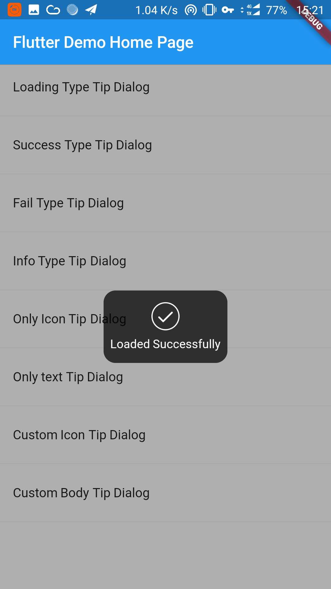
_buildItem("Success Type Tip Dialog", () async {
TipDialogHelper.success("Loaded Successfully");
}),
newDivider(),
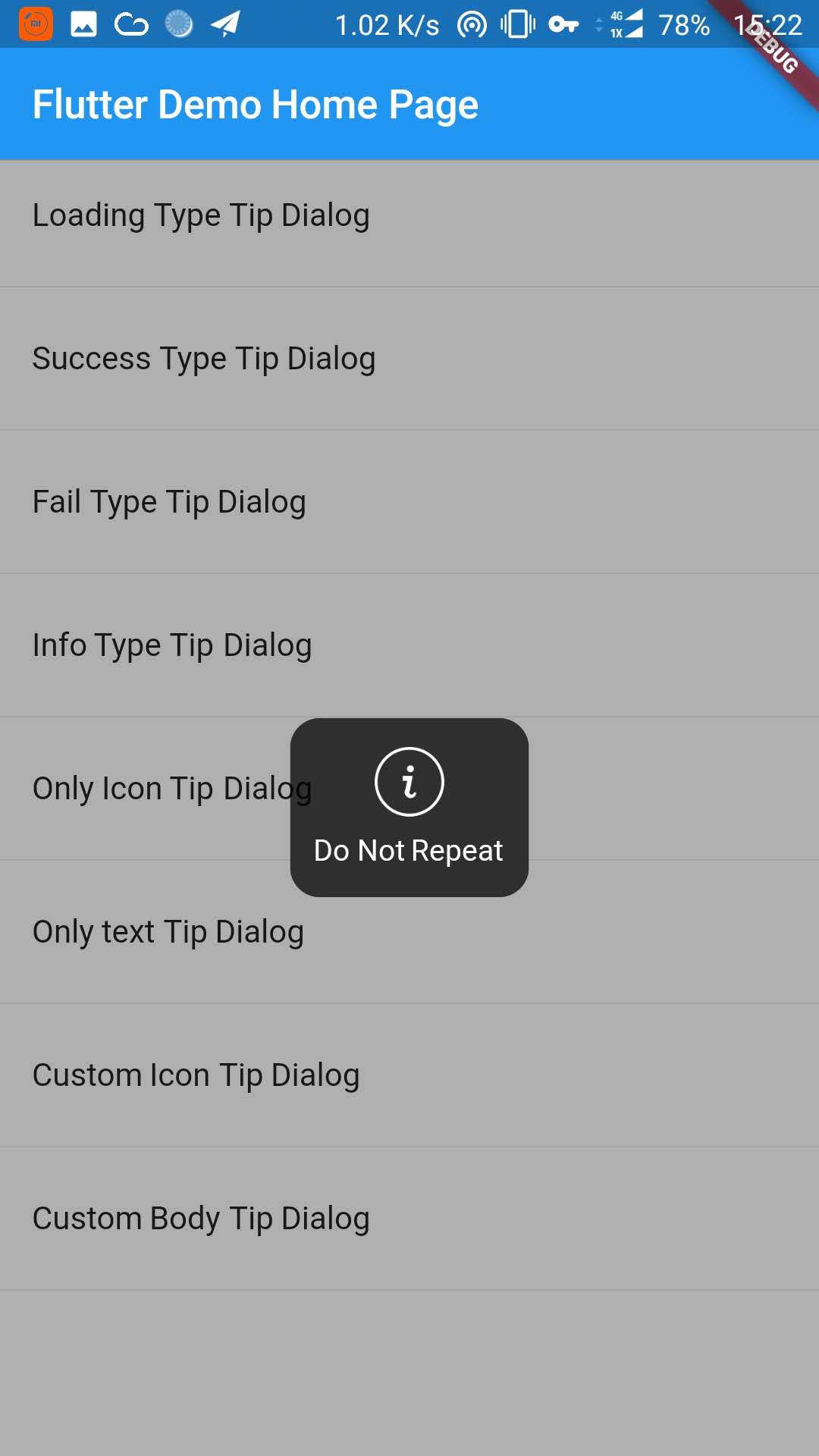
_buildItem("Only text Tip Dialog", () async {
TipDialogHelper.show(newTipDialog(
type: TipDialogType.NOTHING,
tip: "Do Not Repeat",
));
}),
newDivider(),
_buildItem("Custom Icon Tip Dialog", () async {
TipDialogHelper.show(newTipDialog.customIcon(
icon: newIcon(
Icons.file_download,
color: Colors.white,
size: 30.0,
textDirection: TextDirection.ltr,
),
tip: "Download",
));
}),
newDivider(),
_buildItem("Custom Body Tip Dialog", () async {
TipDialogHelper.show(newTipDialog.builder(
bodyBuilder: (context) {
returnnewContainer(
width: 120.0,
height: 90.0,
alignment: Alignment.center,
child: newText(
"Custom",
style: newTextStyle(color: Colors.white),
/// if TipDialogContainer are outside of MaterialApp,/// here is a must to set
textDirection: TextDirection.ltr,
),
);
},
color: Colors.blue.withAlpha(150),
));
}),
newDivider(),
]));
}
Use a custom widget when using [TipDialogContainer] globally, there may be appear some unexpected errors.
such as Text or Icon, will appear similar to the following error.
No Directionality widget found.
Just set TextDirection just fine. See the custom Widget in the example for details.
5. Default Dialog Type
enumTipDialogType { NOTHING, LOADING, SUCCESS, FAIL, INFO }
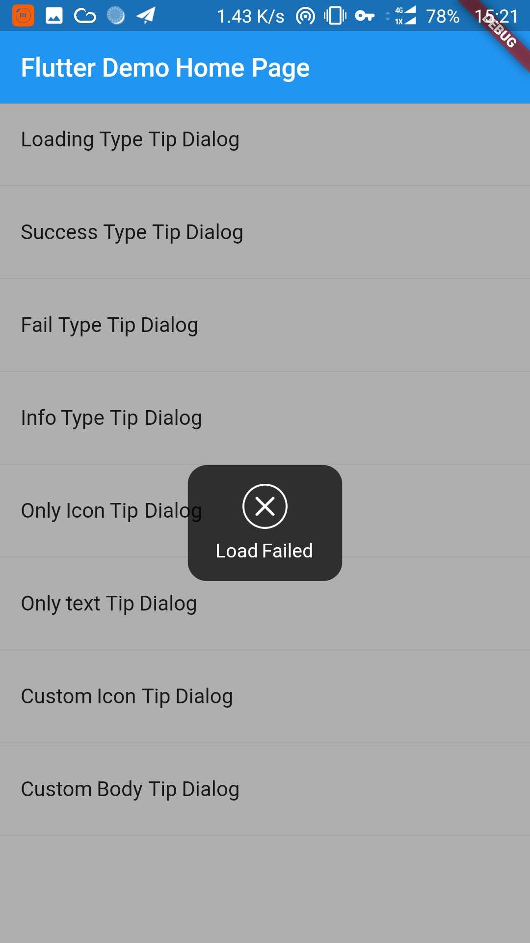
NOTHING:noiconLOADING:havealoadingiconSUCCESS:haveasuccessiconFAIL:haveafailiconINFO:haveainfoiconCUSTOM:customtipdialogtype,justasign,donothing
6. TipDialogHelper Method
/// tipDialog: Need to display the widget////// isAutoDismiss: decide whether to disappear automatically, default is true/// if true, the dialog will not automatically disappear/// otherwise, the dialog will automatically disappear after the [Duration] set by [TipDialogContainer]voidshow(Widget tipDialog, {bool isAutoDismiss: true});
/// dismiss dialogvoiddismiss();
/// show info dialogvoidinfo(String tip);
/// show fail dialogvoidfail(String errMsg);
/// show success dialogvoidsuccess(String success);
/// show loading dialogvoidloading(String loadingTip);
See the example directory for more details.
7. Change log
[4.0.0]
migrating to null safety
[3.1.0]
add outside touchable features
[3.0.0]
fix performance issues
easier way to call
[2.1.0]
add TipDialogHelper and deprecated TipDialogConnector