Pakete, Repositories und App-Kategorien suchen

Cover von titled_navigation_bar
Paketdetailsv4.1.0

titled_navigation_bar

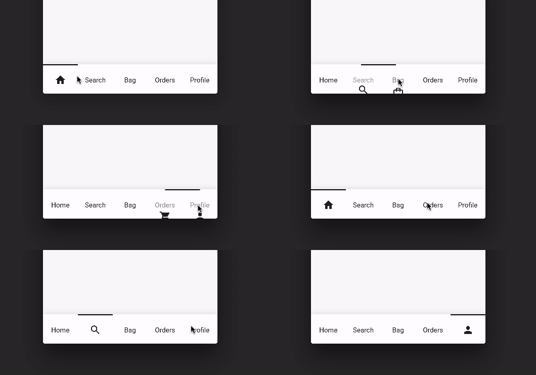
Eine schöne, saubere und einfache Bottom-Navigation-Bar mit sanfter Animation beim Klicken. Dieses Paket ist hoch anpassbar, weitere Details finden Sie unten.

30-Tage-Downloads
193
Likes
142
Pub-Punkte
40

Paket installieren

flutter pub add titled_navigation_bar

Paketübersicht

Aus öffentlichen Paketdaten erstellte Orientierung.

Eine visuell ansprechende und minimalistische Bottom-Navigation für Flutter mit glatten, animierten Übergängen bei der Auswahl. Hochgradig anpassbar ermöglicht es Entwicklern, Aussehen und Verhalten an das Design ihrer App anzupassen. Das Paket konzentriert sich auf saubere Ästhetik und intuitive Benutzerinteraktion und ist daher ideal für Apps, die eine moderne, polierte Oberfläche priorisieren. Die Integration erfolgt einfach über einen einfachen pub-Befehl und das Paket wird mit Fokus auf Leistung und Benutzerfreundlichkeit gepflegt.

Anwendungsfälle

  • Mobile Apps, die eine schlanke untere Navigationsleiste erfordern
  • Anpassbare Navigationserfahrungen
  • Auf visuelle Aufbereitung und Benutzererfahrung ausgerichtete Apps
  • Einfache, aber elegante Benutzeroberflächenkomponenten
  • Navigationsleisten mit animierten Zustandsänderungen

Hauptmerkmale

  • Glatte Klickanimationen
  • Hochgradig anpassbarer Entwurf
  • Minimalistische und saubere Ästhetik
  • Einfache Integration mit Flutter
  • Unterstützt dynamische Label-Styling

Geeignet für

  • Flutter-Entwickler, die moderne Navigations-UI suchen
  • Projekte, die auf Designkonsistenz abzielen
  • Apps mit mehreren Registerkarten oder Abschnitten
  • Entwickler, die leichte Navigationslösungen suchen
  • designorientierte mobile Anwendungen

Hinweise

  • Eingeschränkte plattformspezifische Anpassung
  • Keine integrierte Icon-Unterstützung (erfordert manuelle Einrichtung)
  • Am besten geeignet für einfache Navigationsmuster
  • Kann zusätzliche Stilisierung für komplexe Layouts erfordern
  • Nicht für sehr große Navigationsmengen optimiert

Original-README

Originaler README-Schnappschuss aus dem verknüpften Quell-Repository. Aktuelle Inhalte finden Sie im Repository.

Pub Awesome Flutter

Titled Bottom Navigation Bar

A beautiful, clean and simple bottom navigation bar with smooth animation on click. This package is high customizable, read more bellow for more details.

You can see the source code of this lib inside the /lib folder.

Show some :heart: and star the repo to support this project

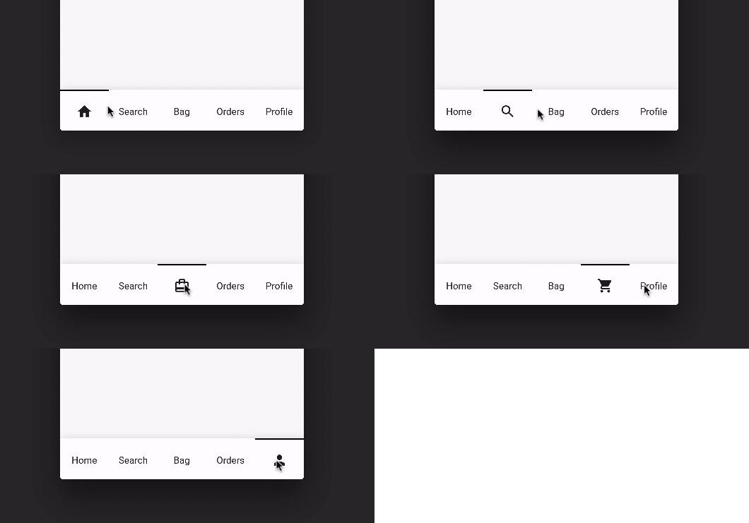
Preview (default mode)

Default Mode Gif

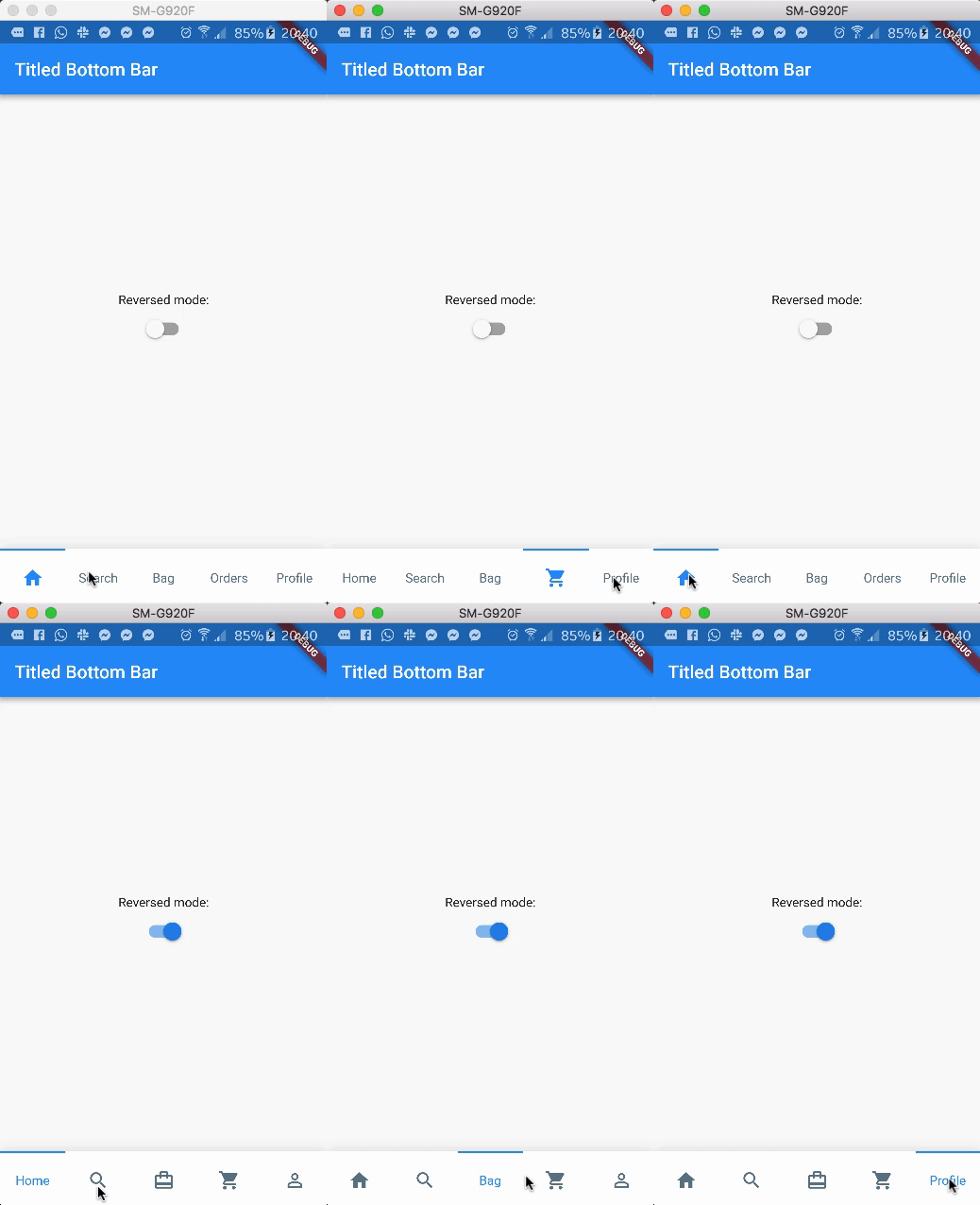
Preview (with reverse mode)

Reversed Mode Gif

Package overview

  • [x] Custom icon color
  • [x] Custom indicator color
  • [x] Support from two to five items
  • [x] Reverse mode (show selected item as icon or title)
  • [x] Option to define custom item background color
  • [x] Use currentIndex property to update the Bar giving a tab position
  • [x] No need setState(...) to update the current index
  • [x] Support RTL TextDirection (thanks to Victor Uvarov)

Getting Started

Follow these steps to use this library

Add the plugin:
dependencies:
  ...
  titled_navigation_bar: ^5.0.0-nullsafety.0
Import the package
import 'package:titled_navigation_bar/titled_navigation_bar.dart';
Adding the widget
bottomNavigationBar: TitledBottomNavigationBar(
  currentIndex: 2, // Use this to update the Bar giving a position
  onTap: (index){
    print("Selected Index: $index");
  },
  items: [
      TitledNavigationBarItem(title: Text('Home'), icon: Icons.home),
      TitledNavigationBarItem(title: Text('Search'), icon: Icons.search),
      TitledNavigationBarItem(title: Text('Bag'), icon: Icons.card_travel),
      TitledNavigationBarItem(title: Text('Orders'), icon: Icons.shopping_cart),
      TitledNavigationBarItem(title: Text('Profile'), icon: Icons.person_outline),
  ]
)

Customization (Optional)

TitledBottomNavigationBar

onTap - Use this to get notified when an item is clicked, you can retrieve the current item's index on this function. Should not be null!
items - The items of your bottom navigation bar. Use the TitledNavigationBarItem class to add items. Should not be null!
curve - Use this to define your custom curve animation. Should not be null!
reverse - If true, the visible widget of the selected item will be the Text (with the title of the item). If false, the visible widget of the selected item will be the icon. Default to false
activeColor - The active Text/Icon color. The default color is the indicatorColor of your app Theme.
inactiveColor - The inactive Text/Icon color. The default is the black color.
indicatorColor - The indicator color. The default color is the indicatorColor of your app Theme.
currentIndex - Use this to update the Bar giving a position.
enableShadow - Use this to remove the NavigationBar's shadow

TitledNavigationBarItem

icon -The icon of this item. This will be used as default state if reverse mode is disabled
title - The title of this item. This will be used as default state if reverse mode is enabled

Kategorien

Quell-Repository

Projekte, die dieses Paket verwenden