Pakete, Repositories und App-Kategorien suchen

Cover von toggle_switch
Paketdetailsv2.3.0

toggle_switch

Umschalter - Ein einfaches Umschaltwidget. Es kann vollständig mit gewünschten Symbolen, Breite, Farben, Text, Eckenradius usw. angepasst werden. Es behält auch den Auswahlstatus bei.

AndroidiOSWebmacOSWindowsLinux
30-Tage-Downloads
217.000
Likes
1640
Pub-Punkte
160

Paket installieren

flutter pub add toggle_switch

Paketübersicht

Aus öffentlichen Paketdaten erstellte Orientierung.

Ein anpassbarer Toggle-Schalter-Widget für Flutter, der eine vollständige Anpassung von Aussehen und Verhalten unterstützt. Benutzer können Breite, Farben, Symbole, Text, Eckenradius und mehr anpassen. Er behält den Auswahlstatus bei Neuerstellung bei und ist für verschiedene UI-Anforderungen geeignet, die ein Ein/Aus-Toggeln erfordern. Das Paket ist leichtgewichtig und kompatibel mit allen wichtigen Plattformen einschließlich Mobilgeräte, Web und Desktop.

Anwendungsfälle

  • Benutzereinstellungen
  • Ein-/Ausschalt-Funktions-Schalter
  • Formular-Eingabesteuerelemente
  • Dunkelmodus-Schalter
  • Profils-Konfigurationspanele

Hauptmerkmale

  • Vollständig anpassbarer Design
  • Beibehält den Auswahlstatus
  • Unterstützt Symbole und Text
  • Plattformübergreifende Kompatibilität
  • Einstellbare Größe und Gestaltung
  • Einfache API-Integration

Geeignet für

  • Entwickler, die responsive Benutzeroberflächen erstellen
  • Apps, die togglebasierte Eingaben erfordern
  • Anpassbare Formularkomponenten
  • Multiplattform-Flutter-Projekte

Hinweise

  • Erfordert in einigen Fällen die manuelle Verwaltung des Zustands
  • begrenzte eingebaute Animationen
  • Am besten geeignet für einfache Toggle-Logik
  • Nicht ideal für komplexe interaktive Widgets

Original-README

Originaler README-Schnappschuss aus dem verknüpften Quell-Repository. Aktuelle Inhalte finden Sie im Repository.

Toggle Switch

A simple toggle switch widget. It can be fully customized with desired icons, width, colors, text, corner radius, animation etc. It also maintains selection state.

Getting Started

In the pubspec.yaml of your flutter project, add the following dependency:

dependencies:
  ...
  toggle_switch: ^2.3.0

Import it:

import 'package:toggle_switch/toggle_switch.dart';

Usage Examples

Basic toggle switch
// Here, default theme colors are used for activeBgColor, activeFgColor, inactiveBgColor and inactiveFgColor
ToggleSwitch(
  initialLabelIndex: 0,
  totalSwitches: 3,
  labels: ['America', 'Canada', 'Mexico'],
  onToggle: (index) {
    print('switched to: $index');
  },
),

Basic toggle switch

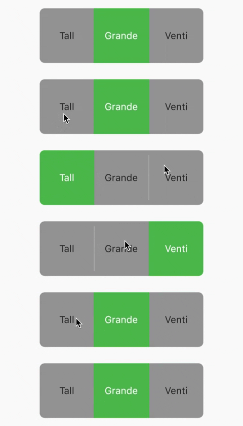
Basic toggle switch with custom height and font size
ToggleSwitch(
  minWidth: 90.0,
  minHeight: 90.0,
  fontSize: 16.0,
  initialLabelIndex: 1,
  activeBgColor: [Colors.green],
  activeFgColor: Colors.white,
  inactiveBgColor: Colors.grey,
  inactiveFgColor: Colors.grey[900],
  totalSwitches: 3,
  labels: ['Tall', 'Grande', 'Venti'],
  onToggle: (index) {
    print('switched to: $index');
  },
),

Basic toggle switch with custom height and font size

With text or icon and custom widths
ToggleSwitch(
  customWidths: [90.0, 50.0],
  cornerRadius: 20.0,
  activeBgColors: [[Colors.cyan], [Colors.redAccent]],
  activeFgColor: Colors.white,
  inactiveBgColor: Colors.grey,
  inactiveFgColor: Colors.white,
  totalSwitches: 2,
  labels: ['YES', ''],
  icons: [null, FontAwesomeIcons.times],
  onToggle: (index) {
    print('switched to: $index');
  },
),

With text or icon and custom widths

With icons, text and different active background colors
ToggleSwitch(
  minWidth: 90.0,
  initialLabelIndex: 1,
  cornerRadius: 20.0,
  activeFgColor: Colors.white,
  inactiveBgColor: Colors.grey,
  inactiveFgColor: Colors.white,
  totalSwitches: 2,
  labels: ['Male', 'Female'],
  icons: [FontAwesomeIcons.mars, FontAwesomeIcons.venus],
  activeBgColors: [[Colors.blue],[Colors.pink]],
  onToggle: (index) {
    print('switched to: $index');
  },
),

With icons, text and different active background colors

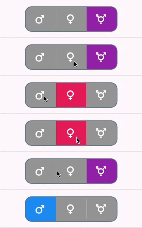
With border color, border width, icons, custom height and different active background colors
ToggleSwitch(
  minWidth: 90.0,
  minHeight: 70.0,
  initialLabelIndex: 2,
  cornerRadius: 20.0,
  activeFgColor: Colors.white,
  inactiveBgColor: Colors.grey,
  inactiveFgColor: Colors.white,
  totalSwitches: 3,
  icons: [
    FontAwesomeIcons.mars,
    FontAwesomeIcons.venus,
    FontAwesomeIcons.transgender
  ],
  iconSize: 30.0,
  borderWidth: 2.0,
  borderColor: [Colors.blueGrey],
  activeBgColors: [[Colors.blue], [Colors.pink], [Colors.purple]],
  onToggle: (index) {
    print('switched to: $index');
  },
),

With border color, border width, icons, custom height and different active background colors

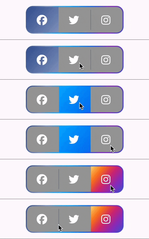
With gradient border color, divider color and gradient active background colors
ToggleSwitch(
  minWidth: 90.0,
  minHeight: 70.0,
  initialLabelIndex: 0,
  cornerRadius: 20.0,
  activeFgColor: Colors.white,
  inactiveBgColor: Colors.grey,
  inactiveFgColor: Colors.white,
  totalSwitches: 3,
  icons: [
    FontAwesomeIcons.facebook,
    FontAwesomeIcons.twitter,
    FontAwesomeIcons.instagram
  ],
  iconSize: 30.0,
  borderColor: [Color(0xff3b5998), Color(0xff8b9dc3), Color(0xff00aeff), Color(0xff0077f2), Color(0xff962fbf), Color(0xff4f5bd5)],
  dividerColor: Colors.blueGrey,
  activeBgColors: [[Color(0xff3b5998), Color(0xff8b9dc3)], [Color(0xff00aeff), Color(0xff0077f2)], [Color(0xfffeda75), Color(0xfffa7e1e), Color(0xffd62976), Color(0xff962fbf), Color(0xff4f5bd5)]],
  onToggle: (index) {
    print('switched to: $index');
  },
),

With gradient border color, divider color and gradient active background colors

With bounceInOut animation
ToggleSwitch(
  minWidth: 90.0,
  minHeight: 70.0,
  initialLabelIndex: 0,
  cornerRadius: 20.0,
  activeFgColor: Colors.white,
  inactiveBgColor: Colors.grey,
  inactiveFgColor: Colors.white,
  totalSwitches: 2,
  icons: [
    FontAwesomeIcons.lightbulb,
    FontAwesomeIcons.solidLightbulb,
  ],
  iconSize: 30.0,
  activeBgColors: [[Colors.black45, Colors.black26], [Colors.yellow, Colors.orange]],
  animate: true, // with just animate set to true, default curve = Curves.easeIn
  curve: Curves.bounceInOut, // animate must be set to true when using custom curve
  onToggle: (index) {
    print('switched to: $index');
  },
),

With bounceInOut animation

With radius style
ToggleSwitch(
  minWidth: 90.0,
  cornerRadius: 20.0,
  activeBgColors: [[Colors.green[800]!], [Colors.red[800]!]],
  activeFgColor: Colors.white,
  inactiveBgColor: Colors.grey,
  inactiveFgColor: Colors.white,
  initialLabelIndex: 1,
  totalSwitches: 2,
  labels: ['True', 'False'],
  radiusStyle: true,
  onToggle: (index) {
    print('switched to: $index');
  },
),

With radius style

With custom text styles, null initial label, double tap to de-activate
ToggleSwitch(
  minWidth: 90.0,
  cornerRadius: 20.0,
  inactiveFgColor: Colors.white,
  initialLabelIndex: null,
  doubleTapDisable: true, // re-tap active widget to de-activate
  totalSwitches: 3,
  labels: ['Normal', 'Bold', 'Italic'],
  customTextStyles: [
    null,
    TextStyle(
        color: Colors.brown,
        fontSize: 18.0,
        fontWeight: FontWeight.w900),
    TextStyle(
        color: Colors.black,
        fontSize: 16.0,
        fontStyle: FontStyle.italic)
  ],
  onToggle: (index) {
    print('switched to: $index');
  },
),

With custom text styles, null initial label, double tap to de-activate

With custom icons
ToggleSwitch(
  minWidth: 90.0,
  minHeight: 90.0,
  cornerRadius: 20.0,
  activeBgColors: [
    [Color(0xfffdbb0a)],
    [Colors.black54],
    [Colors.white54]
  ],
  inactiveFgColor: Colors.white,
  initialLabelIndex: 2,
  totalSwitches: 3,
  customIcons: [
    Icon(
      FontAwesomeIcons.ccVisa,
      color: Color(0xff1a1f71),
      size: 55.0,
    ),
    Icon(
      FontAwesomeIcons.ccMastercard,
      color: Color(0xffF79E1B),
      size: 55.0,
    ),
    Icon(
      FontAwesomeIcons.ccAmex,
      color: Color(0xff27AEE3),
      size: 55.0,
    )
  ],
  onToggle: (index) {
    print('switched to: $index');
  },
),

With custom icons

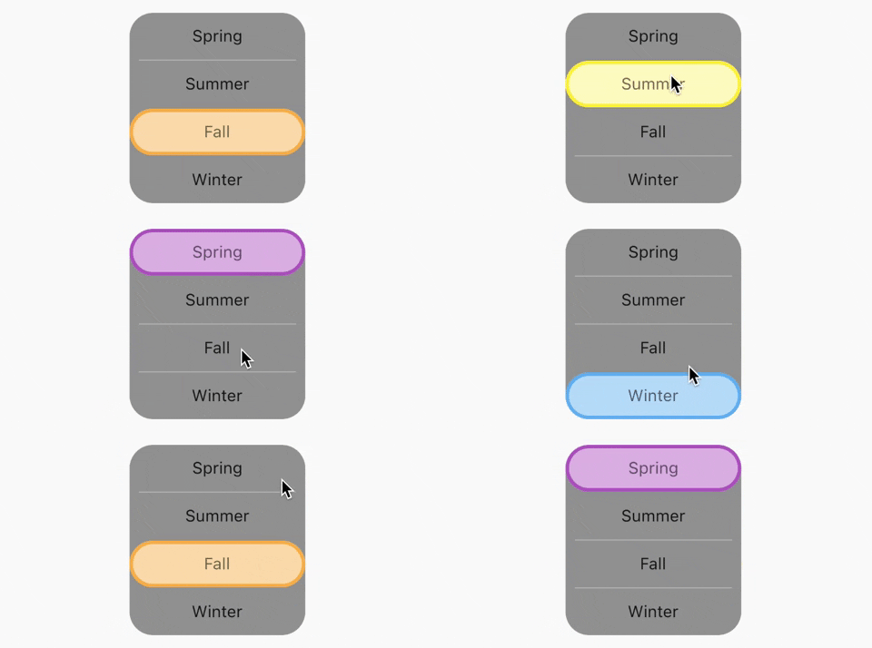
Vertical toggle switch with active border
ToggleSwitch(
  activeBorders: [
    Border.all(
      color: Colors.purple,
      width: 3.0,
    ),
    Border.all(
      color: Colors.yellow.shade700,
      width: 3.0,
    ),
    Border.all(
      color: Colors.deepOrangeAccent,
      width: 3.0,
    ),
    Border.all(
      color: Colors.blue.shade500,
      width: 3.0,
    ),
  ],
  activeFgColor: Colors.black54,
  isVertical: true,
  minWidth: 150.0,
  radiusStyle: true,
  cornerRadius: 20.0,
  initialLabelIndex: 2,
  activeBgColors: [
    [Colors.purpleAccent],
    [Colors.yellow],
    [Colors.orange],
    [Colors.lightBlueAccent]
  ],
  labels: ['Spring', 'Summer', 'Fall', 'Winter'],
  onToggle: (index) {
    print('switched to: $index');
  },
),

Vertical toggle switch with active border

Custom widths greater than device width
SingleChildScrollView(
  scrollDirection: Axis.horizontal,
  child: Scrollbar(
    child: Padding(
      padding: const EdgeInsets.symmetric(horizontal: 10.0),
      child: ToggleSwitch(
        customWidths: [300.0, 100.0, 100.0],
        cornerRadius: 20.0,
        activeBgColors: [
          [Colors.green],
          [Colors.redAccent],
          [Colors.blue]
        ],
        activeFgColor: Colors.white,
        inactiveBgColor: Colors.grey,
        inactiveFgColor: Colors.white,
        labels: ['Yes, the statement above is true', 'False', 'Other'],
        onToggle: (index) {
          print('switched to: $index');
        },
      ),
    ),
  ),
),

Custom widths greater than device width

Multi-line text with custom text style inheriting activeFgColor and inactiveFgColor
ToggleSwitch(
  initialLabelIndex: 0,
  minHeight: 100.0,
  minWidth: 100.0,
  activeBgColor: [Colors.blueAccent.shade200],
  activeFgColor: Colors.yellow,
  customTextStyles: [
    TextStyle(
      fontSize: 15.0
    )
  ],
  multiLineText: true,
  centerText: true,
  totalSwitches: 2,
  labels: ['This is multi-line text.', 'One line'],
  onToggle: (index) {
    print('switched to: $index');
  },
),

Multi-line text with custom text style inheriting activeFgColor and inactiveFgColor

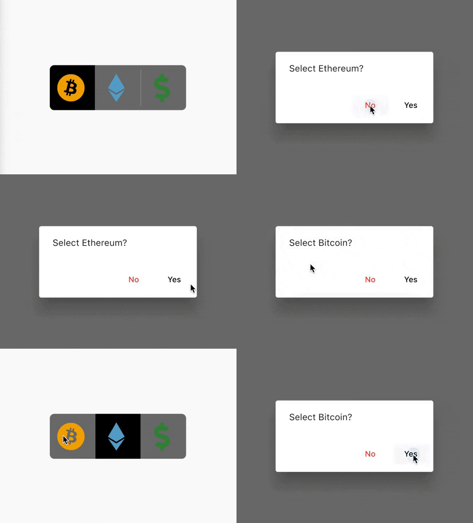
Cancel toggle
ToggleSwitch(
  initialLabelIndex: 0,
  inactiveBgColor: Colors.black54,
  activeBgColor: [Colors.black],
  totalSwitches: 3,
  minHeight: 80.0,
  minWidth: 80.0,
  customIcons: [
    Icon(
      FontAwesomeIcons.bitcoin,
      color: Color(0xFFF2A900),
      size: 50.0,
    ),
    Icon(
      FontAwesomeIcons.ethereum,
      color: Color(0xFF5ca6ce),
      size: 50.0,
    ),
    Icon(
      FontAwesomeIcons.dollarSign,
      color: Colors.green.shade700,
      size: 50.0,
    )
  ],
  onToggle: (index) {
    print('switched to: $index');
  },
  cancelToggle: (index) async {
    String selection = index == 0
        ? 'Bitcoin'
        : index == 1
            ? 'Ethereum'
            : 'Fiat';
    return await showDialog(
      context: context,
      builder: (dialogContext) => AlertDialog(
        content: Text("Select $selection?"),
        actions: [
          TextButton(
              child: Text("No",
                  style: TextStyle(color: Colors.red)),
              onPressed: () {
                Navigator.pop(dialogContext, true);
              }),
          TextButton(
              child: Text("Yes",
                  style: TextStyle(color: Colors.black)),
              onPressed: () {
                Navigator.pop(dialogContext, false);
              })
        ],
      ),
    );
  },
),

Cancel toggle

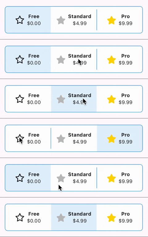
Custom widgets
ToggleSwitch(
  initialLabelIndex: 0,
  minHeight: 75.0,
  minWidth: double.maxFinite,
  activeBgColor: [Colors.blue.shade50],
  inactiveBgColor: Colors.white,
  dividerColor: Colors.blue,
  borderColor: [Colors.blue],
  borderWidth: 1.0,
  customWidgets: [
    // Overrides default widgets, foreground colors
    Row(
      mainAxisAlignment: MainAxisAlignment.center,
      children: [
        Icon(
          FontAwesomeIcons.star,
        ),
        const SizedBox(width: 10.0),
        Column(
          mainAxisAlignment: MainAxisAlignment.center,
          children: [
            Text(
              'Free',
              style: TextStyle(
                fontWeight: FontWeight.bold,
              ),
              maxLines: 1,
              overflow: TextOverflow.ellipsis,
            ),
            Text(
              '\$0.00',
              maxLines: 1,
              overflow: TextOverflow.ellipsis,
            ),
          ],
        ),
      ],
    ),
    Row(
      mainAxisAlignment: MainAxisAlignment.center,
      children: [
        Icon(
          FontAwesomeIcons.solidStar,
          color: Color(0xffC0C0C0),
        ),
        const SizedBox(width: 10.0),
        Column(
          mainAxisAlignment: MainAxisAlignment.center,
          children: [
            Text(
              'Standard',
              style: TextStyle(
                fontWeight: FontWeight.bold,
              ),
              maxLines: 1,
              overflow: TextOverflow.ellipsis,
            ),
            Text(
              '\$4.99',
              maxLines: 1,
              overflow: TextOverflow.ellipsis,
            ),
          ],
        ),
      ],
    ),
    Row(
      mainAxisAlignment: MainAxisAlignment.center,
      children: [
        Icon(
          FontAwesomeIcons.solidStar,
          color: Color(0xffFFD700),
        ),
        const SizedBox(width: 10.0),
        Column(
          mainAxisAlignment: MainAxisAlignment.center,
          children: [
            Text(
              'Pro',
              style: TextStyle(
                fontWeight: FontWeight.bold,
              ),
              maxLines: 1,
              overflow: TextOverflow.ellipsis,
            ),
            Text(
              '\$9.99',
              maxLines: 1,
              overflow: TextOverflow.ellipsis,
            ),
          ],
        ),
      ],
    ),
  ],
  onToggle: (index) {
    print('switched to: $index');
  },
),

Custom widgets

TextDirection.rtl and corner radius
// When ToggleSwitch is used with Directionality widget and textDirection is set to TextDirection.rtl (right-to-left), 
// switches are displayed right to left along with their respective index values. In this case, corner radius of switches aren't set correctly. 
// To fix this, please use textDirectionRTL parameter and set it to true as shown in the example below. 
Directionality(
  textDirection: TextDirection.rtl,
  child: ToggleSwitch(
    initialLabelIndex: 0,
    cornerRadius: 12.0,
    textDirectionRTL: true,
    activeFgColor: Colors.white,
    totalSwitches: 2,
    labels: ['left', 'right'],
    onToggle: (index) {
      print('switched to: $index');
    },
  ),
),
setState() inside onToggle

Example code with explanation

Code Contributors

Kategorien

Quell-Repository

Projekte, die dieses Paket verwenden

Ranglisten