Aus öffentlichen Paketdaten erstellte Orientierung.
uCreditCard ist ein Flutter-Paket, das eine einfach zu verwendende und visuell ansprechende Kreditkarten-UI-Komponente bereitstellt. Für Entwickler, die eine saubere und moderne Kartenoberfläche suchen, wurde es entwickelt und unterstützt mehrere Plattformen wie Android, iOS, Web, macOS, Windows und Linux. Das Paket verbessert die Benutzererfahrung durch intuitives Design und nahtlose Integration in Zahlungs- oder Finanzanwendungen. Es eignet sich hervorragend für die sichere und stilvolle Darstellung von Karteninformationen innerhalb von Flutter-Anwendungen.
Anwendungsfälle
Kreditkarteninformationen in Apps anzeigen
Erstellen von Zahlungsformular-Schnittstellen
Finanz- oder Bankanwendungen erstellen
Verbesserung von Checkout-Erlebnissen
Sichere Karten-Eingabebildschirme gestalten
Hauptmerkmale
Schöne und anpassbare Karten-Oberfläche
Plattformübergreifende Kompatibilität
Einfache Integration mit Flutter
Unterstützt mehrere Betriebssysteme
Responsive Design für alle Geräte
Geeignet für
Flutter-Entwickler, die Zahlungs-Apps erstellen
Designer, die schlanke Kartenkomponenten wollen
Apps, die sichere Kartenanzeige erfordern
Frontend-orientierte Finanztools
Schnellprototypisierung von kartenbasierten Schnittstellen
Hinweise
Enthält keine vollständige Zahlungsabwicklung
Benötigt manuelle Handhabung sensibler Daten
Beschränkt auf die Benutzeroberfläche; keine Scankapazitäten
Nicht geeignet für Produktionszahlungsgateways
Der Benutzer muss zusätzliche Sicherheitsmaßnahmen umsetzen
Original-README
Originaler README-Schnappschuss aus dem verknüpften Quell-Repository. Aktuelle Inhalte finden Sie im Repository.
u_credit_card
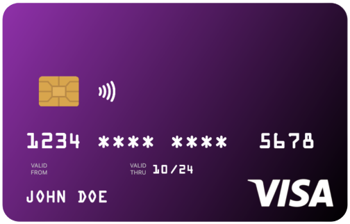
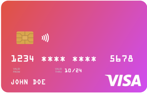
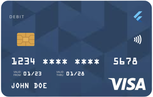
A Flutter widget that renders a realistic, customizable credit-card UI with optional flip animation, balance display, and provider-logo support.
Because card text is rendered in white, avoid light gradient colors.
Sizing the card
Use the width parameter rather than wrapping the widget in a SizedBox. The card is laid out at its natural width of 300 logical pixels and scales proportionally to fit width. Values above 300 are clamped.
cardType controls the small label at the top of the card (CREDIT, DEBIT, PREPAID, GIFT CARD); pass CardType.other to hide the label.
creditCardType controls the network logo (Visa, Mastercard, Amex, Discover). If omitted, the widget auto-detects the network from cardNumber. Pass CreditCardType.none to hide the logo entirely.
cardProviderLogo accepts any widget — typically your bank or wallet logo. Position it on the left or right of the card-type label with cardProviderLogoPosition. Add a background image with backgroundDecorationImage; both NetworkImage and AssetImage are supported.
Set showBalance: true and pass a balance to render the amount in the top-left of the card. Enabling autoHideBalance: true replaces the figure with a "TAP TO SEE BALANCE" placeholder; tapping reveals it for two seconds. currencySymbol defaults to $.
Set enableFlipping: true to render a back side (with the CVV) and enable a horizontal-drag gesture that flips between sides. Provide the CVV with cvvNumber.
Haptic feedback fires on each flip; disable it with disableHapticFeedBack: true.
Programmatic flipping API
For flows that need to flip the card in response to UI events — for example, flipping to the back when a CVV input field gains focus — attach a CreditCardController.