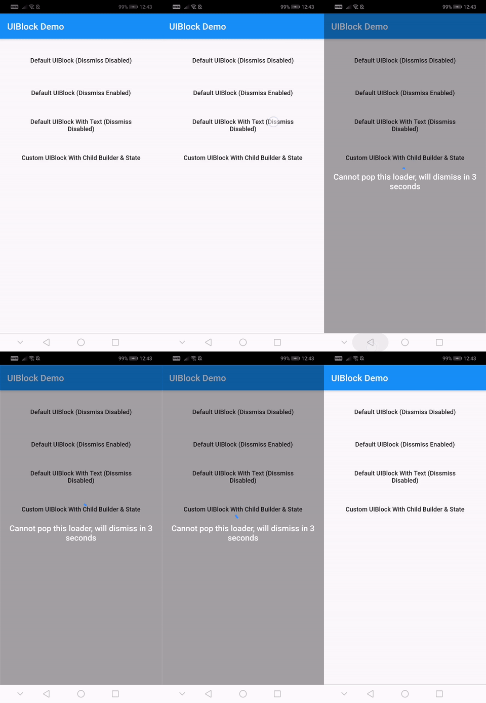
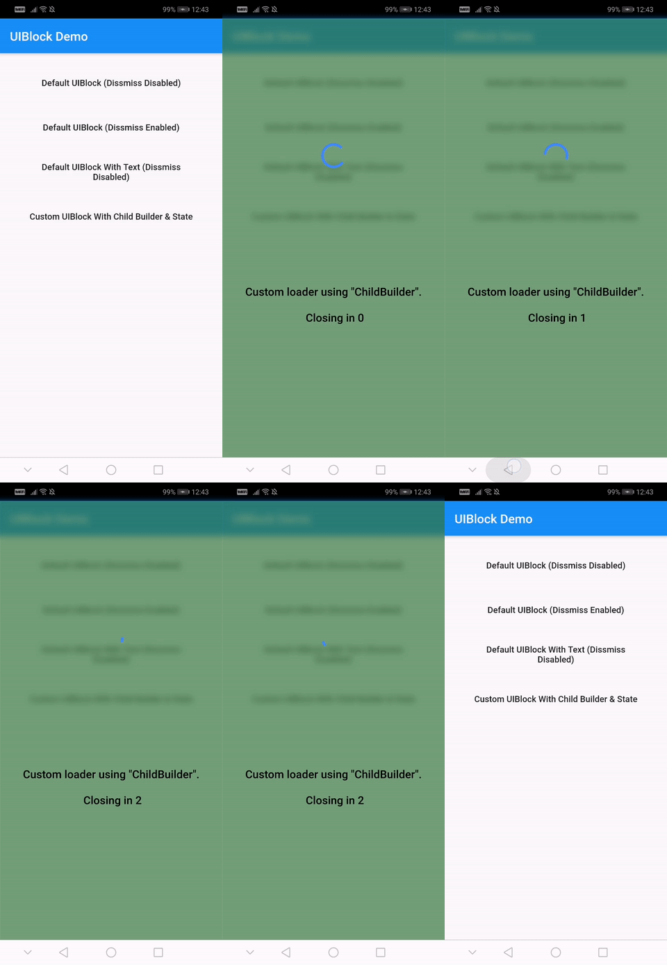
Aus öffentlichen Paketdaten erstellte Orientierung.
Ein vollständig anpassbares und einfach zu verwendendes Flutter-Paket zur Implementierung von UI-Sperr-Elementen in Apps. Es bietet eine einfache Möglichkeit, Inhalte mit Ladeindikatoren, Fortschrittsbalken oder benutzerdefinierten Widgets zu überlagern, um Benutzer während asynchroner Operationen zu informieren. Ideal zum Verhindern von Interaktionen während des Datenladens oder der Verarbeitung, unterstützt alle wichtigen Plattformen wie Android, iOS, Web, macOS, Windows und Linux. Das Paket ist leichtgewichtig und für eine nahtlose Integration in bestehende Flutter-Projekte konzipiert.
Anwendungsfälle
UI während des Datenladens blockieren
Benutzerdefinierte Ladeüberlagerungen anzeigen
Verhindern von Benutzerinteraktion während asynchroner Aufgaben
Verbesserung der Benutzererfahrung durch visuelle Rückmeldung
Aktualisierungsindikatoren implementieren
Modale Ladebildschirme erstellen
Hauptmerkmale
Vollständig anpassbare Darstellung
Einfache API für schnelle Integration
Unterstützt alle Flutter-Plattformen
Erweiterbar für benutzerdefinierte Overlay
Leichtgewichtig und leistungsstark
Eingebaute Lade- und Fortschrittsindikatoren
Geeignet für
Entwickler, die schnelle UI-Sperrlösungen suchen
Apps mit konsistenten Ladezuständen
Teams, die sich auf UX-Verbesserungen konzentrieren
Projekte mit Querplattform-Anforderungen
Frontend-Entwickler, die Flutter verwenden
Anwendungen mit häufigen asynchronen Operationen
Hinweise
Kann zusätzliche Stilisierung für komplexe Designs erfordern
Benutzerdefinierte Overlay müssen manuell implementiert werden
Begrenzte integrierte Themen
Nicht für Hochfrequenz-Updates optimiert
Abhängig von der korrekten Widget-Baumstruktur
Am besten mit angemessener Zustandsverwaltung verwendet
Original-README
Originaler README-Schnappschuss aus dem verknüpften Quell-Repository. Aktuelle Inhalte finden Sie im Repository.
uiblock
Easiest and simplest method to block/unblock ui for your flutter apps.
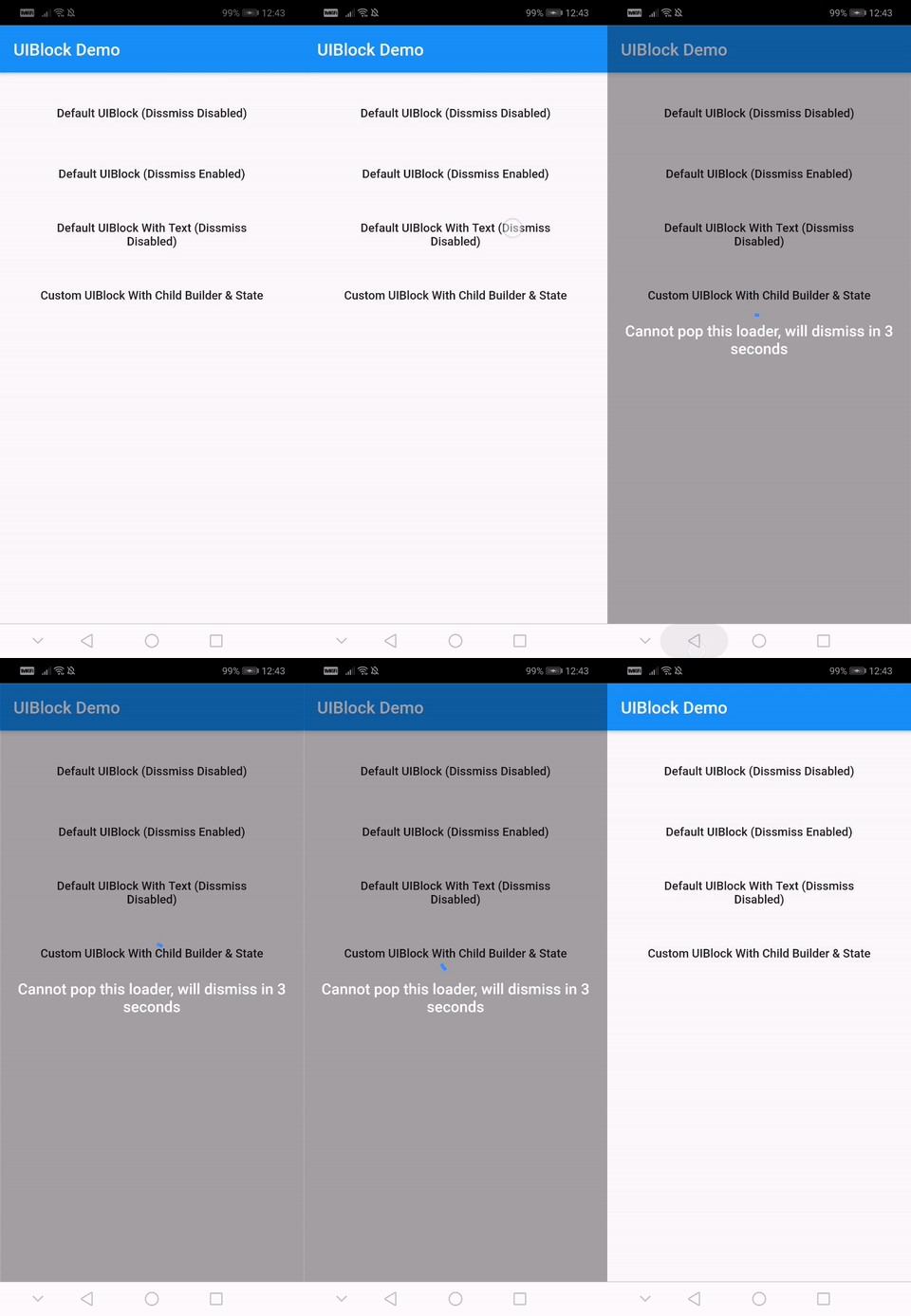
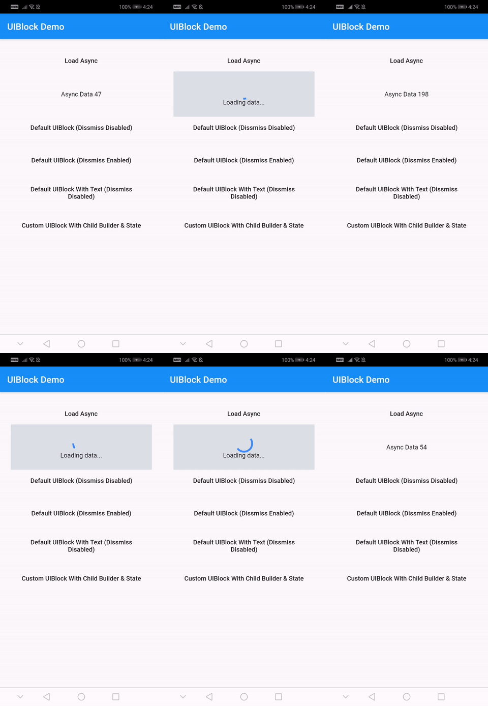
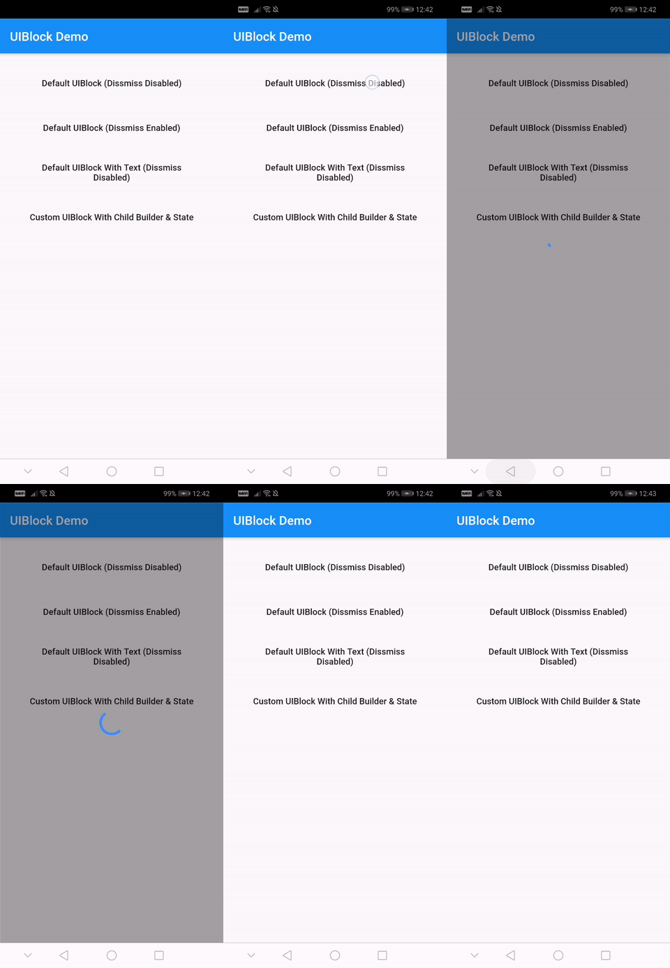
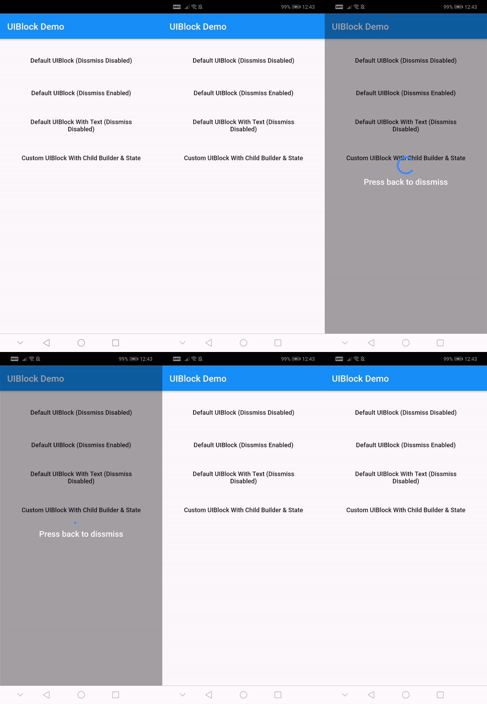
One line of code to block/unblock ui and stop user from navigating during loading or processing in your flutter apps. You could use it as a widget or directly as a global service/util.
Fully customizable
Android and IOS
Easy and Simple
No other dependencies
Well documented
Production ready
Installation
With null-safety
      dependencies:
        uiblock: ^2.0.1
Without null-safety
      dependencies:
        uiblock: 1.2.0
Getting Started
Add the dependency to your project and start using uiblock everywhere:
Import the package.
import'package:uiblock/uiblock.dart';
To block ui
// defaultUIBlock.block(context);
//OR// if using globalKeyUIBlock.block(_scaffoldGlobalKey.currentContext);
To unblock ui
// call unblock after blockui to dissmissUIBlock.unblock(context);
//OR// if using globalKeyUIBlock.unblock(_scaffoldGlobalKey.currentContext);
// easily create custom block ui bodyUIBlock.block(
_scaffoldGlobalKey.currentContext,
backgroundColor: Colors.green.withOpacity(0.5),
imageFilter: ImageFilter.blur(sigmaX: 5.0, sigmaY: 5.0),
childBuilder: (BuildContext context) {
// return your widget here
},
);
// Don't forget to call unblock after block :)
Creating custom block modal transitions (only applicable on static UIBlock.block)
// NOTE : only for on UIBlock.block as this uses Modal Barrier// widget block is inline widget replacement with loader widgetUIBlock.block(
//...// more code
customBuildBlockModalTransitions:
(context, animation, secondaryAnimation, child) {
returnRotationTransition(
turns: animation,
child: child,
);
},
// ...
);
Using with data return
// NOTE : canDissmissOnBack is alaways truevar result = awaitUIBlock.blockWithData(
_scaffoldGlobalKey.currentContext,
loadingTextWidget: Padding(
padding: constEdgeInsets.all(8.0),
child: FlatButton(
onPressed: () {
// unblock and return dataUIBlock.unblockWithData(context, "hello world");
},
child: Text(
'Press here to dissmiss with data. Back for null',
textAlign: TextAlign.center,
style: TextStyle(
color: Colors.white,
fontSize: 18.0,
fontWeight: FontWeight.w600,
),
),
),
),
);
print(result);
For more details have a look at the other examples.
Properties
Property
Type
Default
Note
context (required)
BuildContext
-
childBuilder
Function
-
customLoaderChild
Widget
-
loadingTextWidget
Widget
-
imageFilter
ImageFilter
-
backgroundColor
Color
Transparent
canDissmissOnBack
bool
false
safeAreaLeft
bool
true
Set as 'false' to disable 'Left' Safe Area
safeAreaTop
bool
true
Set as 'false' to disable 'Top' (usually status bar) Safe Area
safeAreaRight
bool
true
Set as 'false' to disable 'Right' Safe Area
safeAreaBottom
bool
true
Set as 'false' to disable 'Bottom' Safe Area
safeAreaMinimumPadding
EdgeInsets
EdgeInsets.zero
safeAreaMaintainBottomViewPadding
bool
false
isSlideTransitionDefault
bool
true
Toggle between slide or fade transition
buildBlockModalTransitions
Function
-
Use this to create custom transition other than fade/slide
Widget Properties
Property
Type
Default
builder
Function
you implement it
loadingStateFromFuture
Future Function()
your future function (APIs,etc)
loaderBuilder
Function
-
customLoaderChild
Widget
-
loadingTextWidget
Widget
-
offset
offset
-
barrierOpacity
double
0.4
barrierColor
Color
black45
canDismiss
bool
false
hideBuilderOnNullData
bool
false
Improve
Help me by reporting bugs, submit new ideas for features or anything else that you want to share.