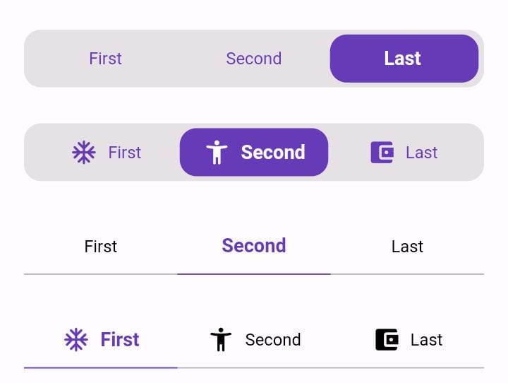
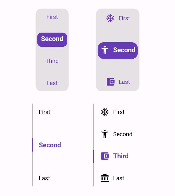
सार्वजनिक जानकारी से बना चयन मार्गदर्शन। केवल संदर्भ हेतु।
Animated Toggle एक Flutter पैकेज है जो कस्टम एनिमेटेड टॉगल स्विच बनाने को सरल बनाता है। यह ऑन/ऑफ स्थितियों के लिए चिकनी, दृश्य रूप से आकर्षक संक्रमण प्रदान करता है और न्यूनतम सेटअप के साथ। विकासकर्ताओं के लिए डिज़ाइन किया गया है जो जटिल एनिमेशन कोड के बिना UI इंटरैक्टिविटी को बढ़ाना चाहते हैं, यह Android, iOS, Web, macOS, Windows और Linux जैसे कई प्लेटफॉर्म को समर्थित करता है। पैकेज हल्का है और एक सरल एड कमांड का उपयोग करके मौजूदा Flutter प्रोजेक्ट में आसानी से एकीकृत होता है। सेटिंग पैनल, थीम टॉगल या किसी भी इंटरैक्टिव स्विच इंटरफेस के लिए आदर्श।
उपयोग
कस्टम थीम टॉगल
उपयोगकर्ता प्राथमिकता स्विच
सेटिंग्स यूआई घटक
ऑनबोर्डिंग फ्लो सूचकांक
इंटरैक्टिव फॉर्म तत्व
मुख्य विशेषताएँ
स्मूथ एनिमेशन संक्रमण
कस्टमाइज़ेबल उपस्थिति
प्लेटफॉर्म के अनुकूल समर्थन
न्यूनतम बॉयलरप्लेट
pub के माध्यम से आसान एकीकरण
निर्धारित करने योग्य टॉगल व्यवहार
इनके लिए उपयुक्त
इंटरैक्टिव तत्वों की तलाश में UI डिजाइनर
सेटिंग स्क्रीन बनाने वाले डेवलपर्स
दृश्य प्रतिक्रिया की आवश्यकता वाले ऐप्स
Flutter शुरुआती एनिमेशन का अन्वेषण कर रहे हैं
क्रॉस-प्लेटफॉर्म आवश्यकताओं वाले प्रोजेक्ट
विचार योग्य बातें
टॉगल-विशिष्ट उपयोग केस के लिए सीमित
उन्नत डिजाइन के लिए हस्तक्षेप स्टाइलिंग की आवश्यकता होती है
कोई निर्मित सुविधा नहीं है
बाहरी एनिमेशन तर्क पर निर्भर करता है
जटिल राज्य मशीन के लिए उपयुक्त नहीं
पूर्ण कस्टमाइज़ेशन के लिए अतिरिक्त पैकेज की आवश्यकता हो सकती है
मूल README
संबंधित सोर्स रिपॉज़िटरी के मूल README का स्नैपशॉट। नवीनतम सामग्री के लिए रिपॉज़िटरी देखें।
Animated Toggle
Animated Toggle Give you easy way to make your custom Animated toggle.
Installation
Add this to your pubspec.yaml:
dependencies:animated_toggle:^LastVersion
Features
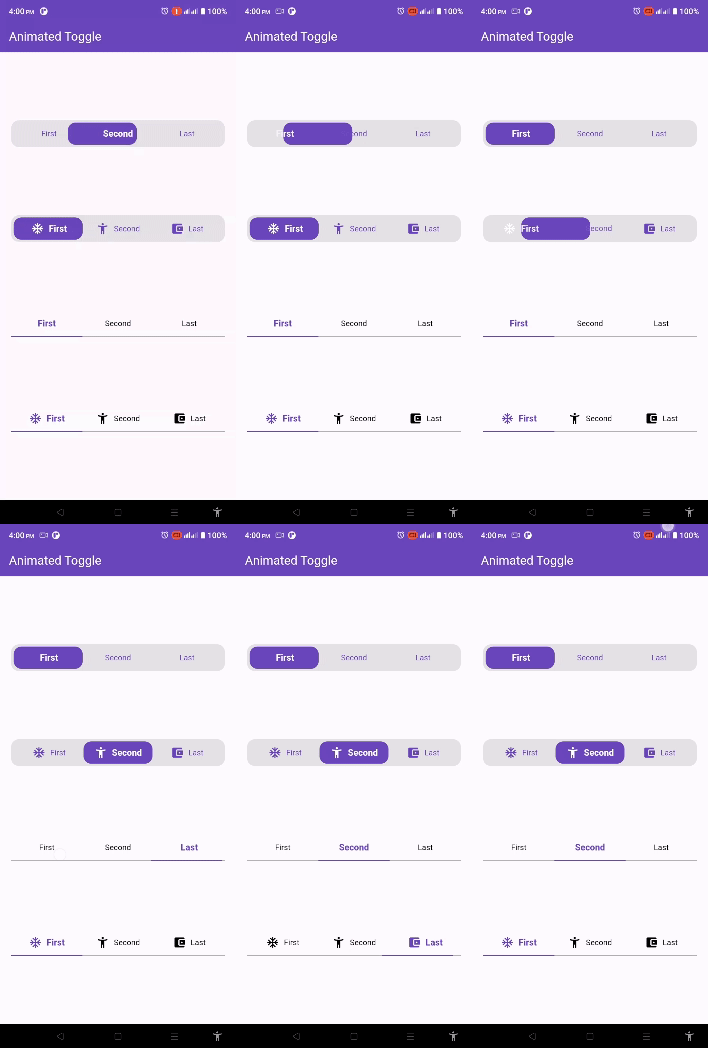
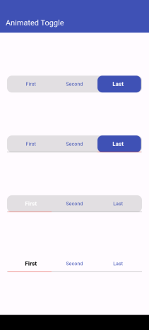
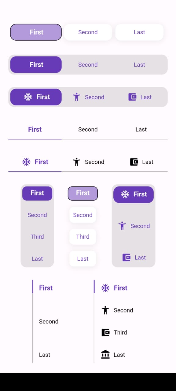
Easy to use the Animated Toggle Package you can handle all colors and width and the height and you can make it vertical or horizontal.
You can control the start from left or right if you need this for arabic or english or etc.
you can control the Text Style and the padding for the Animated Toggle.
Getting started
import'package:animated_toggle/animated_toggle.dart';
voidmain() {
}
// Start use th package in your State Widget
classMyAnimatedToggleextendsStatefulWidget{
constMyAnimatedToggle({super.key});
@overrideState<MyAnimatedToggle> createState() => _MyAnimatedToggleState();
}
class_MyAnimatedToggleStateextendsState<MyAnimatedToggle> {
@overrideWidgetbuild(BuildContext context) {
returnScaffold(
appBar: AppBar(
backgroundColor: Theme.of(context).colorScheme.inversePrimary,
title: constText('Animated Toggle'),
),
body: Center(
child: AnimatedHorizontalToggle(
taps: const ['First', 'Second', 'Last'],
// write you taps names
width: MediaQuery.of(context).size.width - 40,
height: 48,
duration: constDuration(milliseconds: 300),
initialIndex: 0,
background: Colors.black.withOpacity(0.1),
activeColor: Colors.deepPurple,
// here you can control the active text style
activeTextStyle: constTextStyle(
fontSize: 16, fontWeight: FontWeight.w600, color: Colors.white),
// here you can control the inactive text style
inActiveTextStyle: constTextStyle(
fontSize: 14,
fontWeight: FontWeight.w400,
color: Colors.deepPurple),
// the next 2 line if you need to put padding for the inactive buttons
horizontalPadding: 4,
verticalPadding: 4,
// the next 2 line if you need to put padding for the active button
activeHorizontalPadding: 2,
activeVerticalPadding: 4,
radius: 14,
// you can control the radius for the Animated widget
activeButtonRadius: 14,
// you can control the radius for the active button
onChange: (int currentIndex, int targetIndex) {
// write Your Personal Code Here
},
showActiveButtonColor: true,
// 'en' mean make the start from left other mean start from right
local:
'en', // her you can add the local to control the alignment like if you use en its the normal to start from left to right and if you use ar the will start from right to left
),
),
);
}
}
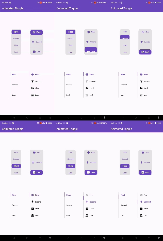
How to use Vertical Animated Toggle
classMyAnimatedToggleextendsStatefulWidget{
constMyAnimatedToggle({super.key});
@overrideState<MyAnimatedToggle> createState() => _MyAnimatedToggleState();
}
class_MyAnimatedToggleStateextendsState<MyAnimatedToggle> {
@overrideWidgetbuild(BuildContext context) {
returnScaffold(
appBar: AppBar(
backgroundColor: Theme.of(context).colorScheme.inversePrimary,
title: constText('Animated Toggle'),
),
body: Center(
child: AnimatedVerticalToggle(
taps: const ['First', 'Second', 'Third', 'Last'],
width: 80,
height: 200,
duration: constDuration(milliseconds: 300),
activeButtonHeight: 34,
initialIndex: 0,
background: Colors.black.withOpacity(0.1),
activeColor: Colors.deepPurple,
// here you can control the active text style
activeTextStyle: constTextStyle(
fontSize: 16,
fontWeight: FontWeight.w600,
color: Colors.white),
// here you can control the inactive text style
inActiveTextStyle: constTextStyle(
fontSize: 14,
fontWeight: FontWeight.w400,
color: Colors.deepPurple),
// the next 2 line if you need to put padding for the inactive buttons
horizontalPadding: 4,
verticalPadding: 4,
// the next 2 line if you need to put padding for the active button
activeHorizontalPadding: 4,
activeVerticalPadding: 2,
radius: 14,
// you can control the radius for the Animated widget
activeButtonRadius: 10,
// you can control the radius for the active button
onChange: (int currentIndex, int targetIndex) {
// write Your Personal Code Here
},
showActiveButtonColor: true,
// 'en' mean make the start from left other mean start from right
local:
'en', // her you can add the local to control the alignment like if you use en its the normal to start from left to right and if you use ar the will start from right to left
),
),
);
}
}
Additional information
Say to me in GitHub what you need to see in the package in the next update.
Wait for more feature soon.