पैकेज, रिपॉज़िटरी और ऐप श्रेणियाँ खोजें

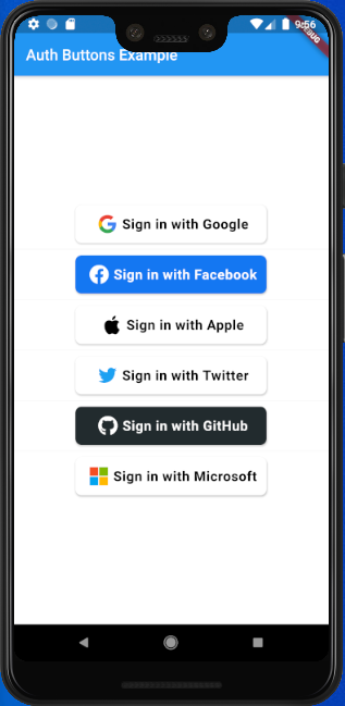
auth_buttons कवर
पैकेज विवरणv3.0.3

auth_buttons

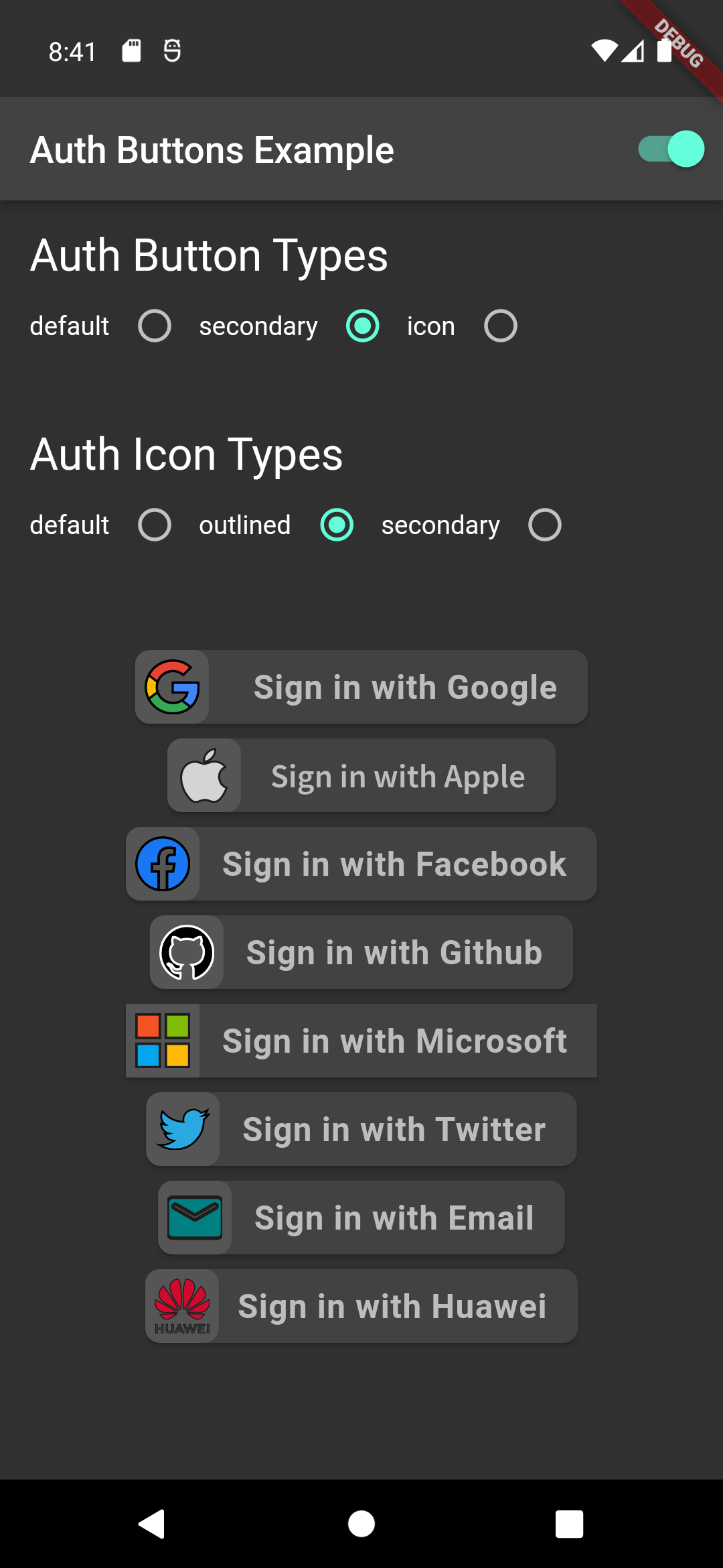
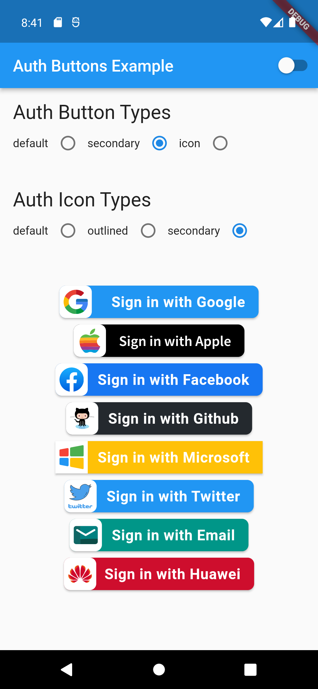
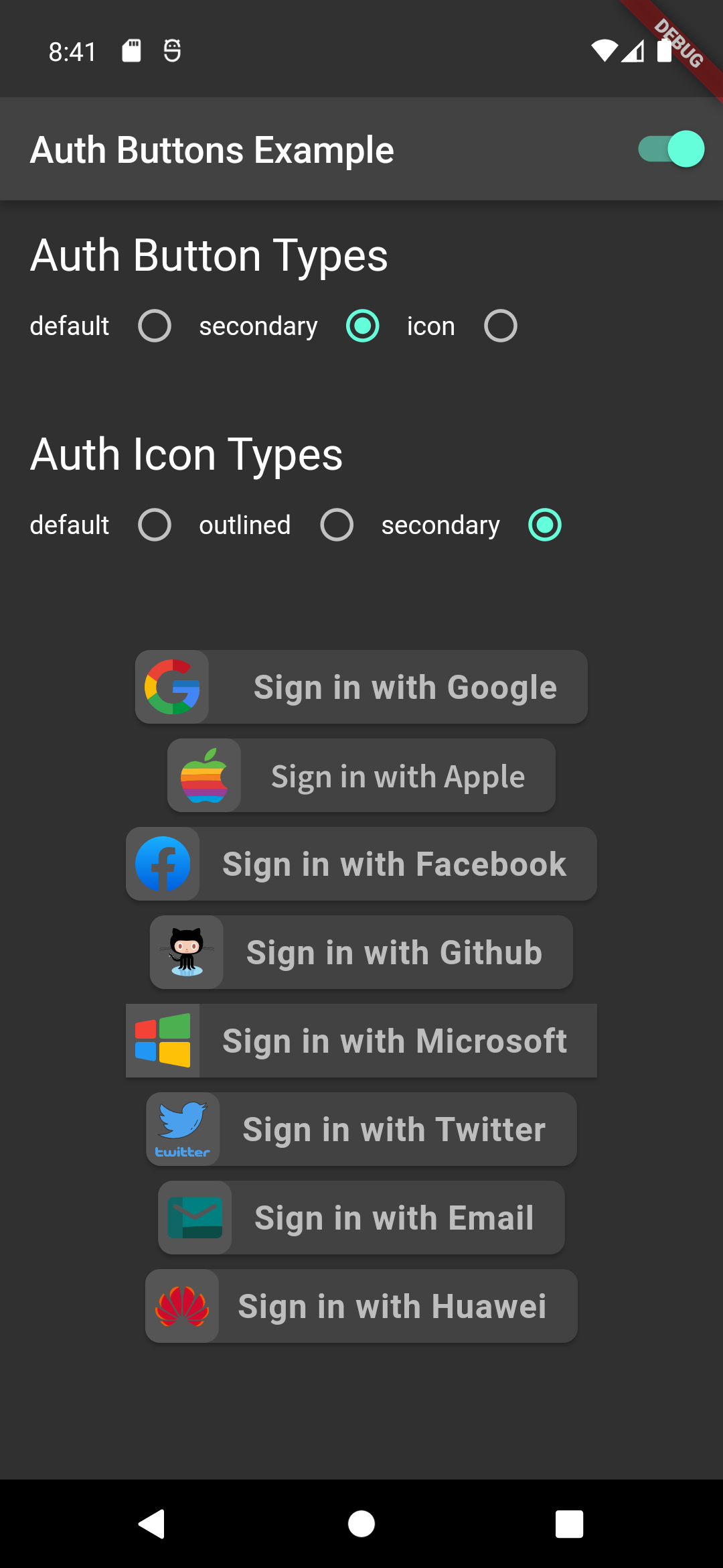
Auth Buttons एक फ्लटर विजेट पुस्तकालय है, जिसमें Google, Facebook, Apple और Twitter जैसे सबसे लोकप्रिय सोशल नेटवर्क के साथ प्रमाणीकरण के लिए बटन शामिल हैं।

AndroidiOSWebmacOSWindowsLinux
30-दिन डाउनलोड
5 हज़ार
लाइक
199
Pub अंक
140

पैकेज इंस्टॉल करें

flutter pub add auth_buttons

पैकेज अवलोकन

सार्वजनिक जानकारी से बना चयन मार्गदर्शन। केवल संदर्भ हेतु।

Auth Buttons एक Flutter विजेट पुस्तकालय है जो Google, Facebook, Apple और Twitter जैसे लोकप्रिय सोशल नेटवर्क के लिए तैयार-उपयोग ऑथेंटिकेशन बटन प्रदान करता है। इसका डिज़ाइन सोशल लॉगिन फीचर्स के एकीकरण को सरल बनाने के लिए किया गया है, और यह प्लेटफॉर्म के अनुसार एक समान, दृश्य रूप से आकर्षक बटन प्रदान करता है। इस पैकेज का समर्थन Android, iOS, Web, macOS, Windows और Linux के लिए है, जिससे क्रॉस-प्लेटफॉर्म संगतता सुनिश्चित होती है। यह बॉयलरप्लेट कोड को कम करके और तीसरे पक्ष के प्रमाणीकरण प्रवाह के कार्यान्वयन को सरल बनाकर उपयोगकर्ता अनुभव को बढ़ाता है।

उपयोग

  • सोशल लॉगिन इंटीग्रेशन
  • सोशल खातों के साथ उपयोगकर्ता ओनबोर्डिंग
  • क्रॉस-प्लेटफॉर्म प्रमाणीकरण यूआई
  • सरलीकृत OAuth बटन कार्यान्वयन
  • सरलीकृत लॉगिन कार्यप्रवाह

मुख्य विशेषताएँ

  • पूर्व-निर्मित सोशल लॉगिन बटन
  • Google, Facebook, Apple और Twitter के लिए समर्थन
  • प्लेटफॉर्म के अनुकूलता
  • उपकरणों के माध्यम से एकसमान उपयोगकर्ता इंटरफेस
  • न्यूनतम सेटअप के साथ आसान एकीकरण
  • कस्टमाइज़ेबल बटन स्टाइल्स

इनके लिए उपयुक्त

  • सोशल लॉगिन के साथ ऐप बना रहे विकासकर्मी
  • त्वरित प्रमाणीकरण UI घटकों की आवश्यकता वाले प्रोजेक्ट
  • कई प्लेटफॉर्म के लिए लक्षित ऐप्स
  • विकास गति को प्राथमिकता देने वाली टीमें
  • फ्रंटएंड-केंद्रित प्रमाणीकरण कार्यान्वयन

विचार योग्य बातें

  • OAuth सेटअप के लिए अतिरिक्त कॉन्फ़िगरेशन की आवश्यकता होती है
  • मूल प्लेटफॉर्म SDK पर निर्भर करता है
  • त्रुटि स्थितियों के लिए कस्टम हैंडलिंग की आवश्यकता हो सकती है
  • पूर्वनिर्धारित सोशल प्रदाताओं तक सीमित
  • कस्टम प्रमाणीकरण विधियों के लिए अनुपयुक्त

मूल README

संबंधित सोर्स रिपॉज़िटरी के मूल README का स्नैपशॉट। नवीनतम सामग्री के लिए रिपॉज़िटरी देखें।

auth_buttons

Github stars Pub Version

Auth Buttons is a flutter widget library, include buttons for authenticating with the most popular social networks like: Google, Facebook, Apple and too other.

Installation

  1. Add this to your packages pubspec.yaml file:
dependencies:
  auth_buttons: <^last>
  1. Install it You can install it from the command line:
$ flutter pub get
  1. Import it Now in Dart code, you can use:
import 'package:auth_buttons/auth_buttons.dart';

Recommendation

We recommend you to using show special when you want use some button. show help you importing part of library.

import 'package:auth_buttons/auth_buttons.dart'
    show GoogleAuthButton, AuthButtonStyle, AuthButtonType, AuthIconType;

We also recommend you to using the latest version.

Overview

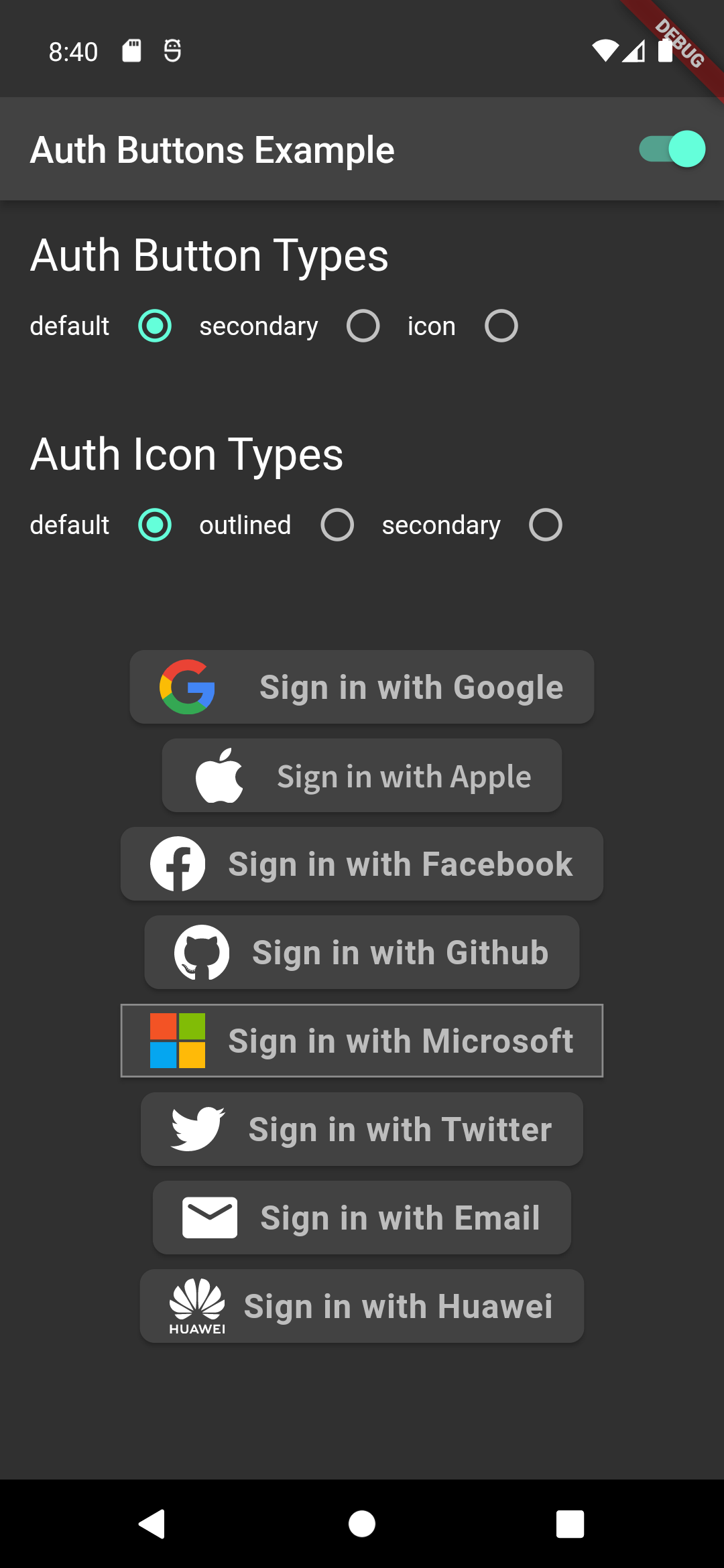
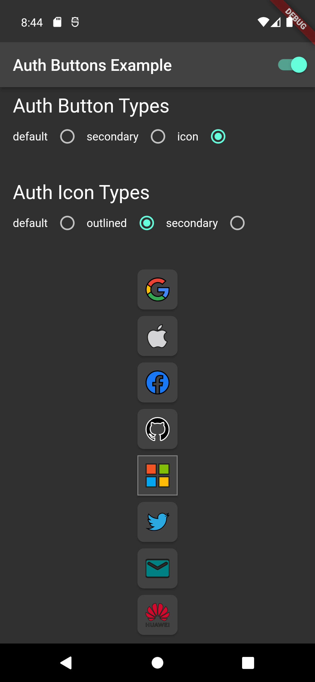
From the version 3.0.0 all AuthButtons are following the system mode. see ThemeMode for more info.

From the version 3.0.0 you're able to regroup AuthButton s for sharing style properties, to do this use the already existing AuthButtonGroup.

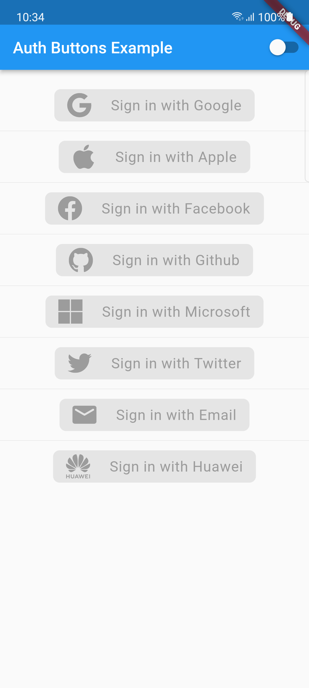
From the version 2.0.0 disabled state is supported.

  1. Enabled
  2. Disabled

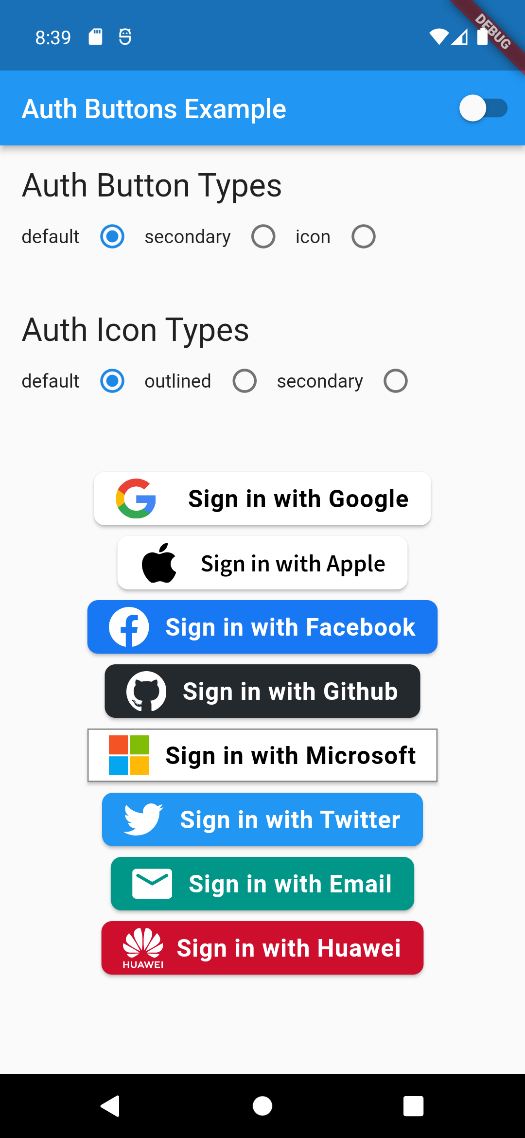
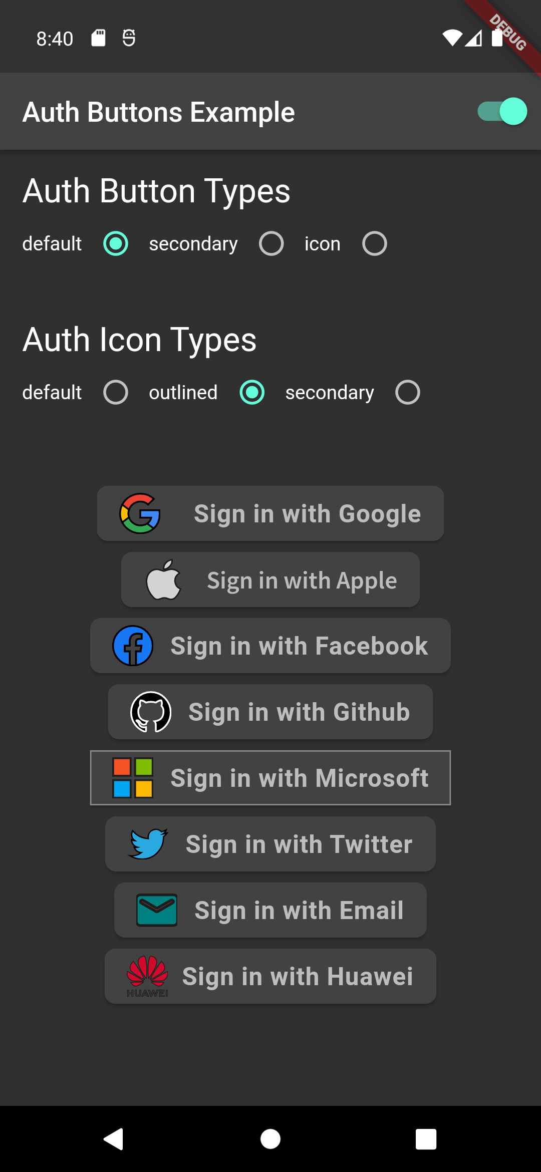
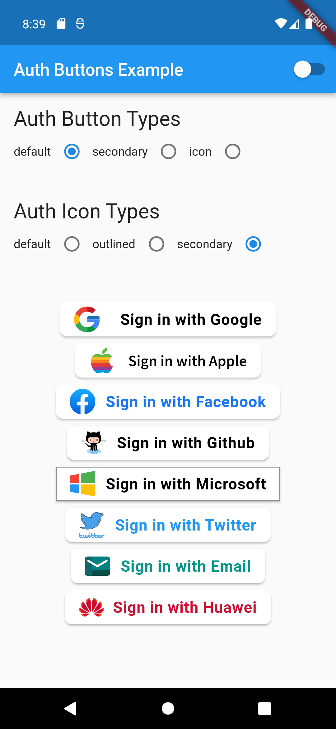
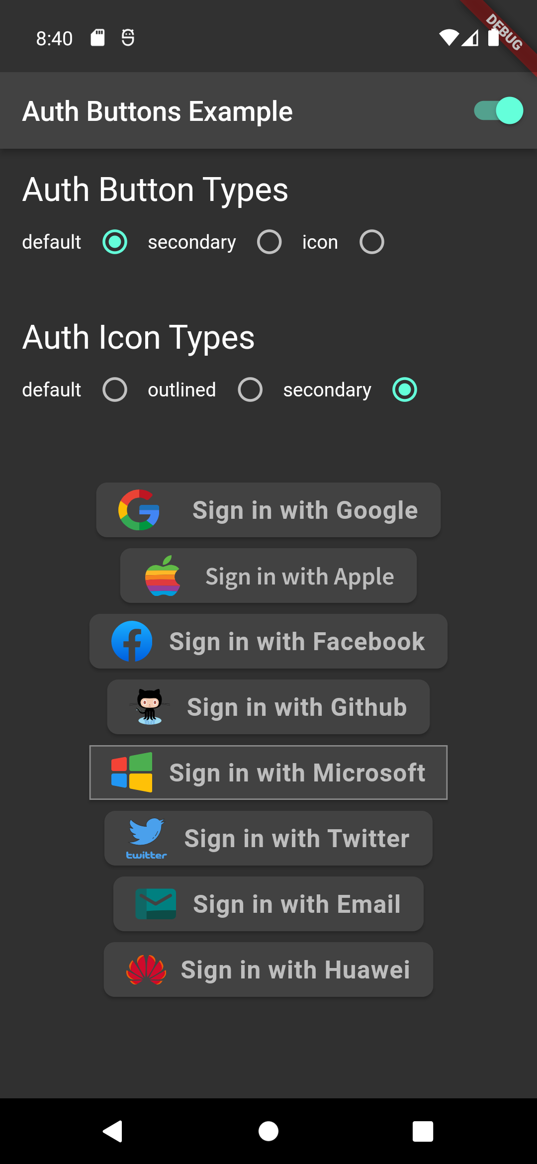
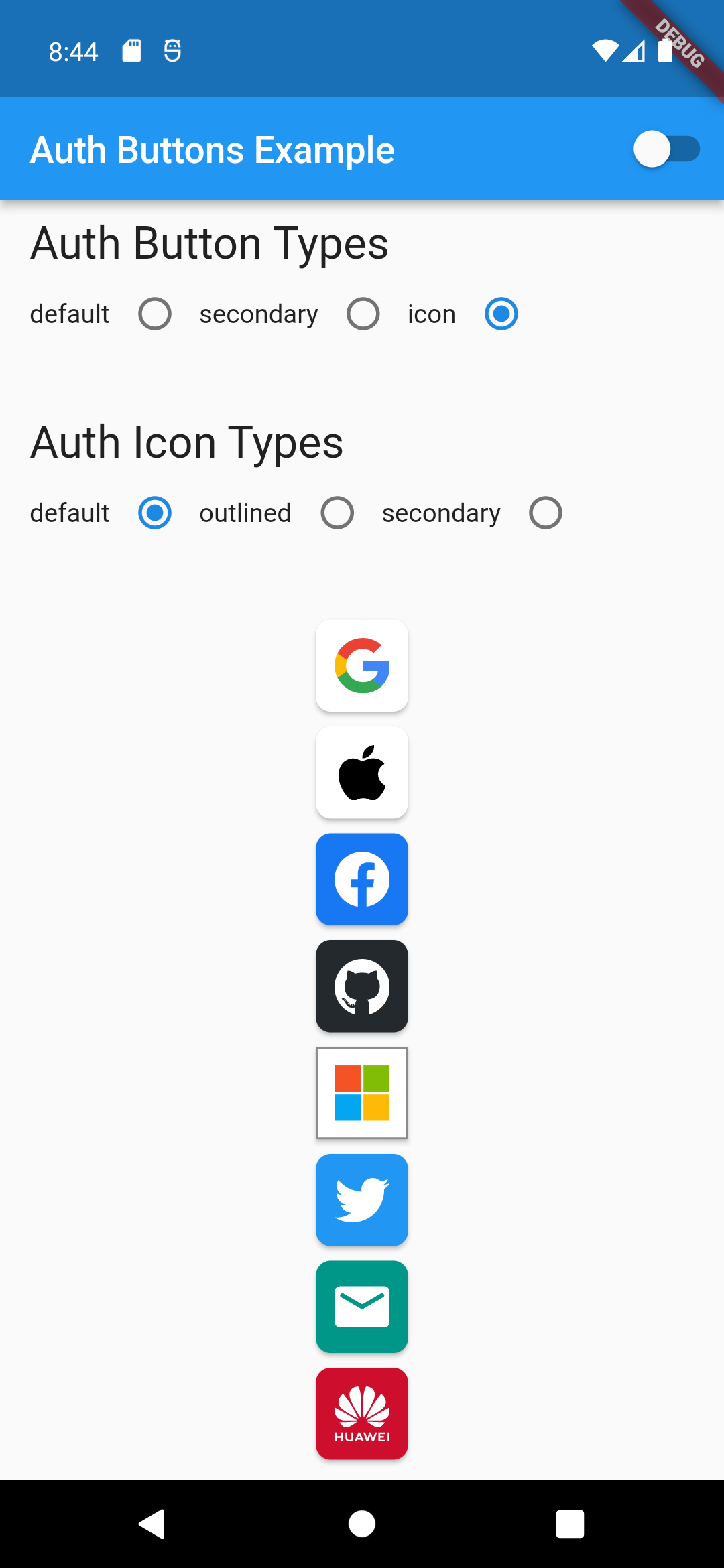
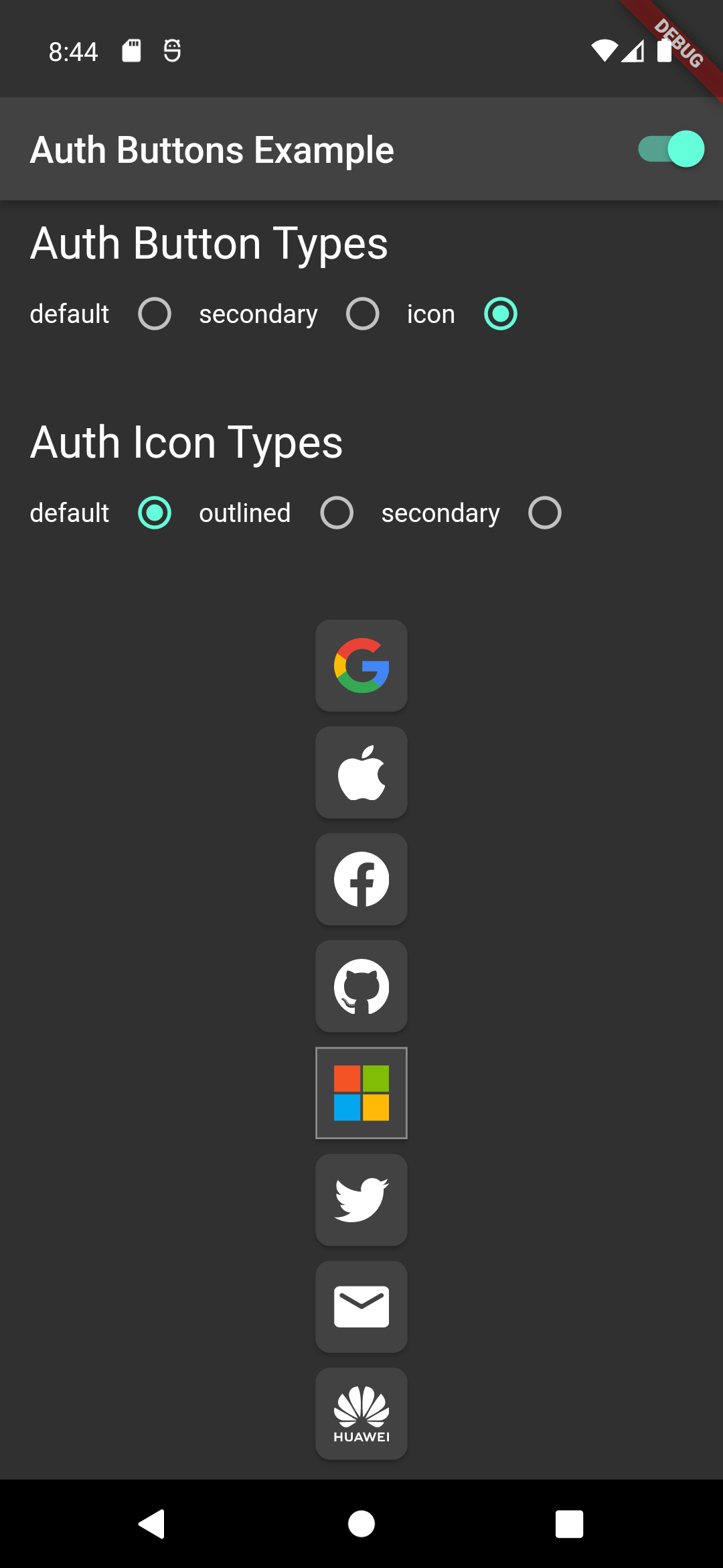
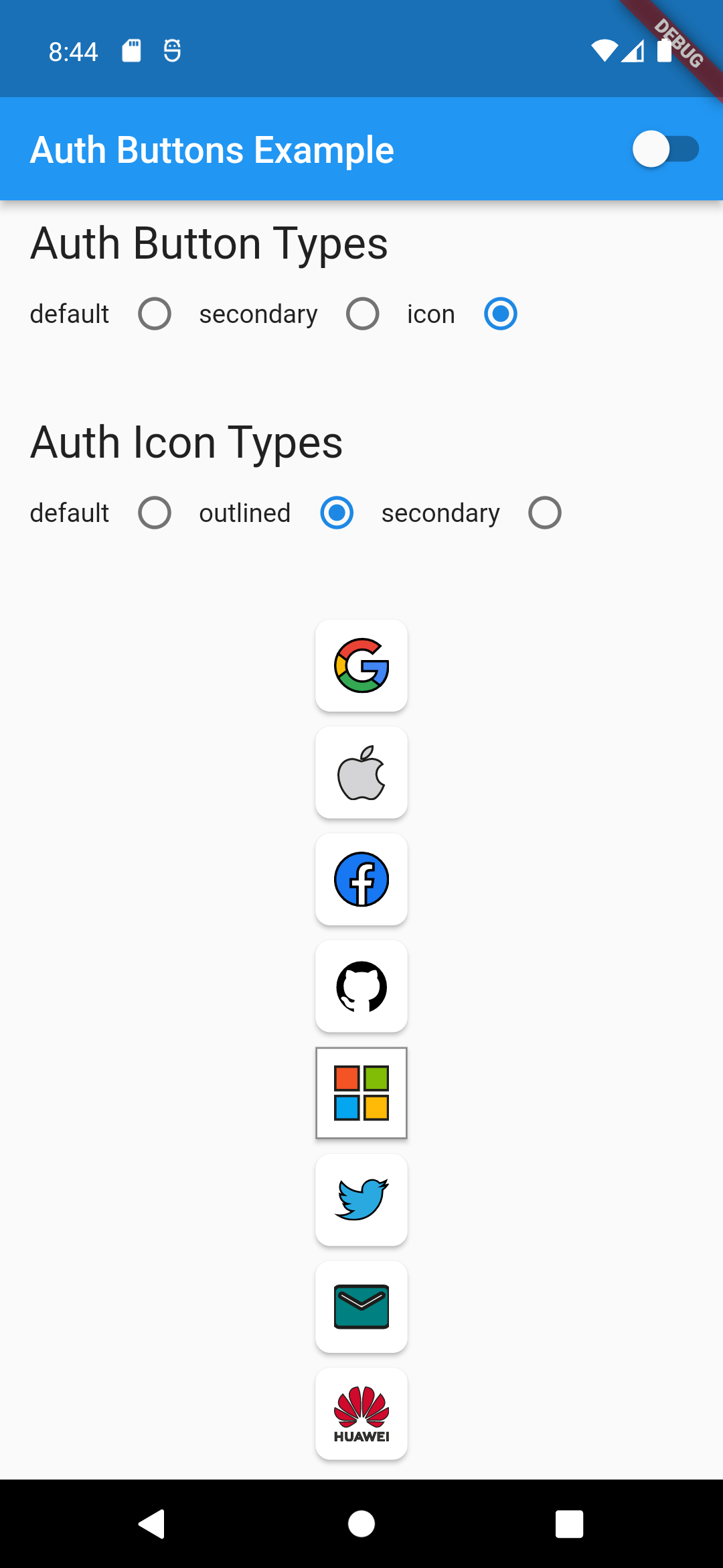
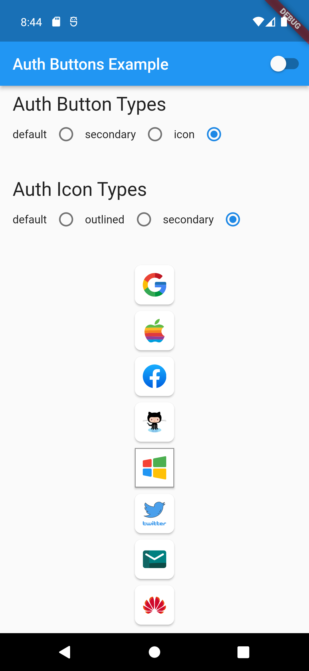
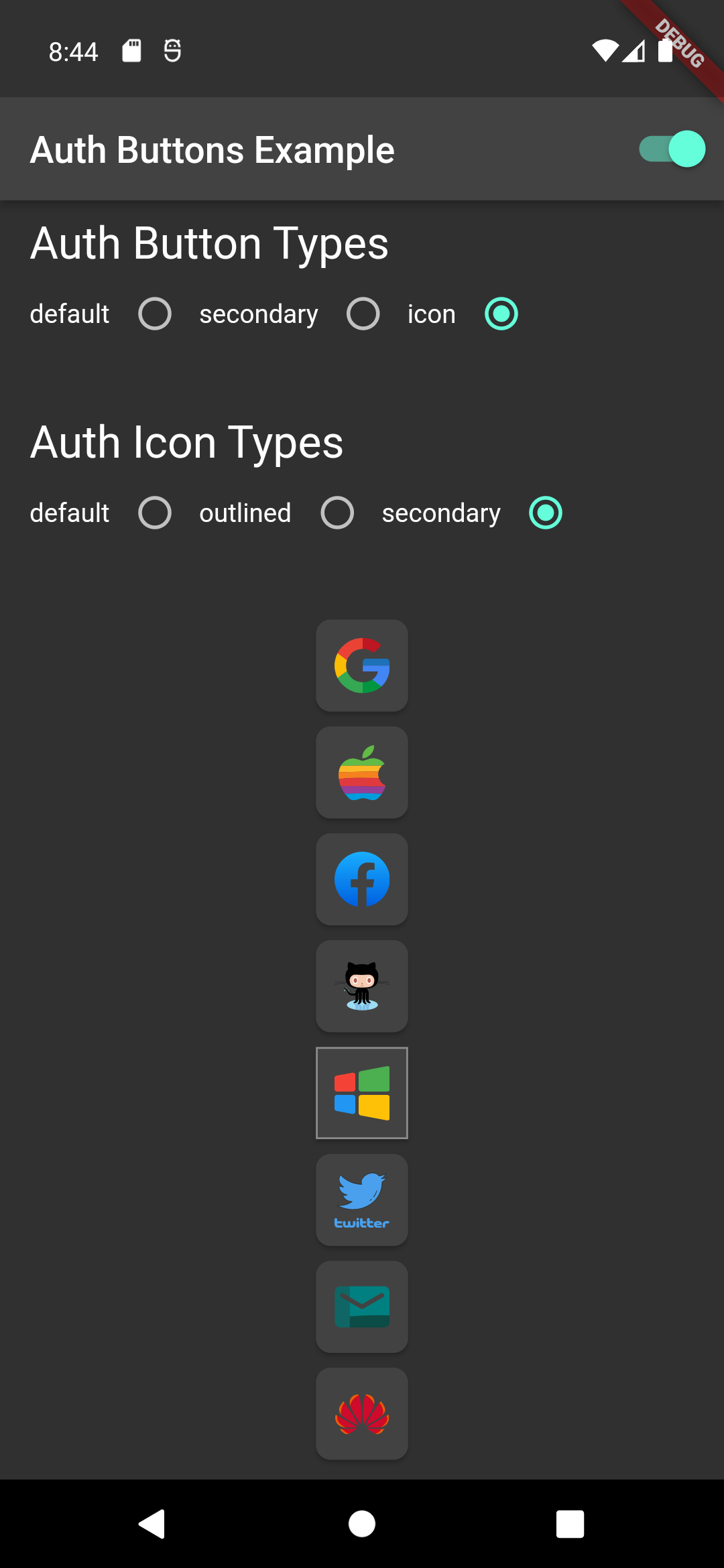
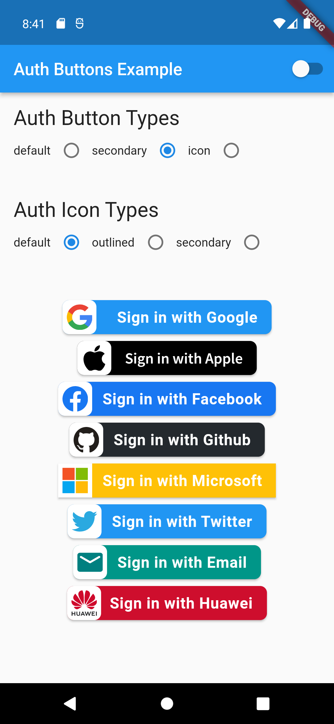
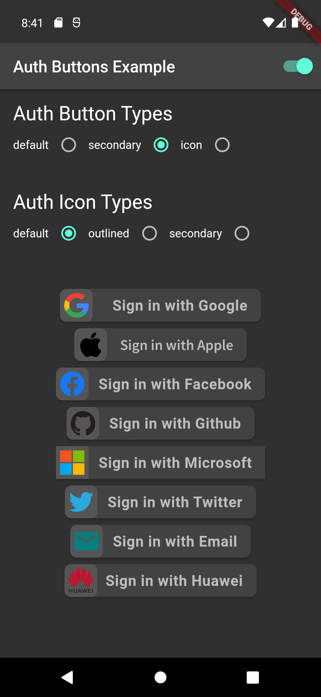
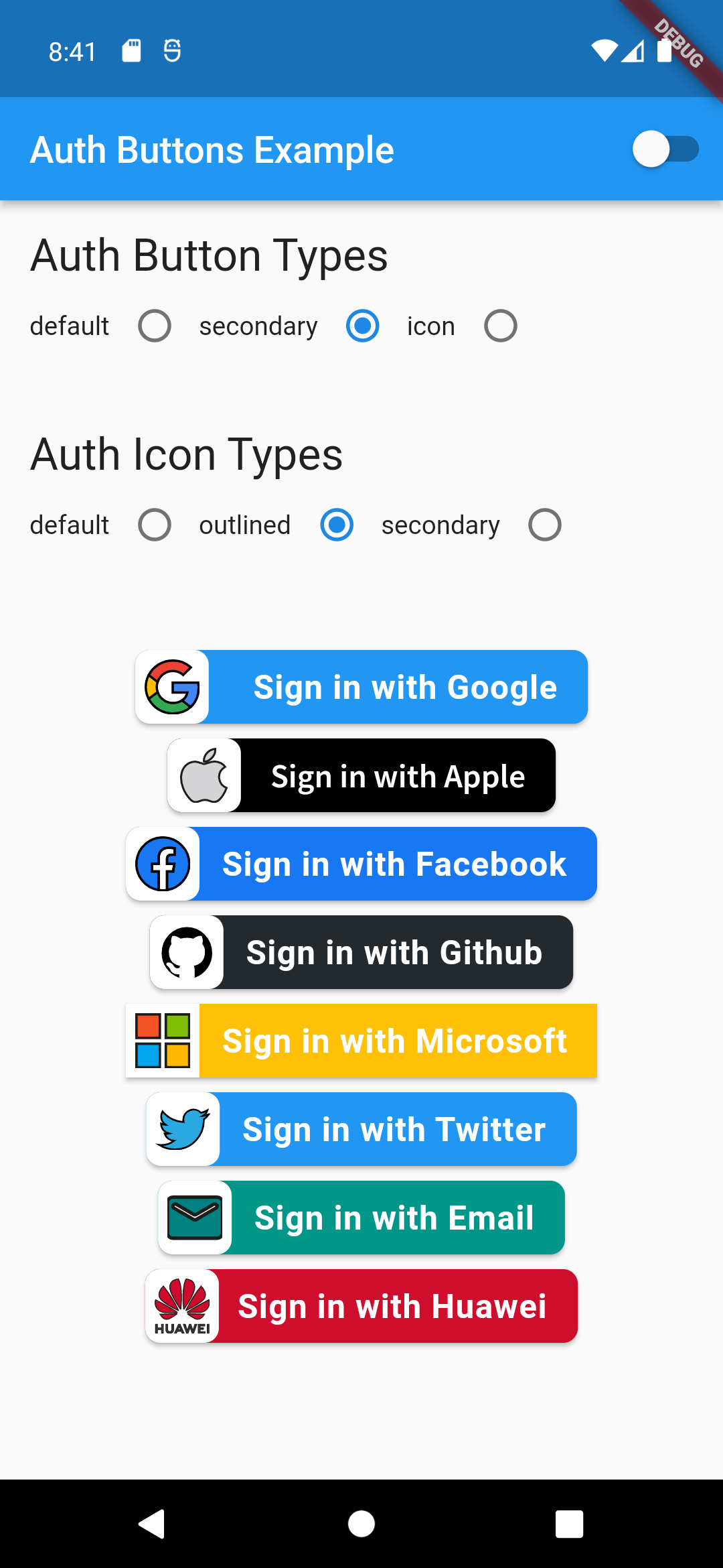
There are three Types you can choose between them:

  1. Default
  2. Icon
  3. Secondary

Suggestion

If you plain to use a non existing AuthButton like: Linkedin or any others along with the existing one, than make your custom one just use CustomAuthButton this provide you with a fast way to do so.

Using

Enabled State.

You need to use just the following code:

Default Type
GoogleAuthButton(
  onPressed: () {},
),
Light Dark
default-button-default-icon dark-default-button-default-icon
GoogleAuthButton(
  onPressed: () {},
  style: AuthButtonStyle(
    iconType: AuthIconType.outlined,
  ),
),
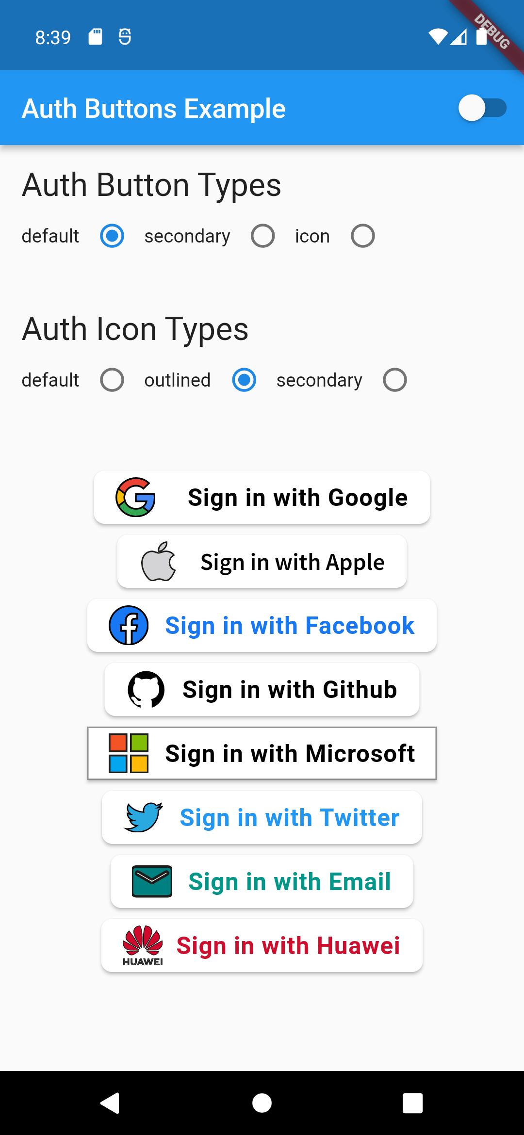
Light Dark
default-button-outlined-icon dark-default-button-outlined-icon
GoogleAuthButton(
  onPressed: () {},
  style: AuthButtonStyle(
    iconType: AuthIconType.secondary,
  ),
),
Light Dark
default-button-secondary-icon dark-default-button-secondary-icon
Icon Type
GoogleAuthButton(
  onPressed: () {},
  style: AuthButtonStyle(
    buttonType: AuthButtonType.icon,
  ),
),
Light Dark
icon-button-default-icon dark-icon-button-default-icon
GoogleAuthButton(
  onPressed: () {},
  style: AuthButtonStyle(
    buttonType: AuthButtonType.icon,
    iconType: AuthIconType.outlined,
  ),
),
Light Dark
icon-button-outlined-icon dark-icon-button-outlined-icon
GoogleAuthButton(
  onPressed: () {},
  style: AuthButtonStyle(
    buttonType: AuthButtonType.icon,
    iconType: AuthIconType.secondary,
  ),
),
Light Dark
icon-button-secondary-icon dark-icon-button-secondary-icon
Secondary Type
GoogleAuthButton(
  onPressed: () {},
  style: AuthButtonStyle(
    buttonType: AuthButtonType.secondary,
  ),
),
Light Dark
secondary-button-default-icon dark-secondary-button-default-icon
GoogleAuthButton(
  onPressed: () {},
  style: AuthButtonStyle(
    buttonType: AuthButtonType.secondary,
    iconType: AuthIconType.outlined,
  ),
),
Light Dark
secondary-button-outlined-icon dark-secondary-button-outlined-icon
GoogleAuthButton(
  onPressed: () {},
  style: AuthButtonStyle(
    buttonType: AuthButtonType.secondary,
    iconType: AuthIconType.secondary,
  ),
),
Light Dark
secondary-button-secondary-icon dark-secondary-button-secondary-icon
Disabled State
Light Dark
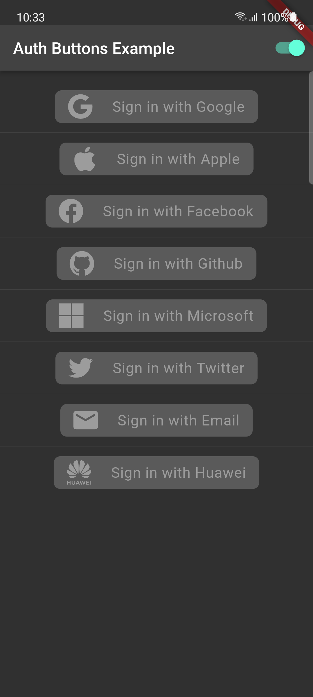
disabled-buttons dark-disabled-buttons

Do same think with the other buttons, when you want to customize any button you can do it just passing a property which you want.

Grouped buttons

Example

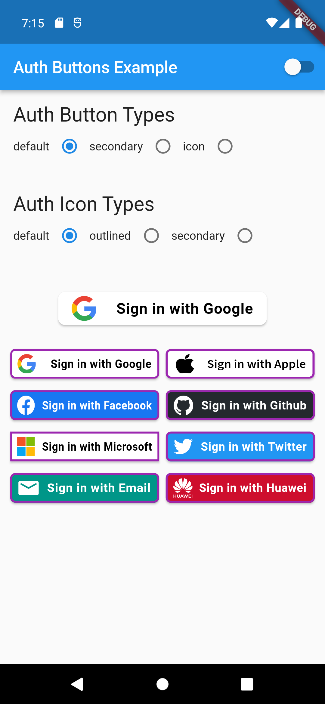
auth button group usecase
AuthButtonGroup(
  style: const AuthButtonStyle(
    width: 180,
    height: 50,
    borderColor: Colors.purple,
    borderWidth: 3.0,
    margin: EdgeInsets.only(bottom: 8.0),
  ),
  buttons: [
    GoogleAuthButton(),
    AppleAuthButton(),
    //....
  ]
),
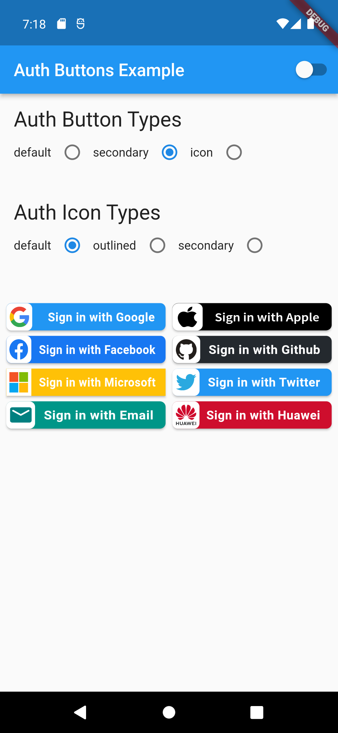
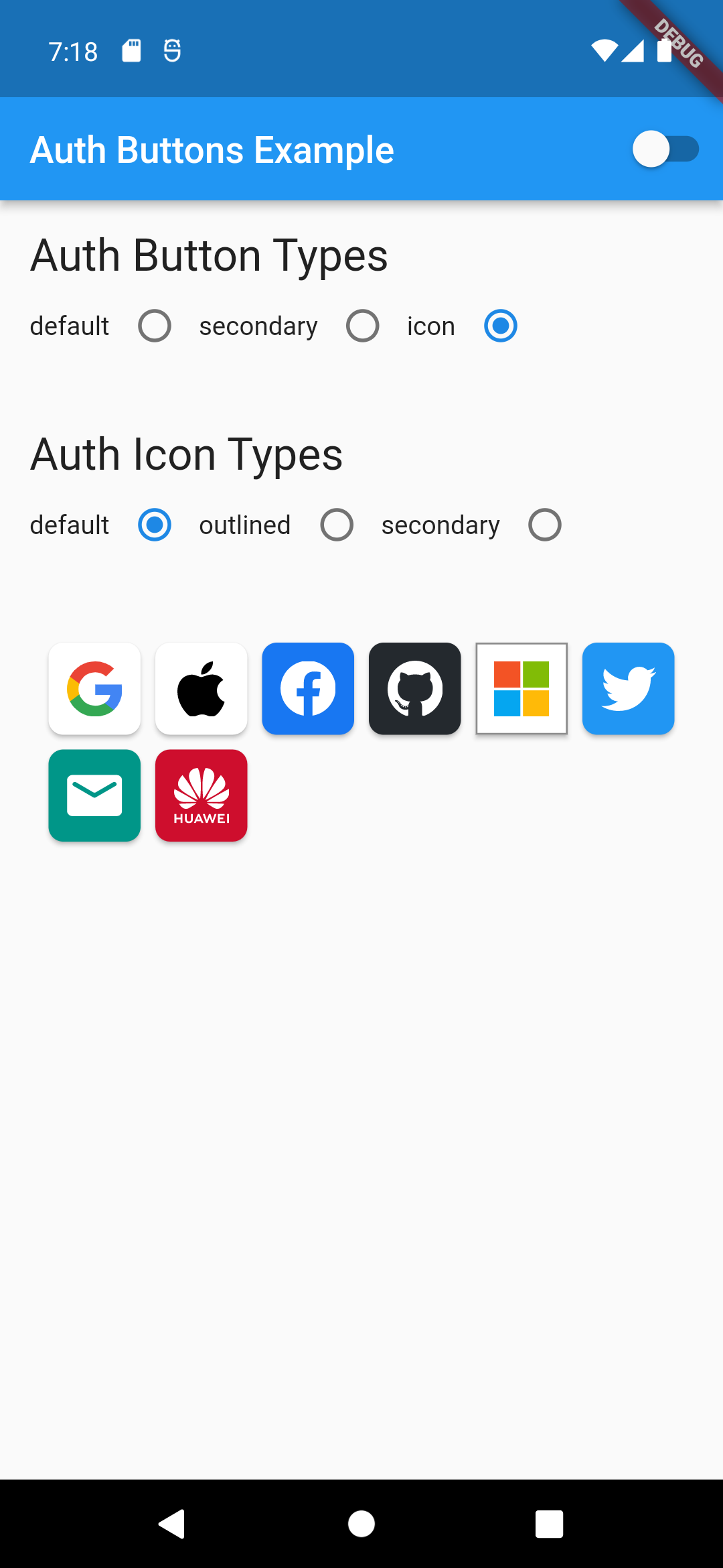
                                                                                           Secondary                                                                                               |  Icon

:-----------------------------------------------------------------------------------------------------------------------------------------------------------------------------------------------------:|:-------------------------: auth button group secondary buttons | auth-button-group-icon-buttons

Full property you can pass:

GoogleAuthButton(
  key: const ValueKey<String>(''),
  onPressed: () {},
  onLongPress: () {},
  onHover: (bool value) {},
  onFocusChange: (bool value) {},
  focusNode: FocusNode(),
  autofocus: false,
  text: 'Sign in with Google',
  isLoading: false,
  themeMode: ThemeMode.system,
  textDirection: TextDirection.ltr,
  materialStyle: ButtonStyle(),
  style: AuthButtonStyle(
    buttonColor: Colors.blue,
    splashColor: Colors.red,
    elevation: 2.0,
    borderRadius: 99.0,
    textStyle: TextStyle(),
    padding: const EdgeInsets.all(8.0),
    margin: const EdgeInsets.all(8.0),
    borderColor: Colors.amber,
    borderWidth: 3.0,
    buttonType: AuthButtonType.secondary,
    width: 300.0,
    height: 50.0,
    iconSize: 40.0,
    separator: 20.0,
    iconBackground: Colors.white,
    iconType: AuthIconType.outlined,
    shadowColor: Colors.pink,
    progressIndicatorColor: Colors.blue,
    progressIndicatorValueColor: Colors.grey[300],
    progressIndicatorStrokeWidth: 2.0,
    progressIndicatorValue: 1.0,
    iconColor: Colors.purple,
    progressIndicatorType: AuthIndicatorType.circular,
    visualDensity: VisualDensity.standard,
    tapTargetSize: MaterialTapTargetSize.shrinkWrap,
),

return up

श्रेणियाँ

निर्भरताएँ

निर्भरता सूची 2 आइटम

सोर्स रिपॉज़िटरी

इस पैकेज का उपयोग करने वाले प्रोजेक्ट

अभी कोई डेटा उपलब्ध नहीं है।