सार्वजनिक जानकारी से बना चयन मार्गदर्शन। केवल संदर्भ हेतु।
Black_Hole_Flutter एक व्यापक उपयोगिता पैकेज है जो आमतौर पर उपयोग किए जाने वाले एक्सटेंशन कार्यों और पुन: उपयोगी विजेट्स को एकल, आसानी से आयात करने योग्य समाधान में संगठित करता है। विकास को सरल बनाने के लिए डिज़ाइन किया गया, यह एंड्रॉइड, आईओएस, वेब, मैकओएस, विंडोज और लिनक्स जैसे कई प्लेटफॉर्मों पर समय बचाने वाले उपकरण प्रदान करता है। इस पैकेज का उपयोग आवश्यक कार्यक्षमता के केंद्रीकृत हब के रूप में किया जाता है, जिससे बॉयलरप्लेट कोड कम होता है और Flutter प्रोजेक्ट में सुसंगतता बढ़ती है। दक्षता और त्वरित प्रोटोटाइपिंग की खोज करने वाले विकासकर्ताओं के लिए उपयुक्त है।
उपयोग
त्वरित यूआई विकास
प्रोजेक्ट्स के बीच कोड पुनर्उपयोग
आम कार्यों को सुगम बनाना
क्रॉस-प्लेटफॉर्म उपयोगिता
Prototyping
बॉयलरप्लेट कम करना
मुख्य विशेषताएँ
एकीकृत उपयोगिता विस्तार
पुनर्उपयोगी विजेट्स
बहु-प्लेटफॉर्म समर्थन
न्यूनतम सेटअप
समान कोडिंग शैली
विस्तारयोगी डिज़ाइन
इनके लिए उपयुक्त
शुरुआती से उन्नत तक के Flutter विकासकर्ता
बड़े पैमाने का एप्लिकेशन विकास
कोड सुसंगतता पर ध्यान केंद्रित करने वाली टीमें
त्वरित अनुकूलन की आवश्यकता वाले प्रोजेक्ट
न्यूनतम निर्भरता वाले डेवलपर्स
विचार योग्य बातें
अप्रयुक्त उपकरण शामिल हो सकते हैं
निर्भरता ब्लोट का संभावित जोखिम
प्रत्येक फीचर के लिए सीमित कस्टमाइज़ेशन
अत्यधिक विशेषज्ञता की आवश्यकता के लिए उपयुक्त नहीं
शामिल कार्यों की ध्यान से समीक्षा करने की आवश्यकता है
जब प्रोजेक्ट के स्कोप में शामिल उपकरणों के साथ मेल खाता है, तो सबसे अच्छा उपयोग किया जाता है
मूल README
संबंधित सोर्स रिपॉज़िटरी के मूल README का स्नैपशॉट। नवीनतम सामग्री के लिए रिपॉज़िटरी देखें।
🛠 A package absorbing all Flutter utility functions, including extension functions and commonly used widgets.
In Flutter, you often see the pattern <Class>.of(context) (e.g., Theme.of(context)). This package adds extension getters on BuildContext for those classes so you can just say:
Note: This uses the name of routes, so it only works with named routes.
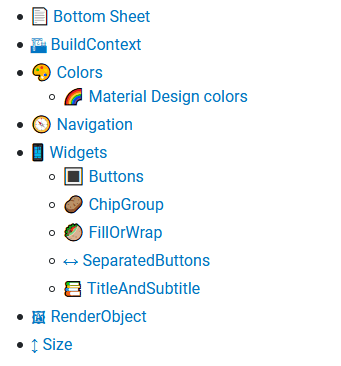
📱 Widgets
🔳 Buttons
Did you ever want to show a progress indicator inside a button? Or were annoyed to conditionally set a Button's onPressed to disable it? Fear no more — black_hole_flutter has got you covered!
This screenshot only shows an excerpt of all available button types and variants.
isEnabled: Settings this to false disables this button, even if onPressed is set.
🥙 FillOrWrap
A layout with two different behaviors:
By default, all children are positioned next to each other with equal widths. This is comparable to a Row with all children wrapped in Expanded.
If the children are too wide to fit in a single line, or one child would become smaller than its reported minimum width, the children get positioned below each other ("wrapped"). This is similar to a Column with MainAxisSize.min.
🎯 LeftCenterRight
A layout taking optional left, center, and right children.
It will try to keep center in the center of itself, even if only one of left and right is set, or they have different widths.
🟢 Circle
A circle with optional diameter, background color, padding, and child.