सार्वजनिक जानकारी से बना चयन मार्गदर्शन। केवल संदर्भ हेतु।
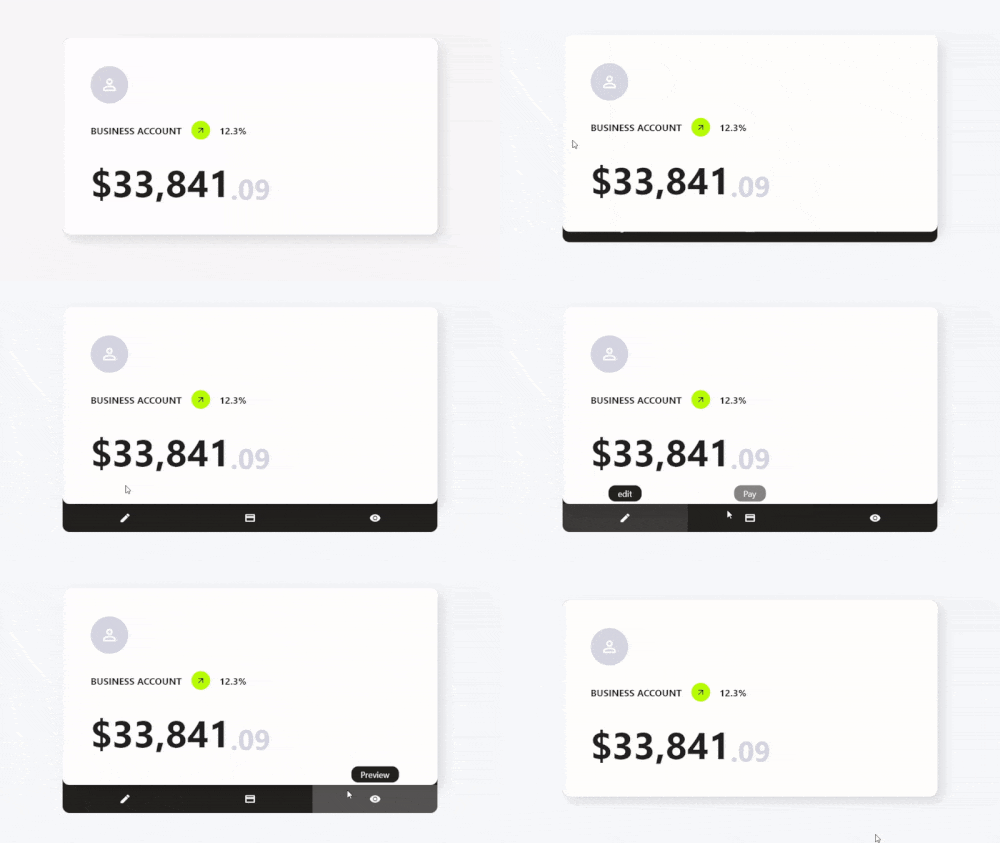
Card Actions एक Flutter पैकेज है जो कार्ड विजेट्स को कस्टमाइज़ करने योग्य कार्रवाई और इंटरैक्टिव फीचर्स के साथ बढ़ाता है। यह विकासकर्ताओं को कार्ड्स में स्वाइप गेस्चर, टैप इंटरैक्शन और डायनामिक कंटेंट बदलाव जोड़ने की अनुमति देता है, जिससे उपयोगकर्ता एंगेजमेंट में सुधार होता है। इसे सूचियों, डैशबोर्ड्स या कार्ड-आधारित UI में उपयोग के लिए डिज़ाइन किया गया है, और यह Android, iOS, Web, macOS, Windows और Linux जैसे कई प्लेटफॉर्मों को सपोर्ट करता है। इस पैकेज को सरल pub add कमांड के माध्यम से मौजूदा Flutter प्रोजेक्ट्स में बिना किसी झंझट के एकीकृत किया जा सकता है। इसका हल्का डिज़ाइन प्रदर्शन और उपयोग में आसानी पर ध्यान केंद्रित करता है, जिससे यह आधुनिक, प्रतिक्रियाशील कार्ड इंटरफेस के लिए आदर्श है।
उपयोग
इंटरैक्टिव कार्ड स्वाइप
डायनामिक कार्ड कंटेंट अपडेट्स
गतिशील कार्ड इंटरैक्शन
कार्ड-आधारित डैशबोर्ड
कार्ड क्रियाओं के माध्यम से उपयोगकर्ता प्रतिक्रिया
क्रॉस-प्लेटफ़ॉर्म कार्ड सुधार
मुख्य विशेषताएँ
स्वाइप-टू-एक्शन समर्थन
कस्टमाइज़ किए गए टैप और गेस्चर प्रतिक्रियाएं
हल्का और कार्यक्षम
बहुपлатफॉर्म सुसंगतता
Flutter के साथ आसान एकीकरण
विस्तार्य कार्रवाई हैंडलर्स
इनके लिए उपयुक्त
कार्ड-भरे यूआई विकसित करने वाले विकासकर्ता
इंटरैक्टिव कार्ड तत्वों की आवश्यकता वाले ऐप्स
क्रॉस-प्लेटफ़ॉर्म मोबाइल और वेब ऐप्स
पुनर्उपयोगी कार्ड घटकों के साथ डिज़ाइन प्रणालियाँ बनाएँ
इंटरैक्टिव लेआउट के प्रोटोटाइपिंग
विचार योग्य बातें
Flutter गतिशील प्रणाली की समझ आवश्यक है
जटिल इंटरैक्शन के लिए अतिरिक्त स्टाइलिंग की आवश्यकता हो सकती है
सरल से मध्यम जटिलता वाले कार्ड व्यवहार के लिए सबसे उपयुक्त
पूर्ण-स्क्रीन नेविगेशन के लिए नहीं बनाया गया है
कार्ड-स्तरीय इंटरैक्शन तक सीमित
मूल README
संबंधित सोर्स रिपॉज़िटरी के मूल README का स्नैपशॉट। नवीनतम सामग्री के लिए रिपॉज़िटरी देखें।
Features
✨ Simple Use
⚙️ Great Customization
🌍 Expand the functionality of your cards
🛑 Not use for mobile devices, will soon be available for use on those platforms.
Getting Started
To use this card actions package, you need to add the dependencies in pubspec.yaml file.
dependencies:card_actions:^0.0.1
Use
To use card actions is very simple, just wrap your card with our CardActions widget,
CardActions(
    ...
    child: YourCard() // here would be your card
)
Basic Setup
CardActions needs the parameters width, height and actions
width is the width of the widget
height is the height of the widget
actions is a list of CardActionButton.
CardActions(
    width: //your card width
    height: // your card height
    actions: <CardActionButton>[
        CardActionButton(
            icon: Icon(
                Icons.edit,
                color: Colors.white,
            ), // Icon
            label: 'edit',
            onPress: () {},
        ), // CardActionButton
    ]
    child: yourCard(), // here would be your card
)
If you want to change the direction of the hover, you can use the axisDirection property of the CardAction to change it.
the axisDirection property receives a enum of type CardActionAxis at the moment we only have bottom and right.
CardActionAxis.bottom
CardActionAxis.right
Example
To make this example, we will need to configure more things, but it will be very simple, the first thing is that we change the background color for it we have to use the property backgroundColor then an important part is that we change the design of the cursor when it is on top of the buttons and this we can do it in two ways:
In the CardAction we have the buttonsCursor property that serves to change the cursor to ALL the buttons.
In the CardActionButton we have the cursor property to change the cursor to that specific button.
Important.
If you use both options at the same time the button will prioritize its own cursor setting over the global setting with buttonsCursor.
and finally we add the necessary functions to the buttons by means of its onPress method.