सार्वजनिक जानकारी से बना चयन मार्गदर्शन। केवल संदर्भ हेतु।
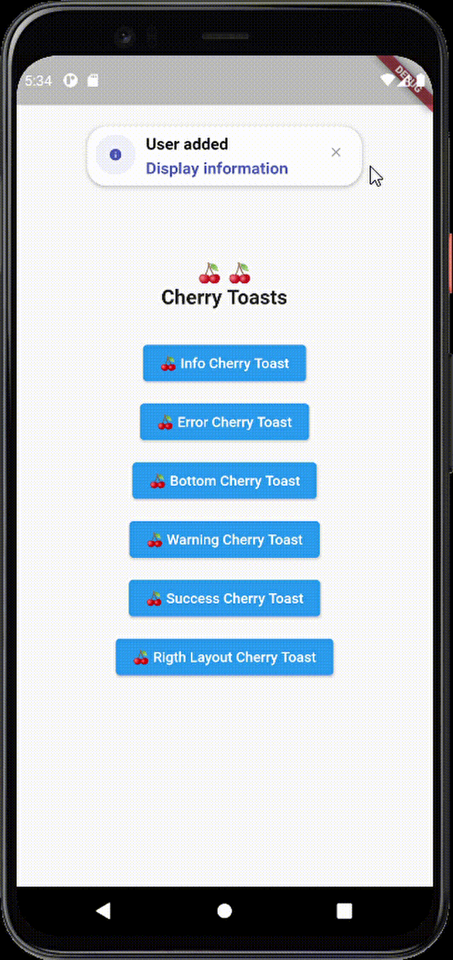
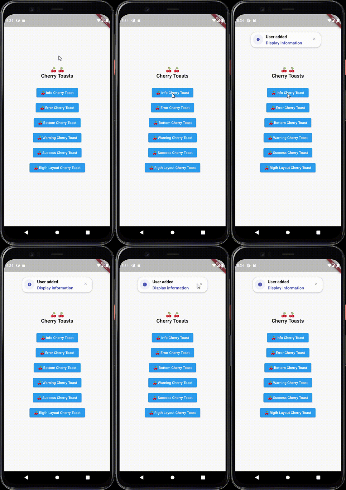
चेरी टोस्ट एक फ्लटर पैकेज है जो सुचारू एनिमेशन और कस्टमाइज़ेबल डिज़ाइन के साथ टोस्ट को दिखाने का आधुनिक, दृश्य रूप से आकर्षक तरीका प्रदान करता है। मानक फ्लटर टोस्ट के लिए एक शानदार विकल्प ढूंढ रहे डेवलपर्स के लिए बनाया गया, यह सूक्ष्म लेकिन शैलीपूर्ण प्रतिक्रिया के साथ उपयोगकर्ता अनुभव को बढ़ाता है। पैकेज एंड्रॉइड, आईओएस, वेब, मैकओएस, विंडोज और लिनक्स जैसे कई प्लेटफॉर्म का समर्थन करता है, जिससे उपकरणों के बीच संगत व्यवहार सुनिश्चित होता है। सुगम एपीआई और भावनात्मक डिज़ाइन पर ध्यान केंद्रित करके, चेरी टोस्ट फ्लटर एप्लिकेशन में आकर्षक नोटिफिकेशन के एकीकरण को सरल बनाता है।
उपयोग
कार्रवाई के बाद उपयोगकर्ता प्रतिक्रिया दिखाएं
सफलता या त्रुटि संदेश दिखाएं
एनिमेटेड नोटिफिकेशन के साथ UI में सुधार करना
हल्के अवस्था अपडेट प्रदान करना
दृश्य चमक के साथ ऐप पॉलिश में सुधार
मुख्य विशेषताएँ
शानदार और आधुनिक डिज़ाइन
स्मूथ एनिमेशन
क्रॉस-प्लेटफ़ॉर्म समर्थन
कस्टमाइज़ करने योग्य दिखावट
सरल API एकीकरण
विभिन्न टोस्ट प्रकारों का समर्थन करता है
इनके लिए उपयुक्त
Flutter विकासक जी यूआई सौंदर्य को प्राथमिकता देते हैं
चिकनी उपयोगकर्ता प्रतिक्रिया की आवश्यकता वाले ऐप्स
आधुनिक नोटिफिकेशन शैलियों के लक्ष्य के परियोजनाएँ
आसान उपयोग के टोस्ट समाधान चाहने वाले डेवलपर्स
उपयोगकर्ता अनुभव सुधार पर केंद्रित टीमें
विचार योग्य बातें
डार्क मोड के लिए अतिरिक्त स्टाइलिंग की आवश्यकता हो सकती है
पूर्ण-सुविधा वाले सूचना प्रणालियों की तुलना में सीमित कस्टमाइज़ेशन
बाहरी एनिमेशन पुस्तकालयों पर निर्भर है
जटिल नोटिफिकेशन वर्कफ्लो के लिए आदर्श नहीं
सरल, संक्षिप्त संदेशों के लिए सबसे उपयुक्त
मूल README
संबंधित सोर्स रिपॉज़िटरी के मूल README का स्नैपशॉट। नवीनतम सामग्री के लिए रिपॉज़िटरी देखें।
Cherry Toast
A new way to display toasts in Flutter in an elegant design and animations
Cherry Toast
Support all platforms
Top and Bottom display position
Customizable background color
Support RTL layout rendering (for arabic text)
Multiple built-in themes
Built-in animations
Support null safety
Elegant design
Full customizable
Heartbeat animation on icons
Customizable icon size and color and display
Dismissable notification
Customizable toast constraints, height and width
Installation
To add cherry toast to your project add this line to your pubspec.yaml file
dependencies:cherry_toast:^1.13.0
Parameters
/// Text widget displayed as a title in the toast/// required parameter for all toast typesfinalText? title;
/// Text widget displayed as a description in the toastfinalText? description;
/// The action button displayed below descriptionfinalText? action;
/// The toast icon, it's required when using the default constructorlateIconData icon;
/// The Icon color/// this parameter is only available on the default constructor/// for the built-in themes the color will be set automaticallylateColor iconColor;
/// Background color of containerfinalColor backgroundColor;
/// Box shadow color of containerfinalColor shadowColor;
/// Custom widget displayed at the place of the predefined iconsfinalWidget? iconWidget;
/// The icon size/// this parameter is available in default constructorlatedouble iconSize;
/// The toast display postion, possible values/// ```dart/// {/// top,/// bottom/// }/// ```finalPosition toastPosition;
/// The color that will be applied on the circle behind the icon/// for better rendering the action button must have the same colorlateColor themeColor;
/// The function invoked when clicking on the action buttonfinalFunction? actionHandler;
/// The duration of the animation by default it's 1.5 secondsfinalDuration animationDuration;
/// The animation curve by default it's set to `Curves.ease`.finalCubic animationCurve;
/// The animation type applied on the toast/// ```dart/// {/// fromTop,/// fromLeft,/// fromRight/// }/// ```finalAnimationType animationType;
/// Indicates whether the toast will be hidden automatically or not.finalbool autoDismiss;
/// The duration of the toast if [autoDismiss] is truefinalDuration toastDuration;
/// The layout of the toast/// ```dart/// {/// ltr,/// rtl/// }/// ```finalTextDirection textDirection;
/// Display / Hide the close button iconfinalbool displayCloseButton;
/// Define the border radius applied on the toastfinaldouble borderRadius;
/// Define whether the icon will be rendered or notfinalbool displayIcon;
/// Define wether the animation on the icon will be rendered or notfinalbool enableIconAnimation;
/// The attribute is declaring a final variable named "width" of type double with a nullable value./// width attribute define the toast widthfinaldouble? width;
/// The attribute is declaring a final variable named "height" of type double with a nullable type/// modifier./// height attribute define the toast heightfinaldouble? height;
/// Enable taost constraints customization (by default it's null)finalBoxConstraints? constraints;
/// Indicate whether the toast animation is enabled or not/// by default the toast animation is enabledfinalbool disableToastAnimation;
/// Indicate toast should inherit theme colors sheme, to apply in background/// and shadow color.finalbool inheritThemeColors;
/// Callback invoked when toast get dismissed (closed by button or dismissed automtically)finalFunction()? onToastClosed;
/// Horizontal alignment display of the toast contentfinalCrossAxisAlignment horizontalAlignment;
/// The space rendered between the title and description widgets.finaldouble titleDescriptionMargin;
/// The space rendered between the description and actions widgets.finaldouble descriptionActionMargin;