सार्वजनिक जानकारी से बना चयन मार्गदर्शन। केवल संदर्भ हेतु।
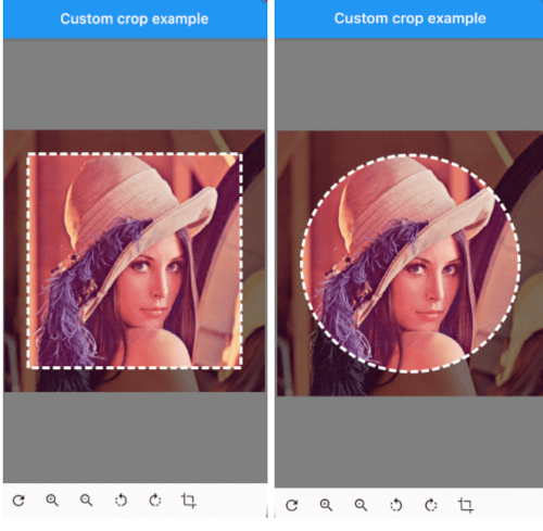
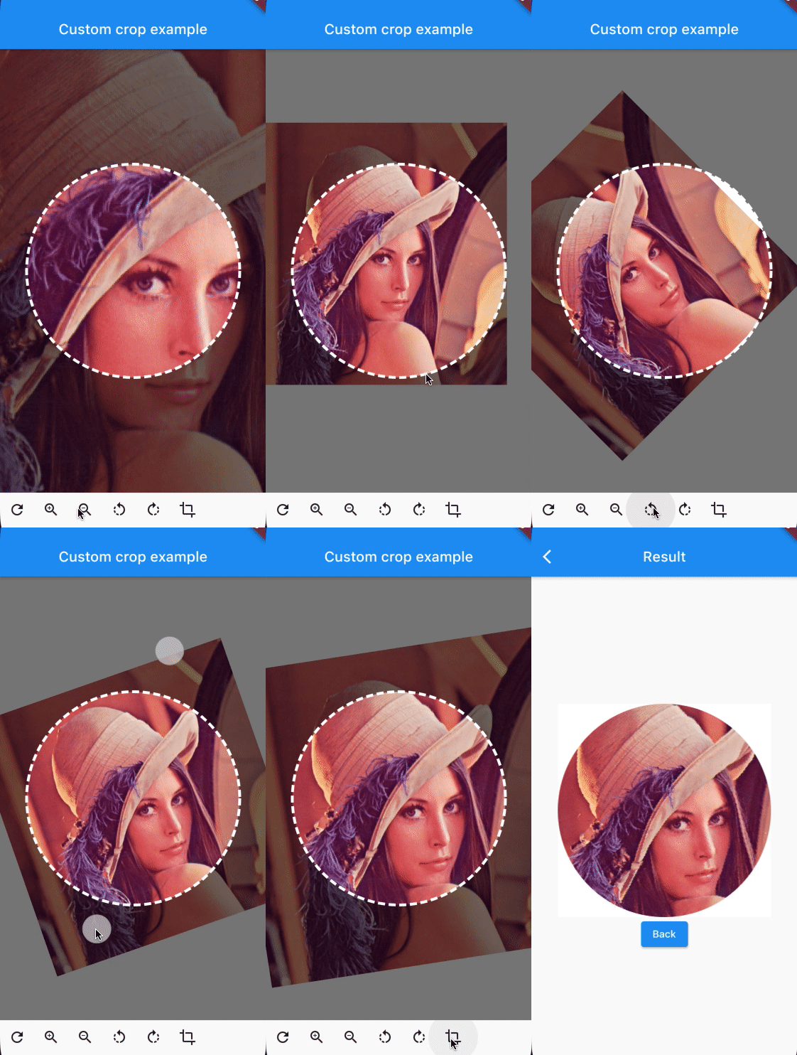
एक उच्चतर अनुकूलनीय छवि क्रॉपर जो उपयोगकर्ताओं को सहज गतियों या नियंत्रक के माध्यम से छवियों को घुमाने, स्केल करने और स्थानांतरित करने की अनुमति देता है। विभिन्न प्लेटफॉर्मों पर बिना किसी बाधा के एकीकरण के लिए डिज़ाइन किया गया है, जो क्रॉपिंग अनुभव पर बहुत बारीक नियंत्रण प्रदान करता है। उन ऐप्स के लिए आदर्श जिनमें प्रतिक्रियाशील और अंतरक्रियाशील इंटरफेस के साथ उन्नत छवि संपादन की आवश्यकता होती है। यह पैकेज Android, iOS, Web, macOS, Windows और Linux का समर्थन करता है, जिससे व्यापक संगतता सुनिश्चित होती है।
उपयोग
फोटो ऐप्स में कस्टम इमेज संपादन
उपयोगकर्ता प्रोफ़ाइल छवि कटाई
इंटरैक्टिव छवि चयन उपकरण
डिज़ाइन ऐप्स में डायनामिक इमेज रीसाइज़िंग
मशीन लर्निंग वर्कफ़्लो में इमेज प्रीप्रोसेसिंग
मुख्य विशेषताएँ
गतिमान हस्तक्षेप आधारित घूर्णन, स्केलिंग और ट्रांसलेशन
नियंत्रक-चालित छवि संशोधन
प्लेटफॉर्म के अनुकूल समर्थन
बहुत कस्टमाइज़ेबल यूआई कंपोनेंट्स
कटिंग के दौरान रियल-टाइम प्रीव्यू
सभी स्क्रीन आकारों के लिए प्रतिक्रियाशी डिज़ाइन
इनके लिए उपयुक्त
छवि संपादन विशेषताएँ बना रहे विकासकर्ता
सटीक छवि क्रॉपिंग की आवश्यकता वाले ऐप्स
बहु-प्लेटफॉर्म छवि संपादन उपकरण
चित्र प्रबंधन के साथ इंटरएक्टिव उपयोगकर्ता इंटरफेस
उन्नत छवि संपादन कार्यप्रवाहों का प्रोटोटाइपिंग
विचार योग्य बातें
प्रदर्शन में समस्याओं से बचने के लिए बड़ी छवियों का सावधानीपूर्वक निपटारा करने की आवश्यकता है
जटिल उपयोग केस के लिए अतिरिक्त राज्य प्रबंधन की आवश्यकता हो सकती है
प्रारंभिक सेटअप में हस्त डिटेक्टर और कंट्रोलर की समझ की आवश्यकता होती है
बहुत उच्च-रिज़ॉल्यूशन छवियों के लिए बिना डाउनसैम्पलिंग के अनअप्टीमाइज़्ड
सीमित बिल्ट-इन प्रीसेट; विशिष्ट फसल अनुपात के लिए कस्टमाइज़ेशन आवश्यक है
मूल README
संबंधित सोर्स रिपॉज़िटरी के मूल README का स्नैपशॉट। नवीनतम सामग्री के लिए रिपॉज़िटरी देखें।
You can provide the image using any Imageprovider.
Parameters
required image
The image that needs to be cropped
cropController
The controller used to adjust the image and crop it.
overlayColor
The color above the image that will be cropped
backgroundColor
The color behind the image. This color will also be used when there are gaps/empty space after the cropping
shape
The shape of the cropping path.
maskShape
The shape of the UI masking.
cropPercentage
How big the crop should be in regards to the width and height available to the cropping widget.
drawPath
How the border of the crop should be painted. default DottedCropPathPainter.drawPath and SolidCropPathPainter.drawPath are provided, but you can create/provide any CustomPaint.
pathPaint
Custom painting for the crop area border style.
canRotate
Whether to allow the image to be rotated.
customProgressIndicator
Custom widget for progress indicator.
ratio
Ratio of the cropping area.
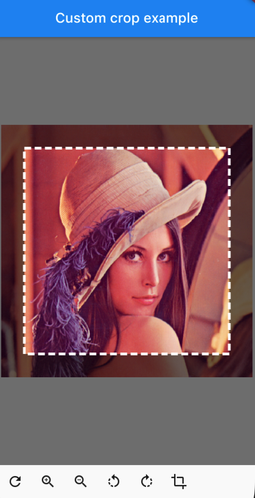
If shape`` is set to CustomCropShape.Ratio, this property is required. For example, to create a square crop area, use [Ratio(width: 1, height: 1).
To create a rectangular crop area with a 16:9 aspect ratio, use [Ratio(width: 16, height: 9)`.
borderRadius
The radius for rounded corners of the cropping area.
forceInsideCropArea
Whether image area must cover clip path.
Controller Methods
addTransition
void addTransition(CropImageData transition)
Add the position, angle and scale to the current state. This can be used to adjust the image with sliders, buttons, etc.
setData
void setData(CropImageData data)
Set the position, angle and scale to the specified values. This can be used to center the image by pressing a button for example.
reset
void reset()
Reset the image to its default state
onCropImage
Future<MemoryImage> onCropImage()
Crops the image in its current state, this will return a MemoryImage that contains the cropped image