सार्वजनिक जानकारी से बना चयन मार्गदर्शन। केवल संदर्भ हेतु।
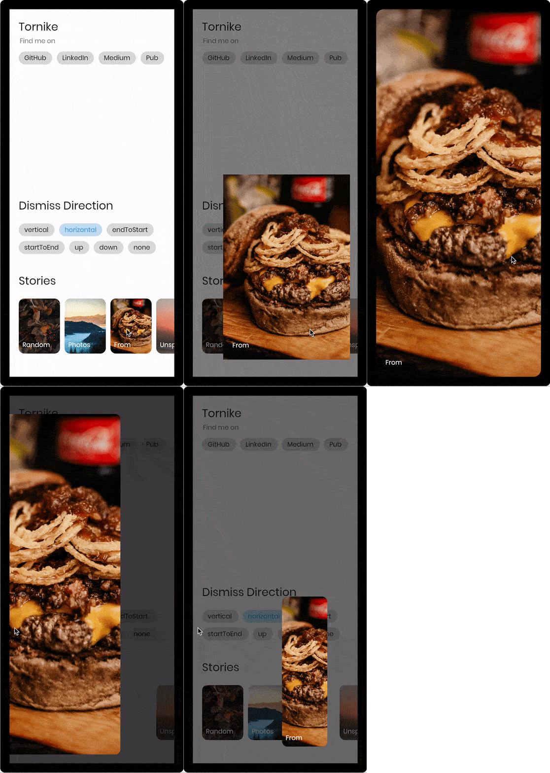
एक फ्लटर विजेट जो उपयोगकर्ताओं को किसी भी दिशा में स्वाइप करके पृष्ठ को बंद करने की अनुमति देता है, पारंपरिक बैक बटन और बेसिक ट्रांज़िशन को बदलता है। यह कस्टमाइज़ किए गए डिस्मिसल व्यवहार के साथ चलती हुई, गतिशील नेविगेशन प्रदान करता है, जो मोबाइल और वेब प्लेटफॉर्म पर उपयोगकर्ता अनुभव को बढ़ाता है। पैकेज कई प्लेटफॉर्मों का समर्थन करता है, जिनमें एंड्रॉइड, आईओएस, वेब, मैकओएस, विंडोज और लिनक्स शामिल हैं, जिससे यह क्रॉस-प्लेटफॉर्म ऐप्स के लिए लचीला बनता है। चिकनी एनीमेशन और स्वचालित इंटरैक्शन के साथ बनाया गया, यह आधुनिक, इंटरैक्टिव UI के लिए आदर्श है।
उपयोग
स्वाइप-टू-डिसमिस मोडल्स
इंटरैक्टिव ऑनबोर्डिंग प्रवाह
गतिशील नेविगेशन
कस्टम पेज बंद करना
उपयोगकर्ता भागीदारी में वृद्धि
मुख्य विशेषताएँ
दिशा-अनार्स फिसलकर बंद करें
चिकनी एनीमेटेड ट्रांजिशन
क्रॉस-प्लेटफ़ॉर्म समर्थन
कस्टमाइज़ की गई ड्रैग संवेदनशीलता
निर्मित किनारा शोधन
Navigator के साथ आसान एकीकरण
इनके लिए उपयुक्त
आधुनिक एप्प इंटरफेस
इंटरैक्टिव ट्यूटोरियल
गतिशील अनुप्रयोग
डिज़ाइन-केंद्रित उपयोगकर्ता अनुभव
मोबाइल-प्रथम विकास
विचार योग्य बातें
अन्य गतिमान डिटेक्टर्स के साथ टकराएगा
नेस्टेड नेविगेशन का ध्यान से निपटना आवश्यक है
जटिल नेविगेशन स्टैक के लिए उपयुक्त नहीं
भारी विजेट्स के साथ प्रदर्शन प्रभाव
सीमित एक्सेसिबिलिटी समर्थन
सभी लक्षित प्लेटफॉर्मों पर परीक्षण की आवश्यकता है
मूल README
संबंधित सोर्स रिपॉज़िटरी के मूल README का स्नैपशॉट। नवीनतम सामग्री के लिए रिपॉज़िटरी देखें।
const imageUrl =
'https://user-images.githubusercontent.com/26390946/155666045-aa93bf48-f8e7-407c-bb19-bc247d9e12bd.png';
classFirstPageextendsStatelessWidget{
@overrideWidgetbuild(BuildContext context) {
returnScaffold(
backgroundColor: Color.fromRGBO(228, 217, 236, 1),
body: GestureDetector(
onTap: () {
// Use extension method to use [TransparentRoute]// This will push page without route background
context.pushTransparentRoute(SecondPage());
},
child: Center(
child: SizedBox(
width: 200,
// Hero widget is needed to animate page transition
child: Hero(
tag: 'Unique tag',
child: Image.network(
imageUrl,
fit: BoxFit.cover,
),
),
),
),
),
);
}
}
classSecondPageextendsStatelessWidget{
@overrideWidgetbuild(BuildContext context) {
returnDismissiblePage(
onDismissed: () {
Navigator.of(context).pop();
},
// Note that scrollable widget inside DismissiblePage might limit the functionality// If scroll direction matches DismissiblePage direction
direction: DismissiblePageDismissDirection.multi,
isFullScreen: false,
child: Hero(
tag: 'Unique tag',
child: Image.network(
imageUrl,
fit: BoxFit.cover,
),
),
);
}
}
Properties
constDismissiblePage({
requiredthis.child,
requiredthis.onDismissed,
this.onDragStart,
this.onDragEnd,
this.onDragUpdate,
this.isFullScreen = true,
this.disabled = false,
this.backgroundColor = Colors.black,
this.direction = DismissiblePageDismissDirection.vertical,
this.dismissThresholds = const <DismissiblePageDismissDirection, double>{},
this.dragStartBehavior = DragStartBehavior.down,
this.dragSensitivity = 0.7,
this.minRadius = 7,
this.minScale = .85,
this.maxRadius = 30,
this.maxTransformValue = .4,
this.startingOpacity = 1,
this.hitTestBehavior = HitTestBehavior.opaque,
this.reverseDuration = constDuration(milliseconds: 200),
Key? key,
}) : super(key: key);
/// Called when the widget has been dismissed.finalVoidCallback onDismissed;
/// Called when the user starts dragging the widget.finalVoidCallback? onDragStart;
/// Called when the user ends dragging the widget.finalVoidCallback? onDragEnd;
/// Called when the widget has been dragged. (0.0 - 1.0)finalValueChanged<DismissiblePageDragUpdateDetails>? onDragUpdate;
/// If true widget will ignore device padding/// [MediaQuery.of(context).padding]finalbool isFullScreen;
/// The minimum amount of scale widget can have while dragging/// Note that scale decreases as user dragsfinaldouble minScale;
/// The minimum amount fo border radius widget can havefinaldouble minRadius;
/// The maximum amount of border radius widget can have while dragging/// Note that radius increases as user dragsfinaldouble maxRadius;
/// The amount of distance widget is able to drag. value (0.0 - 1.0)finaldouble maxTransformValue;
/// If true the widget will ignore gesturesfinalbool disabled;
/// Widget that should be dismissedfinalWidget child;
/// Background color of [DismissiblePage]finalColor backgroundColor;
/// The amount of opacity [backgroundColor] will have when start dragging the widget.finaldouble startingOpacity;
/// The direction in which the widget can be dismissed.finalDismissiblePageDismissDirection direction;
/// The offset threshold the item has to be dragged in order to be considered/// dismissed. default is [_kDismissThreshold], value (0.0 - 1.0)finalMap<DismissiblePageDismissDirection, double> dismissThresholds;
/// Represents how much responsive dragging the widget will be/// Doesn't work on [DismissiblePageDismissDirection.multi]finaldouble dragSensitivity;
/// Determines the way that drag start behavior is handled.finalDragStartBehavior dragStartBehavior;
/// The amount of time the widget will spend returning to initial position if widget is not dismissed after dragfinalDuration reverseDuration;
/// How to behave during hit tests.////// This defaults to [HitTestBehavior.opaque].finalHitTestBehavior hitTestBehavior;