पैकेज, रिपॉज़िटरी और ऐप श्रेणियाँ खोजें

dynamic_tabbar कवर
पैकेज विवरणv1.0.9

dynamic_tabbar

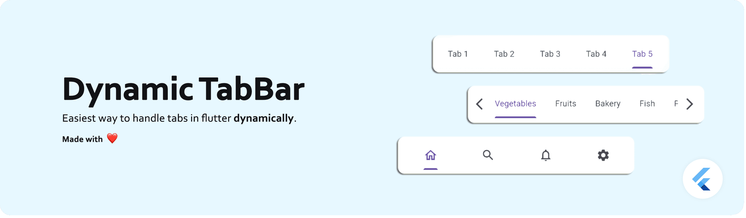
डायनामिक टैब्स (TabBar और TabBarView) को सबसे आसान तरीके से हैंडल करने के लिए Flutter पैकेज।

AndroidiOSWeb
30-दिन डाउनलोड
3.6 हज़ार
लाइक
125
Pub अंक
150

पैकेज इंस्टॉल करें

flutter pub add dynamic_tabbar

पैकेज अवलोकन

सार्वजनिक जानकारी से बना चयन मार्गदर्शन। केवल संदर्भ हेतु।

एक फ्लटर पैकेज जो टैबबार और टैबबारव्यू का उपयोग करके डायनामिक टैब्स के निर्माण और प्रबंधन को सरल बनाता है। यह विकासकर्ताओं को चिंता के बिना रनटाइम में टैब्स जोड़ने, हटाने या अद्यतन करने की अनुमति देता है। पैकेज टैब नेविगेशन, व्यू स्विचिंग और राज्य संरक्षण को बिना किसी झंझट के संभालता है, जिससे यह लचीले टैब लेआउट की आवश्यकता वाले ऐप्स के लिए आदर्श है। सरलता के साथ डिज़ाइन किया गया है, जिससे बॉयलरप्लेट कोड कम होता है और विकासकर्ता उत्पादकता बढ़ती है। एंड्रॉइड, आईओएस और वेब प्लेटफॉर्म्स के साथ संगत है।

उपयोग

  • डायनामिक डैशबोर्ड इंटरफेस बनाना
  • कस्टमाइज़ करने योग्य टैब नेविगेशन बनाएं
  • उपयोगकर्ता-निर्देशित टैब जोड़ने/हटाने का कार्यान्वयन
  • बहु-खंड सामग्री दृश्य विकसित करना
  • वास्तविक समय टैब अद्यतन का समर्थन करना

मुख्य विशेषताएँ

  • रनटाइम टैब संचालन
  • स्वचालित अवस्था संरक्षण
  • न्यूनतम बॉयलरप्लेट कोड
  • क्रॉस-प्लेटफॉर्म समर्थन (Android, iOS, Web)
  • टैब जोड़ने/हटाने के लिए सरल API

इनके लिए उपयुक्त

  • आसान टैब प्रबंधन की तलाश में विकासकर्ता
  • चर टैब गिनती वाले ऐप्स
  • प्रतिक्रियाशील टैब की आवश्यकता वाले डायनामिक UI
  • Flutter टैब पैटर्न सीखने वाले शुरुआती लोग
  • हल्के टैब समाधान की आवश्यकता वाले प्रोजेक्ट

विचार योग्य बातें

  • बुनियादी टैब स्टाइलिंग के आगे सीमित कस्टमाइजेशन
  • स्वाइप गेस्चर के लिए कोई बिल्ट-इन समर्थन नहीं है
  • टैब-विशेष तर्क का हस्तचालित संभाल आवश्यक है
  • अत्यधिक जटिल टैब हिरार्की के लिए आदर्श नहीं
  • उन्नत उपयोग के मामलों के लिए बाहरी अवस्था प्रबंधन पर निर्भर है

मूल README

संबंधित सोर्स रिपॉज़िटरी के मूल README का स्नैपशॉट। नवीनतम सामग्री के लिए रिपॉज़िटरी देखें।

dynamic_tabbar

Dynamic TabBar

A Flutter package that simplifies the implementation of dynamic TabBar in your application.

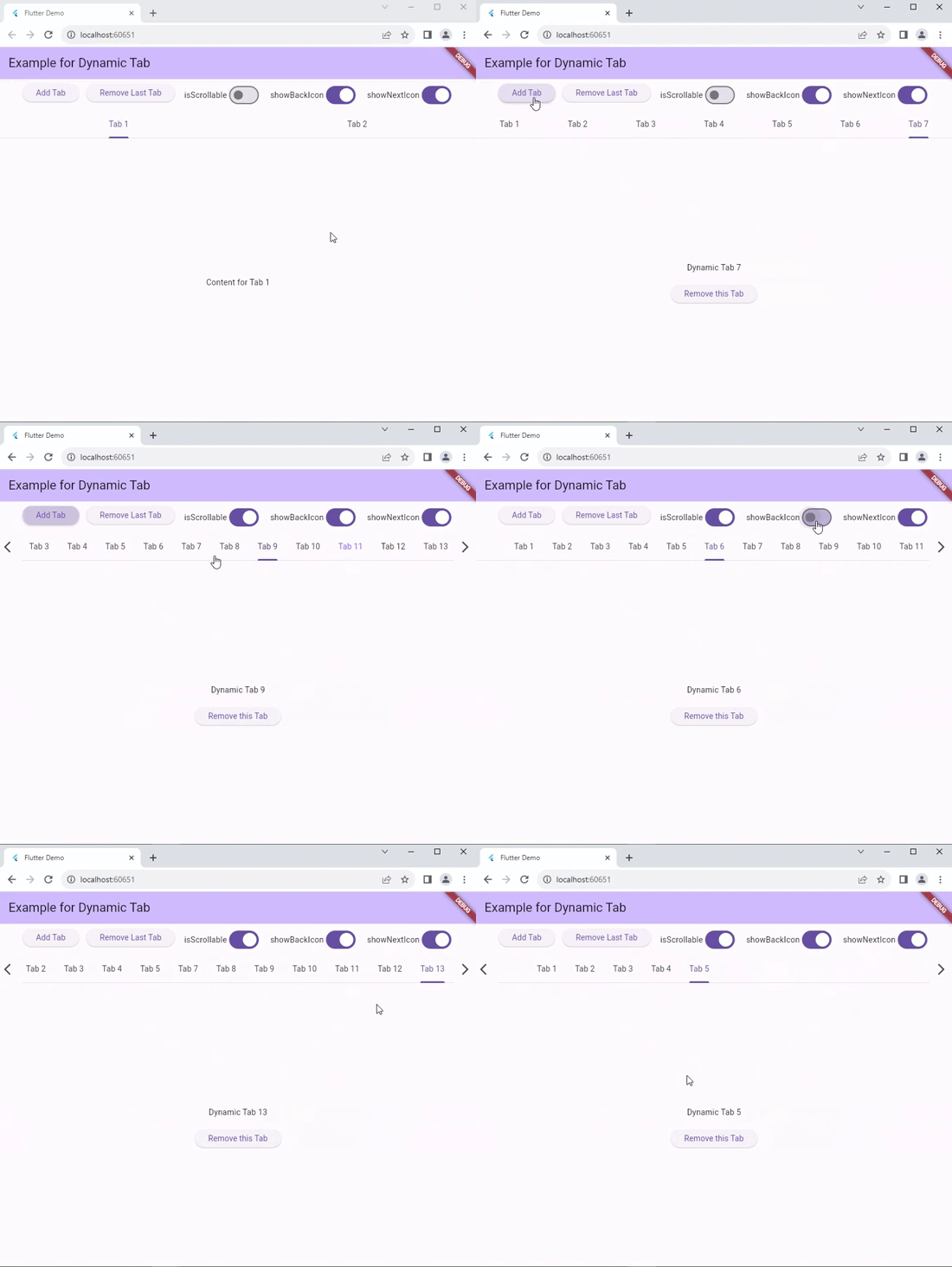
With DynamicTabBarWidget, users can effortlessly manage and navigate through a list of Tabs. The widget is designed to auto-update as Tabs are added or removed, providing a seamless and dynamic user experience.

🚀 Demo: Dynamic Tabbar

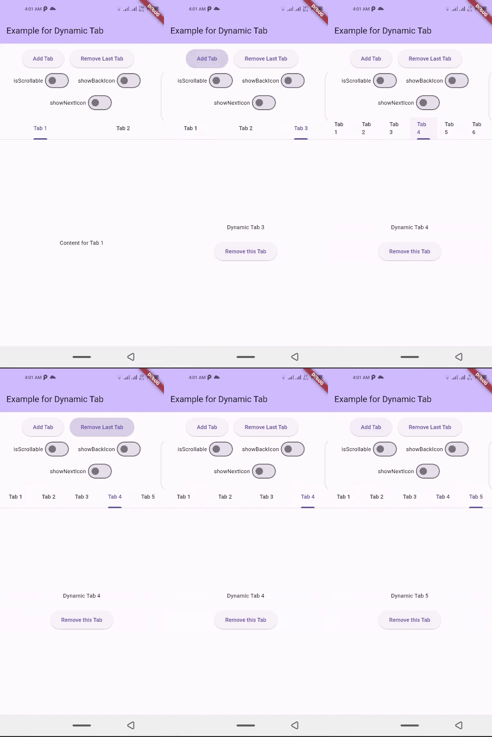
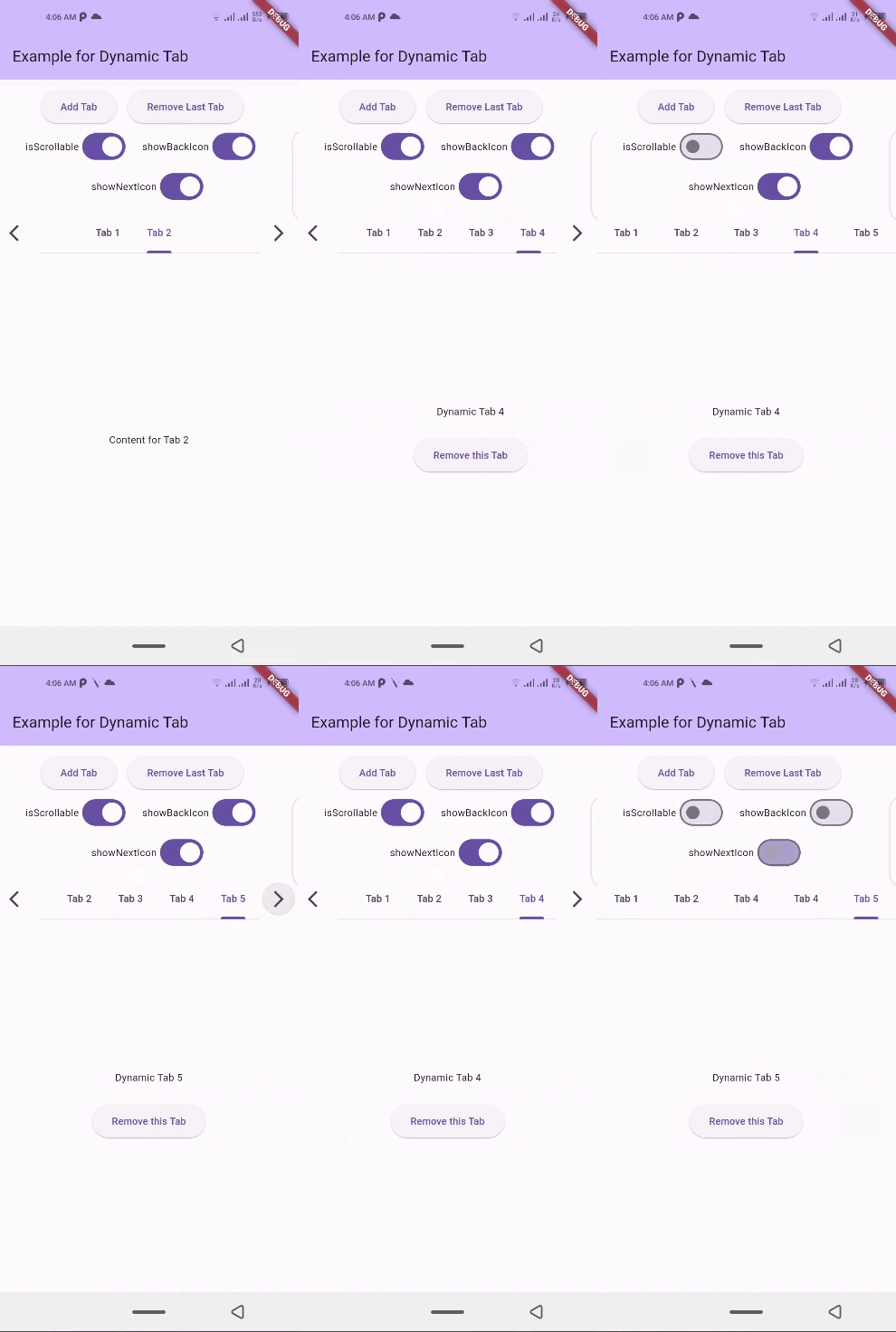
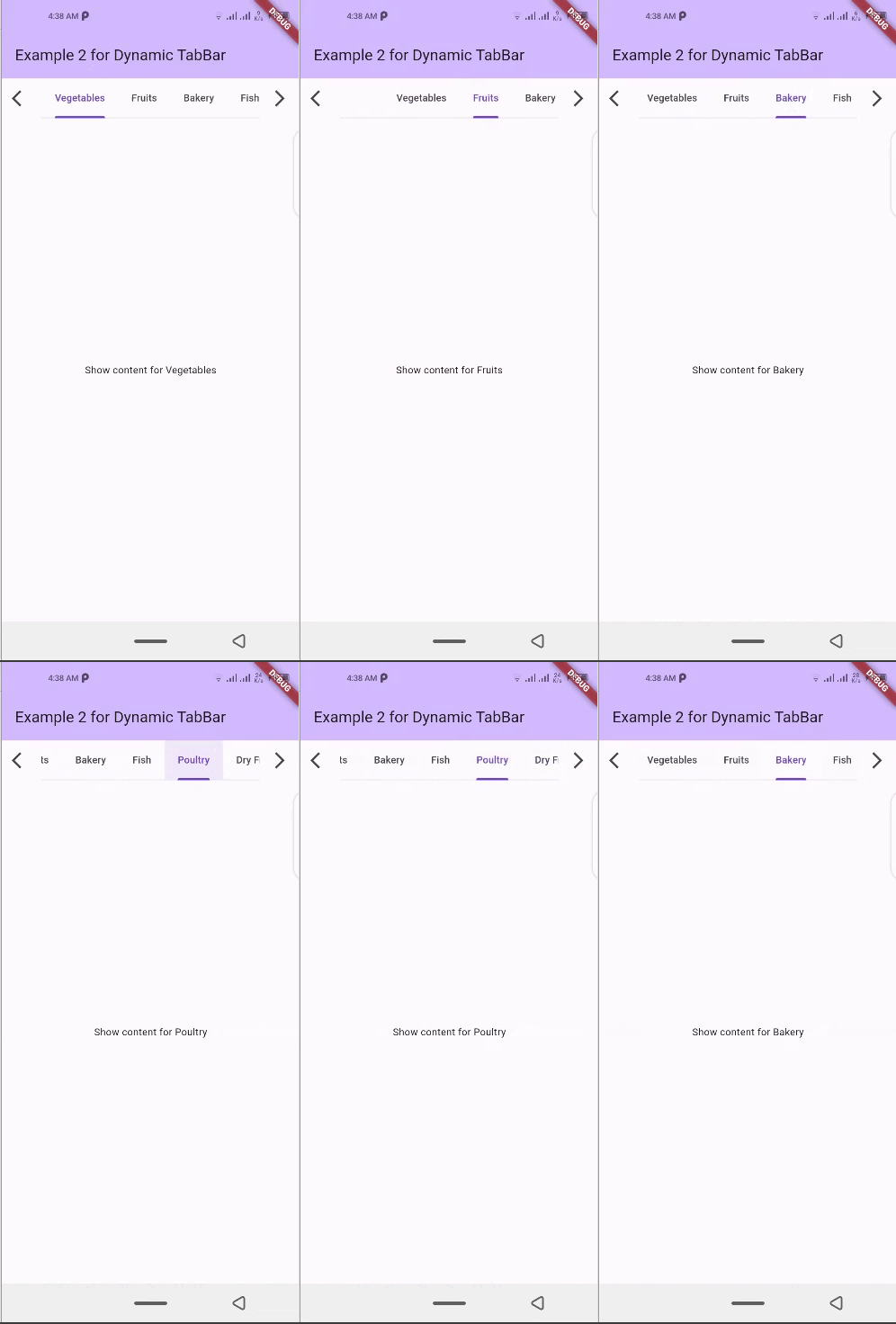
📱 Screenshots

dynamic_tabbar Demo 1 dynamic_tabbar Demo 2 dynamic_tabbar Demo 4 dynamic_tabbar Web Demo

🛠 Installation

  1. Add dependency to pubspec.yaml file:
    Get the latest version from the 'Installing' tab on pub.dev
dependencies:
  dynamic_tabbar: ^latest_version
  1. Import the package
import 'package:dynamic_tabbar/dynamic_tabbar.dart';
  1. Adding DynamicTabBarWidget

With required parameters

 DynamicTabBarWidget(
    dynamicTabs: tabs,
);

With optional parameters

 DynamicTabBarWidget(
    dynamicTabs: tabs,
    isScrollable: isScrollable,
    onTabControllerUpdated: (controller) {},
    onTabChanged: (index) {},
    onAddTabMoveTo: MoveToTab.last,
    onAddTabMoveToIndex : null,
    backIcon: Icon(Icons.arrow_back),
    nextIcon: Icon(Icons.arrow_forward),
    showBackIcon: showBackIcon,
    showNextIcon: showNextIcon,
    leading : leadingWidget,
    trailing : trailingWidget,

    // Default Tab properties can also be updated
    padding: padding,
    indicatorColor: indicatorColor,
    automaticIndicatorColorAdjustment: automaticIndicatorColorAdjustment,
    indicatorWeight: indicatorWeight,
    indicatorPadding: indicatorPadding,
    indicator: indicator,
    indicatorSize: indicatorSize,
    dividerColor: dividerColor,
    dividerHeight: dividerHeight,
    labelColor: labelColor,
    labelStyle: labelStyle,
    labelPadding: labelPadding,
    unselectedLabelColor: unselectedLabelColor,
    unselectedLabelStyle: unselectedLabelStyle,
    dragStartBehavior: dragStartBehavior,
    overlayColor: overlayColor,
    mouseCursor: mouseCursor,
    enableFeedback: enableFeedback,
    onTap: onTap,
    physics: physics,
    splashFactory: splashFactory,
    splashBorderRadius: splashBorderRadius,
    tabAlignment: tabAlignment,

    // Default TabBarView properties can also be updated
    physicsTabBarView: physicsTabBarView,
    dragStartBehaviorTabBarView: physicsTabBarView,
    viewportFractionTabBarView: viewportFractionTabBarView,
    clipBehaviorTabBarView: clipBehaviorTabBarView,
);

🌟 Features

  • Dynamic Tab Management: Users can push or pop items in the List<TabData> tabs array, and the DynamicTabBarWidget will auto-update accordingly.

  • Tab Navigation: Implement the onTabChanged callback to handle tab change events.

  • Customization Options: Customize the appearance and behavior of the DynamicTabBarWidget using parameters like backIcon, nextIcon, showBackIcon, and showNextIcon.

  • Tab Position : Specify the position to which cursor moves to after adding new Tab using the onAddTabMoveTo property.

🧰 Parameters
  • dynamicTabs: List of TabData objects representing the dynamic tabs.

  • isScrollable: Set to true to enable scrollable tabs.

  • onTabChanged: Callback function triggered when a tab is changed.

  • onAddTabMoveTo: Enum value (MoveToTab.idol, MoveToTab.last) specifying where a tab navigator should move when Tab is added.

  • backIcon: Custom icon for the "Back" button, If isScrollable is false, this property is ignored.

  • nextIcon: Custom icon for the "Next" button.

  • showBackIcon: Boolean to show or hide the Back icon button, If isScrollable is false, this property is ignored.

  • showNextIcon: Boolean to show or hide the Next icon button, If isScrollable is false, this property is ignored.

  • leading: Custom leading Widget if needed.

  • trailing: Custom trailing Widget if needed.

  • TabBar default properties...

  • and TabBarView default properties...

📚 How to use

isScrollable
isScrollable: false isScrollable: true
isScrollable.false isScrollable.true
showBackIcon

If isScrollable is false, this property is ignored.

showBackIcon: false showBackIcon: true
isScrollable.true isScrollable.true
showNextIcon

If isScrollable is false, this property is ignored.

showNextIcon: false showNextIcon: true
isScrollable.true isScrollable.true
backIcon

We can use custom Icon for back button, If isScrollable is false, this property is ignored.

backIcon: Icon() backIcon: null
Icon(Icons.keyboard_double_arrow_left) Default back icon will be used
isScrollable.true isScrollable.true
nextIcon

We can use custom Icon for next button, If isScrollable is false, this property is ignored.

nextIcon: Icon() nextIcon: null
Icon(Icons.keyboard_double_arrow_right) Default back icon will be used
nextIcon_custom default_icons

💻 Example

Check out the example app in the example directory for a complete example with additional parameters.

import 'package:flutter/material.dart';
import 'package:dynamic_tabbar/dynamic_tabbar.dart';


class DynamicTabExample extends StatefulWidget {
  const DynamicTabExample({super.key});
  @override
  State<DynamicTabExample> createState() => _DynamicTabExampleState();
}

class _DynamicTabExampleState extends State<DynamicTabExample> {
  bool isScrollable = false;
  bool showNextIcon = true;
  bool showBackIcon = true;

  List<TabData> tabs = [
    TabData(
      index: 1,
      title: const Tab(
        child: Text('Tab 1'),
      ),
      content: const Center(child: Text('Content for Tab 1')),
    ),
    TabData(
      index: 2,
      title: const Tab(
        child: Text('Tab 2'),
      ),
      content: const Center(child: Text('Content for Tab 2')),
    ),
    // Add more tabs as needed
  ];


  @override
  Widget build(BuildContext context) {
    return Scaffold(
      appBar: AppBar(
        title: Text('Example for Dynamic Tab'),
      ),
      body: Column(
        mainAxisSize: MainAxisSize.min,
        children: <Widget>[
          Padding(
            padding: const EdgeInsets.all(8.0),
            child: Wrap(
              direction: Axis.horizontal,
              alignment: WrapAlignment.center,
              children: [
                ElevatedButton(
                  onPressed: addTab,
                  child: const Text('Add Tab'),
                ),
                const SizedBox(width: 12),
                ElevatedButton(
                  onPressed: () => removeTab(tabs.length - 1),
                  child: const Text('Remove Last Tab'),
                ),
                const SizedBox(width: 16),
                Row(
                  mainAxisSize: MainAxisSize.min,
                  children: [
                    const Text('isScrollable'),
                    Switch.adaptive(
                      value: isScrollable,
                      onChanged: (bool val) {
                        setState(() {
                          isScrollable = !isScrollable;
                        });
                      },
                    ),
                  ],
                ),
                const SizedBox(width: 16),
                Row(
                  mainAxisSize: MainAxisSize.min,
                  children: [
                    const Text('showBackIcon'),
                    Switch.adaptive(
                      value: showBackIcon,
                      onChanged: (bool val) {
                        setState(() {
                          showBackIcon = !showBackIcon;
                        });
                      },
                    ),
                  ],
                ),
                const SizedBox(width: 16),
                Row(
                  mainAxisSize: MainAxisSize.min,
                  children: [
                    const Text('showNextIcon'),
                    Switch.adaptive(
                      value: showNextIcon,
                      onChanged: (bool val) {
                        setState(() {
                          showNextIcon = !showNextIcon;
                        });
                      },
                    ),
                  ],
                ),
              ],
            ),
          ),
          Expanded(
            child: DynamicTabBarWidget(
              dynamicTabs: tabs,
              isScrollable: isScrollable,
              onTabControllerUpdated: (controller) {},
              onTabChanged: (index) {},
              onAddTabMoveTo: MoveToTab.last,
              showBackIcon: showBackIcon,
              showNextIcon: showNextIcon,
            ),
          ),
        ],
      ),
    );
  }

  void addTab() {
    setState(() {
      var tabNumber = tabs.length + 1;
      tabs.add(
        TabData(
          index: tabNumber,
          title: Tab(
            child: Text('Tab $tabNumber'),
          ),
          content: Column(
            mainAxisAlignment: MainAxisAlignment.center,
            children: [
              Text('Dynamic Tab $tabNumber'),
              const SizedBox(height: 20),
              ElevatedButton(
                onPressed: () => removeTab(tabNumber - 1),
                child: const Text('Remove this Tab'),
              ),
            ],
          ),
        ),
      );
    });
  }

  void removeTab(int id) {
    setState(() {
      tabs.removeAt(id);
    });
  }
}

📝Contribution

Of course the project is open source, and you can contribute to it repository link

  • If you found a bug, open an issue.

  • If you have a feature request, open an issue.

  • If you want to contribute, submit a pull request.

💳 License

This project is LICENSED under the MIT License. Use it freely, but let's play nice and give credit where it's due!

🎉 Conclusion

I will be happy to answer any questions that you may have on this approach,
If you liked this package, don't forget to show some ❤️ by smashing the ⭐.

श्रेणियाँ

सोर्स रिपॉज़िटरी

इस पैकेज का उपयोग करने वाले प्रोजेक्ट

अभी कोई डेटा उपलब्ध नहीं है।