सार्वजनिक जानकारी से बना चयन मार्गदर्शन। केवल संदर्भ हेतु।
Elegant Notification एक Flutter पैकेज है जो स्क्रीन के शीर्ष पर उच्चतम कस्टमाइज़ेबल, दृश्य आकर्षक नोटिफिकेशन दिखाने के लिए डिज़ाइन किया गया है। इसमें बिल्ट-इन थीम हैं और दिखावट, स्थिति और व्यवहार के लिए पूर्ण नियंत्रण है। बहुप्लेटफॉर्म पर चलने वाले चिकने, आधुनिक टोस्ट-जैसे अलर्ट के माध्यम से उपयोगकर्ता अनुभव को बढ़ाने के लिए आदर्श है। यह पैकेज Android, iOS, Web, macOS, Windows और Linux का समर्थन करता है, जिससे यह क्रॉस-प्लेटफॉर्म एप्लिकेशन के लिए लचीला बनता है। pub add के माध्यम से सरल एकीकरण के साथ, डेवलपर्स बिना विस्तृत कॉन्फ़िगरेशन के त्वरित रूप से शानदार, प्रतिक्रियाशील नोटिफिकेशन लागू कर सकते हैं।
उपयोग
उपयोगकर्ता प्रतिक्रिया संदेश प्रदर्शित कर रहे हैं
सफलता या त्रुटि चेतावनियाँ दिखाएं
एनिमेटेड नोटिफिकेशन्स के साथ ऐप यूएक्स में सुधार करना
रियल-टाइम अपडेट प्रदान करना
कस्टम नोटिफिकेशन लेआउट का अनुकरण
मुख्य विशेषताएँ
निर्मित थीम
पूरी अनुकूलन विकल्प
प्लेटफॉर्म-समर्थन
एनिमेटेड ट्रांजिशन्स
pub के माध्यम से आसान एकीकरण
निर्धारित स्थान
इनके लिए उपयुक्त
मोबाइल और वेब ऐप्स
समृद्ध UI प्रतिक्रिया की आवश्यकता वाले ऐप्स
सौंदर्य पर ध्यान केंद्रित विकासकर्ता
हल्की सूचनाओं की आवश्यकता वाले प्रोजेक्ट
त्वरित कार्यान्वयन की खोज कर रहे टीमें
विचार योग्य बातें
जटिल डिजाइन के लिए अतिरिक्त स्टाइलिंग की आवश्यकता हो सकती है
उच्च आवृत्ति सूचनाओं के साथ प्रदर्शन प्रभाव
सीमित मूल ऑपरेटिंग सिस्टम स्तर की सूचना विशेषताएं
कस्टम एनीमेशन को सभी प्लेटफॉर्म पर ट्यूनिंग की आवश्यकता हो सकती है
फ्लटर के ओवरले प्रणाली पर निर्भर करता है
मूल README
संबंधित सोर्स रिपॉज़िटरी के मूल README का स्नैपशॉट। नवीनतम सामग्री के लिए रिपॉज़िटरी देखें।
Elegant Notification
An elegant notification to display important messages to users
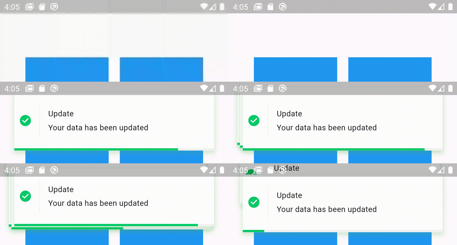
Stacked elegant notification
Features
Display a top notification with animation
A-stacked friendly toast
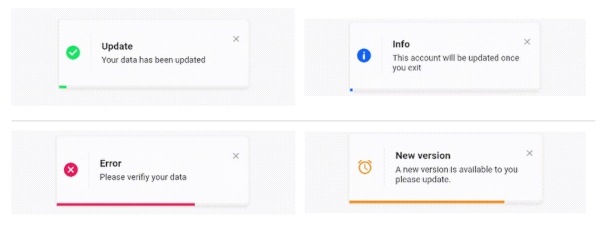
Built-in themes (Success, Error, Info)
Different display animations (fromTop, fromBottom, fromLeft, fromRight)
Support for all display alignment positions
(TopLeft, TopCenter, TopRight, CenterLeft, Center, CenterRight, BottomLeft, BottomCenter, BottomRight)
Support custom theme implementation
on close and on progress finished callback handlers
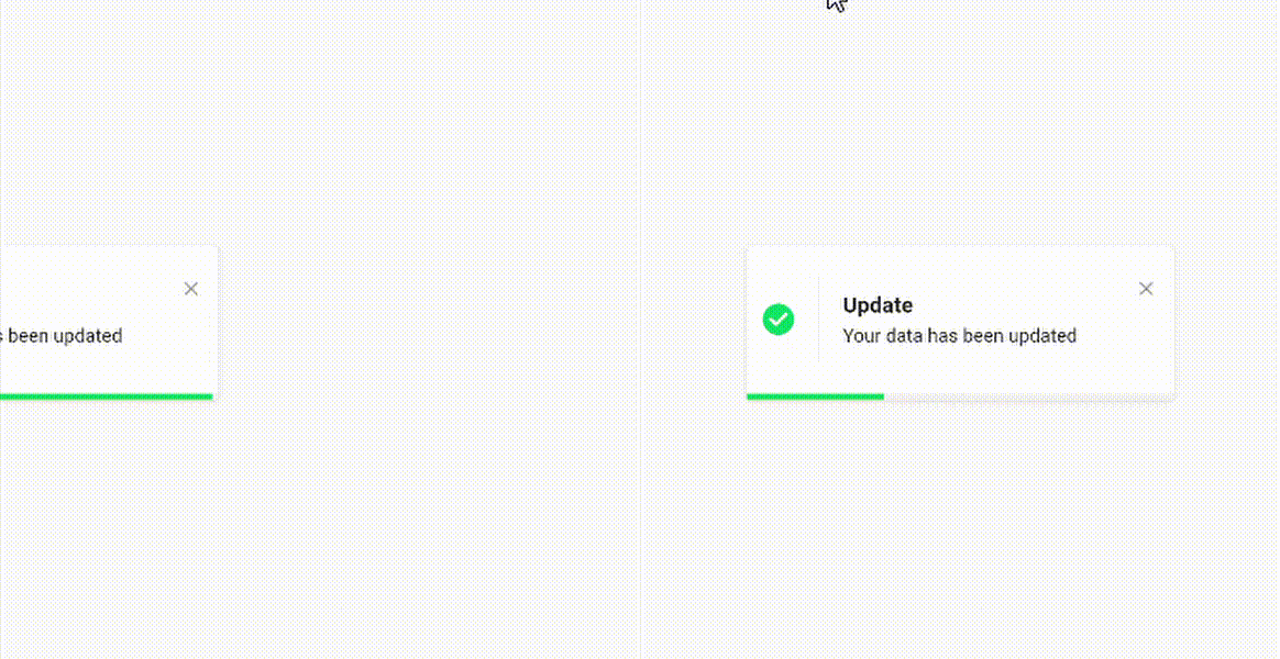
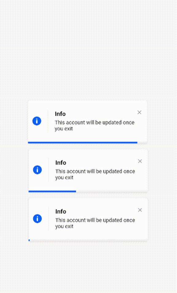
Animated progress bar indicator
Customizable dismiss direction
Background customization
Animation duration customization
Notification position customization
Add clickable action widget to notification
Notification dismiss customization
Customizable notification dimensions (height and width)
Customizable barrier dismission and on dismiss action
Slide back animation
Customizable close button
Customizable border and border radius
RTL support
Getting Started
To use this elegant notification package you need to add the dependency in pubspec.yaml file.
dependencies:elegant_notification:^2.5.1
Parameters
`
/// The toast title widgetfinalWidget? title;
/// The toast description widgetfinalWidget description;
/// A secondary widget displayed under the description widget/// by default `action == null`finalWidget? action;
/// The color of the vertical divider between the icon and content/// By default it's null, which means it will use the default divider color = Color(0xffF3F3F3)/// You can customize the color by providing a specific [Color] valuefinalColor verticalDividerColor;
/// The notification icon, by default it's null./// When it's null and using success, info and error the default icon is displayed/// When using the default constructor and icon is null nothing is renderedWidget? icon;
/// The size of the icon, by default it's 20px.finaldouble iconSize;
/// The type of the animation set on the notification/// possible values/// ```dart/// {/// fromLeft,/// fromRight,/// fromTop,/// fromBottom,/// }/// ```/// default value `fromLeft`finalAnimationType animation;
/// The duration of the animation/// Default value `Duration(milliseconds: 600)`finalDuration animationDuration;
/// The toast animation curve by default the curve is set to [Curves.ease]finalCurve animationCurve;
/// The background color of the notification./// By default it's set to white./// For types constructors (Success, Info, Delete) this parameter is unchangeable.lateColor background;
/// The border radius of the notification widgetfinalBorderRadius? borderRadius;
/// The notification widget borderfinalBoxBorder? border;
/// How much the notification will take time,/// by default the duration is `3000 milliseconds`finalDuration toastDuration;
/// The notification shadowfinalBoxShadow? shadow;
/// Enable or disable the progress indicator rendering./// By default the indicator is displayed,/// for types constructors (Success, Info, Delete) this parameter is unchangeable.latebool showProgressIndicator;
/// The color of the progress./// By default it's blue/// for types constructors (Success, Info, Delete) this parameter is unchangeablelateColor progressIndicatorColor;
/// Progress bar indicator width, by default it's null so it takes the widget's widthfinaldouble? progressBarWidth;
/// Progress bar indicator height, by default it's null so it takes the widget's heightfinaldouble? progressBarHeight;
/// Progress bar indicator padding constraintsfinalEdgeInsetsGeometry? progressBarPadding;
/// The progress indicator background color/// by default it's greyfinalColor progressIndicatorBackground;
/// Display or hide the close button/// by default the close button is displayed/// for types constructors (Success, Info, Delete) this parameter is unchangeable///finalbool displayCloseButton;
/// Close widget rendered as the close function/// by default the close button is displayed, if you don't want it set `closeButton` to null/// for types constructors (Success, Info, Delete) this parameter is unchangeablefinalWidgetFunction(voidFunction() dismissNotification)? closeButton;
/// Function invoked when user press on the close buttonfinalvoidFunction()? onCloseButtonPressed;
/// Function invoked when the notification is closed after the finish of the progress indicatorfinalvoidFunction()? onProgressFinished;
/// Function invoked when the user taps on the notificationfinalvoidFunction()? onNotificationPressed;
/// Function invoked when the user taps on the notificationfinalvoidFunction()? onLongPress;
/// The long press duration of the notification/// By default it's set to `Duration(seconds: 2)`finalDuration longPressDuration;
/// Function invoked when tapping outside the notification/// Or when pressing the back button of the phone/// Or when tapping on the screenfinalFunction()? onDismiss;
/// Define whether the notification will be dismissed automatically or not/// By default `autoDismiss = true`finalbool autoDismiss;
/// The direction of the dismissible widget/// By default it's `DismissDirection.horizontal`finalDismissDirection dismissDirection;
/// The notification position in the screen/// By default the position is set to `Alignment.topRight`finalAlignment position;
/// The width of the notification widgetfinaldouble? width;
/// The height of the notification widgetfinaldouble? height;
/// If the notification is dismissible or not/// by default it's truefinalbool isDismissable;
/// The margin between the notification and the edge of the screenfinaldouble notificationMargin;
/// The options for the stacked modefinalStackedOptions? stackedOptions;
`
Examples
Success theme animation example
ElegantNotification.success(
	title:  Text("Update"),
	description:  Text("Your data has been updated"),
  onDismiss: () {
      print('Message when the notification is dismissed');
  },
  onTap: () {
      print('Message when the notification is pressed');
  },
  closeOnTap: true,
).show(context);
ElegantNotification.info(
	title:  Text("Info"),
	description:  Text("This account will be updated once you exit"),
  icon: Icon(
		Icons.access_alarm,
		color: Colors.orange,
	),
).show(context);
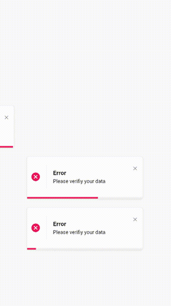
Easiest way to display elegant notification
ElegantNotification(
	description:  Text("Please verifiy your data")
).show(context);
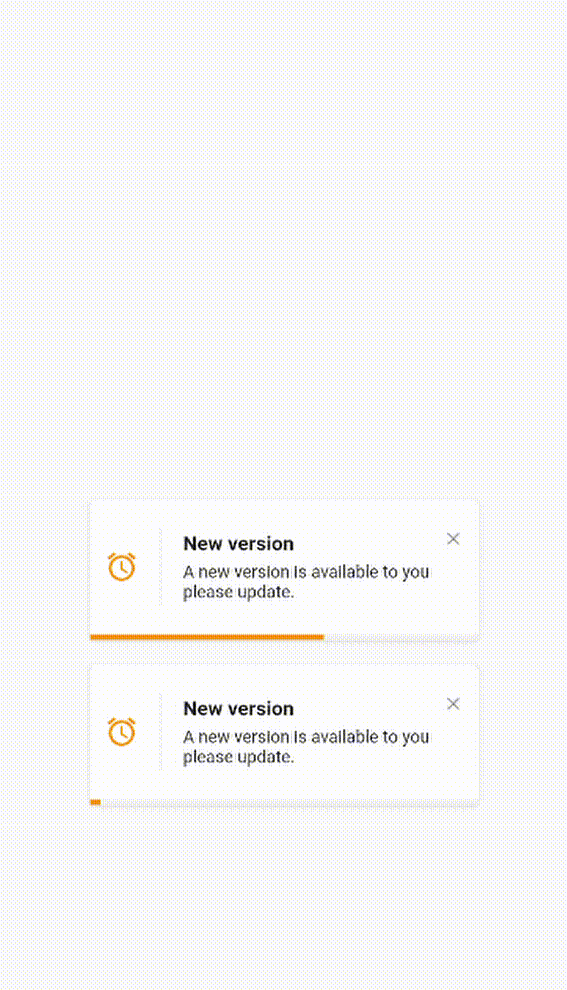
Custom theme animation example
ElegantNotification(
	title:  ("New version"),
	description:  Text("A new version is available to you please update."),
	icon: Icon(
		Icons.access_alarm,
		color: Colors.orange,
	),
	progressIndicatorColor: Colors.orange,
).show(context);
Without title
ElegantNotification.error(
	description:  Text("Please verifiy your data")
).show(context);
With Action
ElegantNotification.info(
	description:  Text('This account will be updated once you exit',),
	action: InkWell(
    onTap: (){
      print('Link pressed')
    }
    child:Text( 'Link',
      style:  TextStyle(
        decoration:  TextDecoration.underline,
        color:  Colors.blue,
      ),
    )
  ),
).show(context);
Using dismissDirection attribute
ElegantNotification.success(
  width: 360,
  position: Alignment.topCenter,
  animation: AnimationType.fromTop,
  title: Text('Update'),
  description: Text('Your data has been updated'),
  onDismiss: () {
    print('Message when the notification is dismissed');
  },
  onNotificationPressed: () {
    print('Message when the notification is pressed');
  },
  isDismissible: true,
  dismissDirection: DismissDirection.up,
).show(context);
Contribution
Of course the project is open source, and you can contribute to it repository link