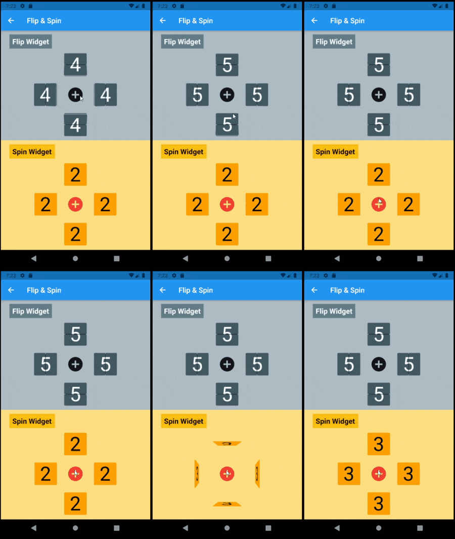
FlipBoards फ्लिपविजेट्स के संयोजन हैं, एक विजेट जो फ्लिपिंग एनीमेशन के साथ कंटेंट बदलाव को एनीमेट करता है। इसमें फ्लिपफ्रेसबोर्ड, फ्लिपमैट्रिक्स, फ्लिपक्लॉक और अन्य शामिल हैं।
सार्वजनिक जानकारी से बना चयन मार्गदर्शन। केवल संदर्भ हेतु।
FlipBoard एक Flutter पैकेज है जो फ्लिपिंग एनीमेशन का उपयोग करके एनीमेटेड कंटेंट ट्रांज़िशन को संभव बनाता है। इसमें FlipFraseBoard, FlipMatrix और FlipClock जैसे पुन: उपयोगी विजेट्स शामिल हैं, जिनमें प्रत्येक को उनके प्रदर्शित कंटेंट में बदलाव को सहज रूप से एनीमेट करने के लिए डिज़ाइन किया गया है। Flutter के एनीमेशन सिस्टम के साथ बनाया गया, यह Android, iOS, Web, macOS, Windows और Linux जैसे कई प्लेटफॉर्म का समर्थन करता है। यह पैकेज ऐसे इंटरएक्टिव यूआई बनाने के लिए आदर्श है जहां राज्य परिवर्तन के दौरान दृश्य प्रतिक्रिया उपयोगकर्ता अनुभव को बढ़ाती है।
उपयोग
एनिमेटेड डिजिटल घड़ी
डायनामिक टेक्स्ट प्रदर्शन
इंटरैक्टिव डेटा ग्रिड्स
उपयोगकर्ता इंटरफेस संक्रमण
गेम स्कोर काउंटर्स
फॉर्म में दृश्य प्रतिक्रिया
मुख्य विशेषताएँ
चिकने फ्लिप एनीमेशन
पूर्व-निर्मित विशेष बोर्ड
क्रॉस-प्लेटफॉर्म संगतता
Flutter के साथ आसान एकीकरण
कस्टमाइज़ किए गए फ्लिप दिशा और गति
प्रतिक्रियाशील सामग्री अद्यतन
इनके लिए उपयुक्त
इंटरैक्टिव डैशबोर्ड बना रहे डेवलपर्स
गतिशील यूआई तत्वों की खोज करने वाले डिज़ाइनर
दृश्य स्थिति संक्रमण की आवश्यकता वाले ऐप्स
शैक्षिक या खेल एप्लिकेशन
रियल-टाइम डेटा विज़ुअलाइज़ेशन टूल्स
विचार योग्य बातें
कम शक्तिशाली उपकरणों पर प्रदर्शन प्रभावित हो सकता है
फ्लिप प्रभावों के आगे सीमित कस्टमाइजेशन
Flutter के विजेट लाइफसाइकल की समझ आवश्यक है
सरल स्थिर सामग्री के लिए उपयुक्त नहीं
न्यूनतम डिज़ाइन में एनीमेशन विचलित कर सकता है
Flutter के एनिमेशन फ्रेमवर्क स्थिरता पर निर्भर करता है
मूल README
संबंधित सोर्स रिपॉज़िटरी के मूल README का स्नैपशॉट। नवीनतम सामग्री के लिए रिपॉज़िटरी देखें।
Flip Board
Widgets to build displays that resemble Mechanical Flip Boards.
The basic component is a stateful FlipWidget that renders flip transitions for a stream of items and an itemBuilder.
The package also includes other widgets that compose this basic component in useful Flip Boards:
The most distinctive characteristic of a FlipWidget is its flip type to define the type of movement that will animate items rendering, either FlipType.middleFlip or FlipType.spinFlip.
This widget renders flip animations in a configured Axis and AxisDirection, animating the transition to each new item received in the given item stream. It is commonly used to display digits and letters but can actually render any widget you build through the given itemBuilder.
It is constructed with four required parameters (besides many optional parameters):
flipType: either FlipType.middleFlip or FlipType.spinFlip
itemStream: stream of items to be flipped as they are received
itemBuilder: builder to create a widget out of each item
flipDirection: AxisDirection to animate new items flip
Please check the class documentation to see all options.
Middle Flip
When we think of Mechanical Flip Boards as we used to see in airports and sport score boards we think on a Vertical MiddleFlip Widget or, most likely, on a composition (row) of them.
Basic FlipWidgets are usually composed in a layout, this package provides a few configurable compositions of FlipWidgets of the same type and orientation, sometimes varying some elements direction within that axis orientation.
All these composed widgets are described below and explored in the examples folder.
Flip Matrix Board
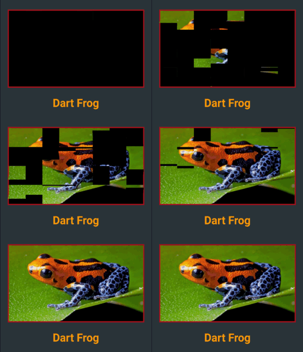
There two classes of FlipMatrixBoard that animate the display in a matrix of FlipWidgets. The first class displays a single child, an image in the given example. The second class animates the display of a stream of items, also given as a stream of images in the example below.
The board is configured with the number of rows and columns, flipping orientation and animation speed and delays parameters.
FlipClock will default to Theme colors but can be further customized through constructor parameters.
The default flip direction is AxisDirection.down and the default animation curve is a custom curve that acceletares like gravity and bounces back at the end (like a mechanical bang).
In the example below some colors are inherited by a parent ThemeData from the amber color scheme. While some colors are defined in the constructor invocation:
This composed widget displays a Frase Board that will animate each letter up to the the given frase letters.
Flip type, initial and end colors, delays and more are all customized at constructor level. Check the class documentation for a run over all configurations.
The provided example looks like this:
This page displays a variety of frase boards, one of them would be constructed like this: