सार्वजनिक जानकारी से बना चयन मार्गदर्शन। केवल संदर्भ हेतु।
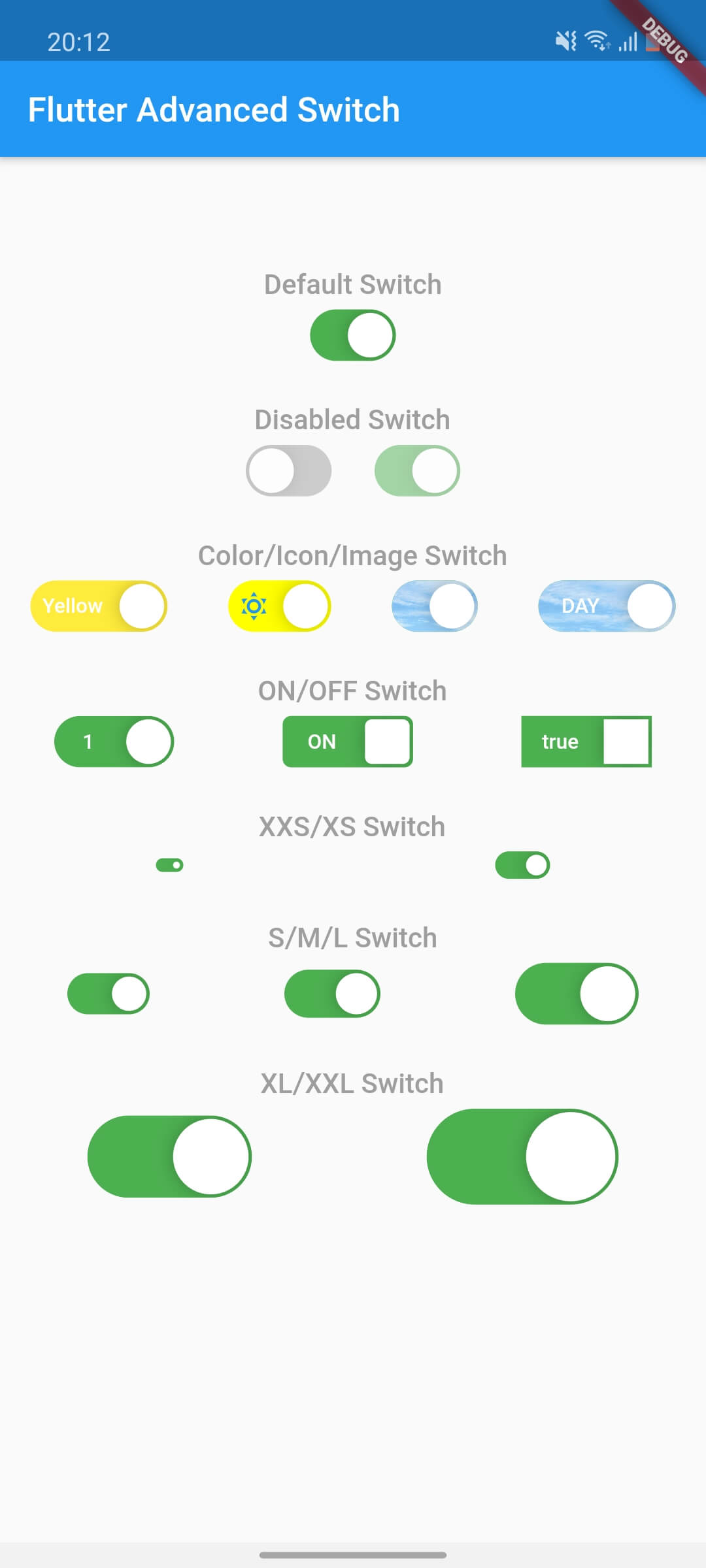
Flutter Advanced Switch एक कस्टमाइज़ेबल स्विच विजेट है जो विस्तृत स्टाइलिंग और व्यवहार कस्टमाइज़ेशन के लिए एक धनी API प्रदान करता है। यह डेवलपर्स को चिकनी एनीमेशन, कस्टम ट्रैक और थम्ब डिज़ाइन, और सभी मुख्य प्लेटफॉर्मों पर प्रतिक्रियाशील इंटरैक्शन के साथ दिखाई देने वाले अलग-अलग स्विच बनाने की अनुमति देता है। आधुनिक UI के लिए अद्वितीय टॉगल कंट्रोल्स की आवश्यकता वाले लिए उपयुक्त है, जो चिकनी, इंटरैक्टिव तत्वों के साथ उपयोगकर्ता अनुभव को बढ़ाता है। यह पैकेज Android, iOS, Web, macOS, Windows और Linux का समर्थन करता है, जिससे क्रॉस-प्लेटफॉर्म सुसंगतता सुनिश्चित होती है।
उपयोग
कस्टम टॉगल इंटरफेस
फॉर्म में अनुभव सुधारित उपयोगकर्ता प्रतिक्रिया
आधुनिक ऐप यूआई डिज़ाइन
इंटरैक्टिव सेटिंग्स पैनल
क्रॉस-प्लेटफ़ॉर्म स्विच घटक
डैशबोर्ड में दृश्य अंतर
मुख्य विशेषताएँ
उच्च रूप से कस्टमाइज़ किए गए ट्रैक और थम्ब
स्मूथ एनीमेशन संक्रमण
क्रॉस-प्लेटफॉर्म संगतता
विस्तृत शैली विकल्प
प्रतिक्रियाशील टच प्रतिक्रिया
कॉन्फ़िगरेबल राज्य और व्यवहार
इनके लिए उपयुक्त
दृश्य लचीलापन की तलाश में UI डिज़ाइनर
आधुनिक ऐप्स बनाने वाले डेवलपर्स
स्थिर टॉगल यूएक्स की आवश्यकता वाली टीमें
जटिल फॉर्म इंटरैक्शन वाले ऐप्स
कई प्लेटफॉर्म के लिए लक्षित प्रोजेक्ट
विचार योग्य बातें
Flutter widget कस्टमाइजेशन की समझ आवश्यक है
बंडल आकार में थोड़ा वृद्धि हो सकती है
स्टाइलिंग की जटिलता विकास गति को प्रभावित कर सकती है
सीमित आंतरिक थीम
कस्टमाइजेशन के बिना सरल ऑन/ऑफ टॉगल के लिए आदर्श नहीं है
मूल README
संबंधित सोर्स रिपॉज़िटरी के मूल README का स्नैपशॉट। नवीनतम सामग्री के लिए रिपॉज़िटरी देखें।
flutter_advanced_switch
A highly customizable switch widget for Flutter with support for custom colors, text, icons, images, and more.
Switch Light
Switch Dark
Features
✅ Fully customizable colors, sizes, and shapes
✅ Support for text labels and icons
✅ Background images for active/inactive states
✅ Custom thumb widget support
✅ Smooth animations
✅ Enabled/disabled states
✅ Controller-based or callback-based state management
✅ Customizable thumb padding
✅ Null-safe
Getting Started
In the pubspec.yaml of your flutter project, add the following dependency:
class_MyWidgetStateextendsState<MyWidget> {
final _controller = ValueNotifier<bool>(false);
@overridevoidinitState() {
super.initState();
_controller.addListener(() {
setState(() {
// React to state changesprint('Switch is now: ${_controller.value}');
});
});
}
@overridevoiddispose() {
_controller.dispose();
super.dispose();
}
@overrideWidgetbuild(BuildContext context) {
returnColumn(
children: [
AdvancedSwitch(controller: _controller),
Text('Switch is ${_controller.value ? "ON" : "OFF"}'),
],
);
}
}
Parameters
Parameter
Description
Type
Default
controller
Controls the state of the switch. If provided, the switch will use this controller to manage its state.
ValueNotifier<bool>?
null
activeColor
The background color when the switch is in the active (on) state.
Color
Color(0xFF4CAF50)
inactiveColor
The background color when the switch is in the inactive (off) state.
Color
Color(0xFF9E9E9E)
activeChild
A widget to display on the left side when the switch is active.
Widget?
null
inactiveChild
A widget to display on the right side when the switch is inactive.
Widget?
null
activeImage
An optional background image to display when the switch is active.
ImageProvider?
null
inactiveImage
An optional background image to display when the switch is inactive.
ImageProvider?
null
decoration
The decoration to apply to the switch container. Typically used to set the border radius and shape.
BoxDecoration
BorderRadius.circular(15)
width
The width of the switch.
double
50.0
height
The height of the switch. The thumb size is automatically calculated based on this value.
double
30.0
enabled
Whether the switch is enabled. If false, the switch will be displayed with reduced opacity and will not respond to user interactions.
bool
true
disabledOpacity
The opacity to apply when the switch is disabled.
double
0.5
thumb
A custom widget to use as the thumb (the sliding part of the switch). If null, a default white rounded rectangle with a shadow will be used.
Widget?
null
thumbPadding
The padding around the thumb. This creates space between the thumb and the switch edges.
double
1.0
initialValue
The initial state of the switch when controller is not provided. This value is only used when controller is null.
bool
false
onChanged
Called when the user toggles the switch. The switch will call this callback with the new value. If null and no controller is provided, the switch will be disabled.