पैकेज, रिपॉज़िटरी और ऐप श्रेणियाँ खोजें

flutter_awesome_buttons कवर
पैकेज विवरणv1.1.0

flutter_awesome_buttons

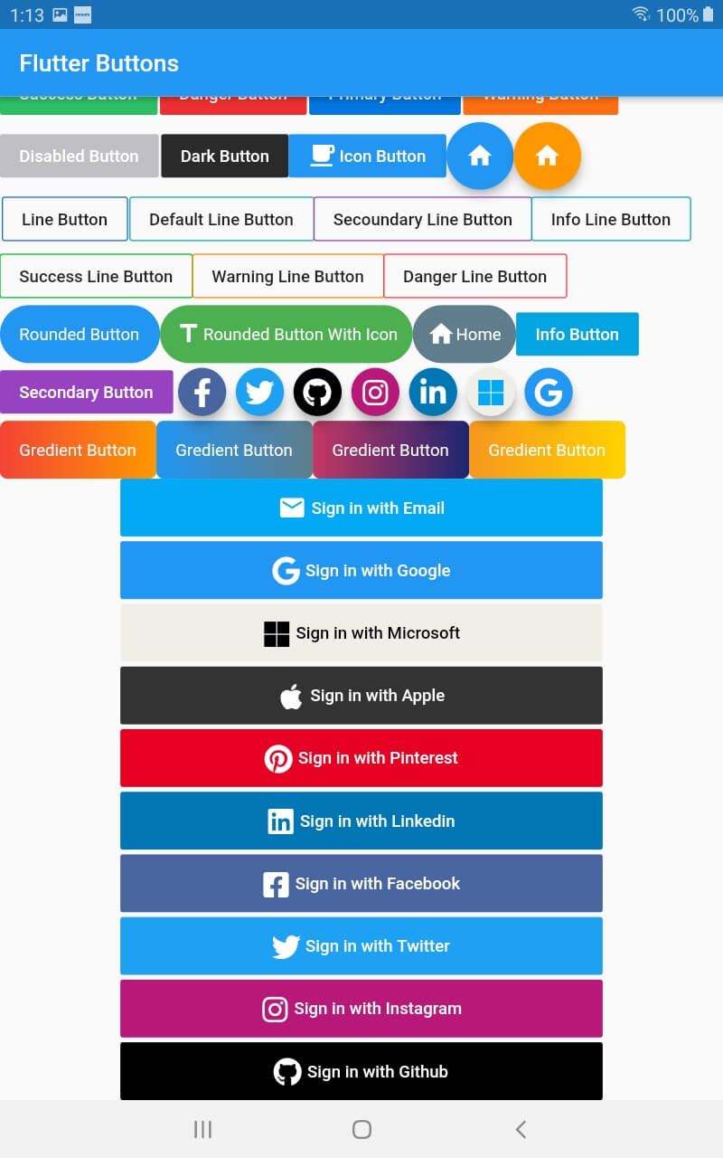
एक नया Flutter पैकेज प्रोजेक्ट।

AndroidiOSWebmacOSWindowsLinux
30-दिन डाउनलोड
126
लाइक
34
Pub अंक
110

पैकेज इंस्टॉल करें

flutter pub add flutter_awesome_buttons

पैकेज अवलोकन

सार्वजनिक जानकारी से बना चयन मार्गदर्शन। केवल संदर्भ हेतु।

एक फ्लटर पैकेज जो मोबाइल, वेब और डेस्कटॉप एप्लिकेशन के लिए दृश्यतः आकर्षक और कस्टमाइज़ करने योग्य बटन का संग्रह प्रदान करता है। आधुनिक, एनीमेटेड बटन स्टाइल के साथ उपयोगकर्ता इंटरफेस को बढ़ावा देने के लिए डिज़ाइन किया गया, यह विभिन्न थीम और इंटरैक्टिव फीडबैक का समर्थन करता है। पैकेज आसानी से एकीकृत किया जा सकता है और विकासकर्ताओं के लिए उपयोगी है जो अपने एप्लिकेशन के UI की भावनात्मक गुणवत्ता को बढ़ाना चाहते हैं बिना विस्तृत कस्टम कोडिंग के। यह सभी प्रमुख प्लेटफॉर्म जैसे Android, iOS, Web, macOS, Windows और Linux पर काम करता है।

उपयोग

  • स्टाइलिश बटन के साथ ऐप यूआई में सुधार
  • इंटरैक्टिव कॉल-टू-एक्शन तत्व बनाना
  • मानक बटन में एनिमेशन जोड़ना
  • दृश्य प्रतिक्रिया के माध्यम से उपयोगकर्ता निरंतरता में सुधार
  • आकर्षक नियंत्रण के साथ प्रतिक्रियाशील फॉर्म बनाएं

मुख्य विशेषताएँ

  • पूर्व-डिज़ाइन किए गए एनीमेटेड बटन टेम्पलेट
  • निर्धारित रंग और आकार
  • क्रॉस-प्लेटफॉर्म संगतता
  • pub.dev के माध्यम से आसान एकीकरण
  • स्पर्श और होवर प्रभाव का समर्थन

इनके लिए उपयुक्त

  • Flutter के साथ काम कर रहे UI/UX डिज़ाइनर
  • आधुनिक अस्थान के साथ ऐप बना रहे डेवलपर्स
  • आकर्षक इंटरैक्टिव तत्वों की आवश्यकता वाले प्रोजेक्ट
  • Flutter UI घटक सीखने वाले शुरुआती लोग
  • बहुप्लेटफॉर्म लक्षित ऐप्स

विचार योग्य बातें

  • बंडल आकार में थोड़ा वृद्धि हो सकती है
  • मूल फ्लटर लेआउट की समझ आवश्यक है
  • प्रदान किए गए थीम्स के बाहर सीमित कस्टमाइजेशन
  • उच्च जटिलता वाले बटन तर्क के लिए उपयुक्त नहीं
  • सुसंगत डिज़ाइन प्रणाली के साथ सबसे अच्छा उपयोग करें

मूल README

संबंधित सोर्स रिपॉज़िटरी के मूल README का स्नैपशॉट। नवीनतम सामग्री के लिए रिपॉज़िटरी देखें।

flutter_buttons

A new Flutter package project for createing Buttons.

Show some :heart: and star the repo to support the project
Screenshot Screenshot

Buttons

import 'package:flutter/material.dart';
import 'package:flutter_buttons/flutter_buttons.dart';

void main() => runApp(MyApp());

class MyApp extends StatelessWidget {
  
  @override
  Widget build(BuildContext context) {
    return MaterialApp(
      debugShowCheckedModeBanner: false,
      home: HomePage()
    );
  }
}

class HomePage extends StatefulWidget {
  @override
  _HomePageState createState() => _HomePageState();
}

class _HomePageState extends State<HomePage> {
  var testing = "123";
  @override
  Widget build(BuildContext context) {
    return Scaffold(
          appBar: AppBar(
            title: Text("Flutter Buttons"),
          ),
          body: ListView(
            children: <Widget>[
              Row(
                children: <Widget>[

Success Button

                 SuccessButton(
                   title: "Success Button",
                   onPressed: () {
                     
                   },
                 ),
                 SizedBox(width: 2.0,),

Danger Button

                 DangerButton(
                   title: "Danger Button",
                   onPressed: () {
                      
                   },
                 ),
                SizedBox(width: 2.0,),

Primary Button

                 PrimaryButton(
                   title: "Primary Button",
                   onPressed: () {                       
                   },
                 ),
                SizedBox(width: 2.0,),

Warning Button

                 WarningButton(
                   title: "Warning Button",
                   onPressed: () {                       
                   },
                 ),
                      
               ],
             ),
             Row(
               children: <Widget>[

Disabled Button

                 DisabledButtton(
                   onPressed: (){},
                   title: "Disabled Button",
                 ),
                  SizedBox(width: 2.0,),

Dark Button

               DarkButtton(
                 onPressed: (){},
                 title: "Dark Button",
               ),

ButttonWithIcon Button (we can use both button and icon in this button)

                ButttonWithIcon(icon: Icons.local_cafe,title: "Icon Button",onPressed: (){},),

Floating Icon Button

                FloatingIconButton(
                  icon: Icons.home,
                  onPressed: (){},
                ),
                FloatingIconButton(
                  icon: Icons.home,
                  onPressed: (){},
                  buttonColor: Colors.orange,
                )
                ],
              )
              ,Row(
                children: <Widget>[
                   SizedBox(width: 2,)

Line Buttons

                  PrimaryLineButton(
                    onPressed: (){},
                    title: "Line Button",
                  ),
                  SizedBox(width: 2,),
                  DefaultLineButton(
                    onPressed: (){},
                    title: "Default Line Button",
                  ),
                  SecoundaryLineButton(
                    onPressed: (){},
                    title: "Secoundary Line Button",
                  ),
                             
                  InfoLineButton(
                    onPressed: (){},
                    title: "Info Line Button",
                  ),
                ],
              ),
              Row(children: <Widget>[
              
                SuccessLineButton(
                    onPressed: (){},
                    title: "Success Line Button",
                  ),    
                
                  WarningLineButton(
                    onPressed: (){},
                    title: "Warning Line Button",
                  ),
                  DangerLineButton(
                    onPressed: (){},
                    title: "Danger Line Button",
                  ),
              ],),
              Row(
                children: <Widget>[

Rounded Button

                  RoundedButton(
                    onPressed: (){},
                    title: "Rounded Button",
                  ),
                   RoundedButtonWithIcon(
                    onPressed: (){},
                    icon:Icons.title,
                    title: "Rounded Button With Icon",
                    buttonColor: Colors.green,
                  ),
                  RoundedButtonWithIcon(
                    onPressed: (){},
                    icon:Icons.home,
                    title: "Home",
                    buttonColor: Colors.blueGrey,
                  )
                ,InfoButtton(
                    onPressed: (){},                   
                    title: "Info Button",                    
                  ),                               
                ],
              ),
              Row(
                children: <Widget>[
                  SecondaryButtton(
                    onPressed: (){},                   
                    title: "Secondary Button",                    
                  ),

Social Buttons

                  FacebookButton(onPressed: (){},),
                   TwitterButton(onPressed: (){},),
                   GithubButton(onPressed: (){},),
                   InstagramButton(onPressed: (){},),
                   LinkedinButton(onPressed: (){},),
                   MicrosoftButton(onPressed: (){},),
                   GoogleButton(onPressed: (){},),
                ],
              )
              ,Column(
                children: <Widget>[
                  Row(
                       children: <Widget>[

Gredient Buttons

                          GredientButton(onPressed: (){},
                  splashColor: Colors.orange,
                  colors: [
                    Colors.red,
                    Colors.orange,                    
                  ], title: "Gredient Button",),
                  GredientButton(onPressed: (){},
                  splashColor: Colors.orange,
                  colors: [
                    Colors.blue,
                    Colors.blueGrey,                    
                  ], title: "Gredient Button",),
                  GredientButton(onPressed: (){},
                  splashColor: Colors.orange,
                  colors: [
                    Color(0xFFC33764),
                    Color(0xFF1D2671),
                  ], title: "Gredient Button",),
                  GredientButton(onPressed: (){},
                  splashColor: Colors.orange,
                  colors: [
                    Color(0xFFF7971E),
                    Color(0xFFFFD200),
                  ], title: "Gredient Button",),
                       ],
                  ),
                  

Sign in Buttons

                  Padding(
                    padding: EdgeInsets.symmetric(horizontal: 100),
                    child: SignInWithEmail(onPressed: (){},),
                  ),
                  SizedBox(height: 4.0,),

                  Padding(
                    padding: EdgeInsets.symmetric(horizontal: 100),
                    child: SignInWithGoogle(onPressed: (){},),
                  ),
                  SizedBox(height: 4.0,),
                  Padding(
                    padding: EdgeInsets.symmetric(horizontal: 100),
                    child: SignInWithMicrosoft(onPressed: (){},),
                  ),
                  SizedBox(height: 4.0,),
                  Padding(
                    padding: EdgeInsets.symmetric(horizontal: 100),
                    child: SignInWithApple(onPressed: (){},),
                  ),
                  SizedBox(height: 4.0,),
                  Padding(
                    padding: EdgeInsets.symmetric(horizontal: 100),
                    child: SignInWithPinterest(onPressed: (){},),
                  ),
                   SizedBox(height: 4.0,),
                  Padding(
                    padding: EdgeInsets.symmetric(horizontal: 100),
                    child: SignInWithLinkedin(onPressed: (){},),
                  ),
                   SizedBox(height: 4.0,),
                  Padding(
                    padding: EdgeInsets.symmetric(horizontal: 100),
                    child: SignInWithFacebook(onPressed: (){},),
                  ),
                   SizedBox(height: 4.0,),
                  Padding(
                    padding: EdgeInsets.symmetric(horizontal: 100),
                    child: SignInWithTwitter(onPressed: (){},),
                  ),
                   SizedBox(height: 4.0,),
                  Padding(
                    padding: EdgeInsets.symmetric(horizontal: 100),
                    child: SignInWithInstagram(onPressed: (){},),
                  ),
                  SizedBox(height: 4.0,),
                  Padding(
                    padding: EdgeInsets.symmetric(horizontal: 100),
                    child: SignInWithGithub(onPressed: (){},),
                  ),


                ],
              )
            ],
          ));
  }
} 

श्रेणियाँ

निर्भरताएँ

निर्भरता सूची 1 आइटम

सोर्स रिपॉज़िटरी

इस पैकेज का उपयोग करने वाले प्रोजेक्ट

अभी कोई डेटा उपलब्ध नहीं है।