सार्वजनिक जानकारी से बना चयन मार्गदर्शन। केवल संदर्भ हेतु।
flutter_screenutil एक Flutter प्लगइन है जो विभिन्न डिवाइस मॉडल के आकार और फ़ॉन्ट साइज के अनुकूलन के माध्यम से रिस्पॉन्सिव UI विकास को सरल बनाने के लिए डिज़ाइन किया गया है। यह किसी भी स्क्रीन आकार, घनत्व या दिशा के आधार पर लेआउट और टाइपोग्राफी को संगत बनाए रखता है। तार्किक पिक्सेल और स्केलिंग कारकों का उपयोग करके, यह किसी भी डिवाइस पर तेज़ और सही अनुपात वाले डिज़ाइन बनाने का एक विश्वसनीय तरीका प्रदान करता है। यह पैकेज Android, iOS, Web, macOS, Windows और Linux सहित सभी प्रमुख प्लेटफॉर्म का समर्थन करता है, जिससे यह सटीक दृश्य सुसंगतता की आवश्यकता वाले क्रॉस-प्लेटफॉर्म एप्लिकेशन के लिए आदर्श बन जाता है।
उपयोग
क्रॉस-प्लेटफॉर्म एप्प डेवलपमेंट
विभिन्न स्क्रीन आकारों पर प्रतिक्रियाशील लेआउट
उपकरणों के बीच सुसंगत फॉन्ट स्केलिंग
विभिन्न डिवाइस घनत्व के अनुकूल डिज़ाइन
विविध हार्डवेयर पर पिक्सेल-परफेक्ट UI बनाना
बहु-उपकरण ऐप में डिज़ाइन अखंडता बनाए रखना
मुख्य विशेषताएँ
स्वचालित स्क्रीन और फॉन्ट स्केलिंग
सभी फ्लटर प्लेटफॉर्म के लिए समर्थन
लचीले विन्यास विकल्प
पिक्सेल-परफेक्ट रिस्पॉन्सिवनेस
iPhone 12 के आधार पर एम्बेडेड डिज़ाइन संदर्भ
मौजूदा Flutter प्रोजेक्ट्स के साथ आसान एकीकरण
इनके लिए उपयुक्त
प्रतिक्रियाशील Flutter एप्लिकेशन बनाने वाले डेवलपर्स
डिज़ाइन सुसंगतता को प्राथमिकता देने वाली टीमें
कई डिवाइस प्रकार के लक्ष्य वाले प्रोजेक्ट
सटीक UI अनुकूलन की आवश्यकता वाले ऐप्स
दृश्य संरक्षण पर ध्यान केंद्रित फ्रंटएंड विकासकर्मी
डिज़ाइनर और डेवलपर्स के साथ सहयोग करते हुए UX डिज़ाइनर
विचार योग्य बातें
प्रारंभिक सेटअप की आवश्यकता होती है डिज़ाइन संदर्भ मानों के साथ
जटिल कस्टम लेआउट के लिए समायोजन की आवश्यकता हो सकती है
वास्तविक उपकरणों पर व्यापक परीक्षण का प्रतिस्थापन नहीं है
एक परिभाषित डिज़ाइन प्रणाली के साथ सबसे अच्छा उपयोग किया जाता है
सीमित स्केलिंग; डायनामिक कंटेंट लेआउट का निपटारा नहीं करता है
अत्यधिक नेस्टेड विजेट्स के उपयोग से संभावित प्रदर्शन प्रभाव
मूल README
संबंधित सोर्स रिपॉज़िटरी के मूल README का स्नैपशॉट। नवीनतम सामग्री के लिए रिपॉज़िटरी देखें।
flutter_screenutil
A flutter plugin for adapting screen and font size.Let your UI display a reasonable layout on different screen sizes!
Note: This plugin is still under development, and some APIs might not be available yet.
List/Set of widget names that should be excluded from rebuilding tree.
enableScaleWH
Function
null
Support enable scale width and height.
enableScaleText
Function
null
Support enable scale text.
Note : You must either provide builder, child or both.
Rebuild list
Starting from version 5.9.0, ScreenUtilInit won't rebuild the whole widget tree, instead it will mark widget needs build only if:
Widget is not a flutter widget (widgets are available in Flutter Docs)
Widget does not start with underscore (_)
Widget does not declare SU mixin
responsiveWidgets does not contains widget name
If you have a widget that uses the library and doesn't meet these options you can either add SU mixin or add widget name in responsiveWidgets list.
Initialize and set the fit size and font size to scale according to the system's "font size" accessibility option
Please set the size of the design draft before use, the width and height of the design draft.
The first way (You should use it once in your app)
voidmain() => runApp(MyApp());
classMyAppextendsStatelessWidget{
constMyApp({Key? key}) : super(key: key);
@overrideWidgetbuild(BuildContext context) {
//Set the fit size (Find your UI design, look at the dimensions of the device screen and fill it in,unit in dp)returnScreenUtilInit(
designSize: constSize(360, 690),
minTextAdapt: true,
splitScreenMode: true,
// Use builder only if you need to use library outside ScreenUtilInit context
builder: (_ , child) {
returnMaterialApp(
debugShowCheckedModeBanner: false,
title: 'First Method',
// You can use the library anywhere in the app even in theme
theme: ThemeData(
primarySwatch: Colors.blue,
textTheme: Typography.englishLike2018.apply(fontSizeFactor: 1.sp),
),
home: child,
);
},
child: constHomePage(title: 'First Method'),
);
}
}
The second way:You need a trick to support font adaptation in the textTheme of app theme
Hybrid development uses the second way
not support this:
MaterialApp(
  ...
  //To support the following, you need to use the first initialization method
  theme: ThemeData(
    textTheme: TextTheme(
      button: TextStyle(fontSize: 45.sp)
    ),
  ),
)
classMyAppextendsStatelessWidget{
@overrideWidgetbuild(BuildContext context) {
returnMaterialApp(
debugShowCheckedModeBanner: false,
title: 'Flutter_ScreenUtil',
theme: ThemeData(
primarySwatch: Colors.blue,
),
home: HomePage(title: 'FlutterScreenUtil Demo'),
);
}
}
classHomePageextendsStatefulWidget{
constHomePage({Key key, this.title}) : super(key: key);
finalString title;
@override_HomePageStatecreateState() => _HomePageState();
}
class_HomePageStateextendsState<HomePage> {
@overrideWidgetbuild(BuildContext context) {
//Set the fit size (fill in the screen size of the device in the design) //If the design is based on the size of the 360*690(dp)ScreenUtil.init(context, designSize: constSize(360, 690));
...
}
}
Note: calling ScreenUtil.init second time, any non-provided parameter will not be replaced with default value. Use ScreenUtil.configure instead
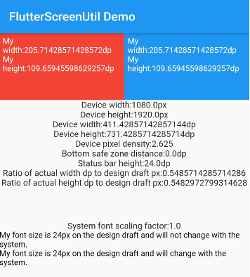
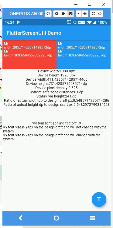
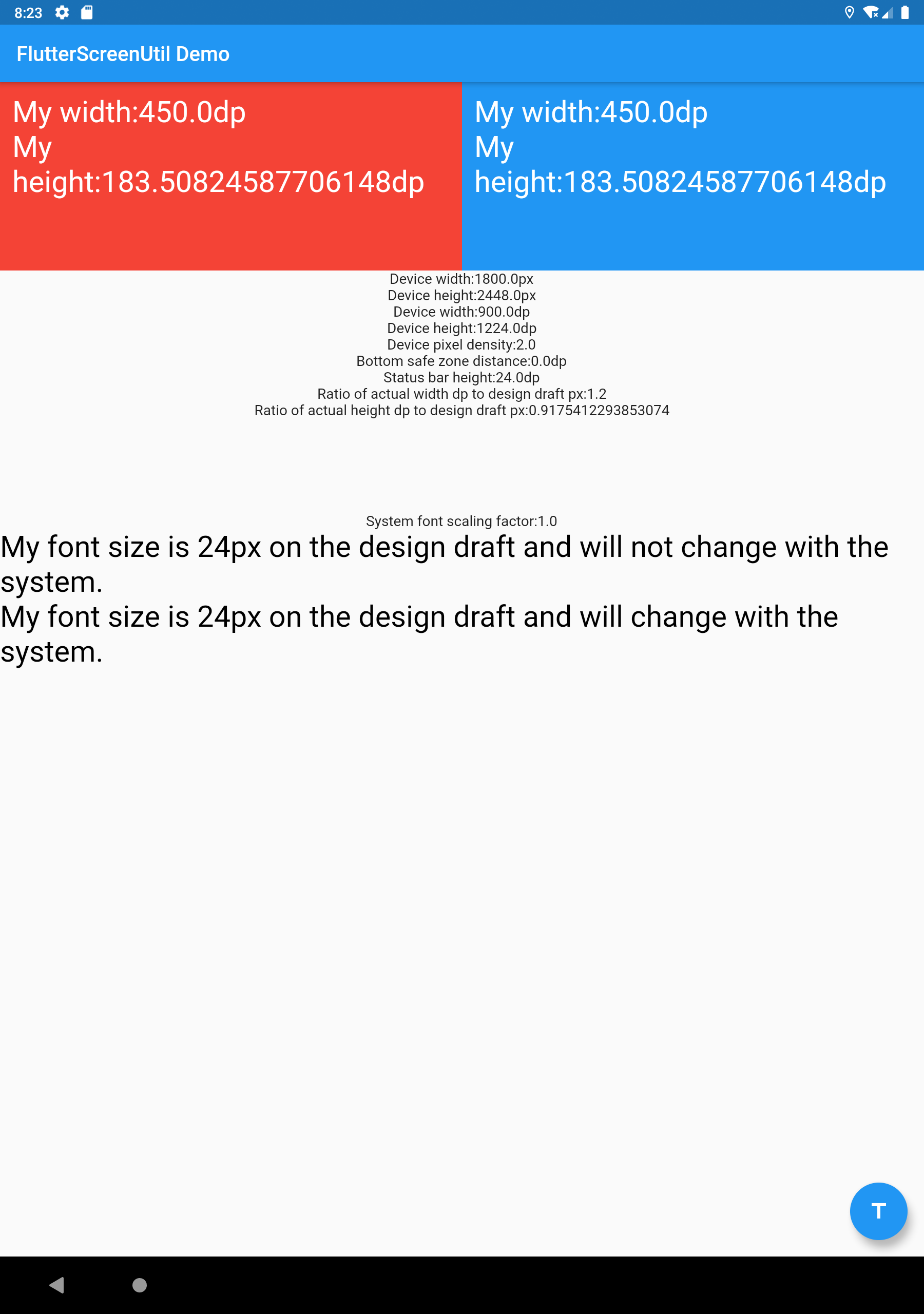
ScreenUtil().setWidth(540) (dart sdk>=2.6 : 540.w) //Adapted to screen widthScreenUtil().setHeight(200) (dart sdk>=2.6 : 200.h) //Adapted to screen height , under normal circumstances, the height still uses x.wScreenUtil().radius(200) (dart sdk>=2.6 : 200.r) //Adapt according to the smaller of width or heightScreenUtil().setSp(24) (dart sdk>=2.6 : 24.sp) //Adapter font12.sm //return min(12,12.sp)ScreenUtil().pixelRatio //Device pixel densityScreenUtil().screenWidth (dart sdk>=2.6 : 1.sw) //Device widthScreenUtil().screenHeight (dart sdk>=2.6 : 1.sh) //Device heightScreenUtil().bottomBarHeight //Bottom safe zone distance, suitable for buttons with full screenScreenUtil().statusBarHeight //Status bar height , Notch will be higherScreenUtil().textScaleFactor //System font scaling factorScreenUtil().scaleWidth //The ratio of actual width to UI designScreenUtil().scaleHeight //The ratio of actual height to UI designScreenUtil().orientation //Screen orientation0.2.sw //0.2 times the screen width0.5.sh //50% of screen height20.setVerticalSpacing // SizedBox(height: 20 * scaleHeight)20.horizontalSpace // SizedBox(height: 20 * scaleWidth)constRPadding.all(8) // Padding.all(8.r) - take advantage of const key wordEdgeInsets.all(10).w //EdgeInsets.all(10.w)REdgeInsets.all(8) // EdgeInsets.all(8.r)EdgeInsets.only(left:8,right:8).r // EdgeInsets.only(left:8.r,right:8.r).BoxConstraints(maxWidth: 100, minHeight: 100).w //BoxConstraints(maxWidth: 100.w, minHeight: 100.w)Radius.circular(16).w //Radius.circular(16.w)BorderRadius.all(Radius.circular(16)).w
Adapt screen size
Pass the dp size of the design draft((The unit is the same as the unit at initialization)):
Adapted to screen width: ScreenUtil().setWidth(540),
Adapted to screen height: ScreenUtil().setHeight(200), In general, the height is best to adapt to the width
If your dart sdk>=2.6, you can use extension functions:
The height can also use setWidth to ensure that it is not deformed(when you want a square)
The setHeight method is mainly to adapt to the height, which is used when you want to control the height of a screen on the UI to be the same as the actual display.
Generally speaking, 50.w!=50.h.
//for example://If you want to display a rectangle:Container(
width: 375.w,
height: 375.h,
),
//If you want to display a square based on width:Container(
width: 300.w,
height: 300.w,
),
//If you want to display a square based on height:Container(
width: 300.h,
height: 300.h,
),
//If you want to display a square based on minimum(height, width):Container(
width: 300.r,
height: 300.r,
),
Adapter font
//Incoming font size(The unit is the same as the unit at initialization)ScreenUtil().setSp(28)
28.sp
//for example:Column(
crossAxisAlignment: CrossAxisAlignment.start,
children: <Widget>[
Text(
'16sp, will not change with the system.',
style: TextStyle(
color: Colors.black,
fontSize: 16.sp,
),
textScaleFactor: 1.0,
),
Text(
'16sp,if data is not set in MediaQuery,my font size will change with the system.',
style: TextStyle(
color: Colors.black,
fontSize: 16.sp,
),
),
],
)
Setting font does not change with system font size
APP global:
MaterialApp(
debugShowCheckedModeBanner: false,
title: 'Flutter_ScreenUtil',
theme: ThemeData(
primarySwatch: Colors.blue,
),
builder: (context, widget) {
returnMediaQuery(
///Setting font does not change with system font size
data: MediaQuery.of(context).copyWith(textScaleFactor: 1.0),
child: widget,
);
},
home: HomePage(title: 'FlutterScreenUtil Demo'),
),
Specified Text:
Text("text", textScaleFactor: 1.0)
Specified Widget:
MediaQuery(
  // If there is no context available you can wrap [MediaQuery] with [Builder]
  data: MediaQuery.of(context).copyWith(textScaleFactor: 1.0),
  child: AnyWidget(),
)
In version 5.9.0, to ensure compatibility and proper functioning of your tests, it is crucial to use the method tester.pumpAndSettle(); when conducting widget tests that depend on animations or a settling time to complete their state.
In the previous version, this step was not strictly necessary. However, to maintain consistency in your tests and avoid unexpected errors, it's strongly recommended incorporating await tester.pumpAndSettle(); in your widget tests if you are using version 5.9.0
Example usage:
testWidgets('Should ensure widgets settle correctly', (WidgetTester tester) async {
await tester.pumpWidget(
constMaterialApp(
home: ScreenUtilInit(
child: MyApp(),
),
),
);
// Insertion of recommended method to prevent failuresawait tester.pumpAndSettle();
// Continue with your assertions and tests
});