पैकेज, रिपॉज़िटरी और ऐप श्रेणियाँ खोजें

flutter_toggle_tab कवर
पैकेज विवरणv2.0.0

flutter_toggle_tab

फ्लटर पर सुंदर और कस्टमाइज़ किए गए टॉगल टैब विजेट बनाने के लिए लाइब्रेरी

AndroidiOSWebmacOSWindowsLinux
30-दिन डाउनलोड
10.7 हज़ार
लाइक
121
Pub अंक
160

पैकेज इंस्टॉल करें

flutter pub add flutter_toggle_tab

पैकेज अवलोकन

सार्वजनिक जानकारी से बना चयन मार्गदर्शन। केवल संदर्भ हेतु।

एक फ्लटर पैकेज जो विकासकर्मियों को दृश्य रूप से आकर्षक और बहुत अनुकूलित करने योग्य टॉगल टैब विजेट बनाने में सक्षम बनाता है। इसमें सभी प्रमुख प्लेटफ़ॉर्मों पर चिकनी एनीमेशन और प्रतिक्रियाशील व्यवहार के साथ विभाजित नियंत्रण के लिए लचीला, आसान उपयोग की सुविधा है। साफ और आधुनिक UI में कंटेंट फ़िल्टर करने, दृश्यों के बीच स्विच करने या विकल्प चुनने के लिए आदर्श है। लाइब्रेरी कस्टम स्टाइलिंग, एलाइनमेंट और डायनामिक कंटेंट रेंडरिंग का समर्थन करती है, जिससे यह सरल और जटिल उपयोग के लिए उपयुक्त है।

उपयोग

  • श्रेणी द्वारा डेटा फ़िल्टर करना
  • ऐप व्यू में परिवर्तन करें
  • फॉर्म इनपुट सिलेक्टर्स बनाना
  • थीम टॉगल का अनुकरण करना
  • नेविगेशन टैब्स बिल्ड करें
  • सेगमेंटेड कंट्रोल को कस्टमाइज़ करें

मुख्य विशेषताएँ

  • उच्च रूप से कस्टमाइज़ किया गया दिखावट
  • स्मूथ एनिमेशन संक्रमण
  • क्रॉस-प्लेटफ़ॉर्म सुविधा
  • गतिशील सामग्री का समर्थन
  • मौजूदा विजेट्स के साथ आसान एकीकरण
  • प्रतिक्रियाशील डिज़ाइन संभालना

इनके लिए उपयुक्त

  • आधुनिक यूआई बनाने वाले डेवलपर्स
  • सेगमेंटेड चयन की आवश्यकता वाले ऐप
  • दृश्य चमक की तलाश में डिज़ाइनर
  • बहुपлатफॉर्म प्रोजेक्ट्स
  • पुनर्उपयोगी घटकों पर ध्यान केंद्रित टीमें

विचार योग्य बातें

  • Flutter लेआउट सिद्धांतों के बारे में समझना आवश्यक है
  • जटिल थीम के लिए अतिरिक्त स्टाइलिंग की आवश्यकता हो सकती है
  • बड़ी संख्या में टैब के साथ प्रदर्शन प्रभाव
  • सीमित निर्मित एक्सेसिबिलिटी सुविधाएं
  • अत्यधिक उच्च आवृत्ति के अपडेट के लिए अनअनुकूलित

मूल README

संबंधित सोर्स रिपॉज़िटरी के मूल README का स्नैपशॉट। नवीनतम सामग्री के लिए रिपॉज़िटरी देखें।

Flutter Tab Toggle

pub package

A Beautiful and Simple Toggle Tab widget. It can be fully customized with desired icons, width, colors, text, corner radius, etc. It also maintains selection state.

Getting Started

In the pubspec.yaml of your flutter project, add the following dependency:

dependencies:
  flutter_toggle_tab: "^latestVersion"

Import it:

import 'package:flutter_toggle_tab/flutter_toggle_tab.dart';

Usage Examples

Basic tab/toggle switch

image


// Here default theme colors are used for activeBgColor, activeFgColor, inactiveBgColor and inactiveFgColor
FlutterToggleTab
(
  width: 90, // width in percent
  borderRadius: 30,
  height: 50,
  selectedIndex: _tabTextIndexSelected,
  selectedBackgroundColors: [Colors.blue, Colors.blueAccent],
  selectedTextStyle: TextStyle(
  color: Colors.white,
  fontSize: 18,
  fontWeight: FontWeight.w700),
  unSelectedTextStyle: TextStyle(
  color: Colors.black87,
  fontSize: 14,
  fontWeight: FontWeight.w500),
  dataTabs: _listTextTabToggle,
  selectedLabelIndex: (index) {
    setState(() {
        _tabTextIndexSelected = index;
    });
  },
  isScroll:false,
)

Basic tab/toggle switch with Custom Counter Widget

image


// Here default theme colors are used for activeBgColor, activeFgColor, inactiveBgColor and inactiveFgColor
FlutterToggleTab
(
  width: 90, // width in percent
  borderRadius: 30,
  height: 50,
  selectedIndex: _tabTextIndexSelected,
  selectedBackgroundColors: [Colors.blue, Colors.blueAccent],
  selectedTextStyle: TextStyle(
  color: Colors.white,
  fontSize: 18,
  fontWeight: FontWeight.w700),
  unSelectedTextStyle: TextStyle(
  color: Colors.black87,
  fontSize: 14,
  fontWeight: FontWeight.w500),
  dataTabs: _listTextTabToggleCounter,
  selectedLabelIndex: (index) {
    setState(() {
        _tabTextIndexSelected = index;
    });
  },
  isScroll:false,
)

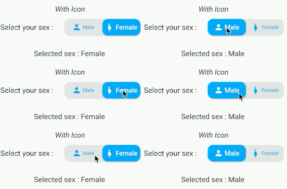
Basic tab/toggle switch with Icon

image

FlutterToggleTab
(
  width: 50,
  borderRadius: 15,
  selectedTextStyle: TextStyle(
  color: Colors.white,
  fontSize: 18,
  fontWeight: FontWeight.w600),
  unSelectedTextStyle: TextStyle(
  color: Colors.blue,
  fontSize: 14,
  fontWeight: FontWeight.w400),
  dataTabs: _listGenderText,
  selectedIndex: _tabTextIconIndexSelected,
  selectedLabelIndex: (index) {
    setState(() {
      _tabTextIconIndexSelected = index;
    });
  },
)

Basic tab/toggle switch with Icon Only and add margin on selected item

image

FlutterToggleTab
(
  width: 40,
  borderRadius: 15,
  selectedIndex: _tabIconIndexSelected,
  selectedTextStyle: TextStyle(
  color: Colors.white,
  fontSize: 18,
  fontWeight: FontWeight.w600),
  unSelectedTextStyle: TextStyle(
  color: Colors.grey,
  fontSize: 14,
  fontWeight: FontWeight.w400),
  dataTabs: _listIconTabToggle,
  selectedLabelIndex: (index) {
    setState(() {
      _tabIconIndexSelected = index;
    });
  },
  marginSelected: EdgeInsets.symmetric(horizontal: 4,vertical:4),
)

Update selected tab Programmatically
FlutterToggleTab
(
  width: 90,
  borderRadius: 15,
  selectedIndex: _tabSelectedIndexSelected,
  selectedTextStyle: TextStyle(
  color: Colors.white,
  fontSize: 18,
  fontWeight: FontWeight.w600),
  unSelectedTextStyle: TextStyle(
  color: Colors.grey,
  fontSize: 14,
  fontWeight: FontWeight.w400),
  dataTabs: _listTextSelectedToggle,
  selectedLabelIndex: (index) {
    setState(() {
      _tabSelectedIndexSelected = index;
    });
  },
)

Available Parameters

Param isRequired
List<DataTab> dataTabs Yes
Function(int) selectedLabelIndex Yes
TextStyle selectedTextStyle default:Theme.of(context).textTheme.bodyMedium, No
TextStyle unSelectedTextStyle default:Theme.of(context).textTheme.bodyMedium, No
int selectedIndex (listener for index selected) see on example Yes
double width (in Percent of width Screen) default: 100 No
double height (double) default: 45 No
double iconSize No
double borderRadius (double) default 30 No
List<Color> selectedBackgroundColors default : [ Theme.of(context).primaryColor] No
List<Color> unSelectedBackgroundColors default [ Color(0xffe0e0e0)] No
Alignment begin default : Alignment.topCenter No
Alignment end default : Alignment.bottomCenter No
bool isScroll default : true No
EdgeInsets marginSelected default : EdgeInsets.zero No
bool isShadowEnable default : true No
bool isInnerShadowEnable default : true No

LinkedIn

Buy me coffee if you love my works ☕️

buymeacoffe      ko-fi      paypal


श्रेणियाँ

निर्भरताएँ

निर्भरता सूची 1 आइटम

सोर्स रिपॉज़िटरी

इस पैकेज का उपयोग करने वाले प्रोजेक्ट

अभी कोई डेटा उपलब्ध नहीं है।