सार्वजनिक जानकारी से बना चयन मार्गदर्शन। केवल संदर्भ हेतु।
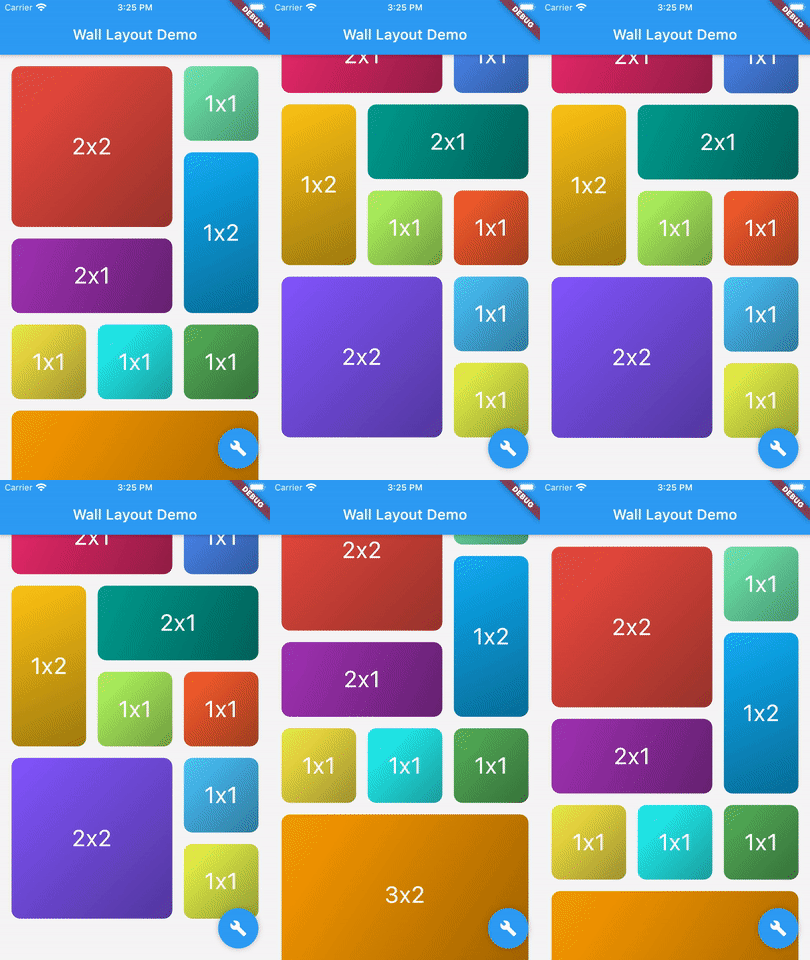
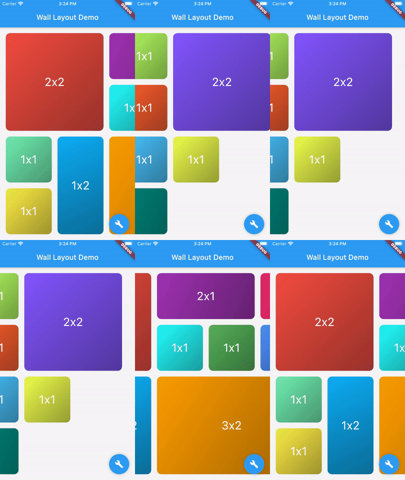
एक फ्लटर पैकेज जो विभिन्न आकार के ब्लॉक (विजुअल तत्व) को ऊर्ध्वाधर या क्षैतिज सूची में व्यवस्थित करने के लिए एक लचीला लेआउट विजेट प्रदान करता है, जो एक दीवार की तरह दिखता है। इसमें डायनामिक साइज़िंग और स्थिति निर्धारण का समर्थन होता है, जिससे असमान आकार के तत्वों के साथ दृश्य रूप से आकर्षक ग्रिड बनाने के लिए उपयुक्त होता है। लेआउट विभिन्न स्क्रीन आकारों और ओरिएंटेशन के लिए अनुकूलित होता है, जिससे प्लेटफॉर्म के बीच रिस्पॉन्सिव डिज़ाइन सुनिश्चित होता है। यह फोटो गैलरी, डैशबोर्ड और असमान लेआउट की आवश्यकता वाले रचनात्मक यूआई के लिए विशेष रूप से उपयोगी है।
उपयोग
मिश्रित आस्पेक्ट अनुपात वाली फोटो गैलरी
विभिन्न आकार के डैशबोर्ड विजेट्स
अनियमित आकृतियों के साथ क्रिएटिव UI लेआउट
बहुप्लेटफॉर्म पर अनुकूल ग्रिड प्रदर्शित करता है
इंटरैक्टिव दीवार-जैसे इंटरफेस
मुख्य विशेषताएँ
विभिन्न आकार और आकृतियों के ईंटों का समर्थन करता है
ऊर्ध्वाधर और क्षैतिज दिशा विकल्प
प्रतिक्रियाशील और अनुकूलित लेआउट
क्रॉस-प्लेटफ़ॉर्म संगतता
मौजूदा Flutter विजेट्स के साथ आसान एकीकरण
इनके लिए उपयुक्त
दृश्य विविधता की तलाश करने वाले डिज़ाइनर
गतिशील ग्रिड बना रहे विकासकर्ता
असमान लेआउट की आवश्यकता वाले ऐप्स
कई प्लेटफॉर्म के लिए लक्षित प्रोजेक्ट्स
जटिल व्यवस्था वाले UI-भारी एप्लिकेशन
विचार योग्य बातें
बड़ी संख्या में ईंटों के साथ प्रदर्शन में भिन्नता हो सकती है
ब्रिक आकार सीमाओं के सावधानीपूर्वक निपटान की आवश्यकता होती है
सीमित निर्मित एनीमेशन
स्थिर या कम गतिशील सामग्री के लिए सबसे उपयुक्त
जटिल इंटरैक्शन के लिए कस्टम लॉजिक की आवश्यकता हो सकती है
मूल README
संबंधित सोर्स रिपॉज़िटरी के मूल README का स्नैपशॉट। नवीनतम सामग्री के लिए रिपॉज़िटरी देखें।
flutter_wall_layout - Layout child having different shape into a vertical or horizontal list
This library provides a unique widget, WallLayout, rendering into a list children having different shapes.
There is two main classes: WallLayout and Stone.
A wall is composed by a set of stones, arranged in a certain way.
A stone is a component defining its shape by a width and a height.
Wall Layout Widget
This component has been inspired by the ListView widget, in which you can choose scroll direction and the way.
Added to that, you can also define how many rows or column have the wall, if you want to create a responsive design.
List of Stone widgets, representing wall layout's children.
-
layersCount
Define the number of layers the wall have. Must be higher or equal to 2. When direction is Axis.vertical, it defines the number of columns the wall has. When direction is Axis.horizontal, it defines the number of rows.
-
wallBuilder
Define how the wall is built: where each stone is positioned within the wall.The wall builder is allowed to use less stones than provided, and can create new stones (see ./example for more details).
WallBuilder.standard()
stonePadding
Padding between stones.
16.0
primaryAxisStoneSize
Optional. If specified, indicates the exact size of each stone in the direction of the primary scroll axis. If not specified, each stone will be exactly square.
-
scrollController
Same as [ListView.scrollController]: "control the position to which this scroll view is scrolled".
-
physics
Same as [ListView.physics]: "How the scroll view should respond to user input".
-
restorationId
Same as [ListView.restorationId]: used "to save and restore the scroll offset of the scrollable".
-
dragStartBehavior
Same as [ListView.dragStartBehavior]: "Determines the way that drag start behavior is handled".
DragStartBehavior.start
clipBehavior
Same as [ListView.clipBehavior]: "ways to clip a widget's content".
Clip.hardEdge
primary
Same as [ListView.primary]: "Whether this is the primary scroll view associated with the parent [PrimaryScrollController]"
false
scrollDirection
Same as [ListView.scrollDirection]: "axis along which the scroll view scrolls".
Axis.vertical
reverse
Same as [ListView.reverse property]: "whether the scroll view scrolls in the reading direction".
false
Stone Widget
A Stone Widget is a widget proxy defining stone's size (width and height).
It's rendered object is optimized thanks to it's id property.