सार्वजनिक जानकारी से बना चयन मार्गदर्शन। केवल संदर्भ हेतु।
Flutter Xlider एक कस्टमाइज़ किया गया मैटेरियल डिज़ाइन स्लाइडर और रेंज स्लाइडर है, जो Flutter के लिए है, जो क्षैतिज और ऊर्ध्वाधर दिशाओं को समर्थन देता है और पूरी तरह से RTL (दाएं से बाएं) लेआउट सुविधा के साथ काम करता है। यह शैली, व्यवहार और इंटरैक्शन के लिए विस्तृत विकल्प प्रदान करता है, जिससे यह उच्च सटीकता वाले इनपुट नियंत्रण की आवश्यकता वाले अंतरफलक बनाने के लिए आदर्श है। यह पैकेज सभी प्रमुख प्लेटफॉर्मों में काम करता है, जैसे Android, iOS, Web, macOS, Windows और Linux।
उपयोग
सटीक मान चयन की आवश्यकता वाले फॉर्म इनपुट
एप्स में इंटरैक्टिव सेटिंग स्लाइडर
रेंज-आधारित फ़िल्टर या चयन
RTL भाषा समर्थन के साथ बहुभाषी एप्लिकेशन
समृद्ध दृश्य प्रतिक्रिया के साथ कस्टमाइज़ेबल UI घटक
मुख्य विशेषताएँ
क्षैतिज और लंबवत स्लाइडर मोड
RTL लेआउट समर्थन
रेंज स्लाइडर कार्यक्षमता
विस्तृत कस्टमाइजेशन विकल्प
चिकनी एनीमेशन और प्रतिक्रियाशील डिज़ाइन
क्रॉस-प्लेटफॉर्म संगतता
इनके लिए उपयुक्त
फॉर्म-भारी एप्लिकेशन बना रहे डेवलपर्स
लचीले स्लाइडर घटकों की आवश्यकता वाले डिजाइनर
अंतरराष्ट्रीय दर्शकों का लक्ष्य बनाने वाले ऐप्स
उच्च कस्टमाइजेबिलिटी वाले प्रोजेक्ट्स
सामग्री डिज़ाइन सिद्धांतों का उपयोग करने वाली टीमें
विचार योग्य बातें
जटिल UI के लिए अतिरिक्त स्टाइलिंग की आवश्यकता हो सकती है
स्क्रीन पर बहुत स्लाइडर के साथ प्रदर्शन प्रभाव
उन्नत कस्टमाइजेशन के लिए सीखने का वक्र
सीमित निर्मित एक्सेसिबिलिटी सुविधाएं
सामंजस्यता के लिए Flutter के रेंडरिंग इंजन पर निर्भर
मूल README
संबंधित सोर्स रिपॉज़िटरी के मूल README का स्नैपशॉट। नवीनतम सामग्री के लिए रिपॉज़िटरी देखें।
flutter_xlider
Now supports null safety.
(Flutter Slider) A material design slider and range slider, horizontal and vertical, with rtl support and lots of options and customizations for flutter
!! Since version 3.4.0-dev.3, step type is no longer double, its FlutterSliderStep !!
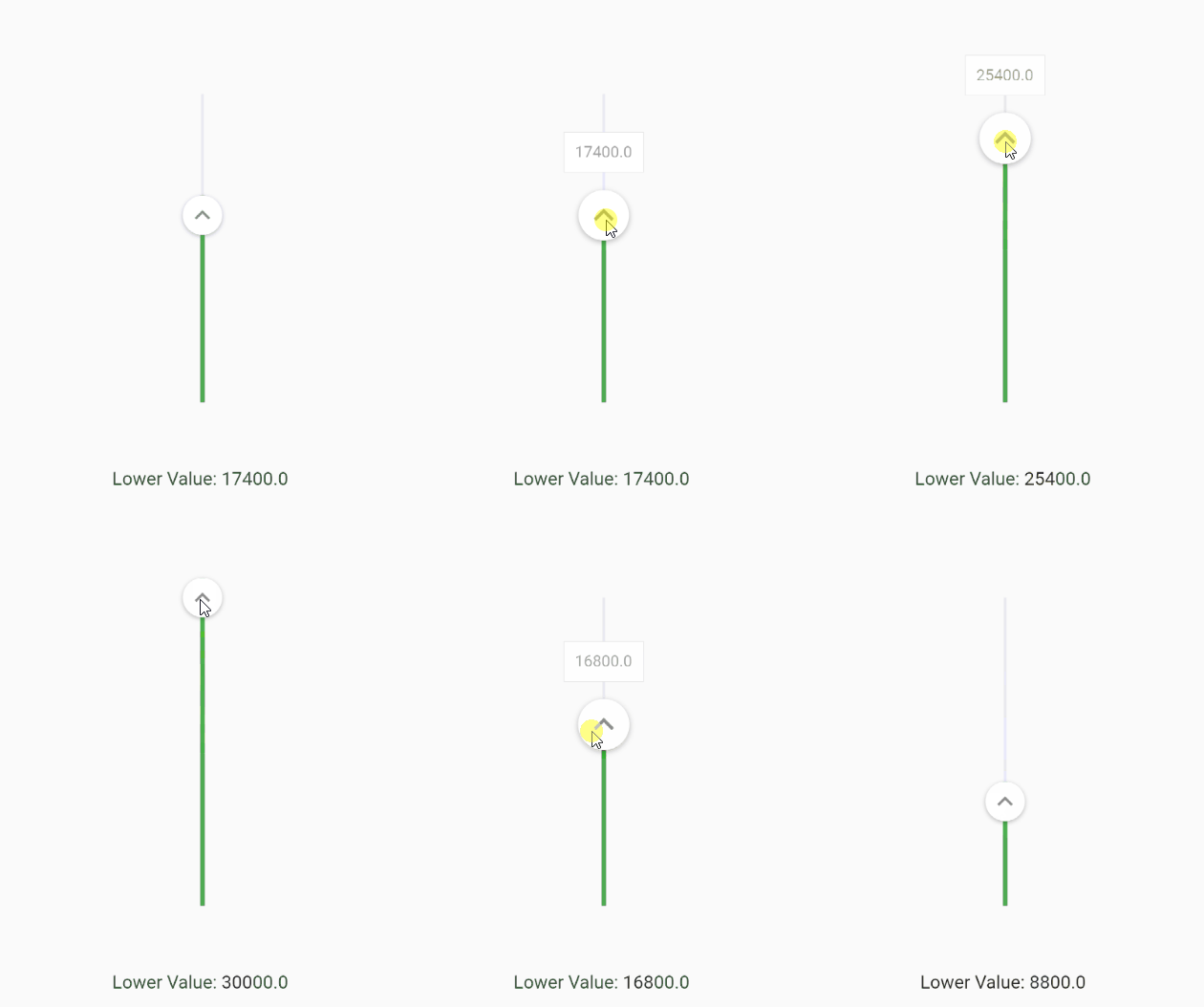
You can change the axis of your slider by setting axis to Axis.vertical. Default is horizontal
FlutterSlider(
  ...
  axis: Axis.vertical,
  ...
)
Handlers
You can customize handlers using handler and rightHandler properties.
Both handler and rightHandler accept FlutterSliderHandler class which has following properties:
child: is a widget
disabled: to disable the handler
decoration, foregroundDecoration and transform are come from Container() widget
You can control the scale animation type of your handlers, it's duration and it's scale size using handlerAnimation handlerAnimation accepts a FlutterSliderHandlerAnimation class which has 4 properties as following
If you want to have a non-linear slider with different steps, simply use rangeStep feature.
FlutterSlider(
  min: 0,
  max: 1000000,
  ...
  step: FlutterSliderStep(
    step: 1, // default
    isPercentRange: true, // ranges are percents, 0% to 20% and so on... . default is true
    rangeList: [
      FlutterSliderRangeStep(from: 0, to: 20, step: 10000),
      FlutterSliderRangeStep(from: 20, to: 100, step: 200000),
    ]
  ),
  ...
)
Ignore Steps
If your configurations requires that some steps are not available, you can use ignoreSteps property.
this property accepts a simple class to define from and to ranges.
FlutterSlider(
  ...
    ignoreSteps: [
      FlutterSliderIgnoreSteps(from: 8000, to: 12000),
      FlutterSliderIgnoreSteps(from: 18000, to: 22000),
    ],
  ...
)
Fixed Values
If you want to have an array of fixed items and slide through it, you can use fixedValues property. use FlutterSliderFixedValue to add your fixed values. FlutterSliderFixedValue has following properties:
percent: (int) ( between 0..100 inclusive). the position of fixed item
value: (dynamic) the value of fixed item
when using fixedValues, values of values property, must be within 0..100
using above example, you get (string) 10K as upperValue or lowerValue (depends on handler), when you reach to 10 percent of the slider,
you get (int) 50000 when you reach 50 percent of the slider and so on...
when using fixedValues, min and max are ignored
Minimum Distance
When using range slider, the minimum distance between two handlers can be defined using minimumDistance option
FlutterSlider(
  ...
    minimumDistance: 300,
  ...
)
Maximum Distance
This is the opposite of minimum distance, when using range slider, the maximum distance between two handlers can be defined using maximumDistance option
FlutterSlider(
  ...
    maximumDistance: 300,
  ...
)
Locked Handlers
If you want to lock your handlers by a certain value, you can use lockHandlers and lockDistance properties
You can display a Hatch Mark underneath or beside of your slider based on axis. In order to display hatch mark you must
use FlutterSliderHatchMark class which has following properties:
linesDistanceFromTrackBar: The distance of lines from slider. can be negative
bigLine: The widget of big lines in hatch mark
smallLine: The widget of small lines in hatch mark
linesAlignment: the direct of lines, right or left which works as top or bottom on horizontal slider
density: The amount of lines per percent. 1 is default. any number less or more than 1 will decrease and increase lines respectively
displayLines: to display lines. by default is false for the sake of optimization
labels: If you want to display some label or text at certain percent in your hatch mark, you can use labels
labelBox: The widget of label box, however, you can define a widget for each label and have it's own style
labelsDistanceFromTrackBar: The distance of labels from slider. can be negative
disabled: to disabled the whole hatchmark ( hide )
It's exciting to see what you've build using this package.
Open wiki tab, create a page and share your code and image of your slider with us. Thank you
Here are some examples of what you can make using this package: