पैकेज, रिपॉज़िटरी और ऐप श्रेणियाँ खोजें

gradient_borders कवर
पैकेज विवरणv1.0.4

gradient_borders

इनपुट और कंटेनर के लिए ग्रेडिएंट बॉर्डर। बॉर्डर पैकेज मूल फ्लटर विजेट्स के साथ एकीकृत है, जैसे कि कंटेनर और इनपुट डिकोरेशन। आसान उपयोग, प्लेटफॉर्म स्वतंत्र।

AndroidiOSWebmacOSWindowsLinux
30-दिन डाउनलोड
1.9 लाख
लाइक
333
Pub अंक
160

पैकेज इंस्टॉल करें

flutter pub add gradient_borders

पैकेज अवलोकन

सार्वजनिक जानकारी से बना चयन मार्गदर्शन। केवल संदर्भ हेतु।

एक फ्लटर पैकेज जो कंटेनर और इनपुट फील्ड में ग्रेडिएंट बॉर्डर जोड़ता है, स्मूथ रंग संक्रमण के साथ दृश्य आकर्षण को बढ़ाता है। सरलता और सभी प्रमुख प्लेटफॉर्म—एंड्रॉइड, आईओएस, वेब, मैकओएस, विंडोज, और लिनक्स—के लिए अनुकूलता के लिए डिज़ाइन किया गया है। मानक फ्लटर विजेट्स जैसे कंटेनर और InputDecoration के साथ बिना किसी जटिलता के एकीकृत होता है। आधुनिक UI डिज़ाइन के लिए उपयुक्त जहां सूक्ष्म ग्रेडिएंट उपयोगकर्ता अनुभव को बढ़ाते हैं बिना जटिलता के।

उपयोग

  • फॉर्म इनपुट में स्टाइलिश बॉर्डर जोड़ना
  • कार्ड या कंटेनर विजुअल्स को बढ़ावा देना
  • एप्प में आधुनिक UI तत्व बनाना
  • घर्षण के साथ प्रतिक्रियाशील लेआउट डिज़ाइन करना
  • बटन या फ़ील्ड सीमाओं को कस्टमाइज़ करें
  • न्यूनतम कोड के साथ ऐप की सुंदरता में सुधार करना

मुख्य विशेषताएँ

  • Container और InputDecoration के साथ आसान एकीकरण
  • स्मूथ ग्रेडिएंट संक्रमण का समर्थन करता है
  • क्रॉस-प्लेटफॉर्म संगतता
  • आवश्यक विन्यास न्यूनतम
  • मौजूदा Flutter विजेट्स के साथ काम करता है
  • अतिरिक्त निर्भरता की आवश्यकता नहीं है

इनके लिए उपयुक्त

  • दृश्य सुधार की तलाश में UI डिज़ाइनर
  • आधुनिक मोबाइल या वेब ऐप्स बनाने वाले डेवलपर्स
  • शानदार बॉर्डर प्रभाव की आवश्यकता वाले प्रोजेक्ट
  • उपयोगकर्ता इंटरफेस पॉलिश पर केंद्रित एप्स
  • Flutter डिकोरेशन विकल्पों का अनुसरण करने वाले शुरुआती लोग
  • प्लेटफॉर्म-अनुकूल शैली चाहने वाली टीमें

विचार योग्य बातें

  • बहुत सारे धीरे-धीरे किनारों वाले कम शक्तिशाली डिवाइस पर प्रदर्शन प्रभावित हो सकता है
  • केवल ध्रुवीय दिशा और रंगों के अलावा सीमित कस्टमाइज़ेशन
  • जटिल सीमा पैटर्न के लिए उपयुक्त नहीं
  • पढ़ने में स्पष्टता के लिए ध्यान से विपरीतता का ध्यान रखें
  • दृश्य अव्यवस्था से बचने के लिए इसका सीमित उपयोग करें
  • सुसंगतता के लिए Flutter के रेंडरिंग पाइपलाइन पर निर्भर करता है

मूल README

संबंधित सोर्स रिपॉज़िटरी के मूल README का स्नैपशॉट। नवीनतम सामग्री के लिए रिपॉज़िटरी देखें।

Gradient borders

style: very good analysis

Various borders that use gradient instead of boring plain colors.

Usage

Box borders:

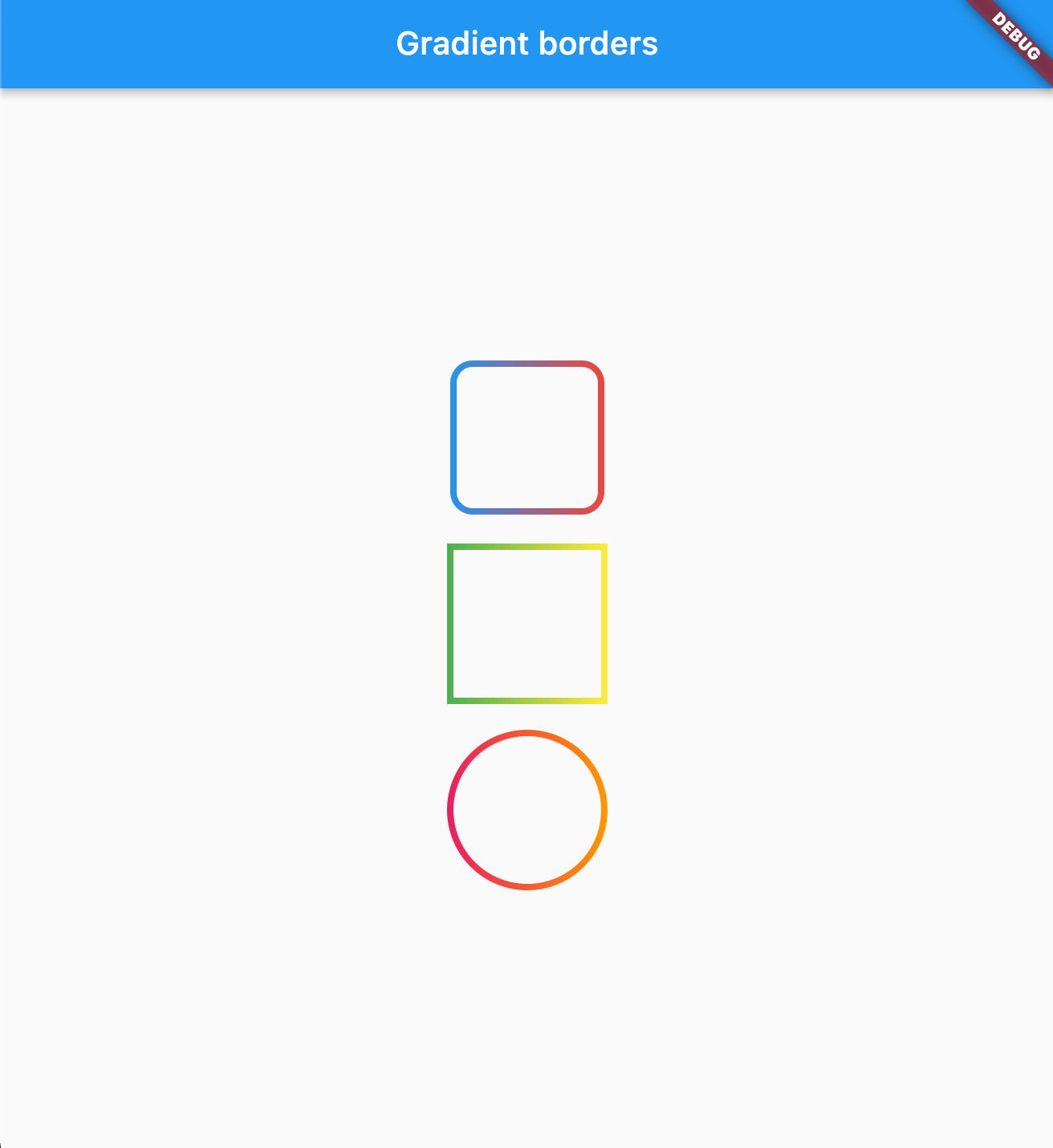
Change your container borders to use fancy gradients:

Container(
  width: 100,
  height: 100,
  decoration: BoxDecoration(
    border: const GradientBoxBorder(
      gradient: LinearGradient(colors: [Colors.blue, Colors.red]),
      width: 4,
    ),
    borderRadius: BorderRadius.circular(16)
  ),
),

Works with both: border radius, and with BoxShape.circle

Parameters
Parameter Type Default Description
gradient Gradient required The gradient to use for the border color.
width double 1.0 The width of the border.
strokeAlign double BorderSide.strokeAlignInside The alignment of the stroke relative to the border edge. Use BorderSide.strokeAlignInside (-1), BorderSide.strokeAlignCenter (0), or BorderSide.strokeAlignOutside (1).

image

Input borders

You can use GradientOutlineInputBorder as a part of your input decoration:

TextField(
  decoration: InputDecoration(
    border: GradientOutlineInputBorder(
      gradient: LinearGradient(colors: [Colors.red, Colors.blue]),
      width: 2,
    ),
    focusedBorder: GradientOutlineInputBorder(
     gradient: LinearGradient(colors: [Colors.yellow, Colors.green]),
      width: 2
    ),
    label: Text("Example"),
  ),
),
Parameters
Parameter Type Default Description
gradient Gradient required The gradient to use for the border color.
width double 1.0 The width of the border.
gapPadding double 4.0 Horizontal padding around the label cutout in the border.
borderRadius BorderRadius BorderRadius.all(Radius.circular(4)) The border radius of the rounded corners.
borderAlignment OutlineBorderAlignment OutlineBorderAlignment.onEdge Controls where the stroke is drawn relative to the widget edge. onEdge draws the border centered on the widget boundary; inside draws it fully inside.

image

You can also use GradientUnderlineInputBorder as part of your input decoration:

TextField(
  decoration: InputDecoration(
    border: GradientOutlineInputBorder(
      gradient: LinearGradient(colors: [Colors.red, Colors.blue]),
      width: 2,
    ),
    focusedBorder: GradientUnderlineInputBorder(
     gradient: LinearGradient(colors: [Colors.yellow, Colors.green]),
      width: 2
    ),
    label: Text("Example"),
  ),
),
Sponsored by

The Code Brothers

श्रेणियाँ

सोर्स रिपॉज़िटरी

इस पैकेज का उपयोग करने वाले प्रोजेक्ट