संबंधित सोर्स रिपॉज़िटरी के मूल README का स्नैपशॉट। नवीनतम सामग्री के लिए रिपॉज़िटरी देखें।
FLUTTER INTRO SLIDER
Flutter Intro Slider is a flutter plugin that helps you make a cool intro for your app. Create intro has never been easier and faster
Table of Contents
Installing
Add to pubspec.yaml file
dependencies:
  intro_slider: ^4.2.5
Import
import 'package:intro_slider/intro_slider.dart' ;
Demo
Code example
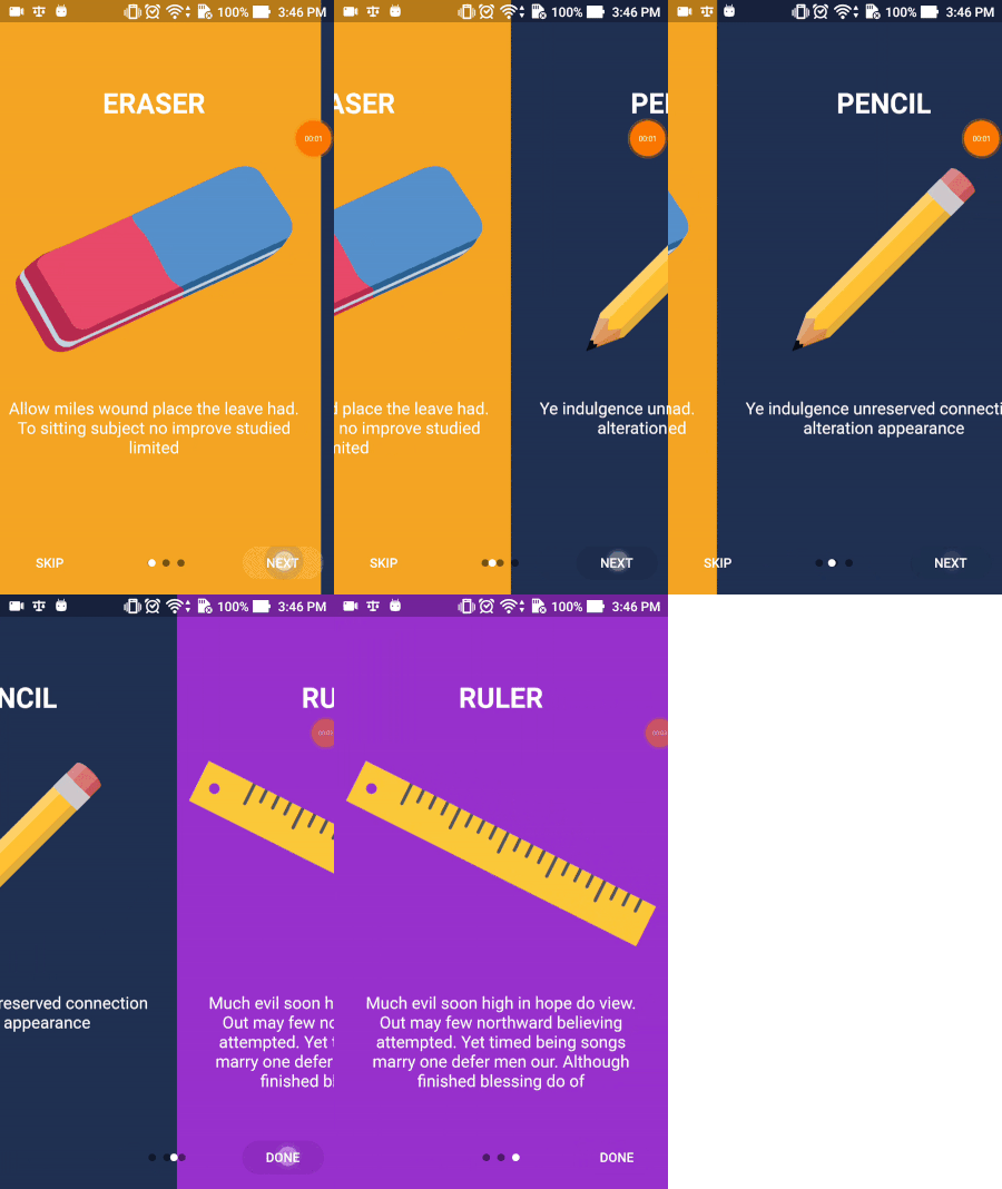
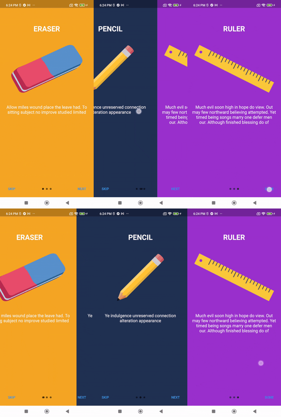
Default config
Code example (click to expand)
class IntroScreenDefaultState extends State <IntroScreenDefault > List <ContentConfig > listContentConfig = [];
@override
void initState () {
super .initState ();
listContentConfig.add (
const ContentConfig (
title: "ERASER" ,
description:
"Allow miles wound place the leave had. To sitting subject no improve studied limited" ,
pathImage: "images/photo_eraser.png" ,
backgroundColor: Color (0xfff5a623 ),
),
);
listContentConfig.add (
const ContentConfig (
title: "PENCIL" ,
description:
"Ye indulgence unreserved connection alteration appearance" ,
pathImage: "images/photo_pencil.png" ,
backgroundColor: Color (0xff203152 ),
),
);
listContentConfig.add (
const ContentConfig (
title: "RULER" ,
description:
"Much evil soon high in hope do view. Out may few northward believing attempted. Yet timed being songs marry one defer men our. Although finished blessing do of" ,
pathImage: "images/photo_ruler.png" ,
backgroundColor: Color (0xff9932CC ),
),
);
}
void onDonePress () {
log ("End of slides" );
}
@override
Widget build (BuildContext context) {
return IntroSlider (
listContentConfig: listContentConfig,
onDonePress: onDonePress,
);
}
}
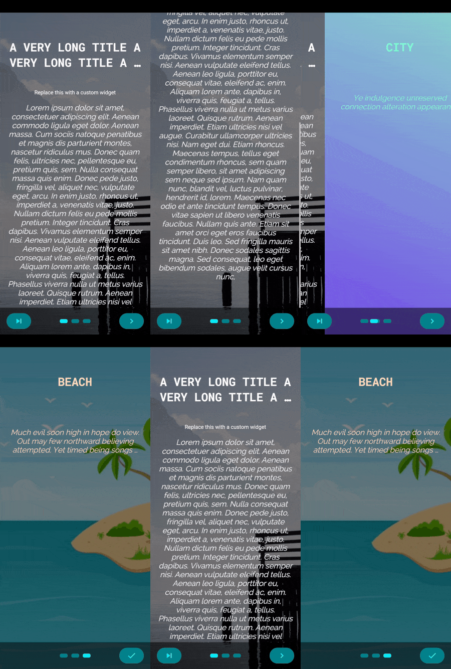
Custom config
Code example (click to expand)
class IntroScreenCustomConfigState extends State <IntroScreenCustomConfig > List <ContentConfig > listContentConfig = [];
Color activeColor = const Color (0xff0BEEF9 );
Color inactiveColor = const Color (0xff03838b );
double sizeIndicator = 20 ;
@override
void initState () {
super .initState ();
listContentConfig.add (
ContentConfig (
title:
"A VERY LONG TITLE A VERY LONG TITLE A VERY LONG TITLE A VERY LONG TITLE A VERY LONG TITLE A VERY LONG TITLE A VERY LONG TITLE A VERY LONG TITLE A VERY LONG TITLE" ,
maxLineTitle: 2 ,
styleTitle: const TextStyle (
color: Colors .white,
fontSize: 30.0 ,
fontWeight: FontWeight .bold,
fontFamily: 'RobotoMono' ,
),
description:
"Lorem ipsum dolor sit amet, consectetuer adipiscing elit. Aenean commodo ligula eget dolor. Aenean massa. Cum sociis natoque penatibus et magnis dis parturient montes, nascetur ridiculus mus. Donec quam felis, ultricies nec, pellentesque eu, pretium quis, sem. Nulla consequat massa quis enim. Donec pede justo, fringilla vel, aliquet nec, vulputate eget, arcu. In enim justo, rhoncus ut, imperdiet a, venenatis vitae, justo. Nullam dictum felis eu pede mollis pretium. Integer tincidunt. Cras dapibus. Vivamus elementum semper nisi. Aenean vulputate eleifend tellus. Aenean leo ligula, porttitor eu, consequat vitae, eleifend ac, enim. Aliquam lorem ante, dapibus in, viverra quis, feugiat a, tellus. Phasellus viverra nulla ut metus varius laoreet. Quisque rutrum. Aenean imperdiet. Etiam ultricies nisi vel augue. Curabitur ullamcorper ultricies nisi. Nam eget dui. Etiam rhoncus. Maecenas tempus, tellus eget condimentum rhoncus, sem quam semper libero, sit amet adipiscing sem neque sed ipsum. Nam quam nunc, blandit vel, luctus pulvinar, hendrerit id, lorem. Maecenas nec odio et ante tincidunt tempus. Donec vitae sapien ut libero venenatis faucibus. Nullam quis ante. Etiam sit amet orci eget eros faucibus tincidunt. Duis leo. Sed fringilla mauris sit amet nibh. Donec sodales sagittis magna. Sed consequat, leo eget bibendum sodales, augue velit cursus nunc," ,
styleDescription: const TextStyle (
color: Colors .white,
fontSize: 20.0 ,
fontStyle: FontStyle .italic,
fontFamily: 'Raleway' ,
),
marginDescription: const EdgeInsets .only (
left: 20.0 ,
right: 20.0 ,
top: 20.0 ,
bottom: 70.0 ,
),
centerWidget: const Text (
"Replace this with a custom widget" ,
style: TextStyle (color: Colors .white),
),
backgroundNetworkImage: "https://picsum.photos/600/900" ,
backgroundFilterOpacity: 0.5 ,
backgroundFilterColor: Colors .redAccent,
onCenterItemPress: () {},
),
);
listContentConfig.add (
const ContentConfig (
title: "CITY" ,
styleTitle: TextStyle (
color: Color (0xff7FFFD4 ),
fontSize: 30.0 ,
fontWeight: FontWeight .bold,
fontFamily: 'RobotoMono' ,
),
description:
"Ye indulgence unreserved connection alteration appearance" ,
styleDescription: TextStyle (
color: Color (0xff7FFFD4 ),
fontSize: 20.0 ,
fontStyle: FontStyle .italic,
fontFamily: 'Raleway' ,
),
colorBegin: Color (0xff89D4CF ),
colorEnd: Color (0xff734AE8 ),
directionColorBegin: Alignment .topRight,
directionColorEnd: Alignment .bottomLeft,
),
);
listContentConfig.add (
const ContentConfig (
title: "BEACH" ,
styleTitle: TextStyle (
color: Color (0xffFFDAB9 ),
fontSize: 30.0 ,
fontWeight: FontWeight .bold,
fontFamily: 'RobotoMono' ,
),
description:
"Much evil soon high in hope do view. Out may few northward believing attempted. Yet timed being songs marry one defer men our. Although finished blessing do of" ,
styleDescription: TextStyle (
color: Color (0xffFFDAB9 ),
fontSize: 20.0 ,
fontStyle: FontStyle .italic,
fontFamily: 'Raleway' ,
),
backgroundImage: "images/beach.jpeg" ,
maxLineTextDescription: 3 ,
),
);
}
void onSwipeCompleted (int prevIndex, int currentIndex, String direction) {
log ("onSwipeCompleted caught prevIndex: $prevIndex , currentIndex: $currentIndex , direction: $direction " );
}
void onDonePress () {
log ("onDonePress caught" );
}
void onNextPress (int index) {
log ("onNextPress caught $index " );
}
void onSwipeBeyondEnd () {
log ("onSwipeBeyondEnd caught - User swiped beyond the last slide!" );
}
Widget renderNextBtn () {
return const Icon (
Icons .navigate_next,
size: 25 ,
);
}
Widget renderDoneBtn () {
return const Icon (
Icons .done,
size: 25 ,
);
}
Widget renderSkipBtn () {
return const Icon (
Icons .skip_next,
size: 25 ,
);
}
ButtonStyle myButtonStyle () {
return ButtonStyle (
shape: WidgetStateProperty .all<OutlinedBorder >(const StadiumBorder ()),
foregroundColor: WidgetStateProperty .all<Color >(activeColor),
backgroundColor: WidgetStateProperty .all<Color >(inactiveColor),
);
}
@override
Widget build (BuildContext context) {
return IntroSlider (
listContentConfig: listContentConfig,
backgroundColorAllTabs: Colors .grey,
renderSkipBtn: renderSkipBtn (),
skipButtonStyle: myButtonStyle (),
renderNextBtn: renderNextBtn (),
onNextPress: onNextPress,
nextButtonStyle: myButtonStyle (),
renderDoneBtn: renderDoneBtn (),
onDonePress: onDonePress,
doneButtonStyle: myButtonStyle (),
indicatorConfig: IndicatorConfig (
sizeIndicator: sizeIndicator,
indicatorWidget: Container (
width: sizeIndicator,
height: 10 ,
decoration: BoxDecoration (
borderRadius: BorderRadius .circular (4 ), color: inactiveColor),
),
activeIndicatorWidget: Container (
width: sizeIndicator,
height: 10 ,
decoration: BoxDecoration (
borderRadius: BorderRadius .circular (4 ), color: activeColor),
),
spaceBetweenIndicator: 10 ,
typeIndicatorAnimation: TypeIndicatorAnimation .sliding,
),
navigationBarConfig: NavigationBarConfig (
navPosition: NavPosition .bottom,
padding: EdgeInsets .only (
top: MediaQuery .of (context).viewPadding.top > 0 ? 20 : 10 ,
bottom: MediaQuery .of (context).viewPadding.bottom > 0 ? 20 : 10 ,
),
backgroundColor: Colors .black.withValues (alpha: 0.5 ),
),
isAutoScroll: false ,
isLoopAutoScroll: true ,
curveScroll: Curves .bounceIn,
onSwipeCompleted: onSwipeCompleted,
onSwipeBeyondEnd: onSwipeBeyondEnd,
swipeBeyondEndThreshold: 100.0 ,
);
}
}
Custom layout
Code example (click to expand)
class IntroScreenCustomLayoutState extends State <IntroScreenCustomLayout > late Function goToTab;
Color primaryColor = const Color (0xffffcc5c );
Color secondColor = const Color (0xff3da4ab );
void onDonePress () {
goToTab (0 );
}
void onTabChangeCompleted (index) {
log ("onTabChangeCompleted, index: $index " );
}
Widget renderNextBtn () {
return Icon (
Icons .navigate_next,
color: primaryColor,
size: 35.0 ,
);
}
Widget renderDoneBtn () {
return Icon (
Icons .done,
color: primaryColor,
);
}
Widget renderSkipBtn () {
return Icon (
Icons .skip_next,
color: primaryColor,
);
}
ButtonStyle myButtonStyle () {
return ButtonStyle (
shape: MaterialStateProperty .all<OutlinedBorder >(const StadiumBorder ()),
backgroundColor:
MaterialStateProperty .all<Color >(const Color (0x33ffcc5c )),
overlayColor: MaterialStateProperty .all<Color >(const Color (0x33ffcc5c )),
);
}
List <Widget > generateListCustomTabs () {
return List .generate (
3 ,
(index) => Container (
color: Colors .black26,
width: double .infinity,
height: double .infinity,
child: ListView (
children: <Widget >[
const SizedBox (height: 20 ),
Center (
child: DropdownButton <String >(
value: index.toString (),
icon: Icon (Icons .arrow_downward, color: secondColor, size: 20 ),
elevation: 16 ,
style: TextStyle (color: primaryColor),
underline: Container (
height: 2 ,
color: secondColor,
),
onChanged: (String ? value) {},
items: ["0" , "1" , "2" ]
.map<DropdownMenuItem <String >>((String value) {
return DropdownMenuItem <String >(
value: value,
child: Text (value,
style: TextStyle (color: secondColor, fontSize: 20 )),
);
}).toList (),
),
),
const SizedBox (height: 20 ),
Image .network (
"https://picsum.photos/${300 + index} " ,
width: 300.0 ,
height: 300.0 ,
),
const SizedBox (height: 20 ),
Container (
margin: const EdgeInsets .symmetric (vertical: 20 , horizontal: 16 ),
child: Text (
"Title at index $index " ,
textAlign: TextAlign .center,
style: TextStyle (
color: secondColor,
fontSize: 30.0 ,
fontWeight: FontWeight .bold,
fontFamily: 'RobotoMono' ,
),
),
),
],
),
),
);
}
@override
Widget build (BuildContext context) {
return IntroSlider (
renderSkipBtn: renderSkipBtn (),
skipButtonStyle: myButtonStyle (),
renderNextBtn: renderNextBtn (),
nextButtonStyle: myButtonStyle (),
renderDoneBtn: renderDoneBtn (),
onDonePress: onDonePress,
doneButtonStyle: myButtonStyle (),
indicatorConfig: const IndicatorConfig (
colorIndicator: Color (0xffffcc5c ),
sizeIndicator: 13.0 ,
typeIndicatorAnimation: TypeIndicatorAnimation .sizeTransition,
),
listCustomTabs: generateListCustomTabs (),
backgroundColorAllTabs: Colors .white,
refFuncGoToTab: (refFunc) {
goToTab = refFunc;
},
scrollPhysics: const BouncingScrollPhysics (),
onTabChangeCompleted: onTabChangeCompleted,
);
}
}
IntroSlider parameter
Name
Type
Default
Description
Tab
key
Key?Assign a unique key to the IntroSlider widget
listContentConfig
List<ContentConfig>?View details List of ContentConfig objects defining slide content. Required if listCustomTabs not defined
listCustomTabs
List<Widget>?Required if listContentConfig not defined
Custom widget list for slides (allows you to put your own widgets into the prebuilt frame)
refFuncGoToTab
void Function(Function function)?Do nothing
Provides reference to navigation function, enabling programmatic navigation to any tab index
onTabChangeCompleted
void Function(int index)?Do nothing
Callback fired when tab change is completed, returns the current tab's index
backgroundColorAllTabs
Color?Transparent
Background color for all tabs (used when backgroundColor is not set in individual tabs)
Skip Button
renderSkipBtn
Widget?Text("SKIP")
Render your own custom SKIP button widget
skipButtonStyle
ButtonStyle?ButtonStyle()
Style configuration for the SKIP button
onSkipPress
void Function()?Go to last page + call your function if define
Fires when SKIP button is pressed. Goes to last page and calls your custom function if defined
isShowSkipBtn
bool?true
Show or hide the SKIP button
skipButtonKey
Key?Assign a unique key to the SKIP button
Previous Button
renderPrevBtn
Widget?Text("PREV")
Render your own custom PREV button widget
prevButtonStyle
ButtonStyle?ButtonStyle()
Style configuration for the PREV button
onPrevPress
void Function(int index)?Go to prev page + call your function if define
Fires when PREV button is pressed. Goes to previous page and calls your custom function if defined
isShowPrevBtn
bool?false
Show or hide the PREV button. Note: set isShowSkipBtn to false first if you want to show this button
prevButtonKey
Key?Assign a unique key to the PREV button
Done Button
renderDoneBtn
Widget?Text("DONE")
Render your own custom DONE button widget
doneButtonStyle
ButtonStyle?ButtonStyle()
Style configuration for the DONE button
onDonePress
void Function()?Do nothing
Fires when DONE button is pressed
isShowDoneBtn
bool?true
Show or hide the DONE button
doneButtonKey
Key?Assign a unique key to the DONE button
Next Button
renderNextBtn
Widget?Text("NEXT")
Render your own custom NEXT button widget
nextButtonStyle
ButtonStyle?ButtonStyle()
Style configuration for the NEXT button
onNextPress
void Function(int index)?Go to next page + call your function if define
Fires when NEXT button is pressed. Goes to next page and calls your custom function if defined
isShowNextBtn
bool?true
Show or hide the NEXT button
nextButtonKey
Key?Assign a unique key to the NEXT button
Indicator
indicatorConfig
IndicatorConfig?View details Configuration for customizing the slide indicator appearance and behavior
Navigation bar
navigationBarConfig
NavigationBarConfig?View details Configuration for customizing the navigation bar position and styling
Scroll behavior
isScrollable
bool?true
Whether the slider is scrollable (or controlled only by buttons)
curveScroll
Curve?Curves.ease
Animation curve for slide transitions (also affects indicator animation)
scrollPhysics
ScrollPhysics?ScrollPhysics()
Physics behavior for horizontal scrolling of the slides
isAutoScroll
bool?false
Enable automatic scrolling of slides
isLoopAutoScroll
bool?false
Loop back to first slide when reaching the end (for auto-scroll)
isPauseAutoPlayOnTouch
bool?true
Pause auto-scroll when user touches the slide
autoScrollInterval
Duration?Duration(seconds: 4)
Time interval between automatic slide transitions
onSwipeCompleted
void Function(int previousIndex, int currentIndex, String direction)?Fires when user completes a swipe gesture
onSwipeBeyondEnd
void Function()?Fire when user swipes beyond the last slide (left swipe on final slide). Useful for navigating to next screen
swipeBeyondEndThreshold
double?50.0
Minimum swipe distance (in pixels) required to trigger onSwipeBeyondEnd. Higher values = harder to trigger
ContentConfig parameter
Name
Type
Default
Description
Title
title
String?""
Text content for the title at the top of the slide
widgetTitle
Widget?null
Custom widget to use as the title (overrides title if both are defined)
maxLineTitle
int?1
Maximum number of lines for the title text
styleTitle
TextStyle?White color, bold and font size is 30.0
TextStyle configuration for the title text
textAlignTitle
TextAlign?TextAlign.center
Text alignment for the title
textOverFlowTitle
TextOverflow?TextOverflow.ellipsis
Text overflow behavior for the title
marginTitle
EdgeInsets?top: 70.0, bottom: 50.0
Margin spacing around the title
Image
pathImage
String?""
File path to your local image
widthImage
double?250.0
Width of the image
heightImage
double?250.0
Height of the image
foregroundImageFit
BoxFit?BoxFit.contain
How the foreground image should fit within its bounds
Center widget
centerWidget
Widget?null
Your custom widget to display in the center
onCenterItemPress
Function()?Do nothing
Fires when the center image/widget is pressed
Description
description
String?""
Text content for the description at the bottom of the slide
widgetDescription
Widget?null
Custom widget to use as the description (overrides description if both are defined)
maxLineTextDescription
int?100
Maximum number of lines for the description text
styleDescription
TextStyle?White and font size is 18.0
TextStyle configuration for the description text
textAlignDescription
TextAlign?TextAlign.center
Text alignment for the description
textOverFlowDescription
TextOverflow?TextOverflow.ellipsis
Text overflow behavior for the description
marginDescription
EdgeInsets?left, right = 20.0, top, bottom = 50.0
Margin spacing around the description
Background Color
backgroundColor
Color?Colors.amberAccent
Solid background color for the slide (if set, gradient properties below will be ignored)
colorBegin
Color?Colors.amberAccent
Starting color for the gradient background
colorEnd
Color?Colors.amberAccent
Ending color for the gradient background
directionColorBegin
AlignmentGeometry?Alignment.topLeft
Starting direction/position for the gradient
directionColorEnd
AlignmentGeometry?Alignment.bottomRight
Ending direction/position for the gradient
Background Image
backgroundImage
String?null
Local image file path for the background (if set, all Background Color parameters above will be ignored)
backgroundNetworkImage
String?null
Network URL for the background image
backgroundImageFit
BoxFit?BoxFit.cover
How the background image should fit within its bounds
backgroundFilterColor
Color?Colors.black
Color filter to apply over the background image
backgroundFilterOpacity
double?0.5
Opacity level for the backgroundFilterColor
backgroundBlendMode
BlendMode?BlendMode.darken
Blend mode for combining the background image with the filter color
Others
verticalScrollbarBehavior
enum ScrollbarBehavior?ScrollbarBehavior.HIDE
Specifies how the vertical scrollbar should behave
IndicatorConfig parameter
Name
Type
Default
Description
isShowIndicator
bool?true
Show or hide the slide indicator
colorIndicator
Color?Colors.black54
Color for inactive indicators (ignored if using custom indicator widgets)
colorActiveIndicator
Color?value of colorIndicator
Color for the active (current) indicator (ignored if using custom indicator widgets)
sizeIndicator
double?8.0
Size of each indicator dot
spaceBetweenIndicator
double?The same value of sizeIndicator
Space between each indicator dot
typeIndicatorAnimation
enum TypeIndicatorAnimation?TypeIndicatorAnimation.sliding
Type of animation for indicator transitions
indicatorWidget
Widget?Default dot
Custom widget for inactive indicators
activeIndicatorWidget
Widget?Default dot
Custom widget for the active indicator
NavigationBarConfig parameter
Name
Type
Default
Description
padding
EdgeInsetsEdgeInsets.symmetric(vertical: 10)
Padding around the navigation bar
navPosition
NavPositionNavPosition.bottom
Position of the navigation bar (top or bottom of the page)
backgroundColor
ColorColors.transparent
Background color for the navigation bar
Pull request and feedback are always appreciated