सार्वजनिक जानकारी से बना चयन मार्गदर्शन। केवल संदर्भ हेतु।
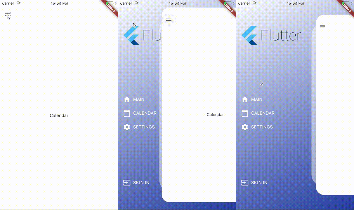
kf_drawer एक Flutter पैकेज है जो कई प्लेटफॉर्म के लिए एप्लिकेशन में कस्टमाइज़ेबल साइड मेनू (Drawer) प्रदान करता है। यह विभिन्न कस्टमाइज़ेशन विकल्पों जैसे चौड़ाई, एनीमेशन और आइटम स्टाइलिंग के समर्थन के साथ नेविगेशन के लिए साफ और हल्का इम्प्लीमेंटेशन प्रदान करता है। उपयोग में आसान डिज़ाइन के साथ, यह Android, iOS, Web, macOS, Windows और Linux पर Flutter ऐप्स में बिना किसी दिक्कत के एकीकृत होता है। यह पैकेज एक सुसंगत और प्रतिक्रियाशील नेविगेशन ड्रॉअर अनुभव की आवश्यकता वाले ऐप्स के लिए आदर्श है।
उपयोग
मोबाइल ऐप नेविगेशन
वेब डैशबोर्ड साइडबार
डेस्कटॉप एप्लिकेशन मेनू
क्रॉस-प्लेटफ़ॉर्म नेविगेशन
कस्टमाइज़ करने योग्य ड्रॉर लेआउट
मुख्य विशेषताएँ
प्लेटफॉर्म के अनुकूलता
कस्टमाइज़ेबल ड्रॉअर चौड़ाई
चिकनी एनीमेशन
आसान एकीकरण
कस्टम विजेट्स के लिए समर्थन
इनके लिए उपयुक्त
बहु-प्लेटफॉर्म एप्लिकेशन बनाने वाले डेवलपर्स
स्थिर नेविगेशन की आवश्यकता वाली टीमें
जटिल साइडबार आवश्यकताओं वाले ऐप्स
उपयोगकर्ता इंटरफेस पर आधारित परियोजनाएँ
त्वरित प्रोटोटाइपिंग
विचार योग्य बातें
सीमित बिल्ट-इन थीम्स
उन्नत डिजाइन के लिए हस्तक्षेप स्टाइलिंग की आवश्यकता होती है
कोई बिल्ट-इन डार्क मोड समर्थन नहीं है
फ्लटर के ड्रॉयर API पर निर्भर करता है
अतिरिक्त अवस्था प्रबंधन की आवश्यकता हो सकती है
मूल README
संबंधित सोर्स रिपॉज़िटरी के मूल README का स्नैपशॉट। नवीनतम सामग्री के लिए रिपॉज़िटरी देखें।
KFDrawer
A dependency-free animated side drawer for Flutter. KFDrawer supports controller
and context-based control, gestures, pinned or centered menus, page history,
right-side drawers, and RTL layouts on every Flutter platform.
Install
dependencies:kf_drawer:^2.1.0
KFDrawer 2.1 supports Dart 3 and Flutter 3.10 or newer. The package is tested
against both its compatibility floor and the current Flutter stable release.
Quick start
Create a controller, give each page item a widget, and place KFDrawer in your
Scaffold body:
footerPinned keeps the footer outside the scrolling item list.
centerScrollableItems centers a shrink-wrapped item list between a fixed
header and footer.
scrollable: false retains the non-scrolling centered column layout.
Right-side and RTL drawers
KFDrawerDirection is logical, so start automatically follows the ambient
text direction:
// Left in LTR, right in RTL (default).KFDrawer(direction: KFDrawerDirection.start)
// Right in LTR, left in RTL.KFDrawer(direction: KFDrawerDirection.end)
Translation, edge dragging, content tap regions, shadow offset, icon padding,
and menu alignment all follow the resolved side.
Dynamic items
Controller changes rebuild the drawer automatically:
drawerController.items = <KFDrawerItem>[...newItems];
drawerController.addItem(newItem);
drawerController.removeItem(oldItem);
drawerController.clearItems();

// If you mutate drawerController.items directly:
drawerController.items.add(newItem);
drawerController.refreshItems();

drawerController.selectItem('settings');
Optional page history and Back handling
KFDrawer swaps page widgets; it does not push Navigator routes. Enable the
lightweight controller history only if this is the behavior your app needs:
Use replacePage to change the current page without adding a history entry and
clearHistory after a navigation reset.
Page item callbacks
When an item has both page and onPressed, KFDrawer now performs both actions:
it selects the page, optionally closes the drawer, and invokes the callback.