सार्वजनिक जानकारी से बना चयन मार्गदर्शन। केवल संदर्भ हेतु।
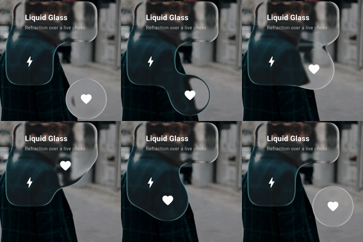
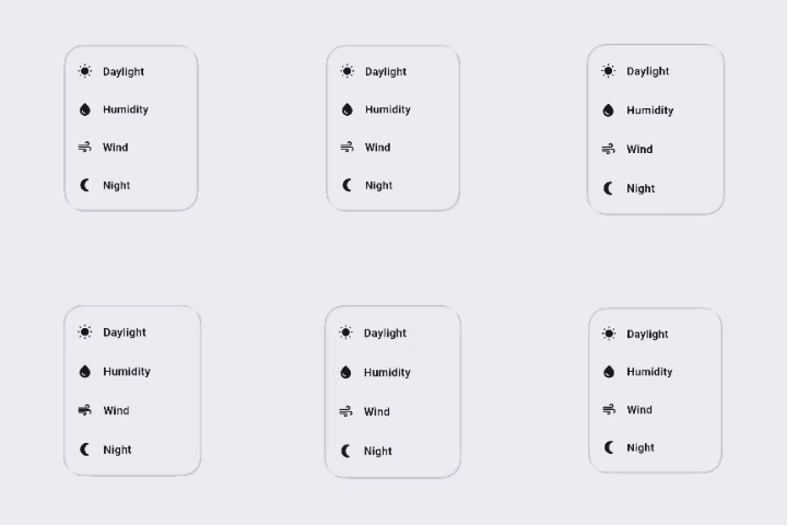
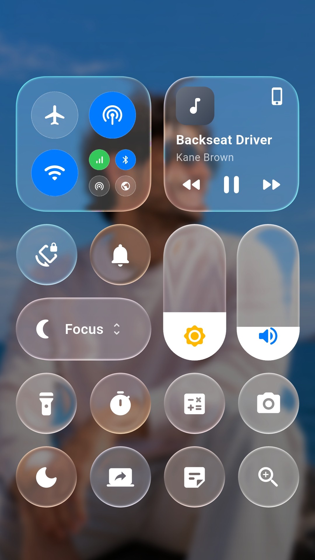
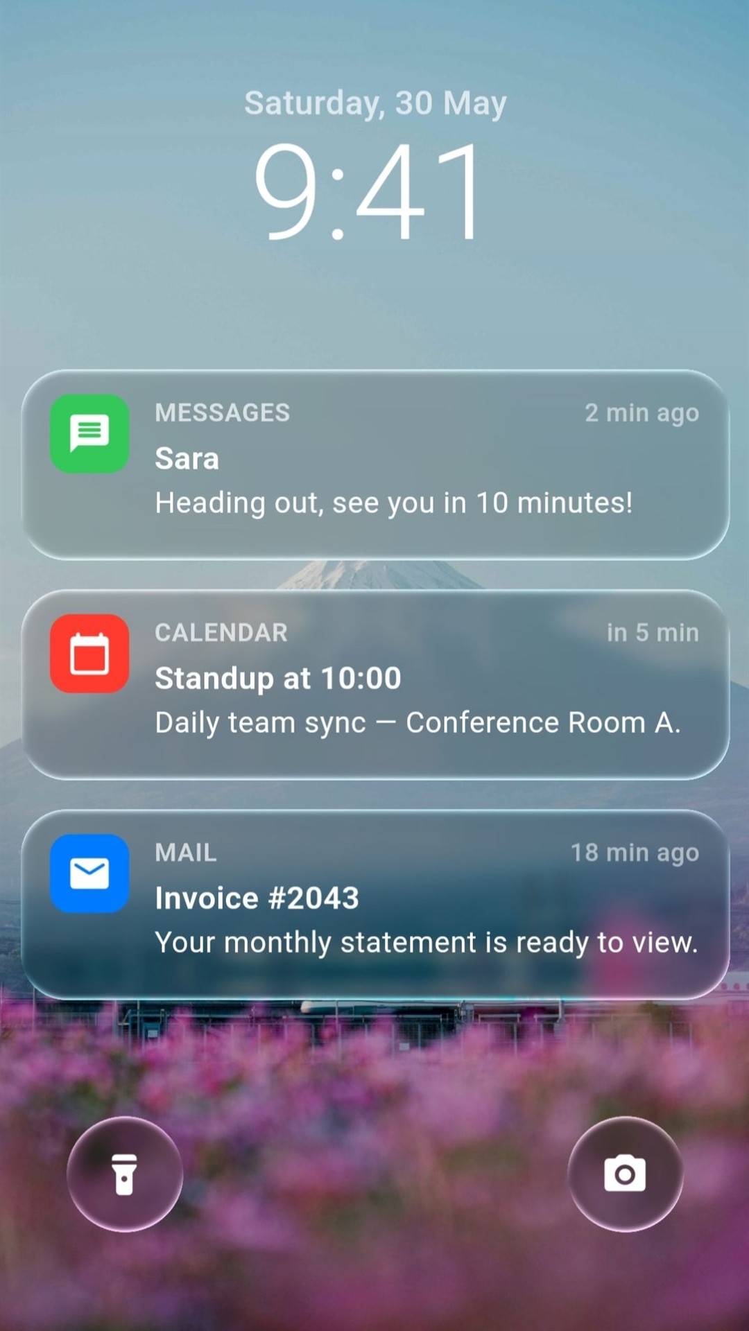
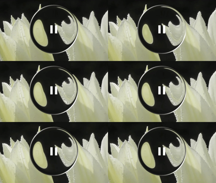
Liquid Glass Easy एक Flutter पैकेज है जो विकर्ण, रियल-टाइम लिक्विड ग्लास लेंस प्रभाव प्रदान करता है, जिसमें विकृति, आवर्धन, अपवर्तन और ब्लर शामिल है। गहन UI के लिए डिज़ाइन किया गया है, यह अर्धपारदर्शी, तरल ग्लास के दिखावट को सिमुलेट करके दृश्य गहराई और अंतरक्रिया को बढ़ाता है। आधुनिक, ग्लासमोर्फिक डिज़ाइन के लिए उपयुक्त है, यह छूने वाली अंतरक्रिया का समर्थन करता है और कई प्लेटफॉर्मों पर प्रतिक्रियाशील, जीवंत लेंस प्रभाव बनाता है।
उपयोग
इंटरैक्टिव ग्लासमोर्फिक ओवरले बनाना
तरल दृश्य के साथ ऐप स्प्लैश स्क्रीन को बेहतर बनाना
डायनामिक फ्लोटिंग यूआई तत्वों का डिज़ाइन करना
चित्र दर्शकों में वास्तविक लेंस प्रभाव जोड़ना
अम्मोदक डैशबोर्ड इंटरफेस बनाना
मुख्य विशेषताएँ
रियल-टाइम लेंस विकृति
स्पर्श-प्रतिक्रिया आवर्धन
डायनामिक अपवर्तन सिमुलेशन
ब्लर परत एकीकरण
क्रॉस-प्लेटफॉर्म समर्थन (Android, iOS, Web, macOS, Windows, Linux)
इनके लिए उपयुक्त
उन्नत ग्लासमोर्फिक प्रभाव चाहने वाले UI डिजाइनर
इंटरैक्टिव और दृश्य रूप से समृद्ध ऐप बनाने वाले डेवलपर्स
चिकने, एनिमेटेड ग्लास-जैसे घटकों की आवश्यकता वाले प्रोजेक्ट
आधुनिक, न्यूनतम डिज़ाइन स्वरूप पर केंद्रित ऐप्स
विचार योग्य बातें
कम-स्तर के उपकरणों पर प्रदर्शन प्रभावित हो सकता है
जटिल लेआउट के लिए सावधानीपूर्वक अनुकूलन की आवश्यकता होती है
न्यूनतम पृष्ठभूमि कठिनाई के साथ सबसे अच्छा उपयोग किया जाता है
स्थिर या सरल UI के लिए आदर्श नहीं है
मुख्य लेंस व्यवहार के आगे सीमित कस्टमाइजेशन
मूल README
संबंधित सोर्स रिपॉज़िटरी के मूल README का स्नैपशॉट। नवीनतम सामग्री के लिए रिपॉज़िटरी देखें।
Liquid Glass Easy
📖 Documentation & live demos
The full guide, the API reference, and every component running as real liquid glass in your browser — press it, drag it, scroll under it.
A Flutter package that brings Apple's iOS-style Liquid Glass to your app with real-time, interactive lenses.
These dynamic lenses magnify, distort, blur, tint, and refract the content behind them — recreating the iOS 26 Liquid Glass look with stunning, glass-like effects that respond fluidly to movement and touch.
Building Blocks
Block
API
What it does
Glass
LiquidGlassLens
The surface itself. Layout-driven — drop it anywhere and it refracts what's behind it. Styled with LiquidGlassStyle: shape, appearance, refraction.
Touch
LiquidGlassTouch
How glass answers a finger. Carries LiquidGlassFlex: press and it swells, drag and it deforms, release and it springs back.
Motion
LiquidGlassLensMotionSpec
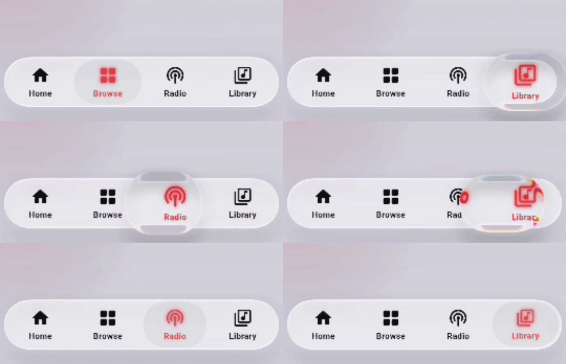
Acceleration-driven deformation for moving glass — it stretches as it launches, squashes as it brakes, and rides undeformed at constant speed. The physics behind the slider thumb and the tab bar's pill (motion: on both).
Blend
LiquidGlassBlender
Merges 2–8 lenses into one surface, joined by a smooth metaball bridge. smoothness: 0 turns the bridge off and keeps the one shared surface — one backdrop read and one material for the whole set, far cheaper than the same lenses standing alone.
Group
LiquidGlassGroup
Deprecated in 4.3.0 — it is LiquidGlassBlender(smoothness: 0) under another name, and it still works. Docs →
Morph
LiquidGlassMorph
Glass that fits whatever you put in it: swap the child and the surface flows to the new size, as two blobs of one liquid with a neck between them. Motion is a preset.
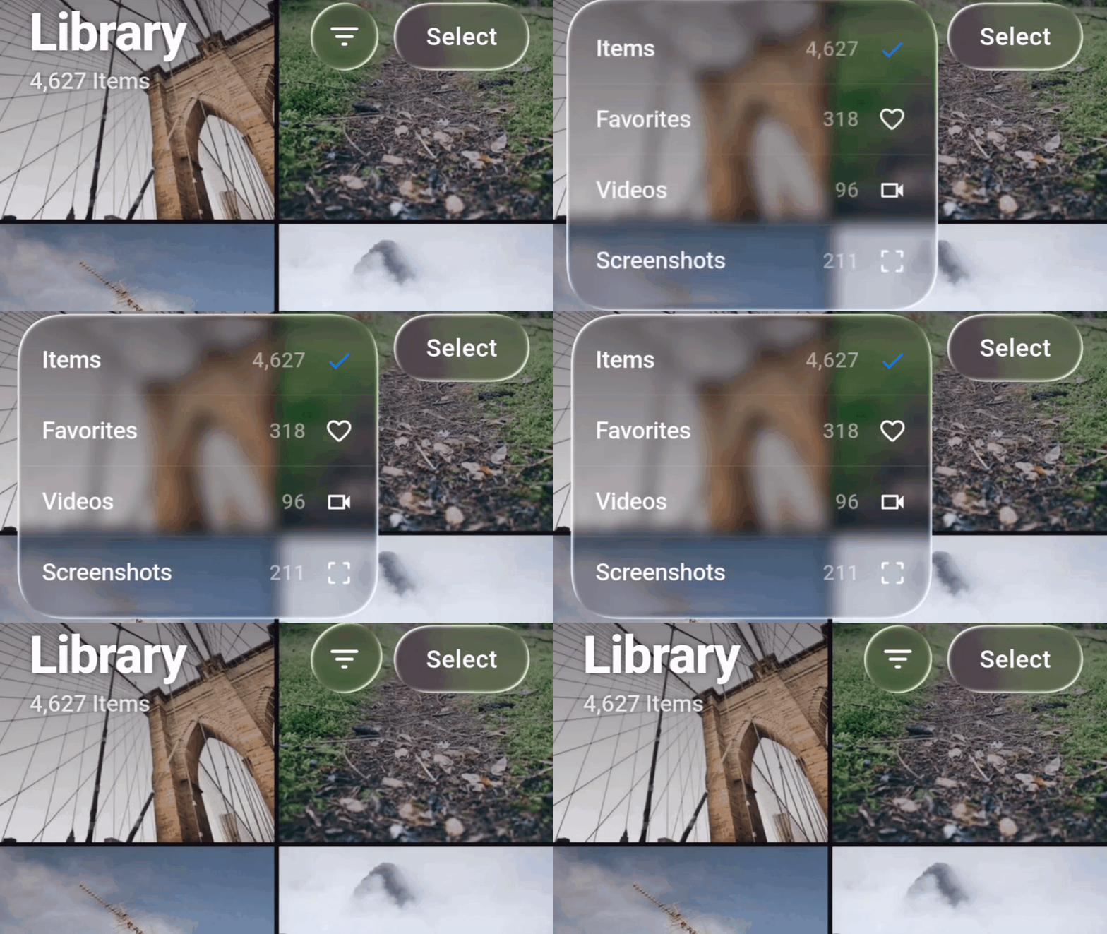
The material without the shader: frost, tint and a lit rim, no refraction. Flip one lens, or the whole app per engine — nothing to compile, no capture on Skia, no slot in the lens budget.
Shadow
LiquidGlassShadow
The contact shadow that sets glass into the page: a soft ring hugging the rim and pooling beneath, multiplied over whatever is under it. Authored on appearance.shadow, where the lens wraps itself in it; usable on its own around anything.
Batch
LiquidGlassBatch
Wrap a subtree and every lens inside it shares one read of the backdrop — no limit on how many, each keeping its own shape and style. The group's ceiling and its fusing, traded away for scale. Members must not overlap; LiquidGlassBatch.exclude keeps one subtree out. The view and the scaffold batch on their own (batch: true).
Adapt
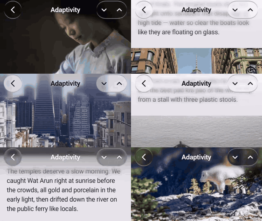
LiquidGlassAdaptivity
Glass tint and content colour flip with the background actually behind each surface — smoked over a dark photo, milky over a white page, and the OS bars along with them. Docs →
Scroll edge
LiquidGlassScrollEdge
iOS-style scroll edge treatment: a fading, blurred band pinned to a screen edge so floating chrome stays legible over whatever scrolls under it. Adapts with the background like everything else.
View
LiquidGlassView
The Skia / web background pipeline. Not needed on Impeller.
Ready-made controls, each a lens with the blocks above already wired.
Shaders
LiquidGlassShaders
await LiquidGlassShaders.ensureLoaded() in main() compiles every program — the lens's and the blender's — so the first glass on screen is glass on its first frame.
Render paths — Impeller, Skia, and the fallback
LiquidGlassLens resolves the best path for the engine your app is running on.
The widget tree you write is identical in every case:
Engine / setup
Behavior
Impeller (Flutter's default on modern iOS/Android)
The lens refracts the live backdrop — whatever your app painted behind it. No LiquidGlassView and no background widget needed at all. Just drop the lens over any UI.
Skia with an ancestor LiquidGlassView (+ backgroundWidget)
The lens refracts the view's captured background, wherever it sits inside the view's child.
Skia without a view
Refraction isn't possible, so the lens gracefully degrades to a frosted look (backdrop blur + tint + border) and logs a one-time debug notice.
Any engine, lite glass
LiquidGlassEngine.liteGlassOnSkia / liteGlassOnImpeller, or a LiquidGlassLitePickup in liteGlass on one style: the lens draws LiquidGlassLite — frost, tint and a lit rim — with no shader, no capture and no view needed.
In short: on Impeller it just works anywhere; on Skia you wrap your
content in a LiquidGlassView to give the lens a background to refract —
or switch that engine to lite glass and skip the view.
Lite glass — the material without the shader
A lens gets its look from a fragment shader that bends the background under
it. Lite glass gives up the bending and keeps everything else: the frost,
the tint, the contact shadow, and a rim lit by the same model the shader
runs, evaluated on the Dart side. Nothing to compile, nothing to warm up, no
capture on Skia, no slot in the lens budget on Impeller.
// The whole app, per engine — set once, before the first lens builds.LiquidGlassEngine.liteGlassOnSkia = true; // Skia and the webLiquidGlassEngine.liteGlassOnImpeller = true; // Impeller// One lens, on either engine — the value is where its rim takes its colour.LiquidGlassLens(
style: constLiquidGlassStyle(liteGlass: LiquidGlassLitePickup.backdrop),
child: child,
)
// The widget itself, on a surface that was never a lens.LiquidGlassLite(
shape: constLiquidGlassShape(cornerRadius: 22, borderWidth: 1.5),
blur: constLiquidGlassBlur(sigmaX: 3, sigmaY: 3),
color: constColor(0x33FFFFFF),
child: child,
)
The value of liteGlass is where the rim takes its colour from, a
LiquidGlassLitePickup. backdrop is the default: it samples the
background along the rim the way the shader does, for one extra read.
blend and surface cost no read of their own; none is white light. A
lens the engine switches put on lite glass takes its rim from
LiquidGlassEngine.litePickup instead, which is backdrop by default too.
What still works, and what does not. Lite glass changes how a lens is
drawn, not what the tree around it does:
Under lite glass
Every component
Works the same, with no refraction. The tab bar's pillStyle.mode: both is fine on Skia here — there is no capture to double.
Work. The adaptive sampler is not a glass capture and keeps running.
LiquidGlassMorph
Runs as plain: one lens, one spring, no second blob.
LiquidGlassBlender
Does not blend — every member paints solo as its own lite surface.
LiquidGlassBatch
Inert — there is no shader pass to share.
refraction
Gone, except magnification, which survives as a flat zoom in the frost.
Touch — glass that answers a finger
Pass a touch: and the lens becomes a soft body. Press it and it swells
under your finger; drag it and it elongates along the pull, pinches in the
cross axis, leans after your thumb, then springs back with a wobble. The lens
never moves — only its shape and its content deform.
touch is a group, not a single effect: it carries the whole response a
surface has to a finger, so a control's feel travels as one value the way its
whole look travels as a LiquidGlassStyle. Today it holds flex — the
deformation — and further members land as new fields, not as a new parameter
on every component.
The four edges spring independently, so the half nearest your finger
deforms more than the far half — the asymmetry a scale transform cannot
produce. grip controls how localized that is (0 = symmetric wherever you
touch, 1 = fully local), squeeze takes the along-axis gain back out of the
cross axis so an elongated lens genuinely gets thinner, and lean slides the
body after the finger. .subtle(), .uniform() and .pronounced() are tuned
starting points.
null — the default — adds nothing to the tree: no gesture listener, no
ticker, no cost.
Blend — fuse lenses into one liquid surface
Wrap two to eightLiquidGlassLens descendants in a LiquidGlassBlender and
their silhouettes merge into a single liquid glass surface: as neighbouring lenses
approach they grow a smooth metaball bridge, and they pull apart as you
separate them — each member keeps its own corner style through the merge.
It works on both backends — Impeller samples the live backdrop, Skia refracts
the captured background (place it inside a LiquidGlassView).
Eight is the ceiling — LiquidGlassBlender.maxLensCount. The metaball field
compares every member on every fragment, so the cap is what keeps the shader's
cost bounded; it is raised two at a time, by adding a mat4 to the shader.
Register a ninth lens and it throws in debug; in release the extras are dropped
and the first eight blend.
One shader for all of them. Whatever smoothness says, the blender draws
every lens under it with a single shader pass — one backdrop read and one
material for the whole set, in place of a pass and a read per lens. That is
what makes it the cheap way to put a set of glass on a screen. At
smoothness: 0 the bridge is off and the shader skips the smooth-union work
entirely; the members keep their own hard outlines and still share that one
pass. That is exactly what LiquidGlassGroup did, and the group is deprecated
in favour of it — LiquidGlassGroup(...) is LiquidGlassBlender(smoothness: 0, ...), every other parameter by the same name.
⚠️ A note on blur on Skia. In-shader blur on the Skia capture path may cost
performance when the lenses are big or the blur is big. Also, high blur
(above ~7) doesn't match the look of a real backdrop blur. It isn't clamped,
though — the value is left unrestricted so you can push it if you want; just
expect it to diverge from the Impeller look at high sigmas.
Group — many lenses, one surface
Deprecated in 4.3.0.LiquidGlassGroup is LiquidGlassBlender with
smoothness: 0 as its default and nothing else different; every parameter
carries over by name. It keeps working and will be removed in a future
release. Everything below still applies — read LiquidGlassGroup(...) as
LiquidGlassBlender(smoothness: 0, ...).
A page rarely holds one lens, and lenses are not cheap: each one reads the
backdrop behind it and runs its own glass pass. Wrap a set of them in a
LiquidGlassBlender with smoothness: 0 — what the group was — and they are
drawn as one sheet with one shader: the members keep their own layout,
shape and child, but give up their individual pass for a single surface
covering all of them.
This is the cheap way to put a lot of glass on a screen. Six lenses
standing on their own are six backdrop reads and six materials; the same six in
a blender are one of each, whatever they cost to lay out. Reach for it
wherever glass comes in sets — a toolbar of buttons, a stack of cards, a row of
controls.
LiquidGlassBlender(
smoothness: 0, // one shader, one read, no bridge — the group
style: constLiquidGlassStyle(
shape: LiquidGlassShape.continuousRoundedRectangle(cornerRadius: 26),
),
child: Column(children: const [
SizedBox(width: 180, height: 56, child: LiquidGlassLens()),
SizedBox(height: 12),
SizedBox(width: 180, height: 56, child: LiquidGlassLens()),
]),
)
Fusing is the same knob. Give smoothness a radius instead and members
that come within about half of it flow together through a metaball bridge,
growing as they approach and pulling apart as they separate — the merge in the
Blend section above, on the same shared sheet.
Zero was the only thing the group changed: with it each member keeps its own
hard outline and the shader skips the smooth-union entirely rather than running
it and finding nothing to blend, so a row of buttons or a column of pills pays
nothing for a bridge that never forms.
Adaptivity stays per member. Each lens judges the background behind
itself and paints its own verdict into the shared sheet; where two fuse,
their colours cross over inside the bridge on the same falloff that shapes it.
A member that isn't adaptive takes the blender's colour.
Glass reads as glass by agreeing with its backdrop: smoked over a dark
photo, milky over a white page, with the icons and text on it inverting to
match. Give a style an adaptivity and both do it on their own, from the actual
pixels behind that surface.
Two things flip together, both animated over duration: the glass tint
(overriding appearance.color) and the content colour, installed over the
child as an IconTheme + DefaultTextStyle — so any Icon or Text that
doesn't hardcode a colour follows automatically.
Nothing samples pixels unless a view opts in. A config says what to do
with a verdict, not where it comes from: pass adaptiveSampling to your
LiquidGlassView, or adaptivity to a LiquidGlassScaffold, which opens the
sampler for you. One deliberately tiny capture (pixel ratio 0.05, 8 per
second) serves every adaptive surface in the view — ten of them cost one
capture, not ten.
The pieces
API
What it does
LiquidGlassAdaptivity
The config — palettes, thresholds, and where the verdict comes from. Goes on style.adaptivity.
LiquidGlassAdaptiveArea
Samples one region and hands that verdict to everything inside it, with no wiring. The group form.
LiquidGlassAdaptivityLink
A channel: an area publishes to it, and consumers carrying the same link follow it — for followers that can't sit inside the area.
LiquidGlassAdaptivityController
Pause / resume a whole group, plus adaptOnce() to take a single look on your own cue (scroll settled, page entered).
LiquidGlassAdaptiveContent
Makes bare Text / Icon — with no glass behind them — adapt like a lens child.
LiquidGlassAdaptiveSampling
Tuning for the capture that feeds all of it: pixelRatio, frameLimit, minimumRegionSamples.
LiquidGlassScaffoldAdaptivity
The scaffold's config: palettes for its chrome, plus the strips that drive the system bars.
LiquidGlassSystemChrome
Which OS bars the verdict also drives — icon brightness only, never bar colours. On a scaffold's config it defaults to the status bar.
LiquidGlassBrightnessFallback
What to guess when there is nothing to sample: appTheme (default) or platform.
LiquidGlassScrollEdge runs on the same machine, and so does every drop-in
component: a LiquidGlassScaffold hands its adaptivity down to the app bar,
the tab bar, the action button and its lenses, each of which then judges the
background directly behind itself.
Full guide → ADAPTIVITY.md — how the verdict is decided,
the precedence chain, areas and links, the controller, recipes and gotchas.
What each component needs
On Impeller every component refracts the live backdrop and works anywhere
with no setup. The difference shows on Skia: some refract the app content
behind them (so they need an ancestor LiquidGlassView), while others supply
their own background and work anywhere on both engines.
Component
Skia requirement
LiquidGlassSlider
None — self-contained, it owns its background. Works anywhere on both engines.
LiquidGlassSwitch
None — refracts its own track. Works anywhere on both engines.
LiquidGlassScaffold
None — it is the pipeline; its child lenses refract the body on both engines.
LiquidGlassButton
Needs an ancestor LiquidGlassView (frosted fallback without one).
LiquidGlassAppBar
Needs an ancestor LiquidGlassView.
LiquidGlassFab
Needs an ancestor LiquidGlassView.
LiquidGlassAlertDialog
Open it from a context inside a LiquidGlassView.
LiquidGlassSheet
Placed by hand: needs an ancestor LiquidGlassView. Presented with showLiquidGlassSheet: open it from a context inside one.
LiquidGlassTabBar
Use it inside a LiquidGlassScaffold, which provides the view. For anywhere on Impeller, use LiquidGlassTabBar.withImpeller(...).
LiquidGlassDraggable
Inherits whatever the lens it wraps requires.
LiquidGlassMorph
It is a blender: needs an ancestor LiquidGlassView with a backgroundWidget, or the two blobs fall back to two separate lenses and double-refract where they overlap.
LiquidGlassMotionPill
Inherits whatever its host provides — inside a slider or a tab bar it is already covered; on its own, an ancestor LiquidGlassView.
LiquidGlassShadow
None — plain canvas paint, no shader and no capture. Works anywhere on both engines, around anything.
Under lite glass none of them needs a view: there is no capture to feed.
Migration note: the old position-driven lens API (LiquidGlass) is
no longer used — it has been replaced by LiquidGlassLens. Write new code
against LiquidGlassLens and the drop-in components.
Unlike traditional glassmorphism or static blur, Liquid Glass Easy simulates
real glass physics — complete with refraction, distortion, and fluid
responsiveness. It bends live content behind the glass in real time,
producing immersive, motion-reactive visuals that bring depth and realism
to your UI.
Features
The systems above are what you build with. These are the qualities they all
share:
True liquid glass visuals — real-glass look and physics with fluid transparency, soft highlights, and light-bending refraction.
Real-time rendering — distortion, blur, tint, and refraction react instantly as content moves behind the glass.
Cross-platform — Android, iOS, Web, macOS, and Windows.
Installation
dependencies:liquid_glass_easy:^4.3.1
flutter pub get
Optionally, compile the shaders before the first frame so the very first
lens — or blender — on screen is glass immediately rather than frosted for a
moment:
The exact same LiquidGlassLens code refracts the live backdrop on Impeller and
the captured backgroundWidget on Skia — no changes required.
Explore interactively
You can find the demos shown above under the example/ folder.
Core API
LiquidGlassLens
LiquidGlassLens({
LiquidGlassStyle style = constLiquidGlassStyle(),
bool visibility = true, // instant show/hide; hidden = no backdrop costbool? useImpellerBackdrop, // override engine auto-detectionWidget? child, // clipped to the lens shape
})
Size comes from layout — wrap it in a SizedBox (or let its child/constraints
size it). The child is always clipped to the full lens shape; add your own
Padding to inset it.
copyWith(...) and merge(other) are provided for theme/override patterns.
LiquidGlassRefraction
Property
Default
Description
distortion
0.1
Bending strength of the distortion (0.0–1.0).
distortionWidth
30
Thickness of the distortion band around the perimeter, in px.
magnification
1.0
Magnification of content seen through the lens (1.0 = none).
chromaticAberration
0.003
Color-channel separation; 0.0 disables it.
refractionMode
shapeRefraction
shapeRefraction (follows shape contours) or radialRefraction (circular pattern).
LiquidGlassAppearance
Property
Default
Description
color
transparent
Base tint of the lens (often semi-transparent).
blur
LiquidGlassBlur()
Blur applied to content beneath the glass.
saturation
1.0
1.0 = unchanged, 0.0 = grayscale.
enableInnerRadiusTransparent
false
Whether the inner, non-distorted region is transparent.
shadow
null
Contact shadow (LiquidGlassShadow) the lens wraps itself in — part of the material, so it travels wherever the style goes. Components take their shadow from here, never as a separate parameter.
LiquidGlassShape
Pick a corner curve via a convenience constructor:
Constructor
Corner style
LiquidGlassShape.roundedRectangle(...)
Plain circular corners (cheapest).
LiquidGlassShape.squircle(...)
L^n squircle — iOS-style continuous curvature.
LiquidGlassShape.continuousRoundedRectangle(...)
Apple capsule-style continuous corners (default; collapses to a clean capsule at full radius).
Common parameters: cornerRadius, borderWidth, borderColor, lightColor,
lightIntensity, lightDirection, borderType, and clipQuality
(roundedRectangle = cheap circular clip, exact = shape-matched ClipPath).
Tip — choosing clipQuality:
squircle: it's worth using LiquidGlassClipQuality.exact. The squircle
has its own shader-matched ClipPath, so exact makes the clipped child/blur
silhouette follow the true L^n curve instead of a plain rounded rectangle.
continuousRoundedRectangle: leave clipQuality at its default
(roundedRectangle). A rounded-rectangle clip already hugs the continuous
corner so closely that there's effectively no visible difference from the
exact continuous clipper — that continuous clipper is only there as an
experiment, and exact just adds an extra (more expensive) save layer for no
real gain. Only reach for exact here if you can actually see the clipped
edge not lining up with the refraction.
adaptiveSampling is the switch that lets adaptive surfaces read the pixels
behind them — nothing samples without it. LiquidGlassScaffold opens it for
you from its own adaptivity. See ADAPTIVITY.md.
Border Modes
Every shape renders its border in one of two styles through borderType.
Mode
Description
ClassicBorder
Deprecated in 4.3.0. Light/shadow colors sweep around the shape based on the angle between the surface normal and the light direction. Clean, stylized, direct color control. Still works; shape the optical rim with borderSaturation, ambientIntensity, borderSolidity and lightSpread instead.
OpticalBorder
(default) An Apple-style, SDF-based rim light that emerges as an optical consequence of the glass shape — background-tinted highlights, dual-sided specular reflections, and a lens height profile. The rim color adapts to whatever sits behind the lens.
visibility: false disables the glass instantly (no backdrop cost) and removes
the child, leaving nothing behind. Wrap the lens yourself to animate the
transition:
Not recommended. Liquid glass is designed to float above your content
— a fixed lens (a bottom bar, a floating panel, a control overlay) that
refracts the scrolling content passing behind it. Putting the lens inside
the scrollable, so it scrolls with the list, fights that concept and runs into
the overscroll limit below. Prefer a floating lens layered over the list (e.g.
in a Stack) instead of a lens placed as a list item.
Lenses inside scrollables, during overscroll (Impeller)
While you pull past the end of a list, Android's stretch overscroll wraps the
whole scrollable in an ImageFiltered — it renders into its own texture and
distorts that. A lens inside it keeps its place: the glass and its sampling
are measured from that texture rather than from the window, so the shape stays
under its own outline and refracts what is actually behind it.
What the texture does not contain is the page behind the scrollable, only
what the scrollable itself painted. So for the length of the pull, a lens
refracts its list and nothing else — one with empty list behind it reads
black until the pull springs back.
If that matters, drop the indicator for scrollables that contain lenses; the
list then simply stops at its end, with no stretch and no isolated layer:
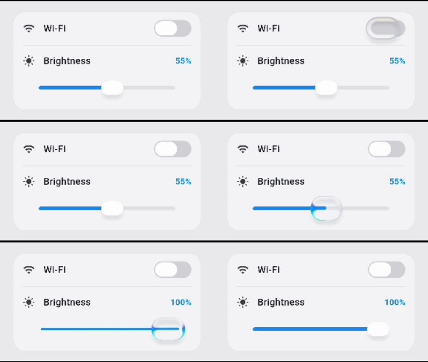
// A glass slider — the thumb lifts into clear glass under your finger// and deforms from acceleration as it travels.LiquidGlassSlider(
value: volume,
onChanged: (v) => setState(() => volume = v),
width: 320,
);
// A glass switch.LiquidGlassSwitch(
value: wifi,
activeColor: constColor(0xFF0A84FF),
onChanged: (v) => setState(() => wifi = v),
width: 63,
height: 28,
);
Both size themselves, so a SizedBox around one does nothing — give
them width / height instead. Those two are a shorthand for the same
fields on layout, which is where the rest of the geometry lives (the
thumb's resting and lifted sizes, the track thickness, the end icons).
Both also ship the tuned look out of the box, exposed as
LiquidGlassSlider.defaultStyle / LiquidGlassSwitch.defaultStyle: a
clear thumb — refraction and a soft rim, no tint — with a tucked-in
contact shadow riding defaultStyle.appearance.shadow. Change one facet
without retyping the rest
(style: LiquidGlassSlider.defaultStyle.copyWith(refraction: …)), or
hand over an appearance carrying no shadow to drop the shadow.
Each component is self-contained and styled through the same
LiquidGlassStyle vocabulary. Other components: LiquidGlassButton,
LiquidGlassFab, LiquidGlassAppBar, LiquidGlassTabBar,
LiquidGlassAlertDialog, LiquidGlassSheet, LiquidGlassScaffold,
LiquidGlassMorph, LiquidGlassShadow, and LiquidGlassMotionPill — the
slider's living thumb on its own, for anything that moves a glass capsule
along a path.
Shadow — the contact shadow
LiquidGlassShadow is what makes a glass pill read as sitting in the
surface rather than floating flat on it: a soft dark band that hugs the rim
and pools underneath. It is cast by a ring straddling the outline —
not by the pill itself — displaced downward and blurred, so one shape gives
both the inner rim contact and the drop below while the middle of the glass
stays clear. It composites with multiply, darkening the glass inside and
the page outside instead of laying grey over both.
The place to author it is the style — appearance.shadow — and every lens
and component takes it from there, never as a separate parameter:
LiquidGlassLens(
style: constLiquidGlassStyle(
appearance: LiquidGlassAppearance(
shadow: LiquidGlassShadow(blur: 3.5, opacity: 0.2),
),
),
child: child,
)
// The slider's and the switch's tuned shadow lives on their defaultStyle;// hand over an appearance carrying no shadow to drop it.
On its own it is a plain parent widget — LiquidGlassShadow(child: …)
— that paints behind whatever it wraps and never touches it, so it composes
with any lens or any surface. Wrap the lens; a shadow passed as content
would be clipped to the outline and lose the half that pools below, which
is the half that reads as contact. blur, opacity, color, offset
(blur + 2 downward by default), cornerRadius (capsule by default) and
inset — how far inside the glass the casting ring sits, for a tighter
contact on a small control — are the knobs. Under a touch, the ring
follows the deformed outline. Not supported inside a LiquidGlassBlender:
a merged silhouette has no single ring to cast.
Sheets — Flutter's bottom sheet, in glass
showLiquidGlassSheetisshowModalBottomSheet: same route, same
slide-up, same drag-to-dismiss, same barrier — with the glass put where
its filled Material used to be. Every parameter of Flutter's is
forwarded (isScrollControlled, constraints, isDismissible,
enableDrag, useSafeArea, transitionAnimationController, …), and the
look is the usual LiquidGlassStyle.
LiquidGlassSheet on its own is just the surface — the glass, a
grabber, a full-width header and the padded child. It takes the
height it is given and hugs its content when given none, so it drops
into anything that owns the motion. That is how you get an expandable
sheet: put the panel inside DraggableScrollableSheet's builder, where
it resizes along with it.
anchor picks the shape: floating (the default) insets the sheet on
all sides and rounds all four corners, while attached runs it full
width along the bottom edge — built taller than it is, with the extra
hanging off the screen, so the bottom corners are never in frame and no
sliver of page shows underneath. avoidKeyboard (on by default) adds
the bottom viewInsets padding you would otherwise write in every
builder, so a sheet with a text field in it rides the
keyboard up — give it isScrollControlled: true for the room to do so.
Morph — glass that fits whatever you put in it
Swap the child; the glass measures the new one and flows to its size. You
never type a dimension:
That is the whole API. Add a row to Menu and the glass grows to match —
there is one truth about how big the menu is, and the glass reads it instead
of being told it a second time. Key is the identity: a child that keeps its
type without a key is not seen as new, and will neither cross-fade nor be
re-measured.
width and height are overrides, not inputs. Set one and that axis is
pinned while the other is still measured — the fixed-width menu whose height
follows its rows. Set both and nothing is measured at all.
It is not an AnimatedContainer. The morph is two blobs of one liquid,
drawn as a single surface by LiquidGlassBlender: the destination blob
carries the new shape and content, the source blob the old, and the smooth
union joins them — so mid-morph the outline has a waist, the one thing a
tween can never produce. Growing, the new blob's centre leaps ahead and its
size catches up, pulling a neck out of the source; shrinking is the same film
run backwards. Each blob keeps its own corners, the old child blurs out in the
first 40% of the swap and the new one blurs in over the second half, pinned
where the glass will finally sit. At rest the two blobs coincide and the union
is off, so the resting outline is the plain shape. smoothness is the neck
radius, the same quantity as the blender's.
alignment is the parameter people regret. The widget fills the box it is
given and places the glass inside it, because a size alone does not say which
way a surface should grow. centerLeft holds the left edge and opens
rightward; bottomRight holds that corner and opens up and left; center
moves both edges — which looks right in every direction, and is exactly why
getting it wrong stays invisible until the surface walks across the screen.
Any Alignment(x, y) is valid, not just the nine names. If the surface is
positioned by something that isn't an alignment — a Positioned, a list, a
drag — recover the one its own rect implies:
motion: LiquidGlassMorphMotion.fluid        // the default: leaps and drags a neck
motion: LiquidGlassMorphMotion.anchoredPop  // pops open from the corner that holds
motion: LiquidGlassMorphMotion.droplet      // born small, leaps hard, long neck
motion: LiquidGlassMorphMotion.calm         // no bounce, for sheets and large cards
Behind them are three numbers — the spring (spring(duration:bounce:)
takes a SwiftUI Spring straight from a design spec), stretch (how far the
leading blob runs ahead of its own size) and anchor (the point the new shape
grows around; null uses the widget's own alignment). Everything set once
and left alone is in LiquidGlassMorphAdvanced, behind advanced.
Two things to know. A content-sized surface needs one frame to measure before
it knows how big it is, so it is transparent for that frame; pin both axes and
there is no warm-up frame. And bound the constraints — under unbounded ones
there is no box to anchor inside, so put it in a Stack, a SizedBox or a
Padding inside one. The style's shape is the destination's; border, light,
tint, blur and refraction pass through to the blender untouched.
Tab bar — the moving glass pill
LiquidGlassTabBar's selection pill is real glass on every renderer
by default: it lifts off the tab the moment you tap, travels on a spring
— stretching as it launches, squashing as it brakes — and refracts the
bar's own capsule as it passes. A settled bar costs no shader pass at
all. The tier is chosen by LiquidGlassTabPillStyle.mode (both /
impellerOnly / none), and the pill's look, motion and contact shadow
are tuned defaults — the shadow authored, like every lens's, on its glass
style's appearance.shadow (the bar capsule's likewise on the bar
style's appearance).
both on Skia. With the shader, the pill on Skia captures the page a
second time on top of the bar's own capture — heavy over anything that
moves, so impellerOnly is the setting to ship there. Under lite glass
(LiquidGlassEngine.liteGlassOnSkia = true, or liteGlass set on the
bar's styles) that cost is gone: the view takes no capture at all, the pill
is a frosted capsule on the same spring, and both runs on Skia with no
performance issue. On Impeller there is no capture either way.
The tab under the pill is its own state: underGlassIconSize and
underGlassLabelFontSize on LiquidGlassTabItemStyle let the icon and
label render bigger while the glass is over them. The enlargement is the
glass's effect, not the selection's — it rides under the pill for the
whole travel and glides back down through the landing.
Tabs aren't limited to IconData. Give LiquidGlassTabBarItem an
iconBuilder instead of an icon and the glyph is drawn through your
builder, so any widget works — an SvgPicture, an Image, a
CustomPaint:
The builder is handed the color the bar already resolved for the layer it
is drawing, the glyph box size, and whether that layer is the selected
one. Tint with i.color and your artwork follows the selected /
unselected palette and the morph pill's reveal — the glass-pill bar
draws each tab twice per frame, once inside the pill and once outside it,
and calls the builder for each. Multi-colour art can simply ignore the
colour. LiquidGlassButton and LiquidGlassTabBarAction take a child
for the same reason.
Labels have the same escape hatch: labelBuilder draws the label line
instead of the plain Text — a custom font, rich text, a badge row. It
receives the already-resolved textStyle (color, size, weight) for the
layer being drawn, so copyWith keeps the stock look and changes only
what you need — and like iconBuilder it runs once per rendered layer,
so a custom label follows the pill's reveal too:
LiquidGlassTabBar shows its animated, glass-refracting morph
selection pill when it's driven by a LiquidGlassScaffold, which owns the
capture pipeline and hands the bar the page as its background.
To use the bar on its own — no LiquidGlassScaffold and no body to pass
— use the .withImpeller constructor. On Impeller the bar and its morph
pill sample the live backdrop, so just drop it as the last child of a Stack
over your page:
.withImpeller is Impeller-first: on Skia (no live-backdrop
shader) it falls back to a plain frosted bar that still shows the content
behind it. For the refracting morph pill on Skia, use a
LiquidGlassScaffold with a real body.
Snapshot vs Realtime (Skia capture)
When you use a LiquidGlassView on Skia, choose how its background is
captured:
For full-screen backgrounds, pixelRatio of 0.5–1.0 balances performance and
detail. Smaller regions can afford higher ratios for sharper glass. The final
choice depends on the device.
License
MIT License
Developed by
Ahmed Gamil
Feel free to open issues or contribute to the project!