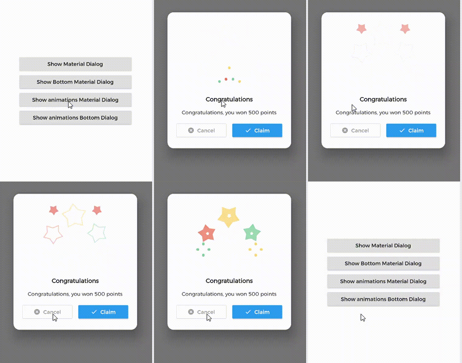
सार्वजनिक जानकारी से बना चयन मार्गदर्शन। केवल संदर्भ हेतु।
Material Dialogs एक Flutter पैकेज है जिसका उद्देश्य एनीमेटेड, स्टाइलिश और कस्टमाइज़ेबल मैटेरियल डिज़ाइन डायलॉग के निर्माण को सरल बनाना है। यह सभी प्लेटफॉर्मों पर मैटेरियल निर्देशों के अनुरूप आधुनिक डायलॉग इंटरफेस बनाने के लिए आसान उपयोग वाला API प्रदान करता है। पैकेज में चेतावनी, पुष्टि और कस्टम डायलॉग जैसे विभिन्न डायलॉग प्रकार समर्थित हैं, जिनमें चिकनी एनीमेशन और प्रतिक्रियाशील लेआउट हैं। एंड्रॉइड, आईओएस, वेब, मैकओएस, विंडोज और लिनक्स के लिए ऐप में दृश्य आकर्षक पॉप-अप के माध्यम से उपयोगकर्ता अंतरक्रिया को बढ़ाने के लिए आदर्श है।
उपयोग
चेतावनियाँ और पुष्टिकरण प्रदर्शित करना
कस्टम मॉडल डायलॉग बनाना
एनिमेशन के साथ उपयोगकर्ता प्रतिक्रिया में सुधार
ऑनबोर्डिंग या ट्यूटोरियल प्रॉम्प्ट का कार्यान्वयन
इंटरैक्टिव बॉटम शीट्स जोड़ें
Material Design के साथ UI सुसंगतता में सुधार
मुख्य विशेषताएँ
एनिमेटेड ट्रांजिशन्स
कस्टमाइज़ किए गए थीम
क्रॉस-प्लेटफ़ॉर्म समर्थन
सरल API
निर्मित डायलॉग प्रकार
प्रतिक्रियाशील डिज़ाइन
इनके लिए उपयुक्त
त्वरित डायलॉग कार्यान्वयन की खोज कर रहे विकासकर्ता
सुसंगत Material Design की आवश्यकता वाले एप्स
बहुप्लेटफॉर्म लक्षित प्रोजेक्ट्स
उपयोगकर्ता इंटरफेस पर केंद्रित अनुप्रयोग
विकासक अनुभव पर ध्यान केंद्रित टीमें
प्रोटोटाइपिंग और त्वरित विकास
विचार योग्य बातें
सामग्री डिज़ाइन अंदरूनी सुंदरता तक सीमित
गैर-Material थीम्स के लिए अतिरिक्त स्टाइलिंग की आवश्यकता हो सकती है
Flutter के Material लाइब्रेरी पर निर्भर करता है
जटिल कस्टम मॉडल्स के लिए उपयुक्त नहीं
फ्लटर के डिफ़ॉल्ट थीम सिस्टम के साथ सबसे अच्छा उपयोग किया जाता है
Flutter के widget वृक्ष की समझ की आवश्यकता है
मूल README
संबंधित सोर्स रिपॉज़िटरी के मूल README का स्नैपशॉट। नवीनतम सामग्री के लिए रिपॉज़िटरी देखें।
MaterialDialog This Plugin will be useful to create simple, animated, and beautiful dialogs in your next Flutter app.
This library implements Airbnb's Lottie library to render After Effects animation in app.
Types of Dialog
MaterialDialog library provides two types of dialog i.e.
1. Material Dialog
2. Bottom Sheet Material Dialog
A normal material dialog which can have one or two buttons.
A Bottom Sheet material dialog which can have one or two buttons, is showed from bottom of device.
Implementation
Implementation of Material Dialog library is so easy. You can check /example directory for demo. Let's have look talk in details about it.
IconsOutlineButton and IconsButton are both buttons widgets provided by the plugin to make things easier for you read more, you can use any other buttons if you want.
ii. Bottom Sheet Material Dialog
Dialogs class will be used to create your dialog, use bottomMaterialDialog. Below is an example to show your dialog in the app.
it's better to make your animation to have the same background color as your dialog's background color, please use lottie editor to remove the background layer of your animation or make it same as your dialog background color before using it in the plugin.
Contribute
Let's develop with collaborations. We would love to have contributions by raising issues and opening PRs. Filing an issue before PR is must.
Credits
This library is built using following open-source libraries.