पैकेज, रिपॉज़िटरी और ऐप श्रेणियाँ खोजें

mobkit_dashed_border कवर
पैकेज विवरणv0.0.8

mobkit_dashed_border

डैश लाइन्स और कर्व्ड बॉर्डर के लिए कस्टम बॉर्डर इम्प्लीमेंटेशन।

AndroidiOSWebmacOSWindowsLinux
30-दिन डाउनलोड
25.3 हज़ार
लाइक
68
Pub अंक
150

पैकेज इंस्टॉल करें

flutter pub add mobkit_dashed_border

पैकेज अवलोकन

सार्वजनिक जानकारी से बना चयन मार्गदर्शन। केवल संदर्भ हेतु।

एक फ्लटर पैकेज जो कस्टम डैश्ड बॉर्डर को सपोर्ट करता है, जिसमें वक्र लाइनों और स्मूथ ट्रांज़िशन का समर्थन होता है। यह फ्लटर के डिकोरेशन सिस्टम को एक्सटेंड करता है ताकि डेवलपर्स को डैश्ड आउटलाइन को विजेट्स पर लगाने में सटीक नियंत्रण मिले डैश लंबाई, गैप साइज़ और बॉर्डर कर्वेचर के लिए। आधुनिक एस्थेटिक के साथ कार्ड, बटन या कंटेनर जैसे UI तत्वों के लिए आदर्श। पैकेज सभी प्रमुख प्लेटफॉर्म्स जैसे एंड्रॉइड, आईओएस, वेब, मैकओएस, विंडोज और लिनक्स के साथ संगत है।

उपयोग

  • डैश्ड आउटलाइन के साथ कार्ड को स्टाइल करना
  • सजावटी बटन सीमा बनाना
  • कस्टम कंटेनर फ्रेम डिज़ाइन करना
  • दृश्य विशेषता के साथ उपयोगकर्ता इंटरफेस में सुधार करना
  • प्रतिक्रियाशील लेआउट कंपोनेंट्स बनाएं

मुख्य विशेषताएँ

  • वक्र डैश्ड सीमाओं का समर्थन
  • कस्टमाइज़ किए गए डैश और गैप लंबाई
  • सभी प्लेटफॉर्मों पर स्मूथ रेंडरिंग
  • Flutter के BoxDecoration का विस्तार करता है
  • pub add के माध्यम से आसान एकीकरण

इनके लिए उपयुक्त

  • दृश्य आकर्षण की तलाश में UI डिज़ाइनर
  • क्रॉस-प्लेटफॉर्म ऐप्स बनाने वाले डेवलपर्स
  • अद्वितीय बॉर्डर शैलियों की आवश्यकता वाले प्रोजेक्ट्स
  • आधुनिक या मिनिमलिस्ट डिज़ाइन वाले ऐप्स
  • इंटरैक्टिव इंटरफेस का प्रोटोटाइपिंग

विचार योग्य बातें

  • जटिल आकृतियों के साथ प्रदर्शन पर प्रभाव पड़ सकता है
  • उत्तम दिखावट के लिए सावधानीपूर्वक ट्यूनिंग की आवश्यकता होती है
  • केवल सीमा सजावट तक सीमित
  • उच्च आवृत्ति एनीमेशन के लिए उपयुक्त नहीं
  • हल्के विजेट के साथ सबसे अच्छा उपयोग करें
मूल README

संबंधित सोर्स रिपॉज़िटरी के मूल README का स्नैपशॉट। नवीनतम सामग्री के लिए रिपॉज़िटरी देखें।

Mobkit Dashed Border

The Mobkit Dashed Border is a border that provide dashed lines. Same time that package provides use different properties with rounded corner unlike border class.

Getting started

Import the following package.
flutter pub add -d mobkit_dashed_border
import 'package:mobkit_dashed_border/mobkit_dashed_border.dart';

Usage

You can use this package like border class. Below you can see the different types of codes and their outputs.

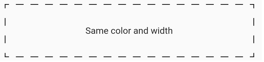
This sample shows border that has same color ,width and non radius corner

Sample code:

Container(
    height: 75,
    decoration: const BoxDecoration(
        border:
            DashedBorder.fromBorderSide(dashLength: 10, side: BorderSide(color: Colors.black, width: 1),
        ),
    ),
    child: const Center(
        child: Text(
            'Same color and width',
        ),
    ),
),

Output of this code:

selectionScroll
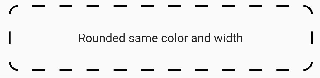
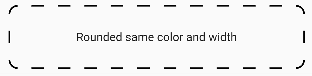
This sample shows border that has same color ,width and radius corner

Sample code:

Container(
    height: 75,
    decoration: const BoxDecoration(
        border: DashedBorder.fromBorderSide(
            dashLength: 15, side: BorderSide(color: Colors.black, width: 2)),
        borderRadius: BorderRadius.all(Radius.circular(10))),
    child: const Center(
        child: Text(
            'Rounded same color and width',
        ),
    ),
),

Output of this code:

selectionScroll
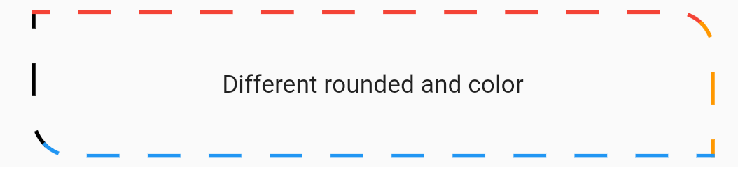
This sample shows border that has different color ,width and radius corner

Sample code:

Container(
    height: 75,
    decoration: const BoxDecoration(
    border: DashedBorder(
        dashLength: 15,
        left: BorderSide(color: Colors.black, width: 2),
        top: BorderSide(color: Colors.red, width: 2),
        right: BorderSide(color: Colors.orange, width: 2),
        bottom: BorderSide(color: Colors.blue, width: 2),
    ),
    borderRadius: BorderRadius.only(
        topLeft: Radius.circular(0),
        topRight: Radius.circular(20),
        bottomLeft: Radius.circular(20),
        bottomRight: Radius.circular(0),
    ),
    ),
    child: const Center(
        child: Text(
            'Different rounded and color',
        ),
    ),
),

Output of this code:

selectionScroll
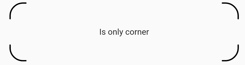
This sample shows a border drawn only on the corners.

Sample code:

   Container(
    height: 90,
    decoration: BoxDecoration(
    border: DashedBorder.all(
        color: Colors.black,
        dashLength: 40,
        width: 2,
        isOnlyCorner: true,
        strokeAlign: BorderSide.strokeAlignInside,
        strokeCap: StrokeCap.round,
    ),
    borderRadius: BorderRadius.circular(20),
    ),
    child: const Center(
        child: Text(
        'Is only corner',
        ),
    ),
),

Output of this code:

selectionScroll

श्रेणियाँ

सोर्स रिपॉज़िटरी

इस पैकेज का उपयोग करने वाले प्रोजेक्ट