सार्वजनिक जानकारी से बना चयन मार्गदर्शन। केवल संदर्भ हेतु।
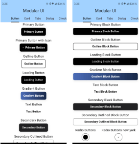
Modular UI एक Flutter पैकेज है जो Material Tailwind और shadcn/ui से प्रेरित पूर्व-निर्मित, आकर्षक विजेट प्रदान करता है। त्वरित विकास के लिए डिज़ाइन किया गया, यह एक सुसंगत, आधुनिक डिज़ाइन प्रणाली प्रदान करता है जिसमें वर्तमान UI प्रवृत्तियों के अनुरूप कस्टमाइज़ करने योग्य घटक होते हैं। यह पैकेज Android, iOS, Web, macOS, Windows और Linux जैसे कई प्लेटफॉर्म का समर्थन करता है, जिससे यह क्रॉस-प्लेटफॉर्म एप्लिकेशन के लिए आदर्श है। साफ, सेमेंटिक कोड और स्पष्ट API के साथ, Modular UI विकासकर्ताओं को बिना शुरुआत किए ही पॉलिश्ड इंटरफेस बनाने में मदद करता है।
उपयोग
त्वरित प्रोटोटाइपिंग
क्रॉस-प्लेटफॉर्म एप्प डेवलपमेंट
आधुनिक यूआई डिज़ाइन
घटक-आधारित यूआई निर्माण
डिज़ाइन सिस्टम कार्यान्वयन
मुख्य विशेषताएँ
पूर्व-निर्मित सुंदर विजेट्स
Material Tailwind और shadcn/ui से प्रेरित
क्रॉस-प्लेटफ़ॉर्म समर्थन
कस्टमाइज़ किए जा सकने वाले घटक
सेमेंटिक और साफ़ API
इनके लिए उपयुक्त
फ्रंटएंड डेवलपर्स
UI/UX डिजाइनर्स
एमवीपी बनाने वाली स्टार्टअप्स
डिज़ाइन प्रणाली का उपयोग करने वाली टीमें
त्वरित UI डिलीवरी की खोज कर रहे विकासकर्मी
विचार योग्य बातें
Flutter widget संरचना के प्रति परिचित होना आवश्यक है
प्रदान किए गए थीम्स के बाहर सीमित कस्टमाइजेशन
बाहरी डिज़ाइन प्रेरणा पर निर्भर है
अद्वितीय ब्रांडिंग के लिए अतिरिक्त स्टाइलिंग की आवश्यकता हो सकती है
आधुनिक, सरल डिजाइन के लिए सबसे उपयुक्त
मूल README
संबंधित सोर्स रिपॉज़िटरी के मूल README का स्नैपशॉट। नवीनतम सामग्री के लिए रिपॉज़िटरी देखें।
Craft beautiful, accessible, and responsive Flutter UIs with a Modular-UI Design-inspired component library
  MUIPrimaryCard(
          title: 'UI/UX Review Check',
          description:
              'The place is close to Barceloneta Beach and bus stop just 2 min by walk and near to "Naviglio" where you can enjoy the main night life in Barcelona',
          image: Image.network(
            'https://images.unsplash.com/photo-1540553016722-983e48a2cd10?ixlib=rb-1.2.1&ixid=MnwxMjA3fDB8MHxwaG90by1wYWdlfHx8fGVufDB8fHx8&auto=format&fit=crop&w=800&q=80',
            fit: BoxFit.cover,
          ),
          buttons: [
            MUIPrimaryButton(
              text: 'Read More',
              onPressed: () {},
            ),
          ],
        ),
For more code samples, you can head on to our documentaion at . https://modularui.site
Features
Comprehensive Modular-UI Design components: Build modern and feature-rich interfaces with a wide range of buttons, cards, forms, navigation elements, and more.
Highly customizable: Tailor components to your exact needs with extensive styling options.
Responsive design: Ensure optimal UI experiences across different screen sizes.
Accessibility focus: Built with accessibility in mind, adhering to best practices.
Lightweight and performant: Efficiently crafted for smooth user interactions.
Additional Features
Custom themes and color palettes: Define your own visual style for a cohesive look.
Dark mode support: Seamlessly adapt your UI to user preferences.
Contributing
Calling on all the trendsetting Flutter enthusiasts! ❤️🔥 Join forces as we pioneer the creation of the ultimate, expansive, and seamless UI Library for Flutter. Let's make waves together! 🚀
Please refer to our contribution guidelines for details and don't forget to drop a Hi at discord