पैकेज, रिपॉज़िटरी और ऐप श्रेणियाँ खोजें

outline_gradient_button कवर
पैकेज विवरणv2.0.1+1

outline_gradient_button

OutlineGradientButton पैकेज को धीरे-धीरे लाइन वाले बटन बनाने के लिए विकसित किया गया है।

AndroidiOSWebmacOSWindowsLinux
30-दिन डाउनलोड
22
लाइक
97
Pub अंक
150

पैकेज इंस्टॉल करें

flutter pub add outline_gradient_button

पैकेज अवलोकन

सार्वजनिक जानकारी से बना चयन मार्गदर्शन। केवल संदर्भ हेतु।

outline_gradient_button पैकेज डेवलपर्स को फ्लटर एप्लिकेशन में ग्रेडिएंट आउटलाइन वाले दिखावटी बटन बनाने की अनुमति देता है। यह मानक बटन विजेट्स को ग्रेडिएंट बॉर्डर के साथ कस्टमाइज़ करके बढ़ाता है, जिससे आधुनिक और डायनामिक UI डिज़ाइन बन सकते हैं। फंक्शनलिटी को नुकसान नहीं पहुंचाए बिना शैलीपूर्ण और आकर्षक इंटरफ़ेस चाहने वाले एप्लिकेशन के लिए आदर्श है। पैकेज सभी प्रमुख प्लेटफॉर्म जैसे Android, iOS, Web, macOS, Windows और Linux को सपोर्ट करता है, जिससे डिवाइस के बीच एक समान दिखावट सुनिश्चित होती है। pub add के माध्यम से न्यूनतम सेटअप के साथ, यह मौजूदा प्रोजेक्ट में आसानी से एकीकृत हो जाता है।

उपयोग

  • स्टाइलिश यूजर इंटरफेस तत्व बनाना
  • एप्लिकेशन के दृश्य आकर्षण में सुधार करना
  • इंटरैक्टिव कॉल-टू-एक्शन बटन डिज़ाइन करें
  • आधुनिक मोबाइल और वेब इंटरफ़ेस बनाना
  • फॉर्म बटन पर धीरे-धीरे प्रभाव जोड़ें

मुख्य विशेषताएँ

  • घेराव धरातल स्टाइलिंग
  • क्रॉस-प्लेटफॉर्म संगतता
  • Flutter के साथ आसान एकीकरण
  • कस्टमाइज़ किए गए सीमा रंग और चौड़ाई
  • विभिन्न बटन प्रकार का समर्थन करता है (उदाहरण के लिए ElevatedButton, TextButton)
  • हल्का और कार्यक्षम

इनके लिए उपयुक्त

  • दृश्य आकर्षण की तलाश में UI डिज़ाइनर
  • आधुनिक Flutter ऐप बनाने वाले विकासकर्ता
  • प्रतिक्रियाशील तत्वों के लिए अवकलज-आधारित परियोजनाएँ
  • बहुप्लेटफॉर्म लक्षित ऐप्स
  • प्रोटोटाइपिंग और उत्पादन-तैयार इंटरफेस

विचार योग्य बातें

  • जटिल ग्रेडिएंट्स के लिए अतिरिक्त स्टाइलिंग की आवश्यकता हो सकती है
  • लिमिटेड आउटलाइन प्रभाव, फिल ग्रेडिएंट नहीं
  • बड़ी संख्या में बटनों पर प्रभाव
  • दृश्यता के लिए विपरीत पृष्ठभूमि रंगों के साथ सबसे अच्छा उपयोग करें

मूल README

संबंधित सोर्स रिपॉज़िटरी के मूल README का स्नैपशॉट। नवीनतम सामग्री के लिए रिपॉज़िटरी देखें।

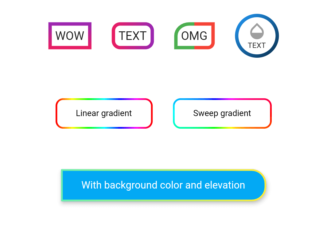
wow

Example

Take a look at the provided example for how to use the OutlineGradientButton.

How to use

demo_button1

OutlineGradientButton(
  child: Text('WOW'),
  gradient: LinearGradient(
    colors: [Colors.purple, Colors.pink],
    begin: Alignment.topCenter,
    end: Alignment.bottomCenter,
  ),
  strokeWidth: 4,
),

demo_button2

OutlineGradientButton(
  child: Text('TEXT'),
  gradient: LinearGradient(colors: [Colors.pink, Colors.purple]),
  strokeWidth: 4,
  radius: Radius.circular(8),
),

demo_button3

OutlineGradientButton(
  child: Text('OMG'),
  gradient: LinearGradient(
    stops: [0, 0.5, 0.5, 1],
    colors: [Colors.green, Colors.green, Colors.red, Colors.red],
  ),
  strokeWidth: 4,
  corners: Corners(topLeft: Radius.elliptical(16, 14), bottomRight: Radius.circular(6)),
),

demo_button4

OutlineGradientButton(
  child: SizedBox(
    width: 52,
    height: 52,
    child: Column(
      mainAxisSize: MainAxisSize.min,
      mainAxisAlignment: MainAxisAlignment.center,
      children: <Widget>[
        Icon(Icons.opacity, color: Colors.grey, size: 24),
        Text('TEXT', style: TextStyle(fontSize: 9)),
      ],
    ),
  ),
  gradient: LinearGradient(
    colors: [Colors.blue, Colors.black],
    begin: Alignment(-1, -1),
    end: Alignment(2, 2),
  ),
  strokeWidth: 4,
  padding: EdgeInsets.zero,
  radius: Radius.circular(26),
),

demo_button5

OutlineGradientButton(
  child: Text('Linear gradient', style: TextStyle(color: Colors.black, fontSize: 10)),
  gradient: LinearGradient(
    colors: List.generate(360, (h) => HSLColor.fromAHSL(1, h.toDouble(), 1, 0.5).toColor()),
  ),
  strokeWidth: 2,
  padding: EdgeInsets.symmetric(horizontal: 24, vertical: 12),
  radius: Radius.circular(8),
),

demo_button6

OutlineGradientButton(
  child: Text('Sweep gradient', style: TextStyle(color: Colors.black, fontSize: 10)),
  gradient: SweepGradient(
    colors: List.generate(360, (h) => HSLColor.fromAHSL(1, h.toDouble(), 1, 0.5).toColor()),
  ),
  strokeWidth: 2,
  padding: EdgeInsets.symmetric(horizontal: 24, vertical: 12),
  radius: Radius.circular(8),
),

demo_button7

OutlineGradientButton(
  child: Text('With background color and elevation', style: TextStyle(color: Colors.white, fontSize: 12)),
  gradient: LinearGradient(colors: [Colors.greenAccent, Colors.yellow]),
  strokeWidth: 2,
  padding: EdgeInsets.symmetric(horizontal: 24, vertical: 12),
  corners: Corners(topRight: Radius.circular(16), bottomRight: Radius.circular(16)),
  backgroundColor: Colors.lightBlue,
  elevation: 4,
  inkWell: true,
  onTap: () => showSnack('onTap'),
  onDoubleTap: () => showSnack('onDoubleTap'),
  onLongPress: () => showSnack('onLongPress'),
),

श्रेणियाँ

सोर्स रिपॉज़िटरी

इस पैकेज का उपयोग करने वाले प्रोजेक्ट