पैकेज, रिपॉज़िटरी और ऐप श्रेणियाँ खोजें

पैकेज विवरणv2.0.4

page_view_indicator

किसी भी Widget और/या Animation से PageView के लिए संकेत चिह्न बनाता है।

30-दिन डाउनलोड
257
लाइक
31
Pub अंक
35

पैकेज इंस्टॉल करें

flutter pub add page_view_indicator

पैकेज अवलोकन

सार्वजनिक जानकारी से बना चयन मार्गदर्शन। केवल संदर्भ हेतु।

एक फ्लटर पैकेज जो PageView विजेट के लिए कस्टमाइज़ेबल इंडिकेटर मार्क प्रदान करता है, जिससे डेवलपर्स किसी भी विजेट या एनिमेशन का उपयोग दृश्य संकेतक के रूप में कर सकते हैं। यह एक स्क्रॉल किए जा सकने वाले पेज की सूची में वर्तमान पेज स्थिति को स्पष्ट रूप से दिखाकर उपयोगकर्ता अनुभव को बढ़ाता है। पैकेज हल्का और लचीला है, कस्टम स्टाइलिंग और डायनामिक एनिमेशन का समर्थन करता है। ओनबोर्डिंग फ्लो, इमेज स्लाइडर और गाइडेड टूर के लिए आदर्श है।

उपयोग

  • ऑनबोर्डिंग स्क्रीन्स
  • इमेज स्लाइडर्स
  • गाइडेड टूर्स
  • फॉर्म विजार्ड
  • सामग्री कैरोसेल

मुख्य विशेषताएँ

  • कस्टमाइज़ करने योग्य विजेट सूचकांक
  • एनीमेशन का समर्थन
  • लचीला शैली
  • PageView के साथ आसान एकीकरण
  • हल्का और कार्यक्षम

इनके लिए उपयुक्त

  • मोबाइल ऐप ऑनबोर्डिंग
  • इमेज गैलरी
  • इंटरैक्टिव ट्यूटोरियल
  • डायनामिक कंटेंट प्रदर्शित होता है
  • उपयोगकर्ता इंटरफेस सुधार

विचार योग्य बातें

  • PageController के साथ हस्तचालित सेटअप की आवश्यकता है
  • सीमित प्लेटफॉर्म-विशिष्ट अनुकूलन
  • कोई निर्मित सुविधा नहीं है
  • जटिल डिजाइन के लिए अतिरिक्त स्टाइलिंग की आवश्यकता हो सकती है
  • बाहरी एनिमेशन तर्क पर निर्भर करता है
मूल README

संबंधित सोर्स रिपॉज़िटरी के मूल README का स्नैपशॉट। नवीनतम सामग्री के लिए रिपॉज़िटरी देखें।

PageViewIndicator Pub Package

Builds indication marks for PageView.

Import

import 'package:page_view_indicator/page_view_indicator.dart';

Usage

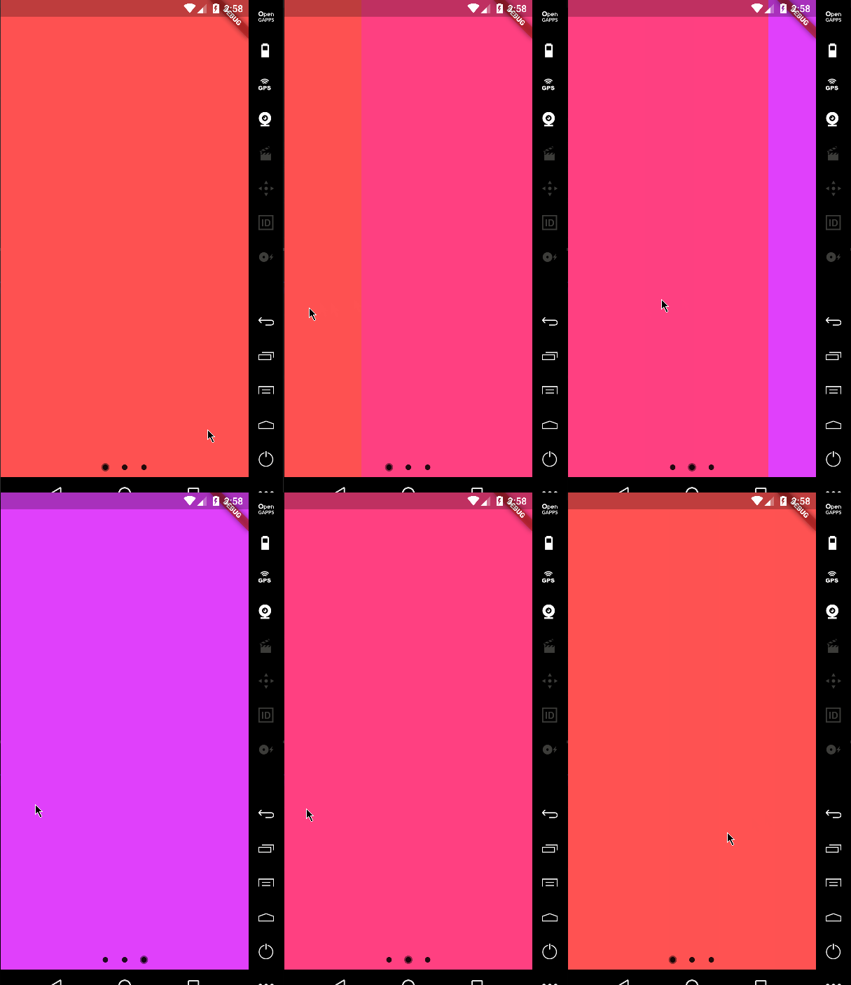
Default Material behavior
return PageViewIndicator(
  pageIndexNotifier: pageIndexNotifier,
  length: length,
  normalBuilder: (animationController, index) => Circle(
        size: 8.0,
        color: Colors.black87,
      ),
  highlightedBuilder: (animationController, index) => ScaleTransition(
        scale: CurvedAnimation(
          parent: animationController,
          curve: Curves.ease,
        ),
        child: Circle(
          size: 12.0,
          color: Colors.black45,
        ),
      ),
);

Example 1


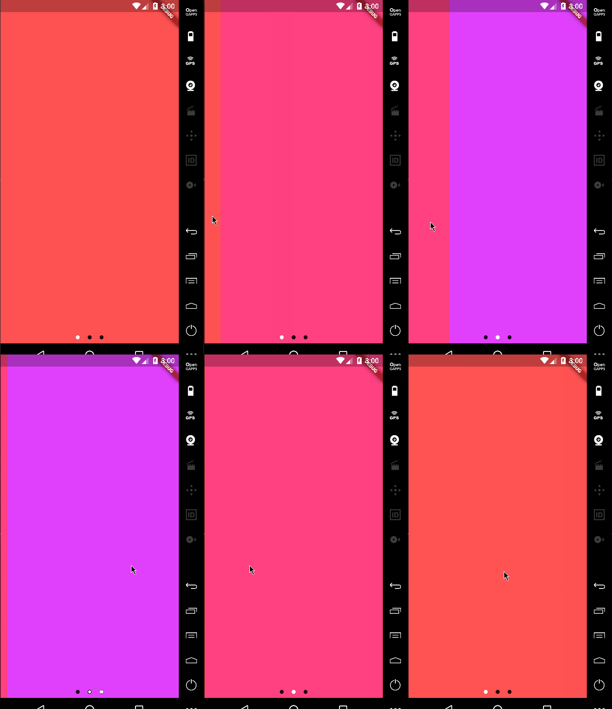
Custom animations
return PageViewIndicator(
  pageIndexNotifier: pageIndexNotifier,
  length: length,
  normalBuilder: (animationController, index) => Circle(
        size: 8.0,
        color: Colors.black87,
      ),
  highlightedBuilder: (animationController, index) => ScaleTransition(
        scale: CurvedAnimation(
          parent: animationController,
          curve: Curves.ease,
        ),
        child: Circle(
          size: 8.0,
          color: Colors.white,
        ),
      ),
);

Example 2


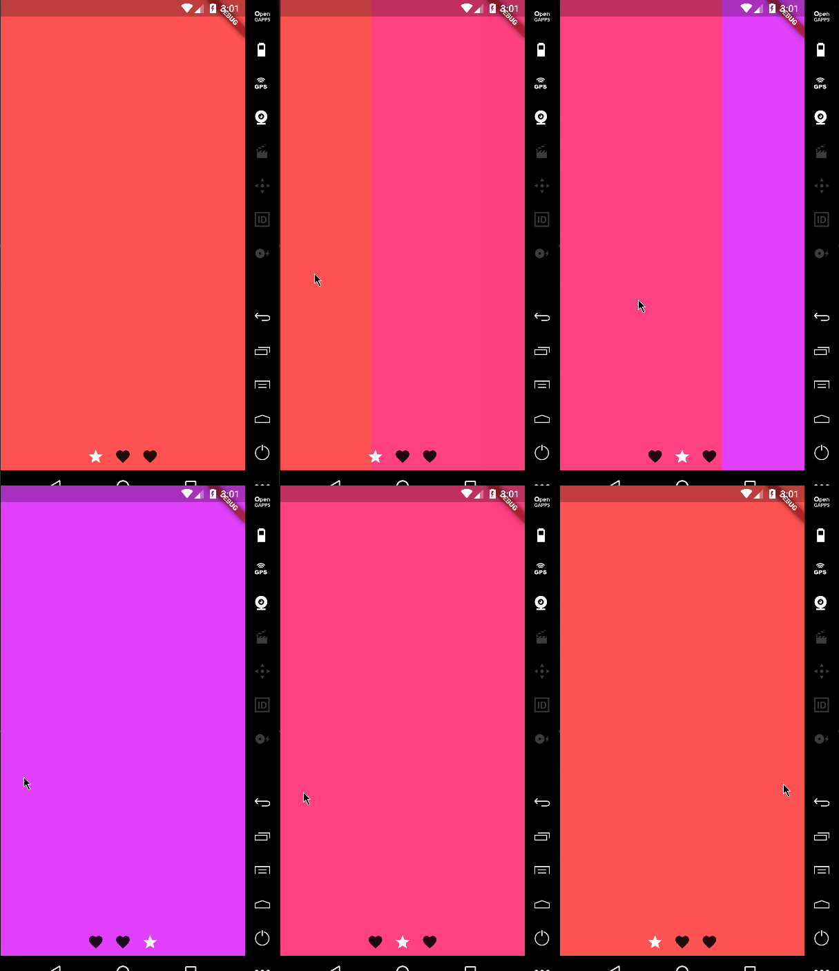
Custom icons

It's not just about dots!

return PageViewIndicator(
  pageIndexNotifier: pageIndexNotifier,
  length: length,
  normalBuilder: (animationController, index) => ScaleTransition(
        scale: CurvedAnimation(
          parent: animationController,
          curve: Curves.ease,
        ),
        child: Icon(
          Icons.favorite,
          color: Colors.black87,
        ),
      ),
  highlightedBuilder: (animationController, index) => ScaleTransition(
        scale: CurvedAnimation(
          parent: animationController,
          curve: Curves.ease,
        ),
        child: Icon(
          Icons.star,
          color: Colors.white,
        ),
      ),
);

Example 3

Changing the space bettwen the indicators

You can change the padding around the indicators using the indicatorPadding property:

return PageViewIndicator(
  pageIndexNotifier: pageIndexNotifier,
  length: length,
  indicatorPadding: const EdgeInsets.all(4.0)
  ...

Default is const EdgeInsets.all(8.0).

श्रेणियाँ

सोर्स रिपॉज़िटरी

इस पैकेज का उपयोग करने वाले प्रोजेक्ट